Interactivity in WPF Range Selector (SfDateTimeRangeNavigator)
9 Jul 20269 minutes to read
The date-time range navigator control provides interactive features such as zooming and panning. This control has a resizable scrollbar, which is used to zoom into a large amount of data and navigate to a particular timespan by moving the scroll bar.
The ZoomPosition and ZoomFactor properties of the chart axis can be bound with the SfDateTimeRangeNavigator.
Properties
| Property | Description |
|---|---|
| Represents the zoom position of the selected range. | |
| Represents the zoom factor of the selected range. | |
| Gets the selected data between selected ranges. | |
| Shows the gridlines inside the content. | |
| Sets the minimum or starting range of the navigator. | |
| Sets the maximum or ending range of the navigator. | |
| Gets the start value of the selected range. | |
| Gets the end value of the selected range. | |
| Enables deferred scrolling and panning. | |
| Gets or sets the delay value when the EnableDeferredUpdate is enabled. |
Events
| Event | Parameters | Description |
|---|---|---|
| ValueChanged(Object sender, EventArgs e) | This event is triggered when the position of the scrollbar is changed. | |
|
|
LowerBarLabelsCreated(Object sender, LowerBarLabelsCreatedEventArgs e) |
This event is triggered when the lower bar labels are created. |
|
|
HigherBarLabelsCreated(Object sender, HigherBarLabelsCreatedEventArgs e) |
This event is triggered when the upper bar labels are created. |
<chart:SfChart x:Name="financialChart">

    <chart:SfChart.PrimaryAxis>
        <chart:DateTimeAxis
            Name="axis1"
            ZoomPosition="{Binding ElementName=RangeNavigator, Path=ZoomPosition, Mode=TwoWay}"
            ZoomFactor="{Binding ElementName=RangeNavigator, Path=ZoomFactor, Mode=TwoWay}"
            Header="Date"
            LabelFormat="MMM/dd"
            LabelTemplate="{StaticResource labelTemplate}"/>
    </chart:SfChart.PrimaryAxis>

    <chart:SfChart.SecondaryAxis>
        <chart:NumericalAxis/>
    </chart:SfChart.SecondaryAxis>

    <chart:CandleSeries
        Name="series"
        ItemsSource="{Binding StockPriceDetails}"
        XBindingPath="_Date"
        High="High"
        Open="Open"
        Close="Close"
        Low="Low"
        Label="Candleseries">
    </chart:CandleSeries>

</chart:SfChart>

<chart:SfDateTimeRangeNavigator
    x:Name="RangeNavigator"
    ItemsSource="{Binding StockPriceDetails}"
    XBindingPath="_Date">

    <chart:SfDateTimeRangeNavigator.Content>
        <chart:SfLineSparkline
            ItemsSource="{Binding StockPriceDetails}"
            YBindingPath="High">
        </chart:SfLineSparkline>
    </chart:SfDateTimeRangeNavigator.Content>
</chart:SfDateTimeRangeNavigator>
SfDateTimeRangeNavigator rangeNavigator = new SfDateTimeRangeNavigator
{
ItemsSource = new ViewModel().StockPriceDetails,
XBindingPath = "_Date",
VerticalAlignment = VerticalAlignment.Top
};
SfLineSparkline sparkline = new SfLineSparkline
{
ItemsSource = new ViewModel().StockPriceDetails,
YBindingPath = "High"
};
rangeNavigator.Content = sparkline;
Grid.SetColumn(rangeNavigator, 1);
SfChart chart = new SfChart();
chart.PrimaryAxis = new CategoryAxis
{
PlotOffset = 25,
Header = "Date",
LabelFormat = "MMM/dd",
ZoomPosition = rangeNavigator.ZoomPosition,
ZoomFactor = rangeNavigator.ZoomFactor
};
chart.SecondaryAxis = new NumericalAxis();
CandleSeries candleSeries = new CandleSeries
{
ItemsSource = new ViewModel().StockPriceDetails,
XBindingPath = "_Date",
High = "High",
Low = "Low",
Open = "Open",
Close = "Close",
Label = "CandleSeries"
};
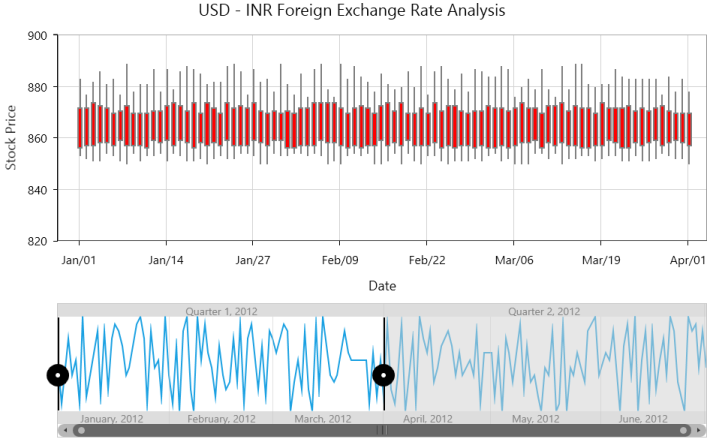
chart.Series.Add(candleSeries);The following screenshot illustrates selecting one quarter of data.
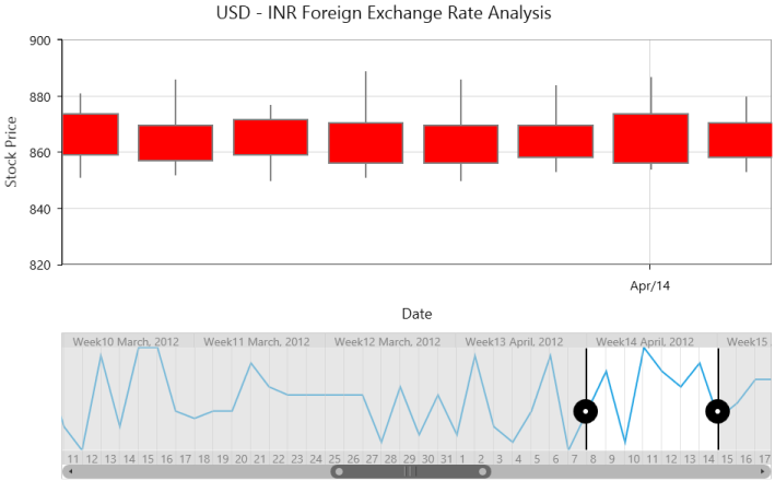
The following screenshot illustrates the control after zooming into weeks of data from 6 months of data.
Thumb style customization
SfDateTimeRangeNavigator LeftThumbStyle and RightThumbStyle can be customized by using the following properties:
SymbolTemplate
SymbolTemplate gets or sets the data template for the symbol.
<syncfusion:SfDateTimeRangeNavigator x:Name="navigator">
    <syncfusion:SfRangeNavigator.Resources>
        <DataTemplate x:Key="symbolTemplate">
            <Grid>
                <Rectangle
                    Height="30"
                    Width="40"
                    Fill="Green"
                    Stroke="Black"
                    StrokeThickness="2"
                    VerticalAlignment="Center"/>

                <Ellipse
                    Height="7"
                    Width="7"
                    Fill="White"
                    VerticalAlignment="Center"/>
            </Grid>
        </DataTemplate>
    </syncfusion:SfRangeNavigator.Resources>

    <syncfusion:SfDateTimeRangeNavigator.RightThumbStyle>
        <syncfusion:ThumbStyle SymbolTemplate="{StaticResource symbolTemplate}"/>
    </syncfusion:SfDateTimeRangeNavigator.RightThumbStyle>
</syncfusion:SfDateTimeRangeNavigator>
ThumbStyle thumbStyle = new ThumbStyle()
{
SymbolTemplate = grid.Resources["symbolTemplate"] as DataTemplate
};
SfDateTimeRangeNavigator rangeNavigator = new SfDateTimeRangeNavigator()
{
ItemsSource = new ViewModel().StockPriceDetails,
XBindingPath = "Date",
RightThumbStyle = thumbStyle
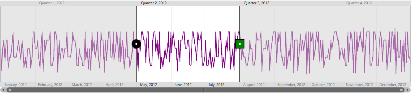
};The following screenshot illustrates the control after customizing the right thumb.
LineStyle
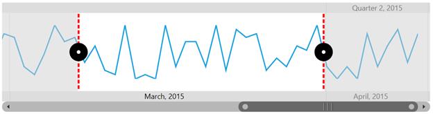
LineStyle gets or sets the style for the thumb line.
<Grid x:Name="grid">
    <Grid.Resources>
        <Style TargetType="Line" x:Key="lineStyle1">
            <Setter Property="Stroke" Value="Red"></Setter>
            <Setter Property="StrokeThickness" Value="3"></Setter>
            <Setter Property="StrokeDashArray" Value="2,1"></Setter>
        </Style>

        <Style TargetType="Line" x:Key="lineStyle2">
            <Setter Property="Stroke" Value="Red"></Setter>
            <Setter Property="StrokeThickness" Value="3"></Setter>
            <Setter Property="StrokeDashArray" Value="2,1"></Setter>
        </Style>
    </Grid.Resources>

    <syncfusion:SfDateTimeRangeNavigator>
        <syncfusion:SfDateTimeRangeNavigator.LeftThumbStyle>
            <syncfusion:ThumbStyle LineStyle="{StaticResource lineStyle1}"/>
        </syncfusion:SfDateTimeRangeNavigator.LeftThumbStyle>

        <syncfusion:SfDateTimeRangeNavigator.RightThumbStyle>
            <syncfusion:ThumbStyle LineStyle="{StaticResource lineStyle2}"/>
        </syncfusion:SfDateTimeRangeNavigator.RightThumbStyle>
    </syncfusion:SfDateTimeRangeNavigator>
</Grid>
ThumbStyle thumbLineStyle1 = new ThumbStyle()
{
LineStyle = grid.Resources["lineStyle1"] as Style
};
ThumbStyle thumbLineStyle2 = new ThumbStyle()
{
LineStyle = grid.Resources["lineStyle2"] as Style
};
SfDateTimeRangeNavigator rangeNavigator = new SfDateTimeRangeNavigator()
{
LeftThumbStyle = thumbLineStyle1,
RightThumbStyle = thumbLineStyle2
};
Higher and lower bars customization
| Property | Description |
|---|---|
| Defines the style for gridlines of upper labels bar. | |
| Defines the style for gridlines of lower labels bar. | |
| Defines the style for ticklines of upper labels bar. | |
| Defines the style for ticklines of lower labels bar. |