How can I help you?
Customization in WPF Range Selector (SfDateTimeRangeNavigator)
30 Apr 20266 minutes to read
Interval customization
The date-time range navigator control helps users to visualize large data in a simplified manner. The timespan of data is represented in the higher level bar and lower level bar. The timespan calculates data smartly and provides suitable date-time format and interval, by default.
Users can also set the interval as needed for their data. This can be done by using the interval as demonstrated in the following code sample.
Properties
| Property | Description |
|---|---|
| Sets the interval type that needs to be displayed in the navigator. | |
| Gets or sets string collection to set the label format for the navigator labels. |
<syncfusion:SfDateTimeRangeNavigator
    x:Name="rangepicker"
    ItemsSource="{Binding Power}"
    XBindingPath="Date">

    <syncfusion:SfDateTimeRangeNavigator.Intervals>
        <syncfusion:Interval IntervalType="Quarter"/>
        <syncfusion:Interval IntervalType="Month"/>
    </syncfusion:SfDateTimeRangeNavigator.Intervals>

    <syncfusion:SfDateTimeRangeNavigator.Content>
        <syncfusion:SfChart>
            <syncfusion:SfChart.PrimaryAxis>
                <syncfusion:CategoryAxis Visibility="Collapsed"/>
            </syncfusion:SfChart.PrimaryAxis>

            <syncfusion:SfChart.SecondaryAxis>
                <syncfusion:NumericalAxis Visibility="Collapsed"/>
            </syncfusion:SfChart.SecondaryAxis>

            <syncfusion:FastLineBitmapSeries
                ItemsSource="{Binding Power}"
                XBindingPath="Date"
                YBindingPath="Value">
            </syncfusion:FastLineBitmapSeries>
        </syncfusion:SfChart>
    </syncfusion:SfDateTimeRangeNavigator.Content>
</syncfusion:SfDateTimeRangeNavigator>
SfChart chart = new SfChart();
chart.PrimaryAxis = new CategoryAxis
{
Visibility = Visibility.Collapsed
};
chart.SecondaryAxis = new NumericalAxis
{
Visibility = Visibility.Collapsed
};
FastLineBitmapSeries candleSeries = new FastLineBitmapSeries
{
ItemsSource = new ViewModel().Power,
XBindingPath = "Date",
YBindingPath = "Value"
};
chart.Series.Add(candleSeries);
SfDateTimeRangeNavigator rangeNavigator = new SfDateTimeRangeNavigator
{
ItemsSource = new ViewModel().Power,
XBindingPath = "Date"
};
rangeNavigator.Intervals.Add(
new Interval { IntervalType = NavigatorIntervalType.Quarter });
rangeNavigator.Intervals.Add(
new Interval { IntervalType = NavigatorIntervalType.Month });
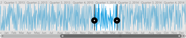
rangeNavigator.Content = chart;The following screenshot illustrates only Quarter and Month intervals in the navigator.
The interval can be set in the following types:
The auto timespan format simplifies the visual representation of data when zooming in with the following formats:
Intervals
| Intervals | Examples |
|---|---|
| HourInterval | 7/21/2011 12:00:00 AM > 12 AM7/21/2011 12:00:00 AM > 12A |
| DayInterval | 7/21/2011 12:00:00 AM > Thursday, July 21, 20117/21/2011 12:00:00 AM > Thu, Jul 21, 20117/21/2011 12:00:00 AM > Thursday, 217/21/2011 12:00:00 AM > Thu, 21 |
| WeekInterval | 7/21/2011 12:00:00 AM > Week 29, July, 20117/21/2011 12:00:00 AM > Week 29, Jul, 20117/21/2011 12:00:00 AM > Week 297/21/2011 12:00:00 AM > W29 |
| MonthInterval | 7/21/2011 12:00:00 AM > July, 20117/21/2011 12:00:00 AM > July7/21/2011 12:00:00 AM > Jul7/21/2011 12:00:00 AM > J |
| QuarterInterval | 7/21/2011 12:00:00 AM > Quarter 3, 20117/21/2011 12:00:00 AM > Quarter 37/21/2011 12:00:00 AM > Q3, 20117/21/2011 12:00:00 AM > Q3 |
| YearInterval | 7/21/2011 12:00:00 AM > 2011 |
Label style customization
| Property | Description |
|---|---|
| Allows to customize the label style using the LabelBarStyle property, and this property can be applied to the or . | |
| Defines the label style for labels in the selected region. | |
| Positions the upper and lower labels inside or outside the label bar. |
<syncfusion:SfDateTimeRangeNavigator x:Name="navigator">
	<syncfusion:SfRangeNavigator.Resources>
		<Style TargetType="TextBlock" x:Key="labelStyle">
			<Setter Property="FontSize" Value="10"/>
		</Style>
	</syncfusion:SfRangeNavigator.Resources>

	<syncfusion:SfDateTimeRangeNavigator.HigherLevelBarStyle>
		<syncfusion:LabelBarStyle
			Background="Red"
			LabelHorizontalAlignment="Left"
			SelectedLabelStyle="{StaticResource labelStyle}"/>
	</syncfusion:SfDateTimeRangeNavigator.HigherLevelBarStyle>
</syncfusion:SfDateTimeRangeNavigator>
LabelBarStyle barStyle = new LabelBarStyle()
{
LabelHorizontalAlignment = HorizontalAlignment.Left,
Background = new SolidColorBrush(Colors.Red),
SelectedLabelStyle = grid.Resources["labelStyle"] as Style
};
SfDateTimeRangeNavigator rangeNavigator = new SfDateTimeRangeNavigator()
{
HigherLevelBarStyle = barStyle
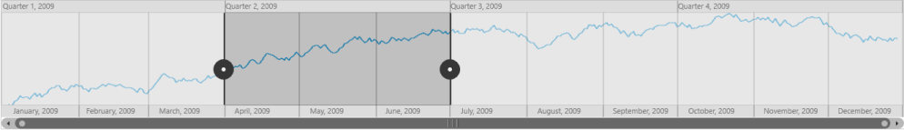
};The following screenshot illustrates setting the Label HorizontalAlignment to left.
Visibility of label bar
SfDateTimeRangeNavigator provides support to customize the visibility of lower bar and upper bar using the LowerLabelBarVisibility and UpperLabelBarVisibility types.
RangePadding Customization
The date-time range navigator supports the following types of padding.
- None
- Round
None
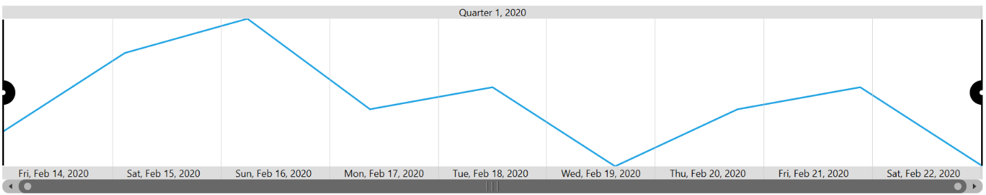
When the value of the RangePadding is None, padding is not applied to the range.
The following screenshot demonstrates a RangePadding set to None.
<Syncfusion:SfDateTimeRangeNavigator RangePadding="None"></Syncfusion:SfDateTimeRangeNavigator >SfDateTimeRangeNavigator rangeNavigator = new SfDateTimeRangeNavigator
{
RangePadding = NavigatorRangePadding.None
};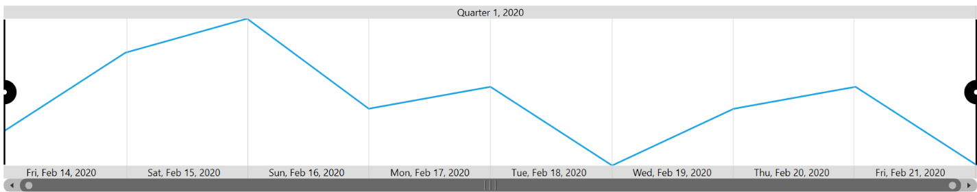
Round
When the value of RangePadding property is Round, range will be rounded to the nearest possible value by the interval.
<Syncfusion:SfDateTimeRangeNavigator RangePadding="Round"></Syncfusion:SfDateTimeRangeNavigator>SfDateTimeRangeNavigator rangeNavigator = new SfDateTimeRangeNavigator
{
RangePadding = NavigatorRangePadding.Round
};