WPF Linear ProgressBar Overview
10 Jun 20261 minute to read
The SfLinearProgressBar control for WPF provides a customizable visual to indicate the progress of an operation and let users know the remaining time for completion.
Key features
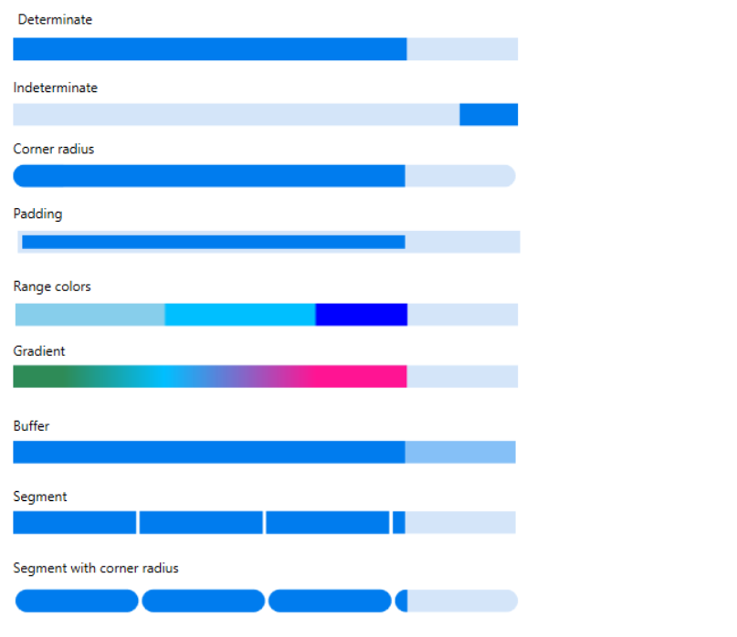
• Determinate and indeterminate: Determinate shows specific quantity of progress that occurred and indeterminate shows a redundant animations of linear progress.
• Corner radius: It customizes to frame rounded edges in the Linear ProgressBar.
• Padding: Padding generates space between track bar and progress bar in Linear ProgressBar.
• Ranges: Specifies the start position and end position to visualize multiple ranges with different colors that are mapped to each range.
• Gradient: Gradient shows change in intensity of the colors during the linear progress.
• Segments: Segment splits the ProgressBar into multiple segments and indicates the progress.
• Segment with corner radius: Segment with corner radius splits the Linear ProgressBar into multiple segments with the rounded edges at the corner.