Dropdown Customization in WinUI Time Picker
18 Nov 20187 minutes to read
This section describes about various dropdown customization options available in Time Picker control.
Customize the dropdown button
You can customize the UI of dropdown button by using the DropDownButtonTemplate property. The DataContext of DropDownButtonTemplate property is SfTimePicker.
<Window
    ...
     xmlns:editors="using:Syncfusion.UI.Xaml.Editors">
    <Grid>
        <Grid.Resources>
            <x:String x:Key="flight">M11.294993,2L15.378997,14 15.277995,14 13.188995,14 9.1429941,14 7.6250149,14 6.9399958,14 6.0199964,11.5 3.2099977,11.5 4.725997,16.014 3.2099977,20.5 6.0199964,20.5 6.8039956,18 7.6250201,18 8.8379947,18 15.288014,18 15.365021,18.000015 11.436984,30.000015 14.368989,30.000015 20.100004,18.000015 20.273989,18.000015 27.989002,18C29.084003,18 29.975004,17.121 29.975004,15.96 29.975004,14.879 29.084003,14 27.989002,14L22.309006,14 20.211995,14 20.096004,14 14.368996,2z M8.6259891,0L15.719998,0 21.367719,12 27.989002,12C30.205004,12,32.001007,13.773,32.001007,15.96L32.001007,16.04C32.001007,18.227,30.205004,20,27.989002,20L21.366735,20 15.719025,32.000015 8.6260106,32.000015 12.536309,20 8.2531061,20 7.5219953,22.5 0,22.5 2.5709982,16.013 0,9.5 7.4539952,9.5 8.3923279,12 12.537137,12z</x:String>
        </Grid.Resources>
        <editors:SfTimePicker
        x:Name="sfTimePicker" VerticalAlignment="Top" Width="180" Height="40"
        PlaceholderText="pick a travel time">
            <editors:SfTimePicker.DropDownButtonTemplate>
                <DataTemplate>
                    <Grid>
                        <Path
                        Width="20"
                        Height="20"
                        Data="{StaticResource flight}"
                        Fill="{Binding Foreground, RelativeSource={RelativeSource Mode=TemplatedParent}}"
                        RenderTransformOrigin="0.5,0.5"
                        Stretch="Uniform" />
                    </Grid>
                </DataTemplate>
            </editors:SfTimePicker.DropDownButtonTemplate>
        </editors:SfTimePicker>
    </Grid>
</Window>
Download demo application from GitHub
Hide dropdown button
You can hide the dropdown button in the WinUI Time Picker by setting the ShowDropDownButton property value as false. The default value of ShowDropDownButton property is true.
To open a dropdown time spinner, press the
Alt+Down Arrowkeys.
<Window
    ...
     xmlns:editors="using:Syncfusion.UI.Xaml.Editors">
    <editors:SfTimePicker
                          x:Name="sfTimePicker"
                          ShowDropDownButton="False"/>
</Window>
using Syncfusion.UI.Xaml.Editors;
SfTimePicker sfTimePicker = new SfTimePicker();
sfTimePicker.ShowDropDownButton = false;

Download demo application from GitHub
Change dropdown alignment
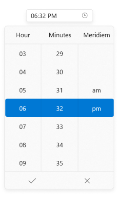
You can change the alignment of the dropdown time spinner as full, center, left, right, top or bottom edge of the WinUI Time Picker by using the DropDownPlacement property. The default value of DropDownPlacement property is Bottom.
If you change the dropdown alignment by using
DropDownPlacementproperty and there is not sufficient space, then theWinUI Time Pickersmartly shifts the spinner alignment.
<Window
    ...
     xmlns:editors="using:Syncfusion.UI.Xaml.Editors">
    <editors:SfTimePicker
                          x:Name="sfTimePicker"
                          DropDownPlacement="BottomEdgeAlignedLeft" />
</Window>
using Microsoft.UI.Xaml.Controls.Primitives;
using Syncfusion.UI.Xaml.Editors;
SfTimePicker sfTimePicker = new SfTimePicker();
sfTimePicker.DropDownPlacement = FlyoutPlacementMode.BottomEdgeAlignedLeft;
Download demo application from GitHub
Open dropdown programmatically
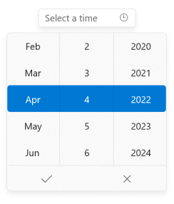
You can open or close the dropdown time spinner programmatically by setting IsOpen property value as true or false. The default value of IsOpen property is false.
<Window
    ...
     xmlns:editors="using:Syncfusion.UI.Xaml.Editors">
    <editors:SfTimePicker
                          x:Name="sfTimePicker"
                          IsOpen="True"/>
</Window>
using Syncfusion.UI.Xaml.Editors;
SfTimePicker sfTimePicker = new SfTimePicker();
sfTimePicker.IsOpen = true;
Download demo application from GitHub
Change dropdown height
You can change the height of the dropdown time spinner by using the DropDownHeight property. Based on the value of DropDownHeight, ItemWidth and ItemHeight properties, particular time cells will be visible. The default value of DropDownHeight property is Auto.
<Window
    ...
     xmlns:editors="using:Syncfusion.UI.Xaml.Editors">
    <editors:SfTimePicker
                          x:Name="sfTimePicker"
                          DropDownHeight="200" />
</Window>
using Syncfusion.UI.Xaml.Editors;
SfTimePicker sfTimePicker = new SfTimePicker();
sfTimePicker.DropDownHeight = 200;

Download demo application from GitHub
Change the number of time cells to be shown in the dropdown
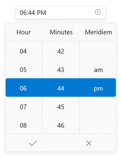
You can change the number of dropdown cells to be shown in the dropdown time spinner by using the VisibleItemsCount property. The default value of VisibleItemsCount property is 7.
When the
DropDownHeightandVisibleItemsCountproperties are set, theVisibleItemsCountproperty has higher precedence.
<Window
    ...
     xmlns:editors="using:Syncfusion.UI.Xaml.Editors">
    <editors:SfTimePicker
                          x:Name="sfTimePicker"
                          VisibleItemsCount="5" />
</Window>
using Syncfusion.UI.Xaml.Editors;
SfTimePicker sfTimePicker = new SfTimePicker();
sfTimePicker.VisibleItemsCount = 5;
Download demo application from GitHub