How can I help you?
Theme support in WinUI Segmented Control
20 Dec 20218 minutes to read
This section explains Segmented Control’s various themes and how to customize the appearance with keys.
Set the Themes in Segmented Control
The Segmented Control provides various themes to be applied by setting the theme name in RequestedTheme property in the App.xaml file.
Dark Theme
<Application
    x:Class="UI_Customization.App"
    xmlns="http://schemas.microsoft.com/winfx/2006/xaml/presentation"
    xmlns:x="http://schemas.microsoft.com/winfx/2006/xaml"
    xmlns:local="using:UI_Customization" RequestedTheme="Dark">
</Application>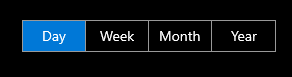
Light Theme
<Application
    x:Class="UI_Customization.App"
    xmlns="http://schemas.microsoft.com/winfx/2006/xaml/presentation"
    xmlns:x="http://schemas.microsoft.com/winfx/2006/xaml"
    xmlns:local="using:UI_Customization" RequestedTheme="Light">
</Application>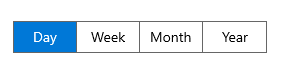
Customization using keys
The Segmented Control can be customized using the theme keys for following interactions.
- Hover.
- Selection.
- Selected hover.
- Disable.
| Key | Description |
|---|---|
| SyncfusionSegmentedControlBackground | Used to set the background color of the segmented control. |
| SyncfusionSegmentedItemBackground | Used to set the background control of the segmented item. |
| SyncfusionSegmentedItemHoverBackground | Used to set the hover background color of the segmented item. |
| SyncfusionSegmentedItemSelectedHoverBackground | Used to set the selected hover background color of the segmented item. |
| SyncfusionSegmentedItemSelectedBackground | Used to set the selected background color of the segmented item. |
| SyncfusionSegmentedItemForeground | Used to set the foreground color of the segmented item. |
| SyncfusionSegmentedItemHoverForeground | Used to set the hover foreground color of the segmented item. |
| SyncfusionSegmentedItemSelectedHoverForeground | Used to set the selected hover foreground color of the segmented item. |
| SyncfusionSegmentedItemSelectedForeground | Used to set the selected foreground color of the segmented item. |
| SyncfusionSegmentedControlBorderBrush | Used to set the border color of the segmented control. |
| SyncfusionSegmentedItemDisabledBackground | Used to set the background color of the disabled item. |
| SyncfusionSegmentedItemDisabledForeground | Used to set the foreground color of the disabled item. |
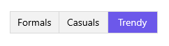
The following code example illustrates how to customize the segmented control using keys.
<Window
    x:Class="GettingStarted.MainWindow"
    xmlns="http://schemas.microsoft.com/winfx/2006/xaml/presentation"
    xmlns:x="http://schemas.microsoft.com/winfx/2006/xaml"
    xmlns:local="using:GettingStarted"
    xmlns:d="http://schemas.microsoft.com/expression/blend/2008"
    xmlns:mc="http://schemas.openxmlformats.org/markup-compatibility/2006"
    xmlns:syncfusion="using:Syncfusion.UI.Xaml.Editors"
    mc:Ignorable="d">
    <Grid>
        <Grid.DataContext>
            <local:SegmentedViewModel/>
        </Grid.DataContext>
        <syncfusion:SfSegmentedControl x:Name="segmentedControl"
                                    HorizontalAlignment="Center"
                                    VerticalAlignment="Center"
                                    SelectedIndex="2"
                                    DisplayMemberPath="Name"
                                    ItemsSource="{Binding ShirtModels}">
            <syncfusion:SfSegmentedControl.Resources>
                <ResourceDictionary>
                    <ResourceDictionary.ThemeDictionaries>
                        <ResourceDictionary x:Key="Light">
                            <SolidColorBrush x:Key="SyncfusionSegmentedControlBackground" Color="#F2F2F2"/>
                            <SolidColorBrush x:Key="SyncfusionSegmentedItemBackground" Color="#F2F2F2"/>
                            <SolidColorBrush x:Key="SyncfusionSegmentedItemSelectedBackground" Color="#6C58EA"/>
                            <SolidColorBrush x:Key="SyncfusionSegmentedItemHoverBackground" Color="#E8E4FF"/>
                            <SolidColorBrush x:Key="SyncfusionSegmentedItemSelectedHoverBackground" Color="#E8E4FF"/>
                            <SolidColorBrush x:Key="SyncfusionSegmentedItemForeground" Color="Black"/>
                            <SolidColorBrush x:Key="SyncfusionSegmentedItemHoverForeground" Color="Black"/>
                            <SolidColorBrush x:Key="SyncfusionSegmentedItemSelectedHoverForeground" Color="Black"/>
                            <SolidColorBrush x:Key="SyncfusionSegmentedItemSelectedForeground" Color="White"/>
                            <SolidColorBrush x:Key="SyncfusionSegmentedControlBorderBrush" Color="#D9D9D9"/>
                        </ResourceDictionary>
                        <ResourceDictionary x:Key="Dark">
                            <SolidColorBrush x:Key="SyncfusionSegmentedControlBackground" Color="#414141"/>
                            <SolidColorBrush x:Key="SyncfusionSegmentedItemBackground" Color="#414141"/>
                            <SolidColorBrush x:Key="SyncfusionSegmentedItemSelectedBackground" Color="#08B2A8"/>
                            <SolidColorBrush x:Key="SyncfusionSegmentedItemHoverBackground" Color="#365856"/>
                            <SolidColorBrush x:Key="SyncfusionSegmentedItemSelectedHoverBackground" Color="#365856"/>
                            <SolidColorBrush x:Key="SyncfusionSegmentedItemForeground" Color="White"/>
                            <SolidColorBrush x:Key="SyncfusionSegmentedItemHoverForeground" Color="White"/>
                            <SolidColorBrush x:Key="SyncfusionSegmentedItemSelectedHoverForeground" Color="White"/>
                            <SolidColorBrush x:Key="SyncfusionSegmentedItemSelectedForeground" Color="White"/>
                            <SolidColorBrush x:Key="SyncfusionSegmentedControlBorderBrush" Color="#5F5E5E"/>
                        </ResourceDictionary>
                    </ResourceDictionary.ThemeDictionaries>
                </ResourceDictionary>
            </syncfusion:SfSegmentedControl.Resources>
        </syncfusion:SfSegmentedControl>
    </Grid>
</Window>
Light Theme
Dark Theme

NOTE