How can I help you?
Selection in WinUI Segmented Control
20 Dec 202121 minutes to read
This section explains about features that aid in the selection of items, customization of the selected item, and its related operations in the Segmented Control.
Selected index
The Segmented Control allows you to select the segment item based on data source index using the SelectedIndex property.
<Window
    x:Class="GettingStarted.MainWindow"
    xmlns="http://schemas.microsoft.com/winfx/2006/xaml/presentation"
    xmlns:x="http://schemas.microsoft.com/winfx/2006/xaml"
    xmlns:local="using:GettingStarted"
    xmlns:d="http://schemas.microsoft.com/expression/blend/2008"
    xmlns:mc="http://schemas.openxmlformats.org/markup-compatibility/2006"
    xmlns:syncfusion="using:Syncfusion.UI.Xaml.Editors"
    mc:Ignorable="d">
    <Grid>
        <Grid.DataContext>
            <local:SegmentedViewModel/>
        </Grid.DataContext>
        <syncfusion:SfSegmentedControl x:Name="segmentWithSelectedIndex"
                                    HorizontalAlignment="Center"
                                    VerticalAlignment="Center"
                                    SelectedIndex="2"
                                    DisplayMemberPath="Name"
                                    ItemsSource="{Binding Days}">
            </syncfusion:SfSegmentedControl>
    </Grid>
</Window>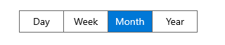
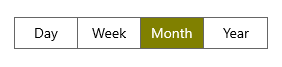
Selected item customization
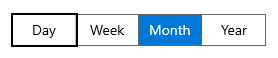
The Segmented Control allows you to customize the appearance of selected item using the SelectedSegmentStyle property. You need to provide the style with target type SelectedSegmentBorder.
<Window
    x:Class="GettingStarted.MainWindow"
    xmlns="http://schemas.microsoft.com/winfx/2006/xaml/presentation"
    xmlns:x="http://schemas.microsoft.com/winfx/2006/xaml"
    xmlns:local="using:GettingStarted"
    xmlns:d="http://schemas.microsoft.com/expression/blend/2008"
    xmlns:mc="http://schemas.openxmlformats.org/markup-compatibility/2006"
    xmlns:syncfusion="using:Syncfusion.UI.Xaml.Editors"
    mc:Ignorable="d">
    <Grid>
        <Grid.DataContext>
            <local:SegmentedViewModel/>
        </Grid.DataContext>
         <Grid.Resources>
            <Style TargetType="syncfusion:SelectedSegmentBorder" x:Key="selectedItemStyle">
               <Setter Property="Background" Value="Olive"/>
            </Style>
        </Grid.Resources>
        <syncfusion:SfSegmentedControl x:Name="segmentedControl"
                                    HorizontalAlignment="Center"
                                    VerticalAlignment="Center"
                                    SelectedIndex="2"
                                    SelectedSegmentStyle="{StaticResource selectedItemStyle}"
                                    DisplayMemberPath="Name"
                                    ItemsSource="{Binding Days}">
        </syncfusion:SfSegmentedControl>
    </Grid>
</Window>
NOTE
Users cannot change the selected item foreground using SelectedSegmentStyle.
Shadow effect
By setting the HasShadow property value to true in the SelectedSegmentBorder style and assign that style to SelectedSegmentStyle property in the Segmented control to enable a shadow effect for a selected segment item. Also, you can customize the appearance of the shadow effect using the ShadowColor property.
<Window
    x:Class="Shadow_effect.MainWindow"
    xmlns="http://schemas.microsoft.com/winfx/2006/xaml/presentation"
    xmlns:x="http://schemas.microsoft.com/winfx/2006/xaml"
    xmlns:local="using:Shadow_effect"
    xmlns:d="http://schemas.microsoft.com/expression/blend/2008"
    xmlns:mc="http://schemas.openxmlformats.org/markup-compatibility/2006"
    xmlns:syncfusion="using:Syncfusion.UI.Xaml.Editors"
    mc:Ignorable="d">
    <Grid>
        <Grid.DataContext>
            <local:SegmentedViewModel/>
        </Grid.DataContext>
        <Grid.Resources>
            <ResourceDictionary>
                <ResourceDictionary.ThemeDictionaries>
                    <ResourceDictionary x:Key="Light">
                        <SolidColorBrush x:Key="SelectedBackground" Color="#00b7c0"/>
                    </ResourceDictionary>
                    <ResourceDictionary x:Key="Dark">
                        <SolidColorBrush x:Key="SelectedBackground" Color="#00b7c0"/>
                    </ResourceDictionary>
                </ResourceDictionary.ThemeDictionaries>
                <Style TargetType="syncfusion:SelectedSegmentBorder" x:Key="shirtModelStyle">
                    <Setter Property="CornerRadius" Value="4"/>
                    <Setter Property="HasShadow" Value="True"/>
                    <Setter Property="ShadowColor" Value="#00b7c0"/>
                    <Setter Property="Background" Value="{ThemeResource SelectedBackground}"/>
                </Style>
            </ResourceDictionary>
        </Grid.Resources>
        <StackPanel HorizontalAlignment="Center" VerticalAlignment="Center">
            <syncfusion:SfSegmentedControl x:Name="segmentWithShadow"
                                    Height="40"
                                    SelectedIndex="1"
                                    CornerRadius="4"
                                    BorderThickness="2"
                                    ItemBorderThickness="0"
                                    DisplayMemberPath="Name"
                                    SelectedSegmentStyle="{StaticResource shirtModelStyle}"
                                    ItemsSource="{Binding ShirtModels}">
                <syncfusion:SfSegmentedControl.Resources>
                    <ResourceDictionary>
                        <ResourceDictionary.ThemeDictionaries>
                            <ResourceDictionary x:Key="Light">
                                <SolidColorBrush x:Key="SyncfusionSegmentedControlBackground" Color="#F2F2F2"/>
                                <SolidColorBrush x:Key="SyncfusionSegmentedItemBackground" Color="#F2F2F2"/>
                                <SolidColorBrush x:Key="SyncfusionSegmentedItemSelectedBackground" Color="#00b7c0"/>
                                <SolidColorBrush x:Key="SyncfusionSegmentedItemHoverBackground" Color="#5bdae4"/>
                                <SolidColorBrush x:Key="SyncfusionSegmentedItemSelectedHoverBackground" Color="#00b7c0"/>
                                <SolidColorBrush x:Key="SyncfusionSegmentedItemForeground" Color="Black"/>
                                <SolidColorBrush x:Key="SyncfusionSegmentedItemHoverForeground" Color="White"/>
                                <SolidColorBrush x:Key="SyncfusionSegmentedItemSelectedHoverForeground" Color="White"/>
                                <SolidColorBrush x:Key="SyncfusionSegmentedItemSelectedForeground" Color="White"/>
                                <SolidColorBrush x:Key="SyncfusionSegmentedControlBorderBrush" Color="#D9D9D9"/>
                            </ResourceDictionary>
                            <ResourceDictionary x:Key="Dark">
                                <SolidColorBrush x:Key="SyncfusionSegmentedControlBackground" Color="#414141"/>
                                <SolidColorBrush x:Key="SyncfusionSegmentedItemBackground" Color="#414141"/>
                                <SolidColorBrush x:Key="SyncfusionSegmentedItemSelectedBackground" Color="#00b7c0"/>
                                <SolidColorBrush x:Key="SyncfusionSegmentedItemHoverBackground" Color="#5bdae4"/>
                                <SolidColorBrush x:Key="SyncfusionSegmentedItemSelectedHoverBackground" Color="#00b7c0"/>
                                <SolidColorBrush x:Key="SyncfusionSegmentedItemForeground" Color="White"/>
                                <SolidColorBrush x:Key="SyncfusionSegmentedItemHoverForeground" Color="White"/>
                                <SolidColorBrush x:Key="SyncfusionSegmentedItemSelectedHoverForeground" Color="White"/>
                                <SolidColorBrush x:Key="SyncfusionSegmentedItemSelectedForeground" Color="White"/>
                                <SolidColorBrush x:Key="SyncfusionSegmentedControlBorderBrush" Color="#5F5E5E"/>
                            </ResourceDictionary>
                        </ResourceDictionary.ThemeDictionaries>
                    </ResourceDictionary>
                </syncfusion:SfSegmentedControl.Resources>
                <syncfusion:SfSegmentedControl.ItemContainerStyle>
                    <Style TargetType="syncfusion:SfSegmentedItem">
                        <Setter Property="Margin" Value="3" />
                        <Setter Property="CornerRadius" Value="4" />
                    </Style>
                </syncfusion:SfSegmentedControl.ItemContainerStyle>
            </syncfusion:SfSegmentedControl>
        </StackPanel>
    </Grid>
</Window>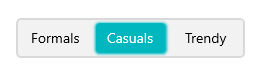
NOTE
Animation
The Segmented Control supports slide animation for selecting the item. Also, users can enable or disable the selection animation using the SelectionAnimationType property. This property has following two values:
-
Slide- The slide animation effect is applied while selecting the item. -
None- Disables animation while selecting the item.
NOTE
The default value of SelectionAnimationType property property is Slide.
Slide
When setting SelectionAnimationType to Slide, then the slide animation effect is applied while selecting the item.
<Window
    x:Class="GettingStarted.MainWindow"
    xmlns="http://schemas.microsoft.com/winfx/2006/xaml/presentation"
    xmlns:x="http://schemas.microsoft.com/winfx/2006/xaml"
    xmlns:local="using:GettingStarted"
    xmlns:d="http://schemas.microsoft.com/expression/blend/2008"
    xmlns:mc="http://schemas.openxmlformats.org/markup-compatibility/2006"
    xmlns:syncfusion="using:Syncfusion.UI.Xaml.Editors"
    mc:Ignorable="d">
    <Grid>
        <Grid.DataContext>
            <local:SegmentedViewModel/>
        </Grid.DataContext>
        <syncfusion:SfSegmentedControl x:Name="segmentedControl"
                                    HorizontalAlignment="Center"
                                    VerticalAlignment="Center"
                                    SelectedIndex="0"
                                    SelectionAnimationType="Slide"
                                    DisplayMemberPath="Name"
                                    ItemsSource="{Binding Days}">
        </syncfusion:SfSegmentedControl>
    </Grid>
</Window>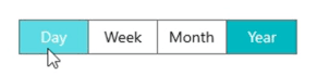
None
The animation effect can be disabled while selecting the item by setting the SelectionAnimationType to None.
<Window
    x:Class="GettingStarted.MainWindow"
    xmlns="http://schemas.microsoft.com/winfx/2006/xaml/presentation"
    xmlns:x="http://schemas.microsoft.com/winfx/2006/xaml"
    xmlns:local="using:GettingStarted"
    xmlns:d="http://schemas.microsoft.com/expression/blend/2008"
    xmlns:mc="http://schemas.openxmlformats.org/markup-compatibility/2006"
    xmlns:syncfusion="using:Syncfusion.UI.Xaml.Editors"
    mc:Ignorable="d">
    <Grid>
        <Grid.DataContext>
            <local:SegmentedViewModel/>
        </Grid.DataContext>
        <syncfusion:SfSegmentedControl x:Name="segmentedControl"
                                    HorizontalAlignment="Center"
                                    VerticalAlignment="Center"
                                    SelectedIndex="0"
                                    SelectionAnimationType="None"
                                    DisplayMemberPath="Name"
                                    ItemsSource="{Binding Days}">
        </syncfusion:SfSegmentedControl>
    </Grid>
</Window>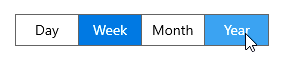
Keyboard behaviors
| Key or Key combinations | Description |
|---|---|
| LeftArrow | Moves to the previous item on the segmented control's left side. It does not make any selection and only navigates to the previous item. If the focus border is on the first item, pressing LeftArrow does nothing. |
| RightArrow | Moves to the next item on the segmented control's right side. It does not make any selection and only navigates to the next item. If the focus border is on the last item, pressing RightArrow does nothing. |
| Tab | The focus border appears on the selected item when users press the Tab key. The focus border appears on the first item, if there is no selected item. It will leave the control after pressing the Tab key with focus. |
| Enter | Pressing the Enter key when segment item in focus will make selection. |
SelectionChanged event
The SelectionChanged event is triggered, once the selection process has been completed for the selected item in the Segmented Control. The SegmentSelectionChangedEventArgs has the following values, which provides information for SelectionChanged event:
-
NewValue: Gets the new value of SelectedItem that has been assigned to the SegmentedControl. -
OldValue: Gets the old value of SelectedItem that has been assigned to the SegmentedControl.
segmentedControl.SelectionChanged += SegmentedControl_SelectionChanged;

private void SegmentedControl_SelectionChanged(object sender, SegmentSelectionChangedEventArgs e)
{
   var newValue = e.NewValue;
   var oldValue = e.OldValue;
}
NOTE