Legend in WinUI Polar Chart
18 Nov 201811 minutes to read
The legend contains a list of series in the chart. The information provided in each legend item helps to identify the corresponding series in the chart. The legend can be configured using the Legend property of SfPolarChart.
<chart:SfPolarChart>

    <!-- Configure additional chart elements -->
    <chart:SfPolarChart.Legend>
        <chart:ChartLegend/>
    </chart:SfPolarChart.Legend>
</chart:SfPolarChart>
SfPolarChart chart = new SfPolarChart();
chart.Legend = new ChartLegend();
// Configure additional chart elements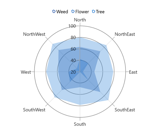
Title
The polar chart provides support to add any UIElement as a title for the legend. The Header property of ChartLegend is used to define the title for the legend.
<chart:SfPolarChart>
    <chart:SfPolarChart.Legend>
        <chart:ChartLegend>
            <chart:ChartLegend.Header>
                <TextBlock
                    Text="Plant Details"
                    HorizontalAlignment="Center"
                    FontWeight="Bold"
                    Foreground="Blue"/>
            </chart:ChartLegend.Header>
        </chart:ChartLegend>
    </chart:SfPolarChart.Legend>

    <!-- Configure additional chart elements -->
</chart:SfPolarChart>
SfPolarChart chart = new SfPolarChart();
ChartLegend legend = new ChartLegend();
TextBlock textBlock = new TextBlock()
{
Text = "Plant Details",
HorizontalTextAlignment = TextAlignment.Center,
Foreground = new SolidColorBrush(Colors.Blue),
FontWeight = FontWeights.Bold,
};
legend.Header = textBlock;
chart.Legend = legend;
// Configure additional chart elements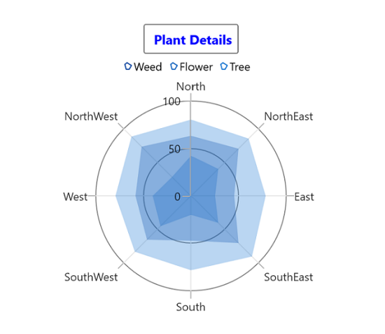
Icon
The legend icon represents a symbol associated with each legend item. The appearance of the legend icon can be customized using the following properties:
- IconWidth - Gets or sets the double value that represents the legend icon(s) width.
- IconHeight - Gets or sets the double value that represents that legend icon(s) height.
- IconVisibility - Gets or sets the visibility of the legend icon.
<chart:SfPolarChart>
    <chart:SfPolarChart.Legend>
        <chart:ChartLegend
            IconWidth="15"
            IconHeight="15"
            IconVisibility="Visible">
        </chart:ChartLegend>
    </chart:SfPolarChart.Legend>

    <!-- Configure additional chart elements -->
</chart:SfPolarChart>
SfPolarChart chart = new SfPolarChart();
chart.Legend = new ChartLegend()
{
IconWidth = 15,
IconHeight = 15,
IconVisibility = Visibility.Visible,
};
// Configure additional chart elements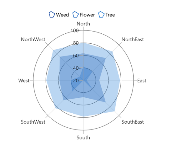
Item spacing
ItemMargin property of the ChartLegend is used to provide spacing between each legend item.
<chart:SfPolarChart>
    <chart:SfPolarChart.Legend>
        <chart:ChartLegend ItemMargin="10"/>
    </chart:SfPolarChart.Legend>

    <!-- Configure additional chart elements -->
</chart:SfPolarChart>
SfPolarChart chart = new SfPolarChart();
chart.Legend = new ChartLegend()
{
ItemMargin = new Thickness(10)
};
// Configure additional chart elements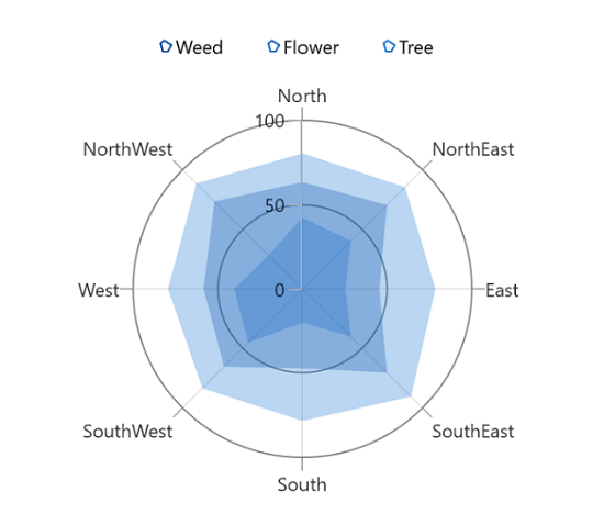
Checkbox for legend
The polar chart provides support to enable the checkbox for each legend item to show or collapse the corresponding series. By default, the value of the CheckBoxVisibility property is Collapsed.
<chart:SfPolarChart>
    <chart:SfPolarChart.Legend>
        <chart:ChartLegend CheckBoxVisibility="Visible"/>
    </chart:SfPolarChart.Legend>

    <!-- Configure additional chart elements -->
</chart:SfPolarChart>
SfPolarChart chart = new SfPolarChart();
chart.Legend = new ChartLegend()
{
CheckBoxVisibility = Visibility.Visible
};
// Configure additional chart elements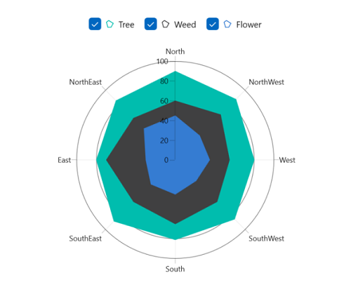
Toggle Series Visibility
By enabling the ToggleSeriesVisibility property, the visibility of the series can be controlled by tapping the legend item. By default, the value of the ToggleSeriesVisibility property is False.
<chart:SfPolarChart>
    <chart:SfPolarChart.Legend>
        <chart:ChartLegend ToggleSeriesVisibility="True"/>
    </chart:SfPolarChart.Legend>

    <!-- Configure additional chart elements -->
</chart:SfPolarChart>
SfPolarChart chart = new SfPolarChart();
chart.Legend = new ChartLegend()
{
ToggleSeriesVisibility = true
};
// Configure additional chart elements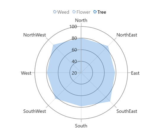
Placement
By using the Placement property, legends can be docked to the left, right, top, or bottom of the chart area. By default, the chart legend is docked at the top of the chart as mentioned earlier.
To display the legend at the right, set the Placement to LegendPlacement.Right as in the following code sample.
<chart:SfPolarChart>
    <chart:SfPolarChart.Legend>
        <chart:ChartLegend ItemMargin="10" Placement="Right"/>
    </chart:SfPolarChart.Legend>

    <!-- Configure additional chart elements -->
</chart:SfPolarChart>
SfPolarChart chart = new SfPolarChart();
chart.Legend = new ChartLegend()
{
Placement = LegendPlacement.Right,
ItemMargin = new Thickness(10),
};
// Configure additional chart elements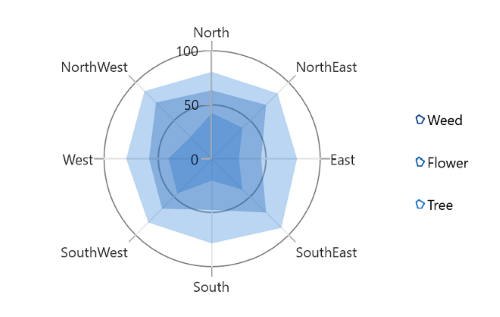
Background customization
The legend background appearance can be customized by using the following properties:
BorderThickness - used to change the stroke width of the legend.
BorderBrush - used to change the stroke color of the legend.
Background - used to change the background color of the legend.
CornerRadius - used to change the corner radius of the legend.
<chart:SfPolarChart>
    <chart:SfPolarChart.Legend>
        <chart:ChartLegend
            Background="LightGray"
            BorderBrush="Black"
            BorderThickness="1"
            CornerRadius="5">
        </chart:ChartLegend>
    </chart:SfPolarChart.Legend>

    <!-- Configure additional chart elements -->
</chart:SfPolarChart>
SfPolarChart chart = new SfPolarChart();
chart.Legend = new ChartLegend()
{
Background = new SolidColorBrush(Colors.LightGray),
BorderBrush = new SolidColorBrush(Colors.Black),
BorderThickness = new Thickness(1),
CornerRadius = new CornerRadius(5)
};
// Configure additional chart elementsTemplate
Customize each legend item by using the ItemTemplate property in ChartLegend, as shown in the following code sample.
<chart:SfPolarChart x:Name="chart">
    <chart:SfPolarChart.Resources>
        <DataTemplate x:Key="labelTemplate" x:DataType="chart:LegendItem">
            <StackPanel Margin="10" Orientation="Vertical">
                <Ellipse
                    Height="15"
                    Width="15"
                    Fill="{Binding IconBrush}"
                    Stroke="#4a4a4a"
                    StrokeThickness="2"/>
                <TextBlock
                    HorizontalAlignment="Center"
                    FontSize="12"
                    Foreground="Black"
                    FontWeight="SemiBold"
                    Text="{Binding Item._XAxesData}"/>
            </StackPanel>
        </DataTemplate>
    </chart:SfPolarChart.Resources>

    <!-- Configure additional chart elements -->
    <chart:SfPolarChart.Legend>
        <chart:ChartLegend ItemTemplate="{StaticResource labelTemplate}"/>
    </chart:SfPolarChart.Legend>
</chart:SfPolarChart>
SfPolarChart chart = new SfPolarChart();
// The 'labelTemplate' resource is defined in XAML Resources and referenced here.
chart.Legend = new ChartLegend()
{
ItemTemplate = chart.Resources["labelTemplate"] as DataTemplate
};
// Configure additional chart elements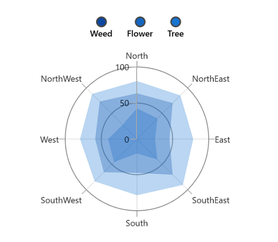
The Item property can be used to access the data linked to the associated model class. The binding context for ChartLegend
ItemTemplateis LegendItem, which provides the necessary data for the legend labels.