Data Label in WinUI Chart (SfPolarChart)
13 Jul 202613 minutes to read
Data labels are used to display values related to a chart segment. Values from data points (x, y) or other custom properties from a data source can be displayed.
Each data label can be represented by the following:
-
Label- displays the segment label content at the (X, Y) point. -
Connector line- used to connect the (X, Y) point and the label element.
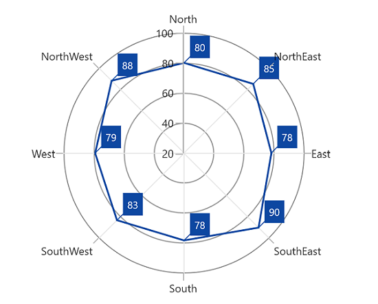
Enable Data Label
The ShowDataLabels property of a series is used to enable the data labels.
<chart:SfPolarChart>

    <!-- Configure additional chart elements -->
    <chart:PolarAreaSeries
        ShowDataLabels="True"
        ItemsSource="{Binding Data}"
        XBindingPath="Product"
        YBindingPath="SalesRate"/>

</chart:SfPolarChart>
SfPolarChart chart = new SfPolarChart();
PolarAreaSeries series = new PolarAreaSeries();
series.ShowDataLabels = true;
// Configure additional chart elements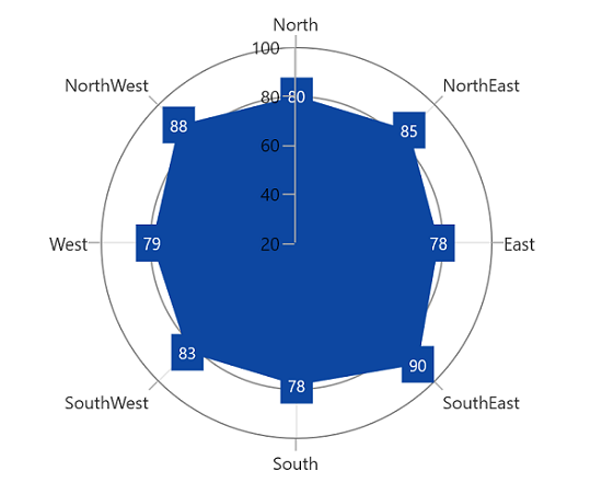
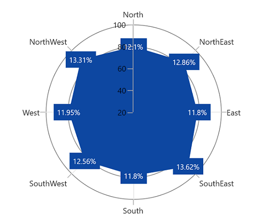
Context
To customize the content of data labels, you need to define DataLabelSettings of the series and set the Context property of DataLabelSettings to define the value to be displayed as the label content.
<chart:SfPolarChart>
    <chart:PolarAreaSeries
        ShowDataLabels="True"
        ItemsSource="{Binding PlantDetails}"
        XBindingPath="Direction"
        YBindingPath="Tree">
        <chart:PolarAreaSeries.DataLabelSettings>
            <chart:PolarDataLabelSettings Context="Percentage"/>
        </chart:PolarAreaSeries.DataLabelSettings>
    </chart:PolarAreaSeries>
</chart:SfPolarChart>
SfPolarChart chart = new SfPolarChart();
// Configure additional chart elements
PolarAreaSeries series = new PolarAreaSeries();
series.ShowDataLabels = true;
series.DataLabelSettings = new PolarDataLabelSettings()
{
Context = LabelContext.Percentage
};
Customization
The following properties are used to customize the data label.
- BorderBrush - used to change the border color.
- BorderThickness - used to change the thickness of the border.
- Margin - used to change the margin size for the label.
- FontStyle - used to change the font style of the label.
- FontSize - used to change the font size of the label.
- Foreground - used to change the text color of the label.
- FontFamily - used to change the font family of the label.
- Background - used to change the label background color.
<chart:SfPolarChart>

    <!-- Configure additional chart elements -->
    <chart:PolarAreaSeries
        ItemsSource="{Binding PlantDetails}"
        XBindingPath="Direction"
        YBindingPath="Tree"
        ShowDataLabels="True">
        <chart:PolarAreaSeries.DataLabelSettings>
            <chart:PolarDataLabelSettings
                Foreground="White"
                FontSize="12"
                BorderBrush="White"
                BorderThickness="1"
                Margin="1"
                FontStyle="Italic"
                FontFamily="Calibri"
                Background="#1E88E5">
            </chart:PolarDataLabelSettings>
        </chart:PolarAreaSeries.DataLabelSettings>
    </chart:PolarAreaSeries>

</chart:SfPolarChart>
SfPolarChart chart = new SfPolarChart();
// Configure additional chart elements
PolarAreaSeries series = new PolarAreaSeries();
series.ShowDataLabels = true;
series.DataLabelSettings = new PolarDataLabelSettings()
{
Foreground = new SolidColorBrush(Colors.White),
BorderBrush = new SolidColorBrush(Colors.White),
Background = new SolidColorBrush(Color.FromArgb(255, 30, 136, 229)),
BorderThickness = new Thickness(1),
Margin = new Thickness(1),
FontStyle = FontStyle.Italic,
FontFamily = new FontFamily("Calibri"),
FontSize = 12
};
// Configure additional chart elements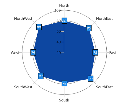
Template
The appearance of the data label can be customized using the ContentTemplate property of PolarDataLabelSettings as shown in the following code example.
<Grid x:Name="grid">
    <Grid.Resources>
        <DataTemplate x:Key="datalabelTemplate">
            <Grid>
                <Ellipse
                    Width="30"
                    Height="30"
                    HorizontalAlignment="Left"
                    VerticalAlignment="Top"
                    Fill="White"
                    Stroke="#0078DE"
                    StrokeThickness="2"/>
                <TextBlock
                    HorizontalAlignment="Center"
                    VerticalAlignment="Center"
                    FontFamily="Segoe UI"
                    FontSize="12"
                    Foreground="#FF585858"
                    Text="{Binding}"
                    TextWrapping="Wrap"/>
            </Grid>
        </DataTemplate>
    </Grid.Resources>

    <chart:SfPolarChart x:Name="chart">
        <chart:PolarAreaSeries ShowDataLabels="True">
            <chart:PolarAreaSeries.DataLabelSettings>
                <chart:PolarDataLabelSettings Context="YValue" ContentTemplate="{StaticResource datalabelTemplate}"/>
            </chart:PolarAreaSeries.DataLabelSettings>
        </chart:PolarAreaSeries>
    </chart:SfPolarChart>
</Grid>
SfPolarChart chart = new SfPolarChart();
// Configure additional chart elements
PolarAreaSeries series = new PolarAreaSeries();
series.ShowDataLabels = true;
// The 'datalabelTemplate' resource is defined in XAML Resources and referenced here.
series.DataLabelSettings = new PolarDataLabelSettings()
{
Context = LabelContext.YValue,
ContentTemplate = grid.Resources["datalabelTemplate"] as DataTemplate,
};
// Configure additional chart elements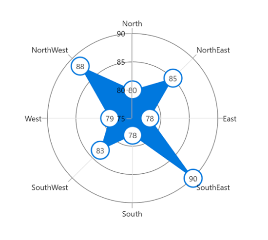
NOTE
The binding context for the DataLabelSettings
ContentTemplateis Context, which is used to customize the content of data labels. This property defines the value displayed in the data label, such as the X value or any other value from the underlying model object. By default, the value ofContextis YValue.
Format
The Format property can be used to format the data labels.
<chart:SfPolarChart x:Name="chart">

    <!-- Configure additional chart elements -->
    <chart:PolarLineSeries ShowDataLabels="True">
        <chart:PolarLineSeries.DataLabelSettings>
            <chart:PolarDataLabelSettings Format="#.0"/>
        </chart:PolarLineSeries.DataLabelSettings>
    </chart:PolarLineSeries>

</chart:SfPolarChart>
SfPolarChart chart = new SfPolarChart();
// Configure additional chart elements
PolarLineSeries series = new PolarLineSeries();
series.ShowDataLabels = true;
series.DataLabelSettings = new PolarDataLabelSettings()
{
Format = "#.0",
};
// Configure additional chart elements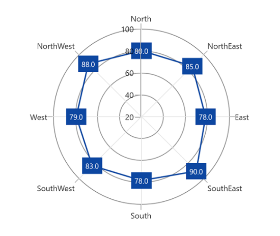
Rotation
Rotation property is used to define the angle by which the label should be rotated.
<chart:SfPolarChart x:Name="chart">

    <!-- Configure additional chart elements -->
    <chart:PolarLineSeries
        ShowDataLabels="True"
        ItemsSource="{Binding PlantDetails}"
        XBindingPath="Direction"
        YBindingPath="Tree">
        <chart:PolarLineSeries.DataLabelSettings>
            <chart:PolarDataLabelSettings Rotation="-45"/>
        </chart:PolarLineSeries.DataLabelSettings>
    </chart:PolarLineSeries>

</chart:SfPolarChart>
SfPolarChart chart = new SfPolarChart();
// Configure additional chart elements
PolarLineSeries series = new PolarLineSeries();
series.ShowDataLabels = true;
series.DataLabelSettings = new PolarDataLabelSettings()
{
Rotation = -45,
};
// Configure additional chart elements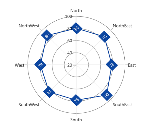
Applying Series Fill
The UseSeriesPalette property is used to set the Fill of the series to the data label background.
<chart:SfPolarChart x:Name="chart">

    <!-- Configure additional chart elements -->
    <chart:PolarLineSeries
        ShowDataLabels="True"
        ItemsSource="{Binding PlantDetails}"
        XBindingPath="Direction"
        YBindingPath="Tree">
        <chart:PolarLineSeries.DataLabelSettings>
            <chart:PolarDataLabelSettings UseSeriesPalette="True"/>
        </chart:PolarLineSeries.DataLabelSettings>
    </chart:PolarLineSeries>

</chart:SfPolarChart>
SfPolarChart chart = new SfPolarChart();
// Configure additional chart elements
PolarLineSeries series = new PolarLineSeries();
series.ShowDataLabels = true;
series.DataLabelSettings = new PolarDataLabelSettings()
{
UseSeriesPalette = true,
};
// Configure additional chart elements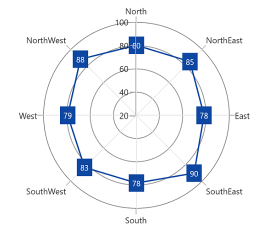
Connector Line
Connector line is used to connect the label and the data point using a line. The ShowConnectorLine property of PolarDataLabelSettings is used to enable the connector line in the polar chart.
The connector line can be customized using the following properties:
- ConnectorHeight - used to set the height for the connector line.
- ConnectorLineStyle - used to customize the style of the line.
- ConnectorRotation - used to rotate the connector line at any angle.
<chart:SfPolarChart x:Name="chart">

    <!-- Configure additional chart elements -->
    <chart:PolarLineSeries
        ShowDataLabels="True"
        ItemsSource="{Binding PlantDetails}"
        XBindingPath="Direction"
        YBindingPath="Tree">
        <chart:PolarLineSeries.DataLabelSettings>
            <chart:PolarDataLabelSettings
                ShowConnectorLine="True"
                ConnectorHeight="25"
                ConnectorRotation="45"/>
        </chart:PolarLineSeries.DataLabelSettings>
    </chart:PolarLineSeries>

</chart:SfPolarChart>
SfPolarChart chart = new SfPolarChart();
// Configure additional chart elements
PolarLineSeries series = new PolarLineSeries();
series.ShowDataLabels = true;
series.DataLabelSettings = new PolarDataLabelSettings()
{
ShowConnectorLine = true,
ConnectorHeight = 25,
ConnectorRotation = 45,
};
// Configure additional chart elements