How can I help you?
Content in WinUI BusyIndicator
4 Oct 20222 minutes to read
The BusyIndicator control provides an option to set the custom message that indicates the busy status of the control to the users by using the BusyContent property.
<notification:SfBusyIndicator IsActive="True"
     AnimationType="DottedCircle"
     BusyContent="Loading...">
</notification:SfBusyIndicator>
SfBusyIndicator busyIndicator = new SfBusyIndicator();
busyIndicator.IsActive = true;
busyIndicator.AnimationType = BusyIndicatorAnimationType.DottedCircle;
busyIndicator.BusyContent = "Loading...";
Busy content position
The content can be positioned at the top, bottom, right, or left of the indicator by using the BusyContentPosition property. The default value is Bottom.
<notification:SfBusyIndicator IsActive="True"
     AnimationType="DottedCircle"
     BusyContent="Loading..."
     BusyContentPosition="Top">
</notification:SfBusyIndicator>
SfBusyIndicator busyIndicator = new SfBusyIndicator();
busyIndicator.IsActive = true;
busyIndicator.AnimationType = BusyIndicatorAnimationType.DottedCircle;
busyIndicator.BusyContent = "Loading...";
busyIndicator.BusyContentPosition = BusyIndicatorContentPosition.Top;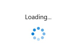
Busy content template
The BusyIndicator control provides options to customize the content by using the DataTemplate with the help of the BusyContentTemplate property.
<notification:SfBusyIndicator IsActive="True" AnimationType="DottedCircle">
    <notification:SfBusyIndicator.BusyContentTemplate>
        <DataTemplate>
            <TextBlock Text="Loading..." FontSize="18" FontStyle="Italic" FontWeight="Bold" Foreground="Red"/>
        </DataTemplate>
    </notification:SfBusyIndicator.BusyContentTemplate>
</notification:SfBusyIndicator>