Alignment and positioning in WinUI Badge
14 Jul 202611 minutes to read
This section explains the alignment and positioning functionalities available in the WinUI Badge control.
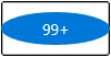
Alignment of Badge
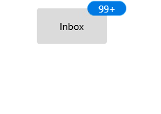
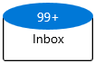
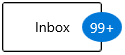
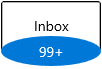
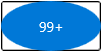
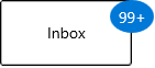
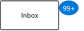
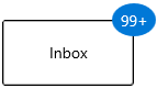
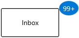
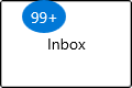
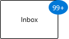
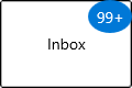
You can align the Badge either horizontally or vertically by using the HorizontalAlignment or VerticalAlignment properties. The default value of HorizontalAlignment property is Right and VerticalAlignment property is Top.
| HorizontalAlignment | ||||
|---|---|---|---|---|
| VerticalAlignment | Left | Center | Right | Stretch |
| Top | 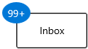 |
 |
 |
 |
| Center | 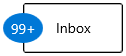 |
 |
 |
 |
| Bottom | 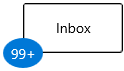 |
 |
 |
 |
| Stretch | 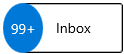 |
 |
 |
 |
<notification:BadgeContainer Name="badgeContainer"  >
    <notification:BadgeContainer.Badge>
        <notification:SfBadge HorizontalAlignment="Left"
                              VerticalAlignment="Center"
                              Content="99+"
                              Name="badge"/>
    </notification:BadgeContainer.Badge>
    <notification:BadgeContainer.Content>
        <Button Content="Inbox">
        </Button>
    </notification:BadgeContainer.Content>
</notification:BadgeContainer>badge.HorizontalAlignment = HorizontalAlignment.Left;
badge.VerticalAlignment = VerticalAlignment.Center;
badge.Content = "99+";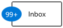
NOTE
Download demo application from GitHub.
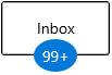
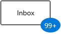
Positioning of Badge
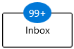
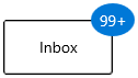
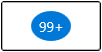
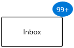
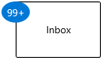
You can change the horizontal or vertical position of the Badge either inside, outside or in the middle by using the HorizontalAnchor and VerticalAnchor properties. It will be placed based on the value of HorizontalAlignment and VerticalAlignment properties. The default value of HorizontalAnchor and VerticalAnchor properties is Center.
For example, you will see how the HorizontalAnchor and VerticalAnchor values work based on the HorizontalAlignment and VerticalAlignment values. Here, the value of HorizontalAlignment properties is Right and VerticalAlignment property is Top.
| HorizontalAnchor | ||||
|---|---|---|---|---|
| VerticalAnchor | Inside | Center | OutSide | |
| Inside | 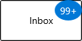 |
 |
 |
|
| Center | 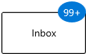 |
 |
 |
|
| Outside | 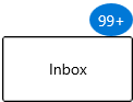 |
 |
 |
|
<notification:BadgeContainer Name="badgeContainer"  >
    <notification:BadgeContainer.Badge>
        <notification:SfBadge HorizontalAnchor="Outside"
                              VerticalAnchor="Center"
                              Content="99+"
                              Name="badge"/>
    </notification:BadgeContainer.Badge>
    <notification:BadgeContainer.Content>
        <Button Content="Inbox">
        </Button>
    </notification:BadgeContainer.Content>
</notification:BadgeContainer>badge.HorizontalAnchor = BadgeAnchor.Outside;
badge.VerticalAnchor = BadgeAnchor.Center;
badge.Content = "99+";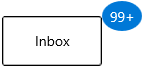
NOTE
Download demo application from GitHub.
Place the Badge anywhere on the container
If you want to place the Badge anywhere on the container, use the HorizontalPosition or VerticalPosition properties. The value range for HorizontalPosition and VerticalPosition properties is 0 to 1. The default value of HorizontalPosition property is 1 and VerticalPosition property is 0.
<notification:BadgeContainer>
    <notification:BadgeContainer.Content>
        <PersonPicture Width="100"
                       Height="100"
                       ProfilePicture="/Images/avatar.png"/>
    </notification:BadgeContainer.Content>
    <notification:BadgeContainer.Badge>
        <notification:SfBadge x:Name="badge3"
                              Shape="None"
                              HorizontalPosition="0.9"
                              VerticalPosition="0.8">
            <Ellipse Width="20" Height="20" Fill="LimeGreen"/>
        </notification:SfBadge>
    </notification:BadgeContainer.Badge>
</notification:BadgeContainer>badge3.HorizontalPosition = 0.9;
badge3.VerticalPosition = 0.8;
Custom alignment and positioning of Badge
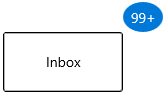
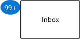
By using the HorizontalAlignment, VerticalAlignment, HorizontalAnchor, and VerticalAnchor properties, you can place Badge only at particular position. If you want to place the Badge at a custom position, use the HorizontalPosition and VerticalPosition properties, as well as the HorizontalAnchorPosition and VerticalAnchorPosition properties. This will be effective only by setting the HorizontalAnchor and VerticalAnchor properties value as Custom. The value range for the HorizontalAnchorPosition and VerticalAnchorPosition properties is 0 to 1. The default value of HorizontalAnchorPosition and VerticalAnchorPosition properties is 0.
For example, you will see how the HorizontalPosition and HorizontalAnchorPosition values work based on the VerticalAnchorPosition and VerticalPosition values. Here, VerticalPosition and VerticalAnchorPosition properties value is 0.
| HorizontalAnchorPosition | |||
|---|---|---|---|
| HorizontalPosition | 0 | 0.5 | 1 |
| 0 | 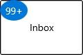 |
 |
 |
| 0.5 |  |
 |
 |
| 1 | 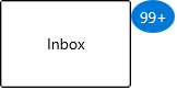 |
 |
 |
<notification:BadgeContainer Name="badgeContainer"  >
    <notification:BadgeContainer.Badge>
        <notification:Badge HorizontalAnchorPosition="0.2"
                            VerticalAnchorPosition="0"
                            HorizontalAnchor="Custom"
                            VerticalAnchor="Custom"
                            HorizontalPosition="0"
                            VerticalPosition="0"
                            Content="99+"
                            Name="badge"/>
    </notification:BadgeContainer.Badge>
    <notification:BadgeContainer.Content>
        <Button Content="Inbox">
        </Button>
    </notification:BadgeContainer.Content>
</notification:BadgeContainer>badge.HorizontalAnchor = BadgeAnchor.Custom;
badge.VerticalAnchor = BadgeAnchor.Custom;
badge.HorizontalAnchorPosition = 0.2;
badge.VerticalAnchorPosition = 0;
badge.HorizontalPosition = 0;
badge.VerticalPosition = 0;
badge.Content = "99+";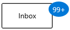
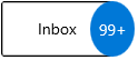
Badge content alignment
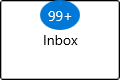
You can place the Badge content either horizontally or vertically by using the HorizontalContentAlignment or VerticalContentAlignment properties. The default value of HorizontalContentAlignment and VerticalContentAlignment properties is Center.
<notification:BadgeContainer Name="badgeContainer"  >
    <notification:BadgeContainer.Badge>
        <notification:SfBadge HorizontalContentAlignment="Right"
                              VerticalContentAlignment="Top"
                              Content="99+"
                              Name="badge"/>
    </notification:BadgeContainer.Badge>
    <notification:BadgeContainer.Content>
        <Button Content="Inbox">
        </Button>
    </notification:BadgeContainer.Content>
</notification:BadgeContainer>badge.HorizontalContentAlignment = HorizontalAlignment.Right;
badge.VerticalContentAlignment = VerticalAlignment.Top;
badge.Content = "99+";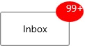
NOTE
Download demo application from GitHub.
Padding for Badge content
By default, Badge control size automatically assigned based on its content. You can change the left, right, top, and bottom content spacing of a Badge control by using the Padding property. The default value of Padding property is 0,0,0,0.
<notification:BadgeContainer Name="badgeContainer">
    <notification:BadgeContainer.Badge>
        <notification:SfBadge Padding="10"
                              Content="10"
                              Name="badge"/>
    </notification:BadgeContainer.Badge>
    <notification:BadgeContainer.Content>
        <Button Content="Inbox">
        </Button>
    </notification:BadgeContainer.Content>
</notification:BadgeContainer>badge.Padding = new Thickness() { Bottom = 10, Left = 10, Right = 10, Top = 10 };
badge.Content = "10";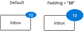
NOTE
Download demo application from GitHub.
Auto re-positioning support
If you change the container size, Badge will be repositioned automatically to the existing position on the container.
<notification:BadgeContainer Name="badgeContainer">
    <notification:BadgeContainer.Badge>
        <notification:SfBadge Content="99+"
                              Name="badge"/>
    </notification:BadgeContainer.Badge>
    <notification:BadgeContainer.Content>
        <Button Content="Inbox">
        </Button>
    </notification:BadgeContainer.Content>
</notification:BadgeContainer>badge.Content = "10";