Getting Started with WinUI Badge
14 Jul 202624 minutes to read
This section explains the steps required to add the WinUI Badge control and its elements such as shapes, alignment, and predefined colors. This section covers only basic features needed to get started with Syncfusion® Badge control.
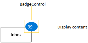
Structure of Badge control
Creating an application with WinUI Badge
- Create a WinUI 3 desktop app for C# and .NET 5.
- Add reference to Syncfusion.Notifications.WinUI NuGet.
- Import the control namespace
Syncfusion.UI.Xaml.Notificationsin XAML or C# code. -
Initialize the
SfBadgecontrol.<Page x:Class="GettingStarted.MainPage" xmlns="http://schemas.microsoft.com/winfx/2006/xaml/presentation" xmlns:x="http://schemas.microsoft.com/winfx/2006/xaml" xmlns:local="using:GettingStarted" xmlns:d="http://schemas.microsoft.com/expression/blend/2008" xmlns:mc="http://schemas.openxmlformats.org/markup-compatibility/2006" xmlns:notification="using:Syncfusion.UI.Xaml.Notifications" mc:Ignorable="d" Background="{ThemeResource ApplicationPageBackgroundThemeBrush}"> <Grid x:Name="grid"> <notification:SfBadge Name="badge" Height="30" Width="30"/> </Grid> </Page>using Syncfusion.UI.Xaml.Notifications; namespace GettingStarted { /// <summary> /// An empty page that can be used on its own or navigated to within a Frame. /// </summary> public sealed partial class MainPage : Page { public MainPage() { this.InitializeComponent(); // Creating an instance of the Badge control SfBadge badge = new SfBadge(); // Setting height and width to Badge control badge.Height = 30; badge.Width = 30; grid.Children.Add(badge); } } }
Adding Badge for a Button
If you want to assign a Badge to any object, create the Badge and assign the badge to the BadgeContainer.Badge property. Before that you need to create a BadgeContainer and add that object to the BadgeContainer.Content property.
Here, the Badge control has been added for the Button control.
<notification:BadgeContainer Name="badgeContainer"  >
    <notification:BadgeContainer.Badge>
        <notification:SfBadge Name="badge"
                              Content="10"/>
    </notification:BadgeContainer.Badge>
    <notification:BadgeContainer.Content>
        <Button Content="Inbox">
        </Button>
    </notification:BadgeContainer.Content>
</notification:BadgeContainer>
//Creating Badge control
SfBadge badge = new SfBadge();
badge.Content = "10";
BadgeContainer badgeContainer = new BadgeContainer();
badgeContainer.Content = new Button(){ Content="Inbox" };
//Assigning Badge control to the content of BadgeContainer
badgeContainer.Badge = badge;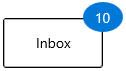
NOTE
Download demo application from GitHub.
Setting Badge display content
If you want to set or change the display content of the Badge, use the Content property. The default value of Content property is null.
<notification:BadgeContainer Name="badgeContainer"  >
    <notification:BadgeContainer.Badge>
        <notification:SfBadge Name="badge"
                              Content="99+"/>
    </notification:BadgeContainer.Badge>
    <notification:BadgeContainer.Content>
        <Button Content="Inbox">
        </Button>
    </notification:BadgeContainer.Content>
</notification:BadgeContainer>
SfBadge badge = new SfBadge();
//Setting Badge display content
badge.Content = "99+";
BadgeContainer badgeContainer = new BadgeContainer();
badgeContainer.Content = new Button(){ Content="Inbox" };
//Assigning Badge control to the content of BadgeContainer
badgeContainer.Badge = badge;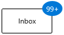
NOTE
Download demo application from GitHub.
Alignment of Badge
You can align the Badge either horizontally or vertically by using the HorizontalAlignment or VerticalAlignment properties. The default value of HorizontalAlignment property is Right and VerticalAlignment property is Top.
<notification:BadgeContainer Name="badgeContainer"  >
    <notification:BadgeContainer.Badge>
        <notification:SfBadge HorizontalAlignment="Left"
                              VerticalAlignment="Center"
                              Content="99+"
                              Name="badge"/>
    </notification:BadgeContainer.Badge>
    <notification:BadgeContainer.Content>
        <Button Content="Inbox">
        </Button>
    </notification:BadgeContainer.Content>
</notification:BadgeContainer>badge.HorizontalAlignment = HorizontalAlignment.Left;
badge.VerticalAlignment = VerticalAlignment.Center;
badge.Content = "99+";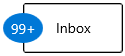
NOTE
Download demo application from GitHub.
Positioning of Badge
You can change the horizontal or vertical position of the Badge either inside, outside, or in the middle by using the HorizontalAnchor and VerticalAnchor properties. The default value of HorizontalAnchor and VerticalAnchor properties is Center.
<notification:BadgeContainer Name="badgeContainer"  >
    <notification:BadgeContainer.Badge>
        <notification:SfBadge HorizontalAnchor="Outside"
                              VerticalAnchor="Center"
                              Content="99+"
                              Name="badge"/>
    </notification:BadgeContainer.Badge>
    <notification:BadgeContainer.Content>
        <Button Content="Inbox">
        </Button>
    </notification:BadgeContainer.Content>
</notification:BadgeContainer>badge.HorizontalAnchor = BadgeAnchor.Outside;
badge.VerticalAnchor = BadgeAnchor.Center;
badge.Content = "99+";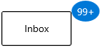
NOTE
Download demo application from GitHub.
Place the Badge anywhere on the container
If you want to place the Badge anywhere on the container, use the HorizontalPosition or VerticalPosition properties. The value range for HorizontalPosition and VerticalPosition properties is 0 to 1. The default value of HorizontalPosition property is 1 and VerticalPosition property is 0.
<notification:BadgeContainer>
    <notification:BadgeContainer.Content>
        <PersonPicture Width="100"
                       Height="100"
                       ProfilePicture="/Images/avatar.png"/>
    </notification:BadgeContainer.Content>
    <notification:BadgeContainer.Badge>
        <notification:SfBadge x:Name="badge3"
                              Shape="None"
                              HorizontalPosition="0.9"
                              VerticalPosition="0.8">
            <Ellipse Width="20" Height="20" Fill="LimeGreen"/>
        </notification:SfBadge>
    </notification:BadgeContainer.Badge>
</notification:BadgeContainer>badge3.HorizontalPosition = 0.9;
badge3.VerticalPosition = 0.8;
Adding a Badge without BadgeContainer
You can directly add the Badge to any objects without using the BadgeContainer.
NOTE
By default,
Badgewill be automatically aligned and positioned inside the container based on their content. If you useBadgecontrol withoutBadgeContainer, the alignment and positioning options are not applicable.
public class ListItem {
    public string ItemName { get; set; }
    public int? UnreadMessageCount { get; set; }
}

public class ViewModel {
    public List<ListItem> MailItems { get; set; }

    public ViewModel() {
        MailItems = new List<ListItem>();
        MailItems.Add(new ListItem() { ItemName = "Inbox",
            UnreadMessageCount = 20 });
        MailItems.Add(new ListItem() { ItemName = "Drafts",
            UnreadMessageCount = null });
        MailItems.Add(new ListItem() { ItemName = "Sent Items",
            UnreadMessageCount = 5 });
        MailItems.Add(new ListItem() { ItemName = "Deleted Items",
            UnreadMessageCount = null });
        MailItems.Add(new ListItem() { ItemName = "Junk Email",
            UnreadMessageCount = null });
    }
}<Page.DataContext>
<local:ViewModel/>
</Page.DataContext>
<Grid>
<ListView BorderThickness="1"
BorderBrush="LightGray"
ItemsSource="{Binding MailItems}"
SelectedIndex="0"
VerticalAlignment="Center"
HorizontalAlignment="Center">
<ListView.ItemTemplate>
<DataTemplate>
<Grid>
<Grid.ColumnDefinitions>
<ColumnDefinition Width="150"/>
<ColumnDefinition Width="100"/>
</Grid.ColumnDefinitions>
<ContentPresenter
Grid.Column="0"
Content="{Binding ItemName}"
VerticalAlignment="Center"/>
<notification:SfBadge
x:Name="badge4"
Grid.Column="1"
Height="20"
Width="40"
Content="{Binding UnreadMessageCount}"
Shape="Oval"
Fill="Warning">
</notification:SfBadge>
</Grid>
</DataTemplate>
</ListView.ItemTemplate>
</ListView>
</Grid>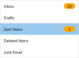
NOTE
Download demo application from GitHub.
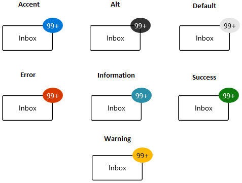
Predefined colors for displaying the Badges
You can change background color of the Badge by using the Fill property. Based on the value of Fill property, respective background color will be applied to the Badge. The default value of Fill property is Accent.
The Badge supports the following different essential states:
-
Accent - RoyalBlue background will be applied.
-
Alt - DarkSlateGray background will be applied.
-
Default - Lavender background will be applied.
-
Error - OrangeRed background will be applied.
-
Information - LightSeaGreen background will be applied.
-
Success - Green background will be applied.
-
Warning - Orange background will be applied.
<notification:BadgeContainer Name="badgeContainer"  >
    <notification:BadgeContainer.Badge>
        <notification:SfBadge Fill="Success"
                              Content="99+"
                              Name="badge"/>
    </notification:BadgeContainer.Badge>
    <notification:BadgeContainer.Content>
        <Button Content="Inbox">
        </Button>
    </notification:BadgeContainer.Content>
</notification:BadgeContainer>badge.Fill = BadgeFill.Success;
badge.Content = "99+";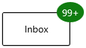
NOTE
Download demo application from GitHub.
NOTE
If you want to apply your own customized colors for the background of
Badge, refer the Custom colors for displaying the badges page.
Predefined shapes for displaying the Badge
You can change the default shape to either Rectangle, Oval, or Ellipse by using Shape property. If you want to display the Badge content without any default shapes, use the Shape property value as None. The default value of Shape property is Oval.
<notification:BadgeContainer Name="badgeContainer"  >
    <notification:BadgeContainer.Badge>
        <notification:SfBadge Shape="Ellipse"
                              Content="99+"
                              Name="badge"/>
    </notification:BadgeContainer.Badge>
    <notification:BadgeContainer.Content>
        <Button Content="Inbox">
        </Button>
    </notification:BadgeContainer.Content>
</notification:BadgeContainer>badge.Shape = BadgeShape.Ellipse;
badge.Content = "99+";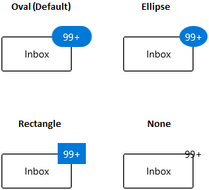
NOTE
Download demo application from GitHub.
NOTE
If you want to apply your own customized shapes for the
Badge, refer the Custom shape for displaying the Badge page.
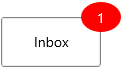
Animate when content changes
You can enable the Scale or Opacity based animation to display the Badge text by using AnimationType property. You can only see the animation when you change the text of the Badge. The default value of AnimationType property is None.
<notification:BadgeContainer Name="badgeContainer"  >
    <notification:BadgeContainer.Badge>
        <notification:SfBadge AnimationType="Scale"
                              Background="Red"
                              Content="1"
                              Name="badge"/>
    </notification:BadgeContainer.Badge>
    <notification:BadgeContainer.Content>
        <Button Content="Inbox">
        </Button>
    </notification:BadgeContainer.Content>
</notification:BadgeContainer>badge.AnimationType = BadgeAnimationType.Scale;
badge.Content = "1";Scaling based animation
Opacity based animation

NOTE
Download demo application from GitHub.
Custom content formats
You can format the content displayed in the Badge content by using the converters. For example, you can display the number as 99+, which is greater than or equal to 100.
public class CustomNumberConverter : IValueConverter {
    public object Convert(object value, Type targetType, object parameter, string language)
    {
        if (int.TryParse(value.ToString(), out int number)) {
            if (number <= 99) {
                return value;
            }
            else if (number <= 999) {
                return "99+";
            }
            else if (number < 99999) {
                return (number / 1000).ToString("0.#") + "K";
            }
            else if (number < 999999) {
                return (number / 1000).ToString("#,0K");
            }
            else if (number < 9999999) {
                return (number / 1000000).ToString("0.#") + "M";
            }
            else {
                return (number / 1000000).ToString("#,0M");
            }
        }
        return value;
    }

    public object ConvertBack(object value, Type targetType, object parameter, string language) {
        throw new NotImplementedException();
    }
}<Page.Resources>
<local:CustomNumberConverter x:Key="customNumberConverter"/>
</Page.Resources>
<Grid>
<Grid.ColumnDefinitions>
<ColumnDefinition/>
<ColumnDefinition/>
</Grid.ColumnDefinitions>
<notification:BadgeContainer Name="badgeContainer">
<notification:BadgeContainer.Badge>
<notification:SfBadge Name="badge"
Background="Red"
Content="{x:Bind badgeContent.Text,
Mode=OneWay,
Converter={StaticResource
customNumberConverter}}"/>
</notification:BadgeContainer.Badge>
<notification:BadgeContainer.Content>
<Button Content="Inbox">
</Button>
</notification:BadgeContainer.Content>
</notification:BadgeContainer>
<Grid Grid.Column="1">
<muxc:NumberBox x:Name="badgeContent"
Header="BadgeContent"
Value="99"
SpinButtonPlacementMode="Compact"
Minimum="0"
Maximum="100000000"/>
</Grid>
</Grid>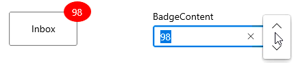
NOTE
Download demo application from GitHub.