Customization in WinUI Badge
14 Jul 202619 minutes to read
This section explains the customization features available in the WinUI Badge control.
Custom colors for displaying the Badge
If you want to change the background color of the Badge other than the default Fill colors, use the Background property. You can also change the foreground of the Badge by using the Foreground property. The default value of Background and Foreground properties is null.
NOTE
If you change the background color,
Badgecontrol will automatically assign a contrasting foreground to theBadgecontent.
<notification:BadgeContainer Name="badgeContainer"  >
    <notification:BadgeContainer.Badge>
        <notification:SfBadge Background="Black"
                              Foreground="Yellow"
                              Content="99+"
                              Name="badge"/>
    </notification:BadgeContainer.Badge>
    <notification:BadgeContainer.Content>
        <Button Content="Inbox">
        </Button>
    </notification:BadgeContainer.Content>
</notification:BadgeContainer>badge.Background = new SolidColorBrush(Colors.Black);
badge.Foreground = new SolidColorBrush(Colors.Yellow);
badge.Content = "99+";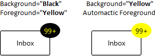
NOTE
Download demo application from GitHub.
Custom shape for displaying the Badge
If you want to change the shape of the Badge other than the default shapes, use the CustomShape property. You can enable the custom shapes by setting the Shape property value as Custom.
<notification:BadgeContainer Name="badgeContainer"  >
    <notification:BadgeContainer.Badge>
        <notification:SfBadge Shape="Custom"
                              CustomShape="M16,0C17.300003,0.49999999 18.399994,1.6000063 19.199997,3.3000189 19.300003,3.3000189 19.5,3.1999823 19.600006,3.1999823 19.800003,3.3999945 20,3.4999703 20.199997,3.8000194 21.5,2.9999701 22.800003,2.6000067 24,2.8000189 24.600006,3.6000069 25,4.6000072 25,5.8000194 25.5,5.8000194 25.899994,5.899995 26.300003,6.1000076 26.399994,6.3999954 26.5,6.6000076 26.600006,6.8999954 28.199997,6.8000198 29.600006,7.1999832 30.5,7.8999959 30.699997,9.1999837 30.199997,10.699984 29.100006,12.199985L29.399994,12.499972C29.399994,12.800021 29.300003,12.999972 29.199997,13.300021 30.600006,13.999972 31.600006,14.999973 32,15.999973 31.600006,16.899998 30.899994,17.699986 29.800003,18.399998 30,18.800022 30.100006,19.199986 30.199997,19.60001 30,19.800022 29.800003,19.999973 29.600006,20.199986 30.399994,21.499975 30.800003,22.800024 30.600006,23.999975 29.5,24.800024 27.899994,25.199988 26,24.999975 26,25.100012 25.899994,25.300024 25.899994,25.4 25.600006,25.499975 25.399994,25.600012 25.100006,25.600012 25.199997,26.999975 24.800003,28.300024 24.100006,29.199989 23.100006,29.400002 22,29.100014 20.800003,28.499975 20.5,28.900002 20.199997,29.199989 19.899994,29.400002 19.600006,29.400002 19.300003,29.300026 19,29.199989 18.300003,30.499977 17.199997,31.499977 16.100006,31.900002 14.800003,31.400002 13.699997,30.199989 12.899994,28.600012 12.800003,28.600012 12.600006,28.699988 12.5,28.699988 12.300003,28.499975 12.100006,28.4 11.899994,28.100012 10.5,28.999977 9.1999969,29.400002 8,29.199989 7.3999939,28.4 7,27.4 7,26.199988 6.5,26.199988 6.1000061,26.100012 5.6999969,25.9 5.6000061,25.600012 5.5,25.4 5.3999939,25.100012 3.8000031,25.199988 2.3999939,24.800024 1.5,24.100012 1.3000031,22.800024 1.8000031,21.300024 2.8999939,19.800022L2.6000061,19.499973C2.6000061,19.199986 2.6999969,18.999973 2.8000031,18.699986 1.3999939,17.999973 0.3999939,16.999973 0,15.999973 0.3999939,15.10001 1.1000061,14.300021 2.1999969,13.600009 2,13.199985 1.8999939,12.800021 1.8000031,12.399997 2,12.199985 2.1999969,11.999972 2.5,11.800021 1.6999969,10.499971 1.3000031,9.1999837 1.5,7.9999715 2.5,7.1999832 4.1000061,6.8000198 6,6.999971 6,6.8999954 6.1000061,6.6999832 6.1000061,6.6000076 6.3999939,6.499971 6.6999969,6.3999954 7,6.3999954 6.8999939,4.899995 7.3000031,3.6999825 8,2.8000189 9,2.6000067 10.100006,2.8999945 11.300003,3.4999705 11.600006,3.1000067 11.899994,2.8000189 12.199997,2.6000067 12.5,2.6000067 12.800003,2.6999823 13.100006,2.8000189 13.800003,1.3999941 14.800003,0.39999388 16,0z"
                              Content="10"
                              Width="50"
                              Height="30"
                              Name="badge"/>
    </notification:BadgeContainer.Badge>
    <notification:BadgeContainer.Content>
        <Button Content="Inbox">
        </Button>
    </notification:BadgeContainer.Content>
</notification:BadgeContainer>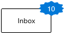
NOTE
Download demo application from GitHub.
Custom UI of Badge content
You can change the appearance of Badge content by using the ContentTemplate property. The DataContext of ContentTemplate property is Content.
<notification:BadgeContainer Name="badgeContainer"  >
    <notification:BadgeContainer.Badge>
        <notification:SfBadge  Name="badge"
                               Content="10">
            <notification:SfBadge.ContentTemplate>
                <DataTemplate>
                    <Grid Background="Yellow">
                        <TextBlock Text="{Binding}"
                                   Foreground="Red"/>
                    </Grid>
                </DataTemplate>
            </notification:SfBadge.ContentTemplate>
        </notification:SfBadge>
    </notification:BadgeContainer.Badge>
    <notification:BadgeContainer.Content>
        <Button Content="Inbox">
        </Button>
    </notification:BadgeContainer.Content>
</notification:BadgeContainer>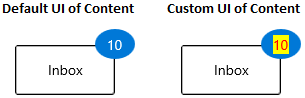
NOTE
Download demo application from GitHub
Custom content formats
You can format the content displayed in the Badge content by using the converters. For example, you can display the number as 99+, which is greater than or equal to 100.
public class CustomNumberConverter : IValueConverter {
    public object Convert(object value, Type targetType, object parameter, string language)
    {
        if (int.TryParse(value.ToString(), out int number)) {
            if (number <= 99) {
                return value;
            }
            else if (number <= 999) {
                return "99+";
            }
            else if (number < 99999) {
                return (number / 1000).ToString("0.#") + "K";
            }
            else if (number < 999999) {
                return (number / 1000).ToString("#,0K");
            }
            else if (number < 9999999) {
                return (number / 1000000).ToString("0.#") + "M";
            }
            else {
                return (number / 1000000).ToString("#,0M");
            }
        }
        return value;
    }

    public object ConvertBack(object value, Type targetType, object parameter, string language) {
        throw new NotImplementedException();
    }
}<Page.Resources>
<local:CustomNumberConverter x:Key="customNumberConverter"/>
</Page.Resources>
<Grid>
<Grid.ColumnDefinitions>
<ColumnDefinition/>
<ColumnDefinition/>
</Grid.ColumnDefinitions>
<notification:BadgeContainer Name="badgeContainer">
<notification:BadgeContainer.Badge>
<notification:SfBadge Name="badge"
Background="Red"
Content="{x:Bind badgeContent.Text,
Mode=OneWay,
Converter={StaticResource customNumberConverter}}"/>
</notification:BadgeContainer.Badge>
<notification:BadgeContainer.Content>
<Button Content="Inbox">
</Button>
</notification:BadgeContainer.Content>
</notification:BadgeContainer>
<Grid Grid.Column="1">
<muxc:NumberBox x:Name="badgeContent"
Header="BadgeContent"
Value="99"
SpinButtonPlacementMode="Compact"
Minimum="0"
Maximum="100000000"/>
</Grid>
</Grid>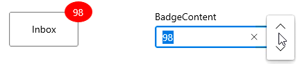
NOTE
Download demo application from GitHub.
Stroke customization
You can change stroke color and its thickness by using the Stroke and StrokeThickness properties. The default value of Stroke property is null and StrokeThickness property is 0.
<notification:BadgeContainer Name="badgeContainer"  >
    <notification:BadgeContainer.Badge>
        <notification:SfBadge Stroke="Red"
                              StrokeThickness="3"
                              Content="99+"
                              Name="badge"/>
    </notification:BadgeContainer.Badge>
    <notification:BadgeContainer.Content>
        <Button Content="Inbox">
        </Button>
    </notification:BadgeContainer.Content>
</notification:BadgeContainer>badge.Stroke = new SolidColorBrush(Colors.Red);
badge.StrokeThickness = 3;
badge.Content = "99+";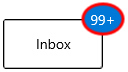
NOTE
Download demo application from GitHub
Hide the Badge
You can hide the Badge by setting the Visibility property value as Collapsed. Badge will be hidden when its content is null. The default value of Visibility property is Visible.
<notification:BadgeContainer Name="badgeContainer"  >
    <notification:BadgeContainer.Badge>
        <notification:SfBadge Visibility="Collapsed"
                              Content="99+"
                              Name="badge"/>
    </notification:BadgeContainer.Badge>
    <notification:BadgeContainer.Content>
        <Button Content="Inbox">
        </Button>
    </notification:BadgeContainer.Content>
</notification:BadgeContainer>badge.Visibility = Visibility.Collapsed;
badge.Content = "99+";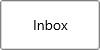
NOTE
Download demo application from GitHub.
Change Badge size
By default, the Badge control size will be automatically allocated based on the content. You can change the size of Badge by using the Width and Height properties. The default value of Width property is 40 and Height property is 30.
<notification:BadgeContainer Name="badgeContainer">
    <notification:BadgeContainer.Badge>
        <notification:SfBadge Width="60"
                              Height="60"
                              Content="99+"
                              Name="badge"/>
    </notification:BadgeContainer.Badge>
    <notification:BadgeContainer.Content>
        <Button Content="Inbox">
        </Button>
    </notification:BadgeContainer.Content>
</notification:BadgeContainer>badge.Width = 60;
badge.Height = 60;
badge.Content = "99+";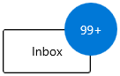
NOTE
Download demo application from GitHub.
Text formatting
You can change the style, size, and font family of the Badge display content by using the FontFamily, FontStyle, and FontSize properties. The default value of FontFamily property is Segoe UI, FontStyle property is Normal, and FontSize property is 14.
<notification:BadgeContainer Name="badgeContainer"  >
    <notification:BadgeContainer.Badge>
        <notification:SfBadge Name="badge"
                              FontFamily="Perpetua"
                              FontSize="20"
                              FontStyle="Oblique"
                              Content="99+"/>
    </notification:BadgeContainer.Badge>
    <notification:BadgeContainer.Content>
        <Button Content="Inbox">
        </Button>
    </notification:BadgeContainer.Content>
</notification:BadgeContainer>badge.FontFamily = new FontFamily("Perpetua");
badge.FontSize = 20;
badge.FontStyle = Windows.UI.Text.FontStyle.Oblique;
badge.Content = "99+";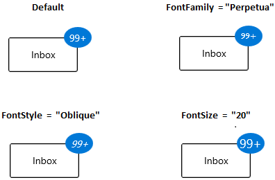
NOTE
Download demo application from GitHub
Rotate the Badge
You can place the Badge with a specific rotation angle by using the Rotation property. The default value of Rotation property is 0.
<notification:BadgeContainer Name="badgeContainer"  >
    <notification:BadgeContainer.Badge>
        <notification:SfBadge Rotation="30"
                              Content="99+"
                              Name="badge"/>
    </notification:BadgeContainer.Badge>
    <notification:BadgeContainer.Content>
        <Button Content="Inbox">
        </Button>
    </notification:BadgeContainer.Content>
</notification:BadgeContainer>badge.Rotation = 30;
badge.Content = "99+";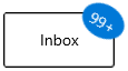
NOTE
Download demo application from GitHub.
Change opacity of Badge
You can change opacity of the Badge by using the Opacity property. The default value of Opacity property is 1.
<notification:BadgeContainer Name="badgeContainer"  >
    <notification:BadgeContainer.Badge>
        <notification:SfBadge Opacity="0.6"
                              Content="99+"
                              Name="badge"/>
    </notification:BadgeContainer.Badge>
    <notification:BadgeContainer.Content>
        <Button Content="Inbox">
        </Button>
    </notification:BadgeContainer.Content>
</notification:BadgeContainer>badge.Opacity = 0.6;
badge.Content = "99+";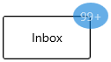
NOTE
Download demo application from GitHub.