Getting Started with UWP Masked TextBox (SfMaskedEdit)
18 Nov 20186 minutes to read
This section explains how to create a new project in Visual Studio using the UWP Masked TextBox control.
Assembly deployment
Refer to the control dependencies section to get the list of assemblies or NuGet package that needs to be added as a reference to use the UWP Masked TextBox in any application.
You can refer this documentation to find more details about installing the NuGet package in a UWP application.
Creating Application with UWP Masked TextBox
In this walkthrough, the user will create a UWP application that contains the UWP Masked TextBox.
- Creating project
- Adding control via designer
- Adding control manually in XAML
- Adding control manually in C#
Creating project
The below section provides detailed information to create a new project in Visual Studio to display the UWP Masked TextBox.
Adding control via designer
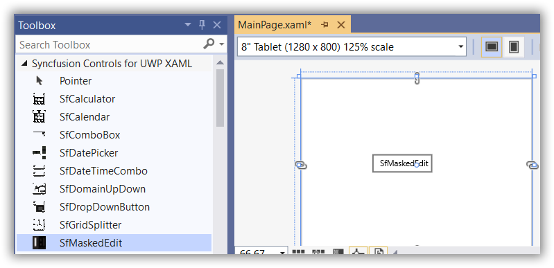
The UWP Masked TextBox can be added to the application by dragging it from Toolbox and dropping it in designer. The required assemblies will be added automatically.
Adding control manually in XAML
In order to add the UWP Masked TextBox manually in XAML, do the below steps,
-
Add the below required assembly references to the project,
- Syncfusion.SfInput.UWP
- Syncfusion.SfShared.UWP
-
Include the namespace for Syncfusion.SfInput.UWP assembly in MainPage.XAML.
<Page xmlns="http://schemas.microsoft.com/winfx/2006/xaml/presentation"

xmlns:x="http://schemas.microsoft.com/winfx/2006/xaml"

xmlns:syncfusion="using:Syncfusion.UI.Xaml.Controls.SfInput">- Now add the UWP Masked TextBox in MainPage.XAML.
<syncfusion:SfMaskedEdit HorizontalAlignment="Center" VerticalAlignment="Center" Text="SfMaskedEdit" TextWrapping="Wrap" />Adding control manually in C#
In order to add the UWP Masked TextBox manually in C#, do the below steps,
-
Add the below required assembly references to the project,
- Syncfusion.SfInput.UWP
- Syncfusion.SfShared.UWP
-
Import the SfMaskedEdit namespace Syncfusion.UI.Xaml.Controls.Input.
-
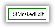
Create a SfMaskedEdit instance and add it to the page.
SfMaskedEdit sfMaskedEdit1 = new SfMaskedEdit()
{
    HorizontalAlignment = HorizontalAlignment.Center,
    VerticalAlignment = VerticalAlignment.Center,
    Height = 30,
    Width = 175,
    Text = "SfMaskedEdit"
};
Dim sfMaskedEdit1 As SfMaskedEdit = New SfMaskedEdit() With {
.HorizontalAlignment = HorizontalAlignment.Center,
.VerticalAlignment = VerticalAlignment.Center,
.Height = 30,
.Width = 175,
.Text = "SfMaskedEdit"
}
Adding Mask to the control
To mask the input of the UWP Masked TextBox, we must set the MaskType and Mask properties.
MaskType has a different set of mask characters that are combined to form a mask expression. Based on the complexity and usage, mask types are classified as Simple, Regular and RegEx.
Using the Mask property, you can specify input without writing any custom validation logic in your application. Mask can be set based on MaskType elements. The Mask property may contain literals and special mask characters. You can use the back-slash character to escape any special mask characters so that they are displayed as literals.
<syncfusion:SfMaskedEdit MaskType="Simple" Mask="00/00/0000" Width="255" Height="46"/>SfMaskedEdit maskedEdit = new SfMaskedEdit();
maskedEdit.MaskType = MaskType.Simple;
maskedEdit.Mask = "00/00/0000";MaskType property with
Simplevalue allows only numeric inputs in the places of 0.
Assigning Value to the control
The value of the UWP Masked TextBox can be set by the Value property. By default, the Value property of the UWP Masked TextBox holds the characters without including the prompt characters and the literals defined in the mask. You can alter this and allow the value to hold literal and prompt characters by setting the ValueMaskFormat property of the control.
<syncfusion:SfMaskedEdit MaskType="Simple" Mask="00/00/0000" Value="14/11/2014" ValueMaskFormat="ExcludePromptAndLiterals" Width="255" Height="46"/>SfMaskedEdit maskedEdit = new SfMaskedEdit();
maskedEdit.MaskType = MaskType.Simple;
maskedEdit.ValueMaskFormat = MaskFormat.ExcludePromptAndLiterals;
maskedEdit.Mask = "00/00/0000";
maskedEdit.Value = "14/11/2014";Validation of Value
You can customize how the UWP Masked TextBox should behave when invalid input is entered using the ValidationMode property. The following values can be set to the ValidationMode property,
-
KeyPress- Validation of value takes place on every key press. -
LostFocus- Validation of value takes place when focus is lost from the UWP Masked TextBox.
<syncfusion:SfMaskedEdit HorizontalAlignment="Center" VerticalAlignment="Center" Text="SfMaskedEdit" TextWrapping="Wrap" />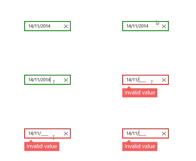
Defining Watermark
You can set watermark for UWP Masked TextBox control using Watermark property. Watermark will be shown in content of the control when it’s not focused and no value is entered.
<syncfusion:SfMaskedEdit MaskType="Simple" Mask="00/00/0000" Watermark="Type here" Width="255" Height="46"/>SfMaskedEdit maskedEdit = new SfMaskedEdit();
maskedEdit.MaskType = MaskType.Simple;
maskedEdit.Mask = "00/00/0000";
maskedEdit.Watermark = "Type here";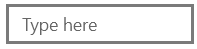
View sample in GitHub.