Appearance in UWP Masked TextBox (SfMaskedEdit)
18 Feb 20251 minute to read
The appearance of the SfMaskedEdit control can be customized by using the BorderBrush and ErrorBorderBrush property
Border
BorderBrush
BorderBrush provides the border color for the SfMaskedEdit.
We can Customize the BorderBrush property as follows
<Input:SfMaskedEdit Width="255" Height="46" BorderBrush="Blue"/>SfMaskedEdit maskededit = new SfMaskedEdit();
maskededit.BorderBrush = Brushes.Blue;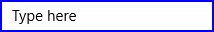
ErrorBorderBrush
ErrorBorderBrush provide the border color for the SfMaskedEdit when validation becomes failed.
We can Customize the ErrorBorderBrush property as follows
<Input:SfMaskedEdit Width="255" Height="46" ErrorBorderBrush="DarkOrange"/>SfMaskedEdit maskededit = new SfMaskedEdit();
maskededit.ErrorBorderBrush = Brushes.DarkOrange;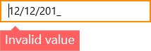
ShowPromptOnFocus
When the ShowPromptOnFocus is set to true, prompt characters are ignored when control loses focus. Again, the prompt characters are restored when the control is focused
Example
<Input:SfMaskedEdit Width="255" Height="46" MaskType="Simple" Mask="(000) 000-0000" ShowPromptOnFocus="True"/>SfMaskedEdit maskededit = new SfMaskedEdit();
maskededit.MaskType = MaskType.Simple;
maskedEdit.Mask = "(000) 000-0000";
maskedEdit.ShowPromptOnFocus = true;Control loses focus

Control gets focus