Placeholder in UWP Kanban Board (SfKanban)
16 Jul 20264 minutes to read
The placeholder denotes a card’s new position in the KanbanColumn. It will appear while dragging a card over the column.
Placeholder style
PlaceholderStyle property is used to customize the placeholder. The following properties are used to customize its appearance:
-
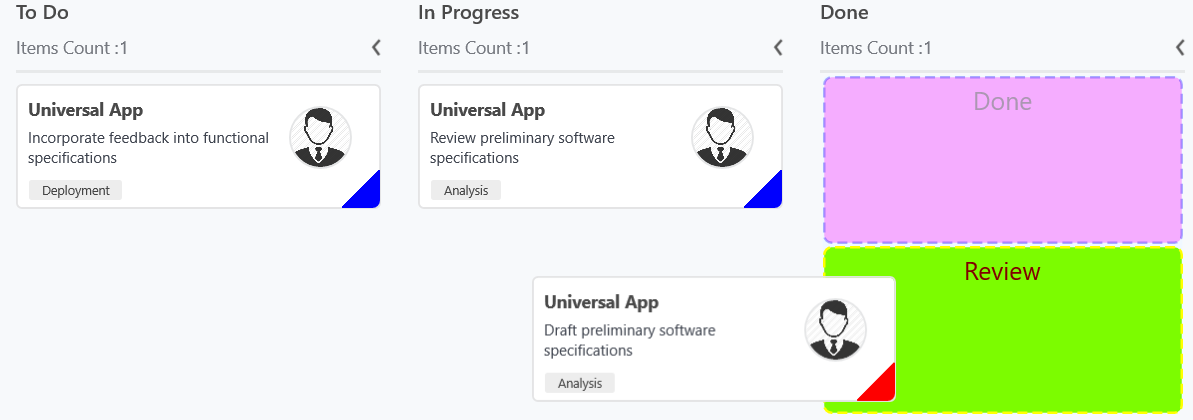
Fill- This property is used to change the background color of the placeholder. -
Stroke- This property is used to change the border color of the placeholder. -
StrokeThickness- This property is used to change the border width of the placeholder. -
StrokeDashArray- This property is used to change the dashes of the placeholder border. -
FontSize- This is used to change the text size of the placeholder. -
Foreground- This property is used to change the text color of the placeholder. -
RadiusX- This property is used to change the x-radius of the placeholder. -
RadiusY- This property is used to change the y-radius of the placeholder. -
TextHorizontalAlignment- This property is used to change the horizontal alignment of the placeholder text. -
TextVerticalAlignment- This property is used to change the vertical alignment of the placeholder text.
The following properties are used to customize the selected category when you have more than one category in a column.
-
SelectedBackground- This property is used to change the background color of the selected placeholder. -
SelectedStroke- This property is used to change the border color of the selected placeholder. -
SelectedStrokeThickness- This property is used to change the border width of the selected placeholder. -
SelectedStrokeDashArray- This property is used to change the dashes of the selected placeholder. -
SelectedFontSize- This is used to change the font size of the text in selected placeholder. -
SelectedForeground- This property is used to change the color of the text in selected placeholder.
The following code example demonstrates the above behavior.
<kanban:PlaceholderStyle FontSize="20"

                         Foreground="DarkGreen"

                         Fill="Fuchsia"

                         Stroke="Blue"

                         StrokeThickness="2"

                         SelectedFontSize="20"

                         SelectedForeground="Maroon"

                         SelectedStroke="Yellow"

                         SelectedStrokeThickness="2"

                         SelectedBackground="LawnGreen">

</kanban:PlaceholderStyle>
PlaceholderStyle style = new PlaceholderStyle();
style.FontSize = 20;
style.Foreground = new SolidColorBrush(Colors.DarkGreen);
style.Fill = new SolidColorBrush(Colors.Fuchsia);
style.Stroke = new SolidColorBrush(Colors.Blue);
style.StrokeThickness = 2;
style.StrokeDashArray = new DoubleCollection() {1, 1};
style.SelectedFontSize = 20;
style.SelectedForeground = new SolidColorBrush(Colors.Maroon);
style.SelectedStroke = new SolidColorBrush(Colors.Yellow);
style.SelectedBackground = new SolidColorBrush(Colors.LawnGreen);
style.SelectedStrokeThickness = 2;
style.SelectedStrokeDashArray = new DoubleCollection() {2, 1};
sfKanban.PlaceholderStyle = style;The following output demonstrates the above code example.
NOTE
The UI of the placeholder can be replaced entirely using
PlaceholderTemplateproperty.