How can I help you?
Cards in UWP Kanban Board (SfKanban)
10 May 20215 minutes to read
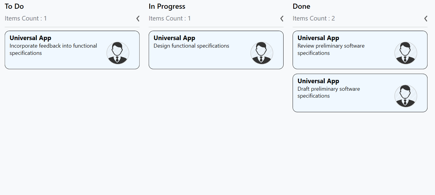
The default elements of a card can be customized using the below properties of KanbanModel.
-
Title- Used to set the title of a card. -
ImageURL- Used to set the image URL of a card. The image will be displayed at right side in default card template. -
Category- Used to set the category of a card. Based on the category the cards will be added to the respective columns. -
Description- Used to set the description text of a card. -
ColorKey- Used to specify the indicatorColorKey. TheColorvalue of the correspondingKeyshould be added inIndicatorColorPalettecollection ofSfKanban. -
Tags- Used to specify the tags of a card. The tags will be displayed at bottom in default card template. -
ID- Used to set the ID of a card.
new KanbanModel()
{

    Title = "Universal App",

    ID = "27654",

    Description = "Incorporate feedback into functional specifications",

    Category = "Open",

    ColorKey = "Low",

    Tags = new string[] { "Deployment" },

    ImageURL = new Uri("ms-appx:///images/icon.jpg")
};
Following code snippet is used to define the colors for each key.
<kanban:SfKanban.IndicatorColorPalette>

    <kanban:ColorMapping Key="Low" Color="Blue"/>

    <kanban:ColorMapping Key="Normal" Color="Green" />

    <kanban:ColorMapping Key="High" Color="Red" />

</kanban:SfKanban.IndicatorColorPalette>
IndicatorColorPalette indicatorColorPalette = new IndicatorColorPalette();
indicatorColorPalette.Add(new ColorMapping() { Key = "Low", Color = Colors.Blue });
indicatorColorPalette.Add(new ColorMapping() { Key = "High", Color = Colors.Red });
indicatorColorPalette.Add(new ColorMapping() { Key = "Normal", Color = Colors.Green });
sfKanban.IndicatorColorPalette = indicatorColorPalette;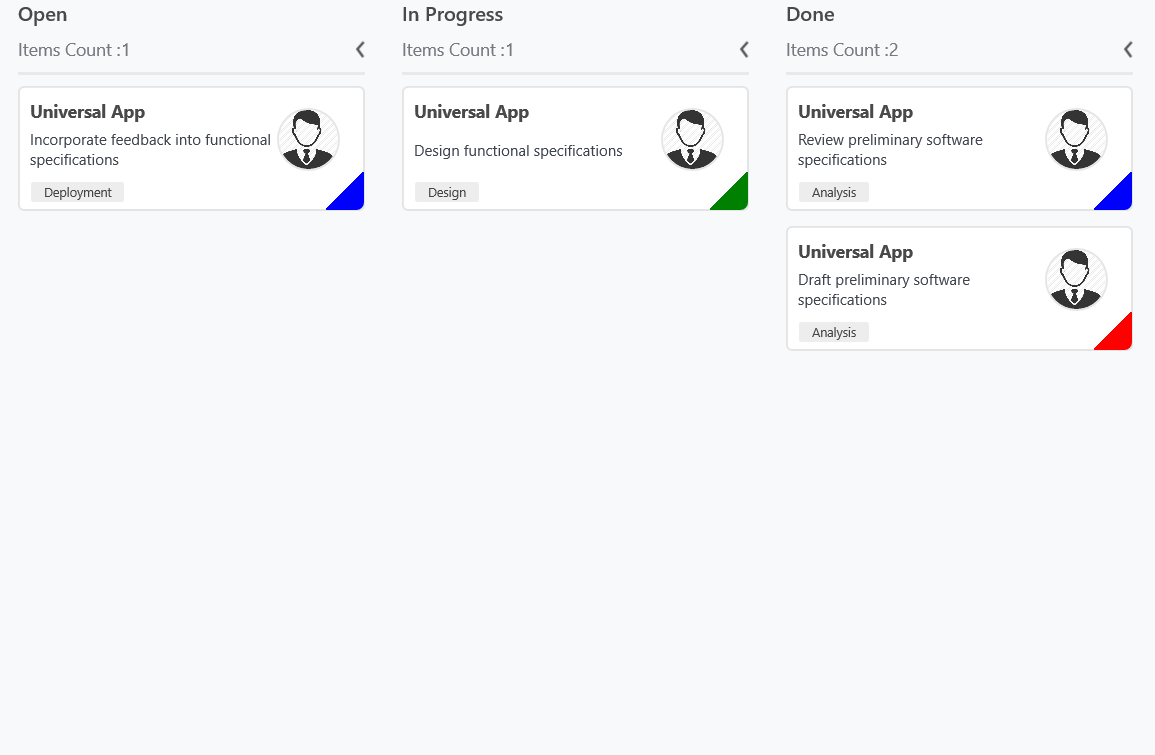
Customizing kanban cards
The CardStyle property customizes the kanban cards. The following properties of CardStyle are used to customize its appearance:
-
Background- Changes the background color of a card. -
BorderBrush- Changes the border brush of a card. -
BorderThickness- Changes the border thickness of a card. -
CornerRadius- Adds rounded corners to a card. -
IconVisibility- Changes the icon visibility of a card. -
IndicatorVisibility- Changes the indicator visibility of a card. -
TagVisibility- Changes the tag panel visibility of a card. -
TitleColor- Changes the header color of a kanban card item. -
TitleFontSize- Changes the font size of a card title. -
TitleHorizontalAlignment- Changes the horizontal alignment of a card title. -
FontSize- Changes the font size of a card description. -
Foreground- Changes the foreground color of a card description. -
TagBackground- Changes the tag’s background color. -
TagForeground- Changes the tag’s foreground color.
Template
You can replace the entire card template with your own design using SfKanban.CardTemplate property. The following code snippet and screenshot illustrates this.
<kanban:SfKanban.CardTemplate>

    <DataTemplate>

        <StackPanel Margin="0,10,0,10" Orientation="Vertical"
                    Background="Gray" Padding="10,10,10,10">

            <StackPanel Orientation="Horizontal">

                <TextBlock Text="{Binding Path=Title}" Foreground="Silver"/>

            </StackPanel>

            <StackPanel  Orientation="Horizontal">

                <TextBlock Text="{Binding Description}" Width="150"
                       FontSize="14" Foreground="Silver" TextWrapping="WrapWholeWords"/>

                <Image Source="{Binding ImageURL}" Margin="30,0,0,10"
                       Height="50" Width="50"/>

            </StackPanel>

        </StackPanel>

    </DataTemplate>

</kanban:SfKanban.CardTemplate>