How can I help you?
Appearance and Styling in UWP DropDown Button (SfDropDownButton)
18 Feb 20251 minute to read
Accent brush
AccentBrush property is used to decorate the hot spots of a control with a solid color.
<input:SfDropDownButton Content="5/24/2016" AccentBrush="Red" x:Name="dropdownbutton

"/>
ContentTemplate
ContentTemplate property is used to decorate the content of the SfDropDownButton.
<input:SfDropDownButton Content="5/24/2016" x:Name="dropdownbutton">

<input:SfDropDownButton.ContentTemplate>

<DataTemplate>

<TextBlock Foreground="Green" Text="{Binding}"/>

</DataTemplate>

</input:SfDropDownButton.ContentTemplate>

</input:SfDropDownButton>
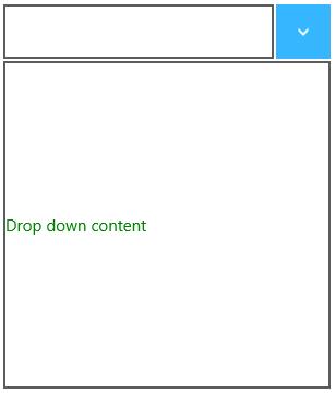
DropdownContentTemplate
DropDownContentTemplate is used to decorate the drop down content of SfDropDownButton.
<input:SfDropDownButton DropDownContent="Drop down content">

<input:SfDropDownButton.DropDownContentTemplate>

<DataTemplate>

<TextBlock Foreground="Green" HorizontalAlignment="Center" Text="{Binding}"/>

</DataTemplate>

</input:SfDropDownButton.DropDownContentTemplate>

</input:SfDropDownButton>