How can I help you?
Customizing DropDown in UWP DropDown Button (SfDropDownButton)
18 Feb 20251 minute to read
DropDown direction
The direction of drop down can be changed using DropDownDirection property.
<input:SfDropDownButton Content="5/24/2016" DropDownDirection="Top" x:Name="dropdownbutton">

<input:SfDropDownButton.DropDownContent>

<input:SfCalendar/>

</input:SfDropDownButton.DropDownContent>

</input:SfDropDownButton>dropdownbutton.DropDownDirection = Syncfusion.UI.Xaml.Controls.Input.DropDownDirection.Top;dropdownbutton.DropDownDirection = Syncfusion.UI.Xaml.Controls.Input.DropDownDirection.Top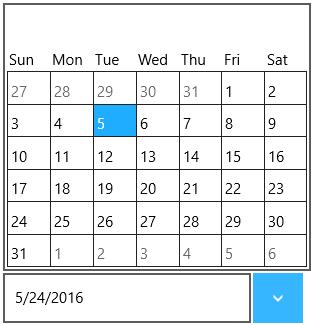
DropDown height
The height of drop down can be changed using DropDownHeight property.
<input:SfDropDownButton Content="5/24/2016" DropDownHeight="250" x:Name="dropdownbutton">

<input:SfDropDownButton.DropDownContent>

<input:SfCalendar/>

</input:SfDropDownButton.DropDownContent>

</input:SfDropDownButton>dropdownbutton.DropDownHeight = 250.0;dropdownbutton.DropDownHeight = 250.0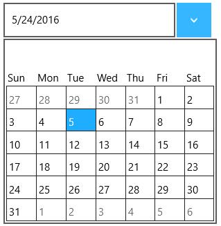
IsDropDownOpen
Drop down can be programmatically opened or closed using the property IsDropDownOpen.