How can I help you?
SfDateSelector in UWP DatePicker (SfDatePicker)
18 Feb 202518 minutes to read
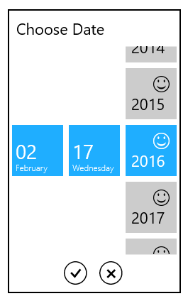
The SfDateSelector control opens inside the drop-down popup.
nsfneklfne
The visual elements of the date selector can be customized using the SelectorStyle property.
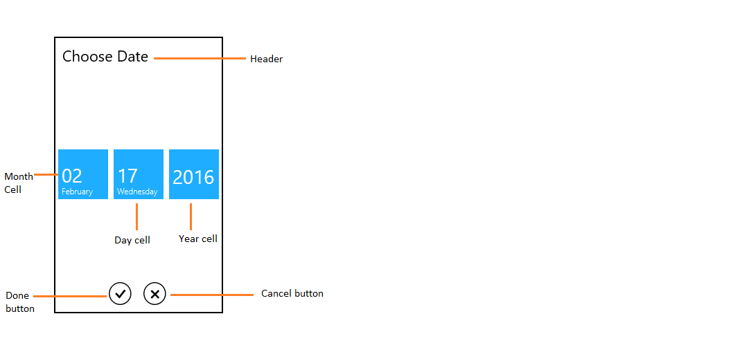
Header
The header property defines the top part of the SfDateSelector.
<syncfusion:SfDatePicker VerticalAlignment="Center"

                               HorizontalAlignment="Center"

                               Width="200">

            <syncfusion:SfDatePicker.SelectorStyle>

                <Style TargetType="syncfusion:SfDateSelector">

                    <Setter Property="Header" Value="Set your alarm"/>

                </Style>

            </syncfusion:SfDatePicker.SelectorStyle>

</syncfusion:SfDatePicker>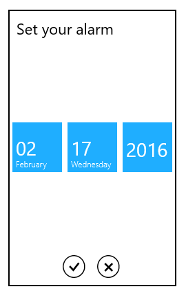
HeaderTemplate
The header template property is used to decorate the header.
<syncfusion:SfDatePicker VerticalAlignment="Center"
HorizontalAlignment="Center"
Width="200">
<syncfusion:SfDatePicker.SelectorStyle>
<Style TargetType="syncfusion:SfDateSelector">
<Setter Property="HeaderTemplate">
<Setter.Value>
<DataTemplate>
<StackPanel Orientation="Horizontal">
<TextBlock Text=""
VerticalAlignment="Top"
Margin="5"
FontSize="22"
FontFamily="Segoe UI Symbol"/>
<TextBlock Text="Set your alarm"
VerticalAlignment="Top"
Margin="5"
FontSize="22"
/>
</StackPanel>
</DataTemplate>
</Setter.Value>
</Setter>
</Style>
</syncfusion:SfDatePicker.SelectorStyle>
</syncfusion:SfDatePicker>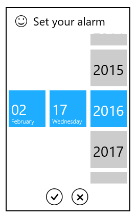
Cell template
The cell template property is used to decorate the selection box with custom visuals.
NOTE
The DataContext of Selection box is Syncfusion.UI.Xaml.Primitives.DateTimeWrapper.
DayCellTemplate
The DayCellTemplate property is used to decorate the day cell selection box.
<syncfusion:SfDatePicker VerticalAlignment="Center"
HorizontalAlignment="Center"
Width="200">
<syncfusion:SfDatePicker.SelectorStyle>
<Style TargetType="syncfusion:SfDateSelector">
<Setter Property="DayCellTemplate">
<Setter.Value>
<DataTemplate>
<Grid>
<TextBlock VerticalAlignment="Top"
HorizontalAlignment="Right"
Margin="5"
FontSize="22"
FontFamily="Segoe UI Symbol"
Text=""/>
<TextBlock Text="{Binding DayNumber}"
VerticalAlignment="Bottom"
Margin="5"
FontSize="22"/>
</Grid>
</DataTemplate>
</Setter.Value>
</Setter>
</Style>
</syncfusion:SfDatePicker.SelectorStyle>
</syncfusion:SfDatePicker>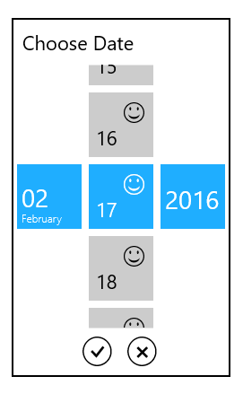
MonthCellTemplate
The MonthCellTemplate property is used to decorate the month cell selection box.
<syncfusion:SfDatePicker VerticalAlignment="Center"
HorizontalAlignment="Center"
Width="200">
<syncfusion:SfDatePicker.SelectorStyle>
<Style TargetType="syncfusion:SfDateSelector">
<Setter Property="MonthCellTemplate">
<Setter.Value>
<DataTemplate>
<Grid>
<TextBlock VerticalAlignment="Top"
HorizontalAlignment="Right"
Margin="5"
FontSize="22"
FontFamily="Segoe UI Symbol"
Text=""/>
<TextBlock Text="{Binding MonthNumber}"
VerticalAlignment="Bottom"
Margin="5"
FontSize="22"/>
</Grid>
</DataTemplate>
</Setter.Value>
</Setter>
</Style>
</syncfusion:SfDatePicker.SelectorStyle>
</syncfusion:SfDatePicker>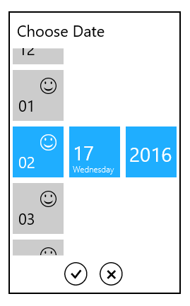
YearCellTemplate
The YearCellTemplate property is used to decorate the year cell selection box.
<syncfusion:SfDatePicker VerticalAlignment="Center"
HorizontalAlignment="Center"
Width="200">
<syncfusion:SfDatePicker.SelectorStyle>
<Style TargetType="syncfusion:SfDateSelector">
<Setter Property="YearCellTemplate">
<Setter.Value>
<DataTemplate>
<Grid>
<TextBlock VerticalAlignment="Top"
HorizontalAlignment="Right"
Margin="5"
FontSize="22"
FontFamily="Segoe UI Symbol"
Text=""/>
<TextBlock Text="{Binding YearNumber}"
VerticalAlignment="Bottom"
Margin="5"
FontSize="22"/>
</Grid>
</DataTemplate>
</Setter.Value>
</Setter>
</Style>
</syncfusion:SfDatePicker.SelectorStyle> </syncfusion:SfDatePicker>