How can I help you?
Appearance and Styling in UWP Calendar (SfCalendar)
10 May 20217 minutes to read
Each and every part in SfCalendar can be customizable. And it can be customized as follows:
Customizing the Active Date Cell
The active calendar day button template can be modified using CellTemplate property. It also provided CellTemplateSelector property for applying selective templates by a logic.
<input:SfCalendar x:Name="calendar">

<input:SfCalendar.CellTemplate>

<DataTemplate>

<TextBlock Text="{Binding Day}" VerticalAlignment="Center"
           HorizontalAlignment="Center" Foreground="Red"/>

</DataTemplate>

</input:SfCalendar.CellTemplate>

</input:SfCalendar>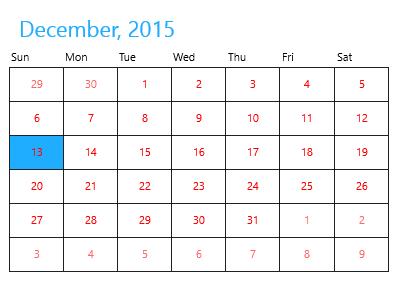
Customizing the Disabled Date Cell
The inactive/disabled calendar day button template can be modified using DisabledCellTemplate property.
<input:SfCalendar x:Name="calendar">

<input:SfCalendar.DisabledCellTemplate>

<DataTemplate>

<Grid Background="Gray">

<TextBlock Text="{Binding Day}" VerticalAlignment="Bottom"
           Foreground="White" Opacity="1" Margin="3"/>

</Grid>

</DataTemplate>

</input:SfCalendar.DisabledCellTemplate>

</input:SfCalendar>calendar.VisibleMinDate = new DateTime(2015, 12, 5);
calendar.VisibleMaxDate = new DateTime(2015, 12, 25);calendar.VisibleMinDate = New Date(2015, 12, 5)
calendar.VisibleMaxDate = New Date(2015, 12, 25)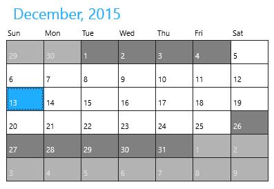
Customizing Day Name Cell
The template of day names can also be modified using DayNameCellTemplate property.
<input:SfCalendar x:Name="calendar">

<input:SfCalendar.DayNameCellTemplate>

<DataTemplate>

<TextBlock Text="{Binding}" Foreground="Red"/>

</DataTemplate>

</input:SfCalendar.DayNameCellTemplate>

</input:SfCalendar>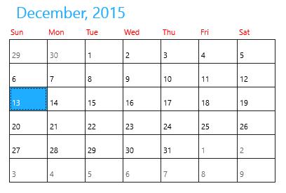
Customizing Header
The template of header in SfCalendar can be modified using HeaderTemplate property.
<input:SfCalendar x:Name="calendar" >

<input:SfCalendar.HeaderTemplate>

<DataTemplate>

<TextBlock Text="{Binding}" FontSize="20" Foreground="Red"/>

</DataTemplate>

</input:SfCalendar.HeaderTemplate>

</input:SfCalendar>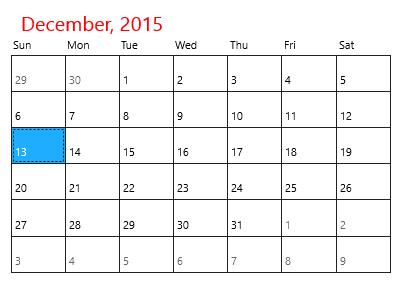
Changing Selected Date Background
The background of selected date can be set using SelectedDateBackground property.
<input:SfCalendar x:Name="calendar" SelectedDateBackground="Red"/>calendar.SelectedDateBackground = new SolidColorBrush(Windows.UI.Colors.Red);calendar.SelectedDateBackground = New SolidColorBrush(Windows.UI.Colors.Red)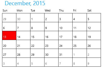
Customizing Scroll Button
The template of previous and next scroll buttons can be modified with PreviousScrollButtonTemplate and NextScrollButtonTemplate properties. **
<input:SfCalendar x:Name="calendar" ShowNavigationButton="True" >
<input:SfCalendar.PreviousScrollButtonTemplate>
<ControlTemplate TargetType="Button">
<Grid>
<VisualStateManager.VisualStateGroups>
<VisualStateGroup x:Name="CommonStates">
<VisualState x:Name="Normal"/>
<VisualState x:Name="PointerOver">
<Storyboard>
<ObjectAnimationUsingKeyFrames Storyboard.TargetProperty="Fill" Storyboard.TargetName="ellipse">
<DiscreteObjectKeyFrame KeyTime="0" Value="#414242"/>
</ObjectAnimationUsingKeyFrames>
<ObjectAnimationUsingKeyFrames Storyboard.TargetProperty="Fill" Storyboard.TargetName="Triangle">
<DiscreteObjectKeyFrame KeyTime="0" Value="#2FA0D5"/>
</ObjectAnimationUsingKeyFrames>
</Storyboard>
</VisualState>
<VisualState x:Name="Pressed">
<Storyboard>
<ObjectAnimationUsingKeyFrames Storyboard.TargetProperty="Fill" Storyboard.TargetName="ellipse">
<DiscreteObjectKeyFrame KeyTime="0" Value="#2FA0D5"/>
</ObjectAnimationUsingKeyFrames>
<ObjectAnimationUsingKeyFrames Storyboard.TargetProperty="Fill" Storyboard.TargetName="Triangle">
<DiscreteObjectKeyFrame KeyTime="0" Value="#ECEEEE"/>
</ObjectAnimationUsingKeyFrames>
</Storyboard>
</VisualState>
<VisualState x:Name="Disabled">
<Storyboard>
<ObjectAnimationUsingKeyFrames Storyboard.TargetProperty="Fill" Storyboard.TargetName="ellipse">
<DiscreteObjectKeyFrame KeyTime="0" Value="{StaticResource ButtonDisabledBackgroundThemeBrush}"/>
</ObjectAnimationUsingKeyFrames>
<ObjectAnimationUsingKeyFrames Storyboard.TargetProperty="Fill" Storyboard.TargetName="Triangle">
<DiscreteObjectKeyFrame KeyTime="0" Value="{StaticResource ButtonDisabledForegroundThemeBrush}"/>
</ObjectAnimationUsingKeyFrames>
</Storyboard>
</VisualState>

</VisualStateGroup>
<VisualStateGroup x:Name="FocusStates">
<VisualState x:Name="Focused">
<Storyboard>
<DoubleAnimation Duration="0" To="1" Storyboard.TargetProperty="Opacity" Storyboard.TargetName="FocusVisualWhite"/>
<DoubleAnimation Duration="0" To="1" Storyboard.TargetProperty="Opacity" Storyboard.TargetName="FocusVisualBlack"/>
</Storyboard>
</VisualState>
<VisualState x:Name="Unfocused"/>
<VisualState x:Name="PointerFocused"/>
</VisualStateGroup>
</VisualStateManager.VisualStateGroups>
<Grid>
<Ellipse x:Name="ellipse"
Canvas.Top="50"
Canvas.Left="50"
Fill="Red"
Margin="3" Width="25" Height="25"
StrokeThickness="{TemplateBinding BorderThickness}"
Stroke="{TemplateBinding BorderBrush}">
</Ellipse>
<Border x:Name="Border" VerticalAlignment="Center" HorizontalAlignment="Center">
<Path x:Name="Triangle"
Data="F1M646.688,13.5518L646.783,13.4593 646.965,13.639 668.383,35.0583 689.459,35.0583 665.155,10.751 657.503,3.10126 657.323,2.92023 664.876,-4.63837 689.184,-28.9417 668.109,-28.9417 646.688,-7.52637 636.15,3.01398 646.688,13.5518z" Stretch="Uniform" Fill="{TemplateBinding Foreground}" Width="12" Height="12"
Margin="-0.5,0,1.3,0" RenderTransformOrigin="0.5,0.5">
<Path.RenderTransform>
<TransformGroup>
<TransformGroup.Children>
<RotateTransform Angle="180" />
<ScaleTransform ScaleX="-1" ScaleY="-1" />
</TransformGroup.Children>
</TransformGroup>
</Path.RenderTransform>
</Path>
</Border>
</Grid>
<Rectangle x:Name="FocusVisualWhite" IsHitTestVisible="False" Opacity="0" StrokeDashOffset="1.5" StrokeEndLineCap="Square" Stroke="{StaticResource FocusVisualWhiteStrokeThemeBrush}" StrokeDashArray="1,1"/>
<Rectangle x:Name="FocusVisualBlack" IsHitTestVisible="False" Opacity="0" StrokeDashOffset="0.5" StrokeEndLineCap="Square" Stroke="{StaticResource FocusVisualBlackStrokeThemeBrush}" StrokeDashArray="1,1"/>
</Grid>
</ControlTemplate>
</input:SfCalendar.PreviousScrollButtonTemplate>
<input:SfCalendar.NextScrollButtonTemplate>
<ControlTemplate TargetType="Button">
<Grid>
<VisualStateManager.VisualStateGroups>
<VisualStateGroup x:Name="CommonStates">
<VisualState x:Name="Normal"/>
<VisualState x:Name="PointerOver">
<Storyboard>
<ObjectAnimationUsingKeyFrames Storyboard.TargetProperty="Fill" Storyboard.TargetName="ellipse">
<DiscreteObjectKeyFrame KeyTime="0" Value="#414242"/>
</ObjectAnimationUsingKeyFrames>
<ObjectAnimationUsingKeyFrames Storyboard.TargetProperty="Fill" Storyboard.TargetName="Triangle">
<DiscreteObjectKeyFrame KeyTime="0" Value="#2FA0D5"/>
</ObjectAnimationUsingKeyFrames>
</Storyboard>
</VisualState>
<VisualState x:Name="Pressed">
<Storyboard>
<ObjectAnimationUsingKeyFrames Storyboard.TargetProperty="Fill" Storyboard.TargetName="ellipse">
<DiscreteObjectKeyFrame KeyTime="0" Value="#2FA0D5"/>
</ObjectAnimationUsingKeyFrames>
<ObjectAnimationUsingKeyFrames Storyboard.TargetProperty="Fill" Storyboard.TargetName="Triangle">
<DiscreteObjectKeyFrame KeyTime="0" Value="#ECEEEE"/>
</ObjectAnimationUsingKeyFrames>
</Storyboard>
</VisualState>
<VisualState x:Name="Disabled">
<Storyboard>
<ObjectAnimationUsingKeyFrames Storyboard.TargetProperty="Fill" Storyboard.TargetName="ellipse">
<DiscreteObjectKeyFrame KeyTime="0" Value="{StaticResource ButtonDisabledBackgroundThemeBrush}"/>
</ObjectAnimationUsingKeyFrames>
<ObjectAnimationUsingKeyFrames Storyboard.TargetProperty="Fill" Storyboard.TargetName="Triangle">
<DiscreteObjectKeyFrame KeyTime="0" Value="{StaticResource ButtonDisabledForegroundThemeBrush}"/>
</ObjectAnimationUsingKeyFrames>
</Storyboard>
</VisualState>
</VisualStateGroup>
<VisualStateGroup x:Name="FocusStates">
<VisualState x:Name="Focused">
<Storyboard>
<DoubleAnimation Duration="0" To="1" Storyboard.TargetProperty="Opacity" Storyboard.TargetName="FocusVisualWhite"/>
<DoubleAnimation Duration="0" To="1" Storyboard.TargetProperty="Opacity" Storyboard.TargetName="FocusVisualBlack"/>
</Storyboard>
</VisualState>
<VisualState x:Name="Unfocused"/>
<VisualState x:Name="PointerFocused"/>
</VisualStateGroup>
</VisualStateManager.VisualStateGroups>
<Grid>
<Ellipse x:Name="ellipse"
Canvas.Top="50"
Canvas.Left="50"
Fill="Red"
Margin="3" Width="25" Height="25"
StrokeThickness="{TemplateBinding BorderThickness}"
Stroke="{TemplateBinding BorderBrush}">
</Ellipse>
<Border x:Name="Border" VerticalAlignment="Center" HorizontalAlignment="Center">
<Path x:Name="Triangle"
Data="F1M646.688,13.5518L646.783,13.4593 646.965,13.639 668.383,35.0583 689.459,35.0583 665.155,10.751 657.503,3.10126 657.323,2.92023 664.876,-4.63837 689.184,-28.9417 668.109,-28.9417 646.688,-7.52637 636.15,3.01398 646.688,13.5518z" Stretch="Uniform" Fill="{TemplateBinding Foreground}" Width="12" Height="12"
Margin="-1,0,-1,0" RenderTransformOrigin="0.5,0.5">
<Path.RenderTransform>
<TransformGroup>
<TransformGroup.Children>
<RotateTransform Angle="0" />
<ScaleTransform ScaleX="-1" ScaleY="-1" />
</TransformGroup.Children>
</TransformGroup>
</Path.RenderTransform>
</Path>
</Border>
</Grid>
<Rectangle x:Name="FocusVisualWhite" IsHitTestVisible="False" Opacity="0" StrokeDashOffset="1.5" StrokeEndLineCap="Square" Stroke="{StaticResource FocusVisualWhiteStrokeThemeBrush}" StrokeDashArray="1,1"/>
<Rectangle x:Name="FocusVisualBlack" IsHitTestVisible="False" Opacity="0" StrokeDashOffset="0.5" StrokeEndLineCap="Square" Stroke="{StaticResource FocusVisualBlackStrokeThemeBrush}" StrokeDashArray="1,1"/>
</Grid>
</ControlTemplate>

</input:SfCalendar.NextScrollButtonTemplate>
</input:SfCalendar>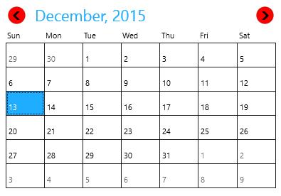
Refresh the Layout
Refresh method is used to refresh the layout of SfCalendar so that the cell templates are applied again.
calendar.Refresh();calendar.Refresh()