Selection in .NET MAUI TreeView
18 Nov 201811 minutes to read
This section explains how to perform selection and its related operations in the TreeView.
UI selection
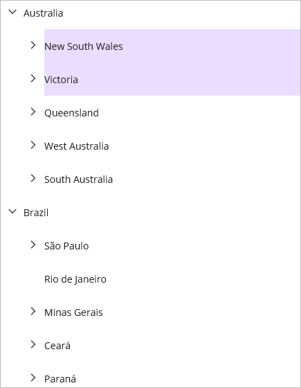
The TreeView allows selecting items programmatically or via touch interactions by setting the SelectionMode property value to other than None. The control has different selection modes to perform selection operations as listed as follows.
- None: Disables the selection.
-
Single: Allows selecting only a single item. When clicking on the selected item, the selection will not be cleared. This is the default value for
SelectionMode. - SingleDeselect: Allows selecting only a single item. When clicking on the selected item, the selection is cleared.
- Multiple: Allows selecting more than one item. Selection is not cleared when selecting more than one item. When clicking on the selected item, the selection is cleared.
- Extended: Allows selecting multiple items using the common key modifiers.
<syncfusion:SfTreeView x:Name="treeView" SelectionMode="Multiple"/>using Syncfusion.Maui.TreeView;
public class MainPage : ContentPage
{
public MainPage()
{
InitializeComponent();
treeView.SelectionMode = TreeViewSelectionMode.Multiple;
}
}
Programmatic selection
When the SelectionMode is other than None, an item or items in the TreeView can be selected from code by setting the SelectedItem, or by adding items to the SelectedItems property based on the SelectionMode. Ensure SelectionMode is configured before performing programmatic selection; selecting items while SelectionMode is None is not supported.
When the selection mode is Single or SingleDeselect, programmatically select an item by setting the underlying object to the SelectedItem property. The SelectedItem can also be bound from a view model.
using Syncfusion.Maui.TreeView;

public class MainPage : ContentPage
{
   public MainPage()
   {
      InitializeComponent();

      treeView.SelectedItem = viewModel.CountriesInfo[2];
   }
}
When the selection mode is Multiple, programmatically select more than one item by adding the underlying object to the SelectedItems property.
using Syncfusion.Maui.TreeView;

public class MainPage : ContentPage
{
   public MainPage()
   {
      InitializeComponent();

      treeView.SelectedItems.Add(viewModel.CountriesInfo[2]);
      treeView.SelectedItems.Add(viewModel.CountriesInfo[3]);
   }
}
If an item is selected programmatically when
SelectionModeisNone, or if multiple items are programmatically selected whenSelectionModeisSingleorSingleDeselect, an exception will be thrown internally.
Manage selected items
Get selected items
The TreeView exposes all selected items through the SelectedItems property, and exposes the single selected item through the SelectedItem property.
Clear selected items
The selected items can be cleared based on the selection mode. When the selection mode is Multiple or Extended, call the SelectedItems.Clear() method to clear all selected items.
using Syncfusion.Maui.TreeView;

public class MainPage : ContentPage
{
   public MainPage()
   {
      InitializeComponent();

      treeView.SelectedItems.Clear();
   }
}
When the selection mode is Single or SingleDeselect, clear the selection by setting the SelectedItem property to null since SelectedItems does not track these selections.
using Syncfusion.Maui.TreeView;

public class MainPage : ContentPage
{
   public MainPage()
   {
      InitializeComponent();

      treeView.SelectedItem = null;
   }
}
CurrentItem vs SelectedItem
The TreeView exposes the selected item through the SelectedItem and CurrentItem properties. Both SelectedItem and CurrentItem return the same data object when a single item is selected. When more than one item is selected, SelectedItem returns the first item in the SelectedItems collection (that is, the earliest added item), and CurrentItem returns the most recently selected item.
Select an entire row
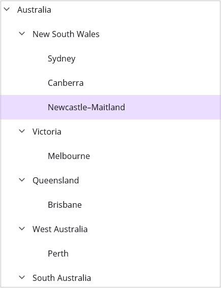
By default, selection applies only within the content area of the item (after the indent), not across the full width of the control. You can select the full row by enabling the FullRowSelect property. When FullRowSelect is set to true, the selection spans the entire width of the TreeView control.
<syncfusion:SfTreeView x:Name="treeView" FullRowSelect="True" />using Syncfusion.Maui.TreeView;
public class MainPage : ContentPage
{
public MainPage()
{
InitializeComponent();
treeView.FullRowSelect = true;
}
}
Selected item style
Selection background
The TreeView allows you to change the selection background color for selected items by using the SelectionBackground property. You can also change the selection background color at runtime.
<syncfusion:SfTreeView x:Name="treeView" SelectionBackground="LightBlue" />using Syncfusion.Maui.TreeView;
public class MainPage : ContentPage
{
public MainPage()
{
InitializeComponent();
treeView.SelectionBackground = Colors.LightBlue;
}
}Selection foreground
The TreeView allows you to change the selection foreground color for selected items by using the SelectionForeground property. You can also change the selection foreground color at runtime.
<syncfusion:SfTreeView x:Name="treeView" SelectionForeground="Red" />using Syncfusion.Maui.TreeView;
public class MainPage : ContentPage
{
public MainPage()
{
InitializeComponent();
treeView.SelectionForeground = Colors.Red;
}
}Events
SelectionChangingandSelectionChangedevents are triggered only on UI interactions. To detect programmatic selection changes, observe theSelectedItemorCurrentItemproperty changes instead.
SelectionChanging Event
The SelectionChanging event is raised while selecting an item at runtime. The ItemSelectionChangingEventArgs has the following members, which provide information for the SelectionChanging event:
- AddedItems: Gets the collection of underlying data objects that are about to be selected.
- RemovedItems: Gets the collection of underlying data objects that are about to be deselected (removed from selection).
You can cancel the selection process within this event by setting the ItemSelectionChangingEventArgs.Cancel property to true.
using Syncfusion.Maui.TreeView;

public class MainPage : ContentPage
{
   public MainPage()
   {
      InitializeComponent();

      treeView.SelectionChanging += TreeView_SelectionChanging;
   }

   private void TreeView_SelectionChanging(object sender, ItemSelectionChangingEventArgs e)
   {
      if (e.AddedItems.Count > 0 && e.AddedItems[0] == ViewModel.Items[0])
      {
         e.Cancel = true;
      }
   }
}
You can also wire the event handler declaratively in XAML.
<syncfusion:SfTreeView x:Name="treeView"
                          SelectionChanging="TreeView_SelectionChanging" />
SelectionChanged Event
The SelectionChanged event occurs once the selection process has been completed for the selected item in the TreeView. The ItemSelectionChangedEventArgs has the following members, which provide information for the SelectionChanged event:
- AddedItems: Gets the collection of underlying data objects that have been selected.
- RemovedItems: Gets the collection of underlying data objects that have been deselected (removed from selection).
using Syncfusion.Maui.TreeView;

public class MainPage : ContentPage
{
   public MainPage()
   {
      InitializeComponent();

      treeView.SelectionChanged += TreeView_SelectionChanged;
   }

   private void TreeView_SelectionChanged(object sender, ItemSelectionChangedEventArgs e)
   {
      treeView.SelectedItems.Clear();
   }
}
Avoid calling
SelectedItems.Clear()directly inside theSelectionChangedhandler without a guard, as clearing selection again raisesSelectionChangingandSelectionChanged, which can lead to recursive calls.
Key navigation
The TreeView allows selecting items through keyboard interactions. The key navigation behavior is explained as follows:
-
When the SelectionMode is
SingleorSingleDeselect, the selected item is highlighted with a focus border around the item during key navigation. -
When the
SelectionModeisMultipleorExtended, the focus border is set on theCurrentItem.
The following keys are supported for navigation and selection:
| Key | Behavior |
|---|---|
Up Arrow |
Moves the selection to the previous item. |
Down Arrow |
Moves the selection to the next item. |
Left Arrow |
Collapses the current node if it has children and is expanded; otherwise moves to the parent item. |
Right Arrow |
Expands the current node if it has children and is collapsed; otherwise moves to the first child. |
Home |
Moves the selection to the first item in the TreeView. |
End |
Moves the selection to the last visible item in the TreeView. |
Ctrl + Up/Down Arrow |
Moves focus without changing selection (Extended mode). |
Shift + Up/Down Arrow |
Selects a contiguous range of items (Extended mode). |
Space |
Toggles the selection of the focused item (Multiple and Extended modes). |
Ctrl + Space |
Toggles the selection of the focused item without affecting other selections (Extended mode). |
Limitations
- When a grid is loaded inside the ItemTemplate with a background color, the SelectionBackground will not be displayed because the grid background overlaps the
SelectionBackground. In this case, set the background color on the TreeView instead of the grid in theItemTemplate.