Appearance in .NET MAUI TreeView
18 Nov 201824 minutes to read
The SfTreeView allows customizing the appearance of the underlying data and provides different functionalities to the end user.
ItemTemplate
A template can be used to present the data using controls that make sense for the application.
The SfTreeView allows you to customize the appearance of the content view and expander view by setting the ItemTemplate and ExpanderTemplate properties.
<?xml version="1.0" encoding="utf-8" ?>
<ContentPage xmlns="http://schemas.microsoft.com/dotnet/2021/maui"
             xmlns:x="http://schemas.microsoft.com/winfx/2009/xaml"
             xmlns:syncfusion="clr-namespace:Syncfusion.Maui.TreeView;assembly=Syncfusion.Maui.TreeView"
             xmlns:local="clr-namespace:GettingStarted;assembly=GettingStarted"
             x:Class="GettingStarted.MainPage">
    <ContentPage.BindingContext>
       <local:FileManagerViewModel x:Name="viewModel"></local:FileManagerViewModel>
    </ContentPage.BindingContext>
    <ContentPage.Content>
       <syncfusion:SfTreeView x:Name="treeView"
                              ChildPropertyName="SubFiles"
                              ItemsSource="{Binding ImageNodeInfo}">
             <syncfusion:SfTreeView.ItemTemplate>
                <DataTemplate>
                    <Grid Padding="5,0,0,0">
                        <Label Text="{Binding ItemName}"
                               VerticalTextAlignment="Center"/>
                   </Grid>
                </DataTemplate>
            </syncfusion:SfTreeView.ItemTemplate>
       </syncfusion:SfTreeView>
    </ContentPage.Content>
</ContentPage>
using Syncfusion.Maui.TreeView;
using Microsoft.Maui.Controls;
using Microsoft.Maui;
namespace GettingStarted
{
public class MainPage : ContentPage
{
SfTreeView treeView;
public MainPage()
{
InitializeComponent();
treeView = new SfTreeView();
FileManagerViewModel viewModel = new FileManagerViewModel();
treeView.ChildPropertyName = "SubFiles";
treeView.ItemsSource = viewModel.ImageNodeInfo;
treeView.ItemTemplate = new DataTemplate(() => {
var grid = new Grid ();
var itemName = new Label();
itemName.SetBinding(Label.TextProperty, new Binding("ItemName"));
grid.Children.Add(itemName);
return grid;
});
this.Content = treeView;
}
}
}BindingContext for ItemTemplate
By default, the binding context of the treeview item is the data model object for Bound Mode and the TreeViewNode for Unbound Mode.
For Bound Mode, you can change the binding context of the treeview items using the ItemTemplateContextType property. This property has the following two values:
-
Item: The binding context of the treeview item will be the data model object (default). -
Node: The binding context of the treeview item will be theTreeViewNode, allowing access to node-level properties such asLevelandContent.
<?xml version="1.0" encoding="utf-8" ?>
<ContentPage xmlns="http://schemas.microsoft.com/dotnet/2021/maui"
             xmlns:x="http://schemas.microsoft.com/winfx/2009/xaml"
             xmlns:syncfusion="clr-namespace:Syncfusion.Maui.TreeView;assembly=Syncfusion.Maui.TreeView"
             xmlns:local="clr-namespace:GettingStarted;assembly=GettingStarted"
             x:Class="GettingStarted.MainPage">
    <ContentPage.BindingContext>
       <local:FileManagerViewModel x:Name="viewModel"></local:FileManagerViewModel>
    </ContentPage.BindingContext>
    <ContentPage.Content>
       <syncfusion:SfTreeView x:Name="treeView"
                              ItemTemplateContextType="Node"
                              ChildPropertyName="SubFiles"
                              ItemsSource="{Binding ImageNodeInfo}">
             <syncfusion:SfTreeView.ItemTemplate>
                <DataTemplate>
                    <Grid Padding="5,0,0,0">
                        <Label Text="{Binding Content.ItemName}"
                               VerticalTextAlignment="Center"/>
                   </Grid>
                </DataTemplate>
            </syncfusion:SfTreeView.ItemTemplate>
       </syncfusion:SfTreeView>
    </ContentPage.Content>
</ContentPage>
using Syncfusion.Maui.TreeView;
using Microsoft.Maui.Controls;
using Microsoft.Maui;
namespace GettingStarted
{
public class MainPage : ContentPage
{
SfTreeView treeView;
public MainPage()
{
InitializeComponent();
treeView = new SfTreeView();
FileManagerViewModel viewModel = new FileManagerViewModel();
treeView.ChildPropertyName = "SubFiles";
treeView.ItemTemplateContextType = ItemTemplateContextType.Node;
treeView.ItemsSource = viewModel.ImageNodeInfo;
treeView.ItemTemplate = new DataTemplate(() => {
var grid = new Grid ();
var itemName = new Label();
itemName.SetBinding(Label.TextProperty, new Binding("Content.ItemName"));
grid.Children.Add(itemName);
return grid;
});
this.Content = treeView;
}
}
}Similarly, you can customize the expander view using the ExpanderTemplate property. The binding context of the ExpanderTemplate is the TreeViewNode, which exposes properties such as IsExpanded and ChildNodes that can be used to drive the expander appearance.
<syncfusion:SfTreeView x:Name="treeView"
                      ChildPropertyName="SubFiles"
                      ItemsSource="{Binding ImageNodeInfo}">
    <syncfusion:SfTreeView.ExpanderTemplate>
        <DataTemplate>
            <Grid>
                <Image Source="{OnPlatform Android='arrow_android.png',
                                          WinUI='arrow_winui.png',
                                          iOS='arrow_ios.png',
                                          MacCatalyst='arrow_mac.png'}"
                       HorizontalOptions="Center"
                       VerticalOptions="Center"/>
            </Grid>
        </DataTemplate>
    </syncfusion:SfTreeView.ExpanderTemplate>
</syncfusion:SfTreeView>
using Syncfusion.Maui.TreeView;
public class MainPage : ContentPage
{
public MainPage()
{
InitializeComponent();
SfTreeView treeView = new SfTreeView();
treeView.ExpanderTemplate = new DataTemplate(() =>
{
var grid = new Grid();
var expanderIcon = new Image
{
Source = "expand_arrow.png",
HorizontalOptions = LayoutOptions.Center,
VerticalOptions = LayoutOptions.Center
};
// Swap the icon based on the expanded state of the node.
expanderIcon.SetBinding(Image.SourceProperty,
new Binding("IsExpanded", converter: new ExpanderIconConverter()));
grid.Children.Add(expanderIcon);
return grid;
});
}
}ItemTemplate selector
The SfTreeView allows you to customize the appearance of each item with different templates based on specific constraints using the DataTemplateSelector. You can choose a DataTemplate for each item at runtime based on the value of a data-bound property.
Create a data template selector
Create a custom class that inherits from DataTemplateSelector and overrides the OnSelectTemplate method to return the DataTemplate for that item. At runtime, the SfTreeView invokes the OnSelectTemplate method for each item and passes the data object as the parameter.
Define different templates and select them inside OnSelectTemplate based on your requirements.
using Syncfusion.Maui.TreeView;
using Microsoft.Maui.Controls;

public class ItemTemplateSelector : DataTemplateSelector
{
    public DataTemplate Template1 { get; set; }
    public DataTemplate Template2 { get; set; }
    public ItemTemplateSelector()
    {
        this.Template1 = new DataTemplate(typeof(Template1));
        this.Template2 = new DataTemplate(typeof(Template2));
    }
    protected override DataTemplate OnSelectTemplate(object item, BindableObject container)
    {
        var treeviewNode = item as TreeViewNode;
        if (treeviewNode == null)
            return null;

        if (treeviewNode.Level == 0)
            return Template1;
        else
            return Template2;
    }
}
Applying a data template selector
Assign a custom DataTemplateSelector to the ItemTemplate property, either in XAML or C#.
The following code example illustrates how to load different templates for treeview items using the DataTemplateSelector based on different levels.
When the
DataTemplateSelectoraccesses node-level properties such asLevel, setItemTemplateContextType="Node"so the binding context passed to the selector is aTreeViewNode.
<ContentPage  xmlns="http://schemas.microsoft.com/dotnet/2021/maui"
             xmlns:x="http://schemas.microsoft.com/winfx/2009/xaml"
             xmlns:syncfusion="clr-namespace:Syncfusion.Maui.TreeView;assembly=Syncfusion.Maui.TreeView"
             xmlns:local="clr-namespace:GettingStarted;assembly=GettingStarted"
             x:Class="GettingStarted.MainPage">
  <ContentPage.Resources>
    <ResourceDictionary>
      <local:ItemTemplateSelector x:Key="ItemTemplateSelector" />
    </ResourceDictionary>
  </ContentPage.Resources>
     <ContentPage.Content>
        <syncfusion:SfTreeView x:Name="treeView"
                               ItemTemplateContextType="Node"
                               ItemTemplate="{StaticResource ItemTemplateSelector}"/>
    </ContentPage.Content>
</ContentPage>
using Syncfusion.Maui.TreeView;
public class MainPage : ContentPage
{
public MainPage()
{
InitializeComponent();
SfTreeView treeView = new SfTreeView();
treeView.ItemTemplateContextType = ItemTemplateContextType.Node;
treeView.ItemTemplate = new ItemTemplateSelector();
}
}Download the entire source code from GitHub here.
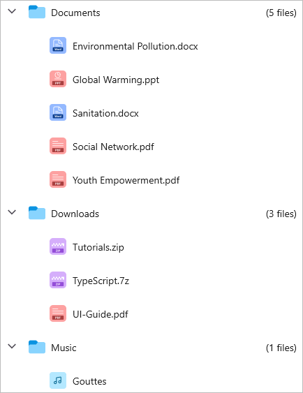
Similarly, you can assign a DataTemplateSelector to the ExpanderTemplate property to apply different expander templates per item.
Layout properties
The SfTreeView exposes properties to control the indentation and the size and placement of the expander view.
Indentation
The SfTreeView allows you to customize the indent spacing of items by setting the Indentation property. The default value of this property is 30d, and it can be customized at runtime.
<syncfusion:SfTreeView x:Name="treeView" Indentation="40">using Syncfusion.Maui.TreeView;
public class MainPage : ContentPage
{
public MainPage()
{
InitializeComponent();
SfTreeView treeView = new SfTreeView();
treeView.Indentation = 40;
}
}ExpanderWidth
The SfTreeView allows you to customize the width of the expander view by setting the ExpanderWidth property. The default value of this property is 32d, and it can be customized at runtime.
<syncfusion:SfTreeView x:Name="treeView" ExpanderWidth="40">using Syncfusion.Maui.TreeView;
public class MainPage : ContentPage
{
public MainPage()
{
InitializeComponent();
SfTreeView treeView = new SfTreeView();
treeView.ExpanderWidth = 40;
}
}ExpanderPosition
The SfTreeView allows you to change the position of the expander view by setting the ExpanderPosition property. The default value of this property is Start. This property has the following two positions:
-
Start: Displays the expander view at the start position (before the item content). This is the default. -
End: Displays the expander view at the end position (after the item content).
<syncfusion:SfTreeView x:Name="treeView" ExpanderPosition="End">using Syncfusion.Maui.TreeView;
public class MainPage : ContentPage
{
public MainPage()
{
InitializeComponent();
SfTreeView treeView = new SfTreeView();
treeView.ExpanderPosition = TreeViewExpanderPosition.End;
}
}Level based styling
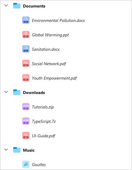
The SfTreeView allows you to customize the style of the TreeViewItem based on different levels by using the IValueConverter.
<ContentPage  xmlns="http://schemas.microsoft.com/dotnet/2021/maui"
             xmlns:x="http://schemas.microsoft.com/winfx/2009/xaml"
             xmlns:syncfusion="clr-namespace:Syncfusion.Maui.TreeView;assembly=Syncfusion.Maui.TreeView"
             xmlns:local="clr-namespace:GettingStarted;assembly=GettingStarted"
             x:Class="GettingStarted.MainPage">
<ContentPage.Resources>
    <ResourceDictionary>
        <local:FontAttributeConverter x:Key="FontAttributeConverter"/>
    </ResourceDictionary>
</ContentPage.Resources>
<ContentPage.Content>
    <syncfusion:SfTreeView x:Name="treeView"
                           ChildPropertyName="SubFolder"
                           AutoExpandMode="AllNodesExpanded"
                           ItemTemplateContextType="Node"
                           ItemsSource="{Binding Folders}">
        <syncfusion:SfTreeView.ItemTemplate>
            <DataTemplate>
                        <Label LineBreakMode="NoWrap"
                               Text="{Binding Content.FolderName}"
                               FontSize="Medium"
                               FontAttributes="{Binding Level,Converter={StaticResource FontAttributeConverter}}"/>
            </DataTemplate>
        </syncfusion:SfTreeView.ItemTemplate>
    </syncfusion:SfTreeView>
</ContentPage.Content>
</ContentPage>
using System;
using System.Globalization;
using Microsoft.Maui.Controls;
public class FontAttributeConverter : IValueConverter
{
public object Convert(object value, Type targetType, object parameter, CultureInfo culture)
{
if (value is int level)
{
return level == 0 ? FontAttributes.Bold : FontAttributes.Italic;
}
return FontAttributes.None;
}
public object ConvertBack(object value, Type targetType, object parameter, CultureInfo culture)
{
throw new NotImplementedException();
}
}Download the entire source code from GitHub here.
Animation
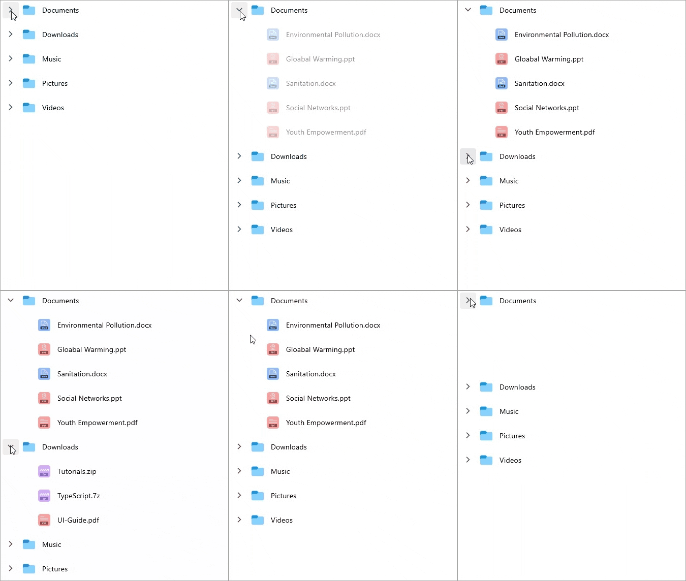
The SfTreeView supports animation when expanding or collapsing the TreeViewNode. To enable or disable the animation, use the IsAnimationEnabled property of SfTreeView.
The default value of the
IsAnimationEnabledproperty isfalse.
<syncfusion:SfTreeView x:Name="treeView"
                       IsAnimationEnabled="true">
using Syncfusion.Maui.TreeView;

public class MainPage : ContentPage
{
    public MainPage()
    {
        InitializeComponent();

        SfTreeView treeView = new SfTreeView();
        treeView.IsAnimationEnabled = true;
    }
}
When IsAnimationEnabled is true, the expand and collapse operations animate the height of the child items over a fixed duration defined by the control. The animation is applied only to the visual transition; it does not affect the underlying data or node state.
How to
Disable the ripple effect on item click
To disable the ripple effect when clicking a TreeViewItem, set the color value Transparent for the built-in theme key SfTreeViewRippleBackground within a SyncfusionThemeDictionary.
<ContentPage xmlns="http://schemas.microsoft.com/dotnet/2021/maui"
                xmlns:x="http://schemas.microsoft.com/winfx/2009/xaml"
                xmlns:syncfusion="clr-namespace:Syncfusion.Maui.TreeView;assembly=Syncfusion.Maui.TreeView"
                xmlns:syncTheme="clr-namespace:Syncfusion.Maui.Themes;assembly=Syncfusion.Maui.Core"
                x:Class="GettingStarted.MainPage">
	<ContentPage.Resources>
        <syncTheme:SyncfusionThemeDictionary>
            <syncTheme:SyncfusionThemeDictionary.MergedDictionaries>
                <ResourceDictionary>
                   <Color x:Key="SfTreeViewRippleBackground">Transparent</Color>
                </ResourceDictionary>
            </syncTheme:SyncfusionThemeDictionary.MergedDictionaries>
        </syncTheme:SyncfusionThemeDictionary>
    </ContentPage.Resources>
    <ContentPage.Content>
        <syncfusion:SfTreeView x:Name="treeView"
                               ChildPropertyName="SubFiles"
                               ItemsSource="{Binding ImageNodeInfo}"/>
    </ContentPage.Content>
</ContentPage>