How can I help you?
Dealing with Header, Footer and Selection in MAUI Picker (SfPicker)
24 Feb 202620 minutes to read
This section explains the header, footer and selection view customization of picker control.
Enable or disable header
SfPicker enables or disables the header section by setting the SfPicker.HeaderView.Height property to a value greater than 0. The default value of the Height property is 0.
<sfPicker:SfPicker x:Name="picker">
    <sfPicker:SfPicker.HeaderView>
        <sfPicker:PickerHeaderView Height="40"/>
    </sfPicker:SfPicker.HeaderView>
</sfPicker:SfPicker>this.picker.HeaderView.Height= 40;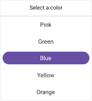
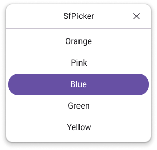
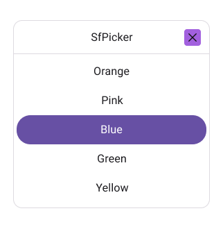
CloseButtonIcon
Show Close Button
You can enable or disable the close button in the SfPicker header by setting the ShowCloseButton property. The default value is false.
<Grid>
    <picker:SfPicker x:Name="picker" Mode="Dialog" ShowCloseButton="True">
        <picker:SfPicker.HeaderView >
            <picker:PickerHeaderView Height="40" Text="Date Picker"/>
        </picker:SfPicker.HeaderView>
    </picker:SfPicker>
    <Button Text="Open Picker"
            x:Name="pickerButton"
            Clicked="Button_Clicked"
            HorizontalOptions="Center"
            VerticalOptions="Center"
            HeightRequest="50"
            WidthRequest="150">
    </Button>
</Grid>
private void Button_Clicked(object sender, EventArgs e)
{
picker.IsOpen = true;
}
NOTE
For the CloseButton to render properly, the header view must be present; otherwise, it will not function.
Close Button Icon
You can customize the close button icon in the SfPicker header by setting the CloseButtonIcon property.
<Grid>
    <picker:SfTimePicker x:Name="timePicker" ShowCloseButton="True" Mode="Dialog" CloseButtonIcon="closeicon.png">
        <picker:SfTimePicker.HeaderView >
            <picker:PickerHeaderView Height="40" Text="Date Picker"/>
        </picker:SfTimePicker.HeaderView>
    </picker:SfTimePicker>
    <Button Text="Open Picker"
            x:Name="pickerButton"
            Clicked="Button_Clicked"
            HorizontalOptions="Center"
            VerticalOptions="Center"
            HeightRequest="50"
            WidthRequest="150">
    </Button>
</Grid>
private void Button_Clicked(object sender, EventArgs e)
{
timePicker.IsOpen = true;
}
NOTE
The ShowCloseButton property must be set to true for the close button icon to be displayed.
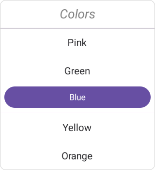
Header customization
SfPicker allows customizing background, text style.
Background
The Header’s Background color can be customized by setting the SfPicker.HeaderView.Background property.
<sfPicker:SfPicker x:Name="picker">
    <sfPicker:SfPicker.HeaderView>
        <sfPicker:PickerHeaderView Background="#D3D3D3"/>
    </sfPicker:SfPicker.HeaderView>
</sfPicker:SfPicker>this.picker.HeaderView.Background = Color.FromArgb("#6750A4");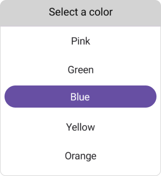
Header text style
The .NET MAUI Picker control and header TextStyle such as TextColor, FontSize, FontFamily, and FontAttributes can be customized as shown in the following code.
<sfPicker:SfPicker x:Name="picker">
    <sfPicker:SfPicker.HeaderView>
        <sfPicker:PickerHeaderView>
            <sfPicker:PickerHeaderView.TextStyle>
                <sfPicker:PickerTextStyle TextColor="Gray"
                FontSize="18"
                FontAttributes="Italic"/>
            </sfPicker:PickerHeaderView.TextStyle>
        </sfPicker:PickerHeaderView>
    </sfPicker:SfPicker.HeaderView>
</sfPicker:SfPicker>this.picker.HeaderView.TextStyle = new PickerTextStyle()
{
TextColor = Colors.Gray,
FontSize = 18,
FontAttributes = FontAttributes.Italic
};
Divider color
The Header’s DividerColor color can be customized by setting the SfPicker.HeaderView.DividerColor property.
<sfPicker:SfPicker x:Name="picker">
    <sfPicker:SfPicker.HeaderView>
        <sfPicker:PickerHeaderView DividerColor="Red"/>
    </sfPicker:SfPicker.HeaderView>
</sfPicker:SfPicker>this.picker.HeaderView.DividerColor = Colors.Red;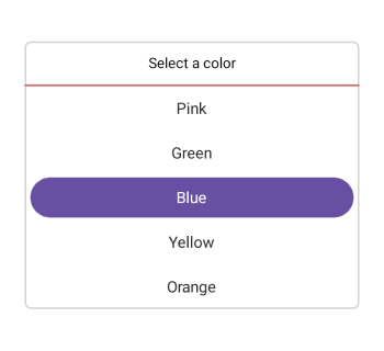
Custom Header Appearance using Data template
You can customize the picker header appearance by using the HeaderTemplate property in the SfPicker.
<Picker:SfPicker x:Name="picker" >
    <picker:SfPicker.HeaderTemplate>
        <DataTemplate>
            <Grid BackgroundColor="#BB9AB1">
                <Label HorizontalOptions="Center" VerticalOptions="Center" Text="Select a Color" TextColor="White"/>
            </Grid>
        </DataTemplate>
    </picker:SfPicker.HeaderTemplate>
</Picker:SfPicker>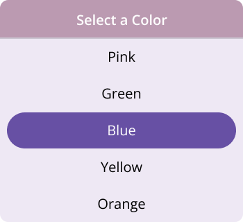
NOTE
If a template is applied to the header in the PickerHeaderView, the remaining header properties will not have any effect, except for the DividerColor Property.
Custom Header appearance using DataTemplateSelector
You can customize the picker header appearance by using the HeaderTemplate property in the SfPicker. The DataTemplateSelector allows you to choose a DataTemplate at runtime based on the value bound to the picker header. This lets you apply a custom data template to the header and customize its appearance based on specific conditions.
<Grid.Resources>
    <DataTemplate x:Key="selectedItemTemplate">
    <Grid Background = "LightBlue" >
        <Label Text="Select a Color"  HorizontalOptions="Center" VerticalOptions="Center" TextColor="Red"/>
    </Grid>
</DataTemplate>
<DataTemplate x:Key="nonSelectedItemTemplate">
    <Grid Background="LightGreen" >
        <Label Text="Select a Color"  HorizontalOptions="Center" VerticalOptions="Center" TextColor="Orange"/>
    </Grid>
</DataTemplate>
    <local:PickerTemplateSelector x:Key="headerTemplateSelector" SelectedItemTemplate="{StaticResource selectedItemTemplate}"  NonSelectedItemTemplate="{StaticResource nonSelectedItemTemplate}"/>
    <picker:SfPicker x:Name="picker" HeaderTemplate="{StaticResource headerTemplateSelector}">
    </picker:SfPicker>
</Grid.Resources>
public class PickerTemplateSelector : DataTemplateSelector
{
public PickerTemplateSelector()
{
}
public DataTemplate SelectedItemTemplate { get; set; }
public DataTemplate NonSelectedItemTemplate { get; set; }
protected override DataTemplate OnSelectTemplate(object item, BindableObject container)
{
var Details = item as PickerColumn;
if (Details != null)
{
if (Details.SelectedIndex <= 4)
return SelectedItemTemplate;
}
return NonSelectedItemTemplate;
}
}Enable or disable footer
SfPicker enables or disables the footer section by setting the SfPicker.FooterView.Height property to a value greater than 0. The default value of the Height property is 0.
<sfPicker:SfPicker x:Name="picker">
    <sfPicker:SfPicker.FooterView>
        <sfPicker:PickerFooterView Height="40"/>
    </sfPicker:SfPicker.FooterView>
</sfPicker:SfPicker>this.picker.FooterView.Height= 40;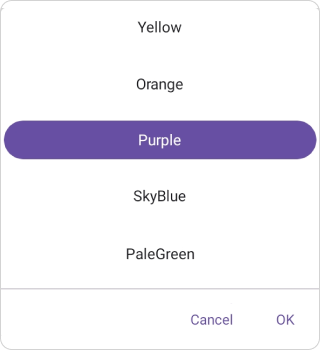
Footer view customization
SfPicker allows customizing the background, text, and text style of the ok and cancel buttons and the visibility of the ok button.
Background
The Header’s Background color can be customized by setting the SfPicker.HeaderView.Background property.
<sfPicker:SfPicker x:Name="picker">
    <sfPicker:SfPicker.FooterView>
        <sfPicker:PickerFooterView Background="#D3D3D3"/>
    </sfPicker:SfPicker.FooterView>
</sfPicker:SfPicker>this.picker.FooterView.Background = Color.FromArgb("#6750A4");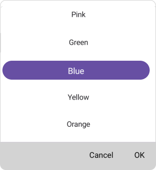
Buttons customization
SfPicker enables or disables the ok button by setting the SfPicker.FooterView.ShowOkButton property to true or false. The default value of the ShowOkButton property is true. Customize the text of the ok and cancel buttons using the OkButtonText and CancelButtonText property.
<sfPicker:SfPicker x:Name="picker">
    <sfPicker:SfPicker.FooterView>
        <sfPicker:PickerFooterView
            ShowOkButton="False"
            OkButtonText="Done"
            CancelButtonText="Exit"/>
    </sfPicker:SfPicker.FooterView>
</sfPicker:SfPicker>this.picker.FooterView.OkButtonShow = false;
this.picker.FooterView.OkButtonText= "Done";
this.picker.FooterView.CancelButtonText= "Exit";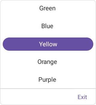
Footer text style
The .NET MAUI Picker control and footer TextStyle such as TextColor, FontSize, FontFamily, and FontAttributes can be customized as shown in the following code.
<sfPicker:SfPicker>
<sfPicker:SfPicker.FooterView>
    <sfPicker:PickerFooterView>
    <sfPicker:PickerFooterView.TextStyle>
        <sfPicker:PickerTextStyle TextColor="Gray" FontSize="18" FontAttributes="Italic"/>
    </sfPicker:PickerFooterView.TextStyle>
    </sfPicker:PickerFooterView>
</sfPicker:SfPicker.FooterView>
</sfPicker:SfPicker>this.picker.FooterView.TextStyle = new PickerTextStyle()
{
TextColor = Colors.Gray,
FontSize = 18,
FontAttributes = FontAttributes.Italic
};
Divider color
The Footer’s DividerColor color can be customized by setting the SfPicker.FooterView.DividerColor property.
<sfPicker:SfPicker x:Name="picker">
    <sfPicker:SfPicker.FooterView>
        <sfPicker:PickerFooterView DividerColor="Red"/>
    </sfPicker:SfPicker.FooterView>
</sfPicker:SfPicker>this.picker.FooterView.DividerColor = Colors.Red;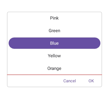
Custom Footer Appearance using Data template
You can customize the picker footer appearance by using the FooterTemplate property in the SfPicker.
<Picker:SfPicker x:Name="picker" >
    <picker:SfPicker.FooterTemplate>
        <DataTemplate>
            <Grid BackgroundColor="#BB9AB1">
                <Grid.ColumnDefinitions>
                    <ColumnDefinition/>
                    <ColumnDefinition/>
                </Grid.ColumnDefinitions>
                <Button Grid.Column="0" Text="Decline" TextColor="White" Background="Transparent" />
                <Button Grid.Column="1" Text="Accept" TextColor="White" Background="Transparent" />
            </Grid>
        </DataTemplate>
    </picker:SfPicker.FooterTemplate>
</Picker:SfPicker>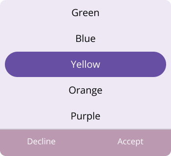
NOTE
If a template is applied to the footer in the PickerFooterView, the remaining footer properties will not have any effect, except for the DividerColor Property.
Custom Footer appearance using DataTemplateSelector
You can customize the picker footer appearance by using the FooterTemplate property in the SfPicker. The DataTemplateSelector allows you to choose a DataTemplate at runtime based on the value bound to the picker footer. This lets you apply a custom data template to the footer and customize its appearance based on specific conditions.
<Grid.Resources>
    <DataTemplate x:Key="selectedItemTemplate">
        <Grid Background = "LightBlue" >
            <Grid.ColumnDefinitions>
                <ColumnDefinition/>
                <ColumnDefinition/>
            </Grid.ColumnDefinitions>
                <Button Grid.Column="0" Text="Decline" TextColor="White" Background="Transparent" />
                <Button Grid.Column="1" Text="Accept" TextColor="White" Background="Transparent" />
        </Grid>
    </DataTemplate>
    <DataTemplate x:Key="nonSelectedItemTemplate">
        <Grid Background="LightGreen" >
            <Grid.ColumnDefinitions>
                <ColumnDefinition/>
                <ColumnDefinition/>
            </Grid.ColumnDefinitions>
                <Button Grid.Column="0" Text="Decline" TextColor="White" Background="Transparent" />
                <Button Grid.Column="1" Text="Accept" TextColor="White" Background="Transparent" />
            </Grid>
    </DataTemplate>
    <local:PickerTemplateSelector x:Key="footerTemplateSelector" SelectedItemTemplate="{StaticResource selectedItemTemplate}"  NonSelectedItemTemplate="{StaticResource nonSelectedItemTemplate}"/>
    <picker:SfPicker x:Name="picker" FooterTemplate="{StaticResource footerTemplateSelector}">
    </picker:SfPicker>
</Grid.Resources>
public class PickerTemplateSelector : DataTemplateSelector
{
public PickerTemplateSelector()
{
}
public DataTemplate SelectedItemTemplate { get; set; }
public DataTemplate NonSelectedItemTemplate { get; set; }
protected override DataTemplate OnSelectTemplate(object item, BindableObject container)
{
var Details = item as PickerColumn;
if (Details != null)
{
if (Details.SelectedIndex <= 4)
return SelectedItemTemplate;
}
return NonSelectedItemTemplate;
}
}Perform validation with default validation button
Picker allows validation based on the OK or Cancel button by hooking into the SfPicker.OkButtonClicked and SfPicker.CancelButtonClicked In this event, from the SelectionChangedEvent argument, current selected items can be obtained.
<sfPicker:SfPicker x:Name="picker"
                       OkButtonClicked="SfPicker_OkButtonClicked"
                       CancelButtonClicked="SfPicker_CancelButtonClicked">
</sfPicker:SfPicker>this.picker.OkButtonClicked += SfPicker_OkButtonClicked;
this.picker.CancelButtonClicked += SfPicker_CancelButtonClicked;
private void SfPicker_OkButtonClicked(object sender, EventArgs e)
{
//// Perform any operation.
}
private void SfPicker_CancelButtonClicked(object sender, EventArgs e)
{
//// Perform any operation.
}Selection view customization
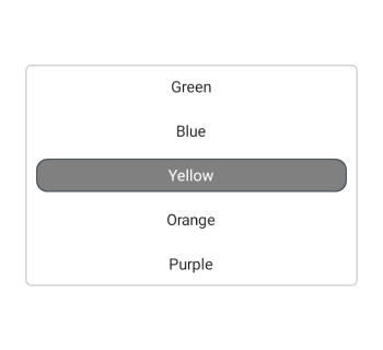
Customize the picker selection view by using the SelectionView property of the SfPicker.
Background and selection shape customization
In the SfPicker control, the corner radius, stroke, background and padding can be customized by setting the CornerRadius, Stroke, Background and Padding properties in the PickerSelectionView.
<picker:SfPicker x:Name="picker" >
    <picker:SfPicker.SelectionView >
        <picker:PickerSelectionView CornerRadius="10" Stroke="#36454F" Padding="10, 5, 10, 5" Background="#808080" />
    </picker:SfPicker.SelectionView>
</picker:SfPicker>
SfPicker picker = new SfPicker();
picker.SelectionView = new PickerSelectionView()
{
CornerRadius = 10,
Stroke = Color.FromArgb("#36454F"),
Padding = new Thickness(10, 5, 10, 5),
Background = Color.FromArgb("#808080"),
};
this.Content = picker;