Dealing with Column Header in .NET MAUI Picker (SfPicker)
8 Jun 20266 minutes to read
This section explains the column header customization of picker control.
Column header view
The SfPicker enables or disables the column header section by setting the SfPicker.ColumnHeaderView.Height property to a value greater than 0. The default value of the Height property is 0.
<sfPicker:SfPicker x:Name="picker">
        <sfPicker:SfPicker.ColumnHeaderView>
            <sfPicker:PickerColumnHeaderView Height="40"/>
        </sfPicker:SfPicker.ColumnHeaderView>
</sfPicker:SfPicker>this.picker.ColumnHeaderView.Height= 40;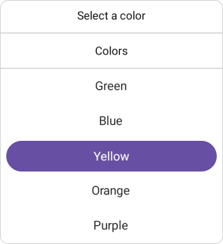
Column header customization
Enhancing Column Header with Height, Text Style, Background, and DividerColor Properties.
Background
The column header Background color can be customized by setting the SfPicker.ColumnHeaderView.Background property.
<sfPicker:SfPicker x:Name="picker">
        <sfPicker:SfPicker.ColumnHeaderView>
            <sfPicker:PickerColumnHeaderView Background="#E5E4E2"/>
        </sfPicker:SfPicker.ColumnHeaderView>
</sfPicker:SfPicker>this.picker.ColumnHeaderView.Background = Color.FromArgb("#E5E4E2"),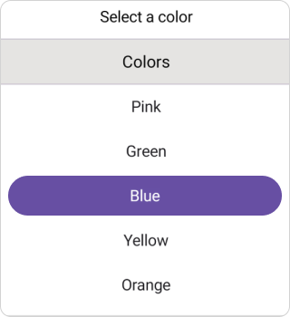
Column header text style
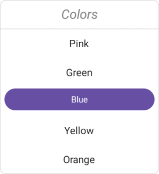
The .NET MAUI Picker control and column header TextStyle such as text color, font size, font family, and font attributes can be customized as shown in the following code.
<sfPicker:SfPicker x:Name="picker">
      <sfPicker:SfPicker.ColumnHeaderView>
          <sfPicker:PickerColumnHeaderView>
              <sfPicker:PickerColumnHeaderView.TextStyle>
                  <sfPicker:PickerTextStyle TextColor="Gray"
                  FontSize="18"
                  FontAttributes="Italic"/>
              </sfPicker:PickerColumnHeaderView.TextStyle>
          </sfPicker:PickerColumnHeaderView>
      </sfPicker:SfPicker.ColumnHeaderView>
</sfPicker:SfPicker>this.picker.ColumnHeaderView.TextStyle = new PickerTextStyle()
{
TextColor = Colors.Gray,
FontSize = 18,
FontAttributes = FontAttributes.Italic
};
Divider color
The .NET MAUI Picker control, Separator line background customized by setting SfPicker.ColumnHeaderView.DividerColor property.
<sfPicker:SfPicker x:Name="picker">
        <sfPicker:SfPicker.ColumnHeaderView>
            <sfPicker:PickerColumnHeaderView DividerColor="Red"/>
        </sfPicker:SfPicker.ColumnHeaderView>
</sfPicker:SfPicker>this.picker.ColumnHeaderView.DividerColor = Colors.Red;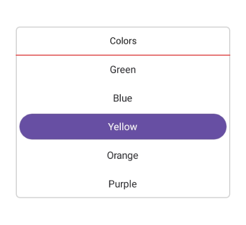
Custom Column Header Appearance using Data template
You can customize the picker column header appearance by using the ColumnHeaderTemplate property in the SfPicker.
<picker:SfPicker x:Name="picker" >
    <picker:SfPicker.ColumnHeaderTemplate>
    <DataTemplate>
        <Grid BackgroundColor="#BB9AB1">
            <Label Text="Colors" TextColor="White" HorizontalTextAlignment="Center" VerticalTextAlignment="Center"/>
        </Grid>
    </DataTemplate>
</picker:SfPicker.ColumnHeaderTemplate>
</picker:SfPicker>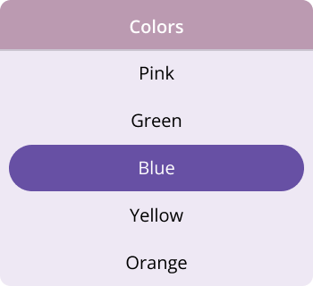
NOTE
If a template is applied to the column header in the PickerColumnHeaderView, the remaining column header properties will not have any effect, except for the DividerColor Property.
Custom Column Header appearance using DataTemplateSelector
You can customize the picker column header appearance by using the ColumnHeaderTemplate property in the SfPicker. The DataTemplateSelector allows you to choose a DataTemplate at runtime based on the value bound to the picker column header. This lets you apply a custom data template to the column header and customize its appearance based on specific conditions.
<Grid.Resources>
    <DataTemplate x:Key="selectedItemTemplate">
        <Grid Background = "LightBlue" >
            <Label Text="Colors"  HorizontalOptions="Center" VerticalOptions="Center" TextColor="Red"/>
        </Grid>
    </DataTemplate>
    <DataTemplate x:Key="nonSelectedItemTemplate">
        <Grid Background="LightGreen" >
            <Label Text="Colors"  HorizontalOptions="Center" VerticalOptions="Center" TextColor="Orange"/>
        </Grid>
    </DataTemplate>
    <local:PickerTemplateSelector x:Key="columnHeaderTemplateSelector" SelectedItemTemplate="{StaticResource selectedItemTemplate}"  NonSelectedItemTemplate="{StaticResource nonSelectedItemTemplate}"/>
    <picker:SfPicker x:Name="picker" ColumnHeaderTemplate="{StaticResource columnHeaderTemplateSelector}">
    </picker:SfPicker>
</Grid.Resources>
public class PickerTemplateSelector : DataTemplateSelector
{
public PickerTemplateSelector()
{
}
public DataTemplate SelectedItemTemplate { get; set; }
public DataTemplate NonSelectedItemTemplate { get; set; }
protected override DataTemplate OnSelectTemplate(object item, BindableObject container)
{
var Details = item as PickerColumn;
if (Details != null)
{
if (Details.SelectedIndex <= 4)
return SelectedItemTemplate;
}
return NonSelectedItemTemplate;
}
}