How can I help you?
Dealing with Columns in .NET MAUI Picker (SfPicker)
22 Sep 20257 minutes to read
This section explains the customization of picker columns.
Columns customization
You can customize various properties, including DisplayMemberPath, Width, SelectedIndex, ItemsSource, and HeaderText for enhanced control and flexibility by the following code.
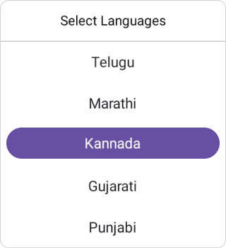
DisplayMemberPath
When you have a collection of objects, and you want to display a specific property of those objects rather than the entire object by using the DisplayMemberPath property in the PickerColumn class.
<sfPicker:SfPicker x:Name="picker">
</sfPicker:SfPicker>
public MainPage()
{
InitializeComponent();
ObservableCollection<CountryInfo> countryDetails = new ObservableCollection<CountryInfo>
{
new CountryInfo { Language = "Tamil", StateName = "Tamil Nadu" },
new CountryInfo { Language = "Hindi", StateName = "Uttar Pradesh" },
new CountryInfo { Language = "Bengali", StateName = "West Bengal" },
new CountryInfo { Language = "Telugu", StateName = "Andhra Pradesh" },
new CountryInfo { Language = "Marathi", StateName = "Maharashtra" },
new CountryInfo { Language = "Kannada", StateName = "Karnataka" },
new CountryInfo { Language = "Gujarati", StateName = "Gujarat" },
new CountryInfo { Language = "Punjabi", StateName = "Punjab" },
new CountryInfo { Language = "Odia", StateName = "Odisha" },
new CountryInfo { Language = "Malayalam", StateName = "Kerala" },
new CountryInfo { Language = "Assamese", StateName = "Assam" },
};
PickerColumn pickerColumn = new PickerColumn()
{
DisplayMemberPath = "Language",
HeaderText = "Select Languages",
ItemsSource = countryDetails,
SelectedIndex = 1,
};
this.picker.Columns.Add(pickerColumn);
}public class CountryInfo
{
public string Language { get; set; }
public string StateName { get; set; }
}
Width customization
Customize the Width of every column by setting the Width property in the PickerColumn. The default value of width is -1.
<sfPicker:SfPicker x:Name="picker">
</sfPicker:SfPicker>this.picker.Columns[0].Width = 150;SelectedIndex customization
Customize the SelectedIndex of every column by setting the SelectedIndex property in the PickerColumn. The default value of the SelectedIndex property is 0.
<sfPicker:SfPicker x:Name="picker">
</sfPicker:SfPicker>this.picker.Columns[0].SelectedIndex = 5;SelectedItem customization
Customize the SelectedItem of every column by setting the SelectedItem property in the PickerColumn. The default value of the SelectedItem property is based on SelectedIndex default value.
<sfPicker:SfPicker x:Name="picker">
</sfPicker:SfPicker>this.picker.Columns[0].SelectedItem = "India";NOTE
- If you sets both the
Selected ItemandSelected Indexproperties, the picker will display the item corresponding to theSelected Indexin the selection view. This ensures the index value takes precedence for display purposes.- In multiple columns, if you set any one column’s selected item as
null, the selected item for the other columns will also becomenull.
HeaderText customization
Customize the Header text of every column by setting the HeaderText property in the PickerColumn. The default value of the HeaderText property is string.empty.
<sfPicker:SfPicker x:Name="picker">
</sfPicker:SfPicker>this.picker.Columns[0].HeaderText = "Languages";
ItemsSource customization
Customize the ItemSource of every column by setting the ItemSource property in the PickerColumn. The default value of the ItemSource property is null.
<sfPicker:SfPicker x:Name="picker">
</sfPicker:SfPicker>ObservableCollection<string> languages = new ObservableCollection<string> { "Spanish", "French", "Tamil", "English", "German", "Chinese", "Telegu", "Japanese", "Arabic", "Russian", "Portuguese", "Italian" };
this.picker.Columns.Add(languages);
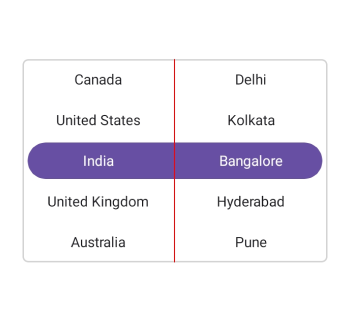
Column divider color
Customize the column divider color when the picker consists of more than one column using the ColumnDividerColor property in SfPicker.
<sfPicker:SfPicker x:Name="picker"
                   ColumnDividerColor="Red">
</sfPicker:SfPicker>
SfPicker picker = new SfPicker();
picker.ColumnDividerColor = Colors.Red;
this.Content = picker;