Populating Items in .NET MAUI Picker (SfPicker)
21 Jul 20268 minutes to read
In .NET MAUI, you can bind the SfPicker control to an external data source by setting its ItemsSource property to an ObservableCollection. This enables the picker to display and update data from the collection.
Set the ItemsSource property in the PickerColumn class as shown in the following code to bind the item source in the picker.
<sfPicker:SfPicker x:Name="picker">
</sfPicker:SfPicker>ObservableCollection<object> cityName = new ObservableCollection<object>();
cityName.Add("Chennai");
cityName.Add("Mumbai");
cityName.Add("Delhi");
cityName.Add("Kolkata");
cityName.Add("Bangalore");
cityName.Add("Hyderabad");
cityName.Add("Pune");
cityName.Add("Ahmedabad");
cityName.Add("Jaipur");
cityName.Add("Lucknow");
cityName.Add("Chandigarh");
PickerColumn pickerColumn = new PickerColumn()
{
HeaderText = "Select City",
ItemsSource = cityName,
SelectedIndex = 1,
};
this.picker.Columns.Add(pickerColumn);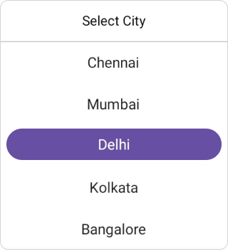
Multi-column items
The picker populates items as multi-column data based on the number of Columns.
A collection of items can be created and assigned to a Collection based on the index value, where each index represents a column in the picker.
The following sample code demonstrates how to populate Countries and Cities in each column of the picker.
<sfPicker:SfPicker x:Name="picker">
</sfPicker:SfPicker>ObservableCollection<object> countryName = new ObservableCollection<object>();
countryName.Add("Canada");
countryName.Add("United States");
countryName.Add("India");
countryName.Add("United Kingdom");
countryName.Add("Australia");
countryName.Add("Germany");
countryName.Add("France");
countryName.Add("Japan");
countryName.Add("China");
countryName.Add("Brazil");
PickerColumn countryColumn = new PickerColumn()
{
HeaderText = "Select Country",
ItemsSource = countryName,
SelectedIndex = 1,
};
ObservableCollection<object> cityName = new ObservableCollection<object>();
cityName.Add("Chennai");
cityName.Add("Mumbai");
cityName.Add("Delhi");
cityName.Add("Kolkata");
cityName.Add("Bangalore");
cityName.Add("Hyderabad");
cityName.Add("Pune");
cityName.Add("Ahmedabad");
cityName.Add("Jaipur");
cityName.Add("Lucknow");
cityName.Add("Chandigarh");
PickerColumn cityColumn = new PickerColumn()
{
HeaderText = "Select City",
ItemsSource = cityName,
SelectedIndex = 1,
};
this.picker.Columns.Add(countryColumn);
this.picker.Columns.Add(cityColumn);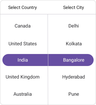
Customizing text style of items
The .NET MAUI Picker control allows customization of the selected and unselected item appearance, including TextColor, FontSize, FontFamily, and FontAttributes, as shown in the following code.
Selected item customization
The selected item SelectedTextStyle can be customized by setting the SfPicker.SelectedTextStyle property.
<sfPicker:SfPicker x:Name="picker">
        <sfPicker:SfPicker.SelectedTextStyle>
            <sfPicker:PickerTextStyle FontSize="16" FontAttributes="Bold" TextColor="White">
            </sfPicker:PickerTextStyle>
        </sfPicker:SfPicker.SelectedTextStyle>
</sfPicker:SfPicker>this.picker.SelectedTextStyle.FontSize = 16;
this.picker.SelectedTextStyle.FontAttributes = FontAttributes.Bold;
this.picker.SelectedTextStyle.TextColor = Colors.White;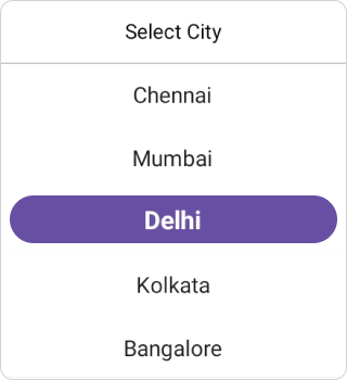
Unselected item customization
The unselected item TextStyle can be customized by setting the SfPicker.TextStyle property.
<sfPicker:SfPicker x:Name="picker">
        <sfPicker:SfPicker.TextStyle>
            <sfPicker:PickerTextStyle FontSize="16" FontAttributes="Italic" TextColor="Black">
            </sfPicker:PickerTextStyle>
        </sfPicker:SfPicker.TextStyle>
</sfPicker:SfPicker>this.picker.TextStyle.FontSize = 16;
this.picker.TextStyle.FontAttributes = FontAttributes.Italic;
this.picker.TextStyle.TextColor = Colors.Black;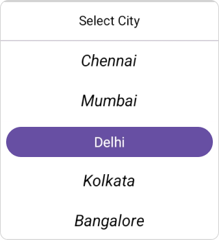
Adding custom view to items
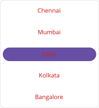
In the picker control, items can be customized with a custom view for all items by using the ItemTemplate property and assigning a custom view to it.
<Grid>
        <Grid.Resources>
            <DataTemplate x:Key="customView">
                <Grid>
                    <Label HorizontalTextAlignment="Center" VerticalTextAlignment="Center" TextColor="Red" Text="{Binding Data}"/>
                </Grid>
            </DataTemplate>
        </Grid.Resources>
    <sfPicker:SfPicker x:Name="picker" ItemTemplate="{StaticResource customView}">
    </sfPicker:SfPicker>
    </Grid>
DataTemplate customView = new DataTemplate(() =>
{
Grid grid = new Grid
{
Padding = new Thickness(0, 1, 0, 1),
};
Label label = new Label
{
HorizontalOptions = LayoutOptions.Center,
VerticalOptions = LayoutOptions.Center,
HorizontalTextAlignment = TextAlignment.Center,
VerticalTextAlignment = TextAlignment.Center,
TextColor = Colors.Black,
};
label.SetBinding(Label.TextProperty, new Binding("Data"));
grid.Children.Add(label);
return grid;
});
this.picker.ItemTemplate = customView;