Setting Main Content in .NET MAUI Navigation Drawer
29 Jul 20268 minutes to read
The main content of the .NET MAUI Navigation Drawer is the area that stays visible behind the side pane. It is configured through the ContentView property. When the user selects an item in the side pane (for example, a ListView item), update ContentView to switch the visible content within the same page.
Prerequisites
Before using the SfNavigationDrawer, ensure the following NuGet package is installed in your .NET MAUI project:
Syncfusion.Maui.NavigationDrawer
For step-by-step setup, refer to the Getting Started documentation.
Setting Main Content
The following code examples illustrate how to set the main content of the Navigation Drawer, along with a hamburger button that toggles the side pane. Choose one of the two approaches below - the XAML approach uses the page’s named element, while the C# approach builds the control entirely in code.
<navigationDrawer:SfNavigationDrawer x:Name="navigationDrawer">
    <navigationDrawer:SfNavigationDrawer.DrawerSettings>
        <navigationDrawer:DrawerSettings DrawerWidth="250"
                                         DrawerHeaderHeight="160" />
    </navigationDrawer:SfNavigationDrawer.DrawerSettings>
    <navigationDrawer:SfNavigationDrawer.ContentView>
        <Grid x:Name="mainContentView"
              BackgroundColor="White"
              RowDefinitions="Auto,*">
            <HorizontalStackLayout Grid.Row="0"
                                   BackgroundColor="#6750A4"
                                   Spacing="10"
                                   Padding="5,0,0,0">
                <ImageButton x:Name="hamburgerButton"
                             HeightRequest="50"
                             WidthRequest="50"
                             HorizontalOptions="Start"
                             Source="hamburger.png"
                             BackgroundColor="#6750A4"
                             Clicked="hamburgerButton_Clicked" />
                <Label x:Name="headerLabel"
                       HeightRequest="50"
                       HorizontalTextAlignment="Center"
                       VerticalTextAlignment="Center"
                       Text="Home"
                       FontSize="16"
                       TextColor="White"
                       BackgroundColor="#6750A4" />
            </HorizontalStackLayout>
            <Label Grid.Row="1"
                   x:Name="contentLabel"
                   VerticalOptions="Center"
                   HorizontalOptions="Center"
                   Text="Content View"
                   FontSize="14"
                   TextColor="Black" />
        </Grid>
    </navigationDrawer:SfNavigationDrawer.ContentView>
</navigationDrawer:SfNavigationDrawer>
SfNavigationDrawer navigationDrawer;
Label contentLabel;
navigationDrawer = new SfNavigationDrawer();
navigationDrawer.DrawerSettings = new DrawerSettings()
{
DrawerWidth = 250,
};
Grid grid = new Grid()
{
RowDefinitions =
{
new RowDefinition {Height=new GridLength(1,GridUnitType.Auto)},
new RowDefinition(),
},
BackgroundColor = Colors.White,
};
HorizontalStackLayout layout = new HorizontalStackLayout()
{
BackgroundColor = Color.FromArgb("#6750A4"),
Spacing = 10,
Padding = new Thickness(5,0,0,0),
};
var hamburgerButton = new ImageButton
{
HeightRequest = 50,
WidthRequest = 50,
HorizontalOptions = LayoutOptions.Start,
BackgroundColor = Color.FromArgb("#6750A4"),
Source = "hamburger.png",
};
hamburgerButton.Clicked += hamburgerButton_Clicked;
var label = new Label
{
HeightRequest = 50,
HorizontalTextAlignment = TextAlignment.Center,
VerticalTextAlignment = TextAlignment.Center,
Text = "Home",
FontSize = 16,
TextColor = Colors.White,
BackgroundColor = Color.FromArgb("#6750A4")
};
layout.Children.Add(hamburgerButton);
layout.Children.Add(label);
contentLabel = new Label
{
HorizontalOptions = LayoutOptions.Center,
VerticalOptions = LayoutOptions.Center,
Text = "Content View",
FontSize = 14,
TextColor = Colors.Black
};
grid.SetRow(layout, 0);
grid.SetRow(contentLabel, 1);
grid.Children.Add(layout);
grid.Children.Add(contentLabel);
navigationDrawer.ContentView = grid;The hamburger button’s Clicked event can be handled in C# as follows:
private void hamburgerButton_Clicked(object sender, EventArgs e)
{
    navigationDrawer.ToggleDrawer();
}
NOTE
It is mandatory to set the
ContentViewforNavigation Drawerwhen initializing.
The following image shows the main content rendered behind the side pane.
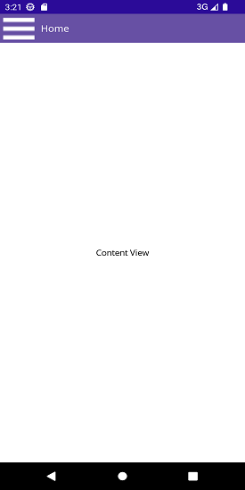
You can find the complete sample on GitHub.