Getting Started with .NET MAUI Navigation Drawer
29 Jun 202613 minutes to read
This section guides you through setting up and configuring a SfNavigationDrawer in your .NET MAUI application. Follow the steps below to add a basic Navigation Drawer to your project.
To quickly get started with the .NET MAUI Navigation Drawer, watch this video.
Prerequisites
Before proceeding, ensure the following are set up:
- Install .NET 9 SDK or later.
- Set up a .NET MAUI environment with Visual Studio 2022 v17.12 or later.
Step 1: Create a new .NET MAUI project
- Go to File > New > Project and choose the .NET MAUI App template.
- Name the project and choose a location. Then, click Next.
- Select the .NET framework version and click Create.
Step 2: Install the Syncfusion® MAUI NavigationDrawer NuGet package
- In Solution Explorer, right-click the project and choose Manage NuGet Packages.
- Search for Syncfusion.Maui.NavigationDrawer and install the latest version.
- Ensure the necessary dependencies are installed correctly, and the project is restored.
Prerequisites
Before proceeding, ensure the following are set up:
- Install .NET 9 SDK or later.
- Set up a .NET MAUI environment with Visual Studio Code.
- Ensure that the .NET MAUI workloads are installed and configured as described here.
Step 1: Create a new .NET MAUI project
- Open the Command Palette by pressing Ctrl+Shift+P and type .NET:New Project and press Enter.
- Choose the .NET MAUI App template.
- Select the project location, type the project name and press Enter.
- Then choose Create project
Step 2: Install the Syncfusion® MAUI NavigationDrawer NuGet package
- Press Ctrl + ` (backtick) to open the integrated terminal in Visual Studio Code.
- Ensure you’re in the project root directory where your .csproj file is located.
- Run the command
dotnet add package Syncfusion.Maui.NavigationDrawerto install the Syncfusion® .NET MAUI NavigationDrawer package. - To ensure all dependencies are installed, run
dotnet restore.
Prerequisites
Before proceeding, ensure the following are set up:
- Install .NET 9 SDK or later.
- Set up a .NET MAUI environment with JetBrains Rider 2024.3 or later.
- Make sure the MAUI workloads are installed and configured as described here.
Step 1: Create a new .NET MAUI project
- Go to File > New Solution, Select .NET (C#) and choose the .NET MAUI App template.
- Enter the Project Name, Solution Name, and Location.
- Select the .NET framework version and click Create.
Step 2: Install the Syncfusion® MAUI NavigationDrawer NuGet package
- In Solution Explorer, right-click the project and choose Manage NuGet Packages.
- Search for Syncfusion.Maui.NavigationDrawer and install the latest version.
- Ensure the necessary dependencies are installed correctly, and the project is restored. If not, Open the Terminal in Rider and manually run:
dotnet restore
Step 3: Register Syncfusion handler
Make sure to add the namespace.
using Syncfusion.Maui.Core.Hosting;Register the Syncfusion core handler in your CreateMauiApp method of MauiProgram.cs file to use Syncfusion controls.
builder.ConfigureSyncfusionCore();Step 4: Import the Navigation Drawer namespace
Add the following namespace in your XAML or C#.
xmlns:navigationDrawer="clr-namespace:Syncfusion.Maui.NavigationDrawer;assembly=Syncfusion.Maui.NavigationDrawer"using Syncfusion.Maui.NavigationDrawer;Step 5: Add a Navigation Drawer with DrawerContentView
Initialize the SfNavigationDrawer and create a CollectionView with items and set it as DrawerContentView.
<navigationDrawer:SfNavigationDrawer x:Name="navigationDrawer">
    <navigationDrawer:SfNavigationDrawer.DrawerSettings>
        <navigationDrawer:DrawerSettings DrawerWidth="250"
                                 DrawerHeaderHeight="160">
            <navigationDrawer:DrawerSettings.DrawerHeaderView>
                <Grid BackgroundColor="#6750A4" RowDefinitions="120,40">
                    <Image Source="user.png"/>
                    <Label Text="James Pollock" Grid.Row="1"/>
                </Grid>
            </navigationDrawer:DrawerSettings.DrawerHeaderView>
            <navigationDrawer:DrawerSettings.DrawerContentView>
                <CollectionView x:Name="collectionView" SelectionMode="Single"
                  SelectionChanged="collectionView_SelectionChanged">
                    <CollectionView.ItemsSource>
                        <x:Array Type="{x:Type x:String}">
                            <x:String>Home</x:String>
                            <x:String>Profile</x:String>
                            ...
                        </x:Array>
                    </CollectionView.ItemsSource>
                    <CollectionView.ItemTemplate>
                        <!--Load your Data Template -->
                    </CollectionView.ItemTemplate>
                </CollectionView>
            </navigationDrawer:DrawerSettings.DrawerContentView>
        </navigationDrawer:DrawerSettings>
    </navigationDrawer:SfNavigationDrawer.DrawerSettings>
    <navigationDrawer:SfNavigationDrawer.ContentView>
        <Grid x:Name="mainContentView" RowDefinitions="Auto,*">
            <HorizontalStackLayout BackgroundColor="#6750A4" Spacing="10" Padding="5,0,0,0">
                <ImageButton x:Name="hamburgerButton" Clicked="hamburgerButton_Clicked"/>
                <Label x:Name="headerLabel" />
            </HorizontalStackLayout>
            <Label Grid.Row="1" x:Name="contentLabel" />
        </Grid>
    </navigationDrawer:SfNavigationDrawer.ContentView>
</navigationDrawer:SfNavigationDrawer>
SfNavigationDrawer navigationDrawer = new SfNavigationDrawer();
var drawerSettings = new DrawerSettings
{
DrawerWidth = 250,
DrawerHeaderHeight = 160
};
var headerGrid = new Grid
{
BackgroundColor = Color.FromArgb("#6750A4"),
RowDefinitions =
{
new RowDefinition { Height = 120 },
new RowDefinition { Height = 40 }
}
};
var userImage = new Image { Source = "user.png" };
var userLabel = new Label { Text = "James Pollock" };
Grid.SetRow(userLabel, 1);
headerGrid.Children.Add(userImage);
headerGrid.Children.Add(userLabel);
drawerSettings.DrawerHeaderView = headerGrid;
collectionView = new CollectionView
{
SelectionMode = SelectionMode.Single,
ItemsSource = new List<string>
{
"Home",
"Profile",
"Settings",
"About"
}
};
collectionView.SelectionChanged += CollectionView_SelectionChanged;
drawerSettings.DrawerContentView = collectionView;
navigationDrawer.DrawerSettings = drawerSettings;
var mainGrid = new Grid
{
RowDefinitions =
{
new RowDefinition { Height = GridLength.Auto },
new RowDefinition { Height = GridLength.Star }
}
};
var topBar = new HorizontalStackLayout
{
BackgroundColor = Color.FromArgb("#6750A4"),
Spacing = 10,
Padding = new Thickness(5, 0, 0, 0)
};
var hamburgerButton = new ImageButton();
hamburgerButton.Clicked += HamburgerButton_Clicked;
private void hamburgerButton_Clicked(object sender, EventArgs e)
{
navigationDrawer.ToggleDrawer();
}
private void collectionView_SelectionChanged(object sender, SelectionChangedEventArgs e)
{
if (e.CurrentSelection.FirstOrDefault() is string selectedItem)
{
headerLabel.Text = selectedItem;
contentLabel.Text = $"{selectedItem} Content";
navigationDrawer.ToggleDrawer();
}
}
headerLabel = new Label();
topBar.Children.Add(hamburgerButton);
topBar.Children.Add(headerLabel);
contentLabel = new Label();
Grid.SetRow(contentLabel, 1);
mainGrid.Children.Add(topBar);
mainGrid.Children.Add(contentLabel);
navigationDrawer.ContentView = mainGrid;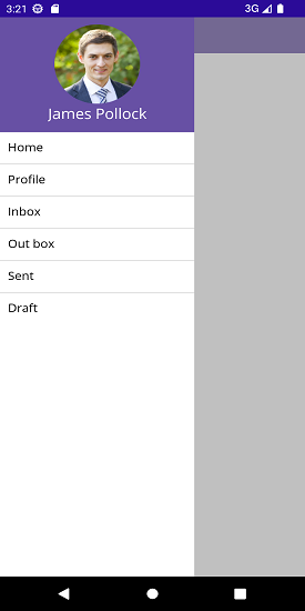
You can download the Navigation Drawer Getting Started sample from GitHub link.