Basic Features in .NET MAUI Masked Entry (SfMaskedEntry)
8 Jun 202622 minutes to read
Setting ClearButtonVisibility
The ClearButtonVisibility of type ClearButtonVisibility controls whether a clear button is displayed, which enables the user to clear the text. The default value of this property is ClearButtonVisibility.Never.
<editors:SfMaskedEntry WidthRequest="200"
                          MaskType="Simple"
                          Mask="(000) 000-0000"
                          ClearButtonVisibility = "WhileEditing" />
SfMaskedEntry maskedEntry = new SfMaskedEntry();
maskedEntry.WidthRequest = 200;
maskedEntry.MaskType = MaskedEntryMaskType.Simple;
maskedEntry.Mask = "(000) 000-0000";
maskedEntry.ClearButtonVisibility = ClearButtonVisibility.WhileEditing;
Setting Clear Button Icon Color
The clear button icon color can be changed by using the ClearButtonColor.
<editors:SfMaskedEntry x:Name="maskedEntry"
                          WidthRequest="200"
                          MaskType="Simple"
                          Mask="(000) 000-0000"
                          ClearButtonVisibility = "WhileEditing"
                          ClearButtonColor="Red" />
SfMaskedEntry maskedEntry = new SfMaskedEntry();
maskedEntry.WidthRequest = 200;
maskedEntry.MaskType = MaskedEntryMaskType.Simple;
maskedEntry.Mask = "(000) 000-0000";
maskedEntry.ClearButtonVisibility = ClearButtonVisibility.WhileEditing;
maskedEntry.ClearButtonColor = Colors.Red;
Setting CursorPosition
The cursor position in the masked entry can either be obtained or updated using the CursorPosition property in SfMaskedEntry.
Setting FontSize
The Masked Entry control allows the user to customize the font size of the text inside the entry part using the FontSize property of type double.
<editors:SfMaskedEntry WidthRequest="200"
                          MaskType="Simple"
                          Mask="(000) 000-0000" Value="1234"
                          FontSize="18"/>
SfMaskedEntry maskedEntry = new SfMaskedEntry();
maskedEntry.WidthRequest = 200;
maskedEntry.MaskType = MaskedEntryMaskType.Simple;
maskedEntry.Mask = "(000) 000-0000";
maskedEntry.Value = 1234;
maskedEntry.FontSize = 18;
Setting FontAttributes
The Masked Entry control allows the user to customize the font attribute of the text inside the entry part using the FontAttributes property of the type FontAttributes.
<editors:SfMaskedEntry WidthRequest="200"
                          MaskType="Simple"
                          Mask="(000) 000-0000" Value="1234"
                          FontAttributes="Bold"/>
SfMaskedEntry maskedEntry = new SfMaskedEntry();
maskedEntry.WidthRequest = 200;
maskedEntry.MaskType = MaskedEntryMaskType.Simple;
maskedEntry.Mask = "(000) 000-0000";
maskedEntry.Value = 1234;
maskedEntry.FontAttributes = FontAttributes.Bold;
Setting FontFamily
The Masked Entry control allows the user to customize the text’s font family inside the entry part using the FontFamily property of the type string.
<editors:SfMaskedEntry WidthRequest="200"
                          MaskType="Simple"
                          Mask="(000) 000-0000" Value="1234"
                          FontFamily="Lobster-Regular"/>
SfMaskedEntry maskedEntry = new SfMaskedEntry();
maskedEntry.WidthRequest = 200;
maskedEntry.MaskType = MaskedEntryMaskType.Simple;
maskedEntry.Mask = "(000) 000-0000";
maskedEntry.Value = 1234;
maskedEntry.FontFamily = "Lobster-Regular";
Setting Keyboard
The Masked Entry control allows the user to specify the virtual keyboard displayed when entering text using the Keyboard property of type Keyboard.
Setting Placeholder
The Masked Entry control allows the user to define the text displayed when the Mask and Value are empty using the Placeholder property of type string. The default value of the Placeholder property is string.Empty.
<editors:SfMaskedEntry WidthRequest="200"
                          Placeholder="Enter the value"/>
SfMaskedEntry maskedEntry = new SfMaskedEntry();
maskedEntry.WidthRequest = 200;
maskedEntry.Placeholder = "Enter the value";
Setting PlaceholderColor
The SfMaskedEntry control allows the user to customize the color of the placeholder text using the PlaceholderColor property of type Color. The default value of the PlaceholderColor property is Colors.Gray.
<editors:SfMaskedEntry WidthRequest="200"
                          Placeholder="Enter the value"
                          PlaceholderColor="Green"/>
SfMaskedEntry maskedEntry = new SfMaskedEntry();
maskedEntry.WidthRequest = 200;
maskedEntry.Placeholder = "Enter the value";
maskedEntry.PlaceholderColor = Colors.Green;
Setting TextColor
The SfMaskedEntry control provides the user to customize the color of the entered text using the TextColor property of type Color. The default value of the TextColor property is Colors.Black.
<editors:SfMaskedEntry WidthRequest="200"
                          MaskType="Simple"
                          Mask="(000) 000-0000" Value="1234"
                          TextColor="Green"/>
SfMaskedEntry maskedEntry = new SfMaskedEntry();
maskedEntry.WidthRequest = 200;
maskedEntry.MaskType = MaskedEntryMaskType.Simple;
maskedEntry.Mask = "(000) 000-0000";
maskedEntry.Value = 1234;
maskedEntry.TextColor = Colors.Green;
Setting the prompt character
Every single mask displays a prompt character (‘_’) in the absence of your input. Customize this prompt character by using the PromptChar property.
<editors:SfMaskedEntry WidthRequest="200"
                          ClearButtonVisibility="WhileEditing"
                          MaskType="Simple"
                          Mask="00/00/0000"
                          PromptChar="#" />
SfMaskedEntry maskedEntry = new SfMaskedEntry();
maskedEntry.WidthRequest = 200;
maskedEntry.ClearButtonVisibility = ClearButtonVisibility.WhileEditing;
maskedEntry.MaskType = MaskedEntryMaskType.Simple;
maskedEntry.Mask = "00/00/0000";
maskedEntry.PromptChar = '#';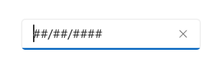
Setting the value
The Value property sets the input value for the MaskedEntry control.
<editors:SfMaskedEntry WidthRequest="200"
                          ClearButtonVisibility="WhileEditing"
                          MaskType="Simple"
                          Mask="00/00/0000"
                          Value="12/02/2022" />
SfMaskedEntry maskedEntry = new SfMaskedEntry();
maskedEntry.WidthRequest = 200;
maskedEntry.ClearButtonVisibility = ClearButtonVisibility.WhileEditing;
maskedEntry.MaskType = MaskedEntryMaskType.Simple;
maskedEntry.Mask = "00/00/0000";
maskedEntry.Value = "12/02/2022";
Stroke
The SfMaskedEntry border color can be changed by using the Stroke property.
<editors:SfMaskedEntry WidthRequest="200"
                          Mask="(000) 000-0000"
                          ClearButtonVisibility="WhileEditing"
                          Stroke="Red"/>
SfMaskedEntry maskedEntry = new SfMaskedEntry();
maskedEntry.WidthRequest = 200;
maskedEntry.Mask = "(000) 000-0000";
maskedEntry.ClearButtonVisibility = ClearButtonVisibility.WhileEditing;
maskedEntry.Stroke = Colors.Red;The following image illustrates the result of the above code:

Border visibility
The ShowBorder property of SfMaskedEntry is used to modify the visibility of the border and its default value is true. The following code example demonstrates how to change the border visibility,
<editors:SfMaskedEntry WidthRequest="200"
                          Mask="00/00/0000"
                          ClearButtonVisibility="WhileEditing"
                          ShowBorder="False"/>
SfMaskedEntry maskedEntry = new SfMaskedEntry();
maskedEntry.WidthRequest = 200;
maskedEntry.Mask = "00/00/0000";
maskedEntry.ClearButtonVisibility = ClearButtonVisibility.WhileEditing;
maskedEntry.ShowBorder = false;The following image illustrates the result of the above code:

TextAlignment
The SfMaskedEntry provides support to customize the text alignment by using the HorizontalTextAlignment and VerticalTextAlignment properties.
<editors:SfMaskedEntry WidthRequest="200"
                          HeightRequest="50"
                          Mask="00/00/0000"
                          ClearButtonVisibility="WhileEditing"
                          HorizontalTextAlignment="Center"
                          VerticalTextAlignment="Start"/>
SfMaskedEntry maskedEntry = new SfMaskedEntry();
maskedEntry.WidthRequest = 200;
maskedEntry.HeightRequest = 50;
maskedEntry.Mask = "00/00/0000";
maskedEntry.ClearButtonVisibility = ClearButtonVisibility.WhileEditing;
maskedEntry.HorizontalTextAlignment = TextAlignment.Center;
maskedEntry.VerticalTextAlignment = TextAlignment.Start;The following image illustrates the result of the above code:

Select text on focus
The SelectAllOnFocus property allows you to automatically select all the text in the masked entry when the control gains focus. This can improve user efficiency by making it easy to replace the entire content. The default value of this property is false.
<editors:SfMaskedEntry WidthRequest="200"
                       MaskType="Simple"
                       Mask="(000) 000-0000"
                       Value="1234567890"
                       SelectAllOnFocus="True"/>
SfMaskedEntry maskedEntry = new SfMaskedEntry();
maskedEntry.WidthRequest = 200;
maskedEntry.MaskType = MaskedEntryMaskType.Simple;
maskedEntry.Mask = "(000) 000-0000";
maskedEntry.Value = "1234567890";
maskedEntry.SelectAllOnFocus = true;IsReadOnly Mode
The IsReadOnly property allows you to make the masked entry non-editable while keeping it focusable and selectable. When enabled, users can still focus and select text, but cannot modify the value via typing, cut, paste, or the keyboard. The default value of this property is false.
<editors:SfMaskedEntry WidthRequest="200"
                       MaskType="Simple"
                       Mask="(000) 000-0000"
                       Value="1234567890"
                       IsReadOnly="True" />
SfMaskedEntry maskedEntry = new SfMaskedEntry();
maskedEntry.WidthRequest = 200;
maskedEntry.MaskType = MaskedEntryMaskType.Simple;
maskedEntry.Mask = "(000) 000-0000";
maskedEntry.Value = "1234567890";
maskedEntry.IsReadOnly = true;ReturnType
The ReturnType property specifies the return button (e.g., Next, Done, Go) of the keyboard. It helps manage the flow between multiple input fields by defining what happens when the action button is pressed.
You can define the return key type of SfMaskedEntry by using the ReturnType property.
NOTE
Default value of ReturnType is
Default.
<editors:SfMaskedEntry x:Name="maskedentry"
                        Mask="00:00:0000"
                        ClearButtonVisibility="WhileEditing"
                        ReturnType="Next"/>
SfMaskedEntry maskedEntry = new SfMaskedEntry();
maskedEntry.Mask = "00:00:0000";
maskedEntry.ClearButtonVisibility = ClearButtonVisibility.WhileEditing;
maskedEntry.ReturnType = ReturnType.Next;
Clear button customization
The ClearButtonPath property allows users to set the path for customizing the appearance of the SfMaskedEntry clear button.
<editors:SfMaskedEntry x:Name="maskedEntry"
                       MaskType="Simple"
                       Mask="(000) 000-0000"
                       ClearButtonVisibility="WhileEditing">
            <editors:SfMaskedEntry.ClearButtonPath>
                <Path Data="M1.70711 0.292893C1.31658 -0.097631 0.683417 -0.097631 0.292893 0.292893C-0.097631 0.683417 -0.097631 1.31658 0.292893 1.70711L5.58579 7L0.292893 12.2929C-0.097631 12.6834 -0.097631 13.3166 0.292893 13.7071C0.683417 14.0976 1.31658 14.0976 1.70711 13.7071L7 8.41421L12.2929 13.7071C12.6834 14.0976 13.3166 14.0976 13.7071 13.7071C14.0976 13.3166 14.0976 12.6834 13.7071 12.2929L8.41421 7L13.7071 1.70711C14.0976 1.31658 14.0976 0.683417 13.7071 0.292893C13.3166 -0.097631 12.6834 -0.097631 12.2929 0.292893L7 5.58579L1.70711 0.292893Z"
                Fill="Red"
                Stroke="Red"/>
            </editors:SfMaskedEntry.ClearButtonPath>
</editors:SfMaskedEntry>
private string _customPath = "M1.70711 0.292893C1.31658 -0.097631 0.683417 -0.097631 0.292893 0.292893C-0.097631 0.683417 -0.097631 1.31658 0.292893 1.70711L5.58579 7L0.292893 12.2929C-0.097631 12.6834 -0.097631 13.3166 0.292893 13.7071C0.683417 14.0976 1.31658 14.0976 1.70711 13.7071L7 8.41421L12.2929 13.7071C12.6834 14.0976 13.3166 14.0976 13.7071 13.7071C14.0976 13.3166 14.0976 12.6834 13.7071 12.2929L8.41421 7L13.7071 1.70711C14.0976 1.31658 14.0976 0.683417 13.7071 0.292893C13.3166 -0.097631 12.6834 -0.097631 12.2929 0.292893L7 5.58579L1.70711 0.292893Z";
var converter = new PathGeometryConverter();
var path = new Path()
{
Data = (PathGeometry)converter.ConvertFromInvariantString(_customPath),
Fill = Colors.Red,
Stroke = Colors.Red
};
SfMaskedEntry maskedEntry = new SfMaskedEntry();
maskedEntry.MaskType = MaskedEntryMaskType.Simple;
maskedEntry.Mask = "(000) 000-0000";
maskedEntry.ClearButtonVisibility = ClearButtonVisibility.WhileEditing;
maskedEntry.ClearButtonPath = path;The following image illustrates the result of the above code:

Return Command and Return Command Parameter
-
ReturnCommand, of type ICommand, defines the command to be executed when the return key is pressed. -
ReturnCommandParameter, of type object, specifies the parameter for theReturnCommand.
<ContentPage.BindingContext>
    <local:CommandDemoViewModel/>
</ContentPage.BindingContext>

<editors:SfMaskedEntry x:Name="maskedEntry"
            ReturnCommand="{Binding AlertCommand}"
            ReturnCommandParameter="Return key is pressed">
</editors:SfMaskedEntry>
var viewModel = new CommandDemoViewModel();
SfMaskedEntry maskedEntry = new SfMaskedEntry();
maskedEntry.ReturnCommand = viewModel.AlertCommand;
maskedEntry.ReturnCommandParameter = "Return key is pressed";//ViewModel.cs
public class CommandDemoViewModel
{
public ICommand AlertCommand => new Command<string>(OnAlertCommandExecuted);
private async void OnAlertCommandExecuted(string parameter)
{
await Application.Current.MainPage.DisplayAlert("Alert", parameter, "OK");
}
}Automation ID
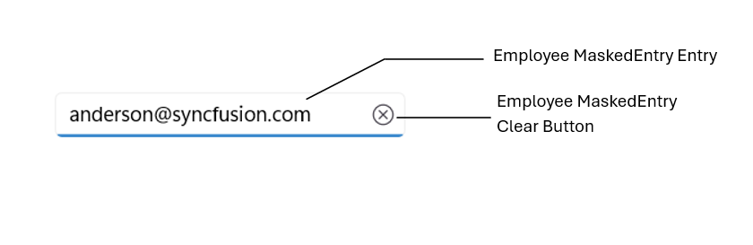
The SfMaskedEntry control provides AutomationId support specifically for the editable entry and the clear button, enabling UI automation frameworks to reliably target these two elements. Each element’s AutomationId is derived from the control’s AutomationId to ensure uniqueness.
For example, if the SfMaskedEntry’s AutomationId is set to “Employee MaskedEntry,” the editable entry can be targeted as “Employee MaskedEntry Entry” and the clear button as “Employee MaskedEntry Clear Button.” This focused support improves accessibility and automated UI testing by providing stable, predictable identifiers for the primary interactive elements.
The following screenshot illustrates the AutomationIds of inner elements.