Customization in .NET MAUI Avatar View (SfAvatarView)
17 Apr 202624 minutes to read
The SfAvatarView control provides options to customize its appearance, including color and size attributes.
To learn how to customize the .NET MAUI Avatar View quickly, you can check the below video.
The control can be customized using the following properties:
Aspect
The Aspect property defines how the image fits the display in SfAvatarView. By default, it is set to AspectFill.
- AspectFit: Ensures the entire image fits, adding space if necessary.
- AspectFill: Clips the image to fill the display while preserving its shape.
- Fill: Stretches the image to fill the entire display; may result in distortion.
- Center: Places the image in the center, maintaining its original shape.
<Grid>
    <sfavatar:SfAvatarView ContentType="Default"
                           AvatarShape="Circle"
                           AvatarSize="Large"
                           StrokeThickness="1"
                           Stroke="Black"
                           HorizontalOptions="Center"
                           VerticalOptions="Center"
                           ImageSource="person.png"
                           Aspect="AspectFit">
    </sfavatar:SfAvatarView>
</Grid>
Grid mainGrid = new Grid();
SfAvatarView avatarview = new SfAvatarView();
avatarview.ContentType = ContentType.Default;
avatarview.AvatarShape = AvatarShape.Circle;
avatarview.AvatarSize = AvatarSize.Large;
avatarview.VerticalOptions = LayoutOptions.Center;
avatarview.HorizontalOptions = LayoutOptions.Center;
avatarview.ImageSource = "person.png";
avatarview.Aspect = Aspect.AspectFit;
avatarview.Stroke = Colors.Black;
avatarview.StrokeThickness = 1;
mainGrid.Children.Add(avatarview);
this.Content = mainGrid;
Colors
The SfAvatarView control provides options to customize colors, including the stroke, default background color, and automatic background color.
Stroke
The Stroke property is used to set the stroke color of the SfAvatarView.
<Grid>
    <sfavatar:SfAvatarView ContentType="Default"
                           AvatarShape="Circle"
                           AvatarSize="Large"
                           HorizontalOptions="Center"
                           VerticalOptions="Center"
                           ImageSource="ellanaa.png"
                           StrokeThickness="1"
                           Stroke="Red">
    </sfavatar:SfAvatarView>
</Grid>
Grid mainGrid = new Grid();
SfAvatarView avatarview = new SfAvatarView();
avatarview.ContentType = ContentType.Default;
avatarview.AvatarShape = AvatarShape.Circle;
avatarview.AvatarSize = AvatarSize.Large;
avatarview.VerticalOptions = LayoutOptions.Center;
avatarview.HorizontalOptions = LayoutOptions.Center;
avatarview.ImageSource = "ellanaa.png";
avatarview.Stroke = Colors.Red;
avatarview.StrokeThickness = 1;
mainGrid.Children.Add(avatarview);
this.Content = mainGrid;
Default background color
The background color of the SfAvatarView control can be specified using the AvatarColorMode property. When the AvatarColorMode property is set to default, it displays the background color specified in the Background property.
<Grid>
    <sfavatar:SfAvatarView ContentType="Initials"
                           AvatarShape="Circle"
                           AvatarSize="Large"
                           HorizontalOptions="Center"
                           VerticalOptions="Center"
                           AvatarName="Alex"
                           Background="Bisque"
                           AvatarColorMode="Default"
                           StrokeThickness="1"
                           Stroke="Black"
                           InitialsColor="Black">
    </sfavatar:SfAvatarView>
</Grid>
Grid mainGrid = new Grid();
SfAvatarView avatarview = new SfAvatarView();
avatarview.ContentType = ContentType.Initials;
avatarview.AvatarShape = AvatarShape.Circle;
avatarview.AvatarSize = AvatarSize.Large;
avatarview.VerticalOptions = LayoutOptions.Center;
avatarview.HorizontalOptions = LayoutOptions.Center;
avatarview.AvatarName = "Alex";
avatarview.Stroke = Colors.Black;
avatarview.StrokeThickness = 1;
avatarview.InitialsColor = Colors.Black;
avatarview.AvatarColorMode = AvatarColorMode.Default;
avatarview.Background = Colors.Bisque;
mainGrid.Children.Add(avatarview);
this.Content = mainGrid;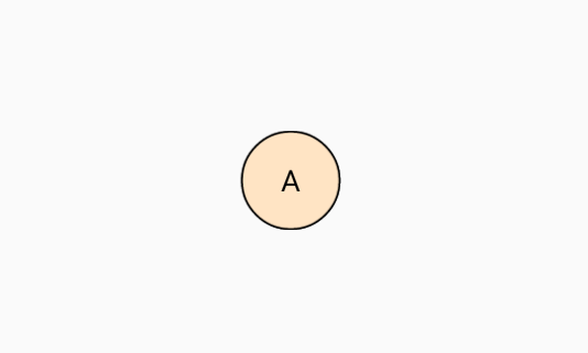
Automatic background color
The SfAvatarView control supports automatic background colors through the following properties:
-
DarkBackground: Applies a dark tone to the initials and background color. -
LightBackground: Applies a light tone to the initials and background color.
Dark color
You can set the background color to dark by using the DarkBackground option in the AvatarColorMode property.
<Grid>
    <sfavatar:SfAvatarView ContentType="Initials"
                           InitialsType="DoubleCharacter"
                           AvatarShape="Circle"
                           AvatarSize="Large"
                           HorizontalOptions="Center"
                           VerticalOptions="Center"
                           AvatarName="Alex"
                           AvatarColorMode="DarkBackground"
                           StrokeThickness="1"
                           Stroke="Black">
    </sfavatar:SfAvatarView>
</Grid>
Grid mainGrid = new Grid();
SfAvatarView avatarview = new SfAvatarView();
avatarview.VerticalOptions = LayoutOptions.Center;
avatarview.HorizontalOptions = LayoutOptions.Center;
avatarview.AvatarShape = AvatarShape.Circle;
avatarview.AvatarSize = AvatarSize.Large;
avatarview.ContentType = ContentType.Initials;
avatarview.InitialsType = InitialsType.DoubleCharacter;
avatarview.AvatarName = "Alex";
avatarview.Stroke = Colors.Black;
avatarview.StrokeThickness = 1;
avatarview.AvatarColorMode = AvatarColorMode.DarkBackground;
mainGrid.Children.Add(avatarview);
this.Content = mainGrid;
Light color
The background color can be set to a light tone by using the LightBackground option in the AvatarColorMode property.
<Grid>
    <sfavatar:SfAvatarView ContentType="Initials"
                           InitialsType="DoubleCharacter"
                           VerticalOptions="Center"
                           AvatarName="Alex"
                           AvatarShape="Circle"
                           AvatarSize="Large"
                           AvatarColorMode="LightBackground"
                           Stroke="Black"
                           StrokeThickness="1"
                           HorizontalOptions="Center" >
    </sfavatar:SfAvatarView>
</Grid>
Grid mainGrid = new Grid();
SfAvatarView avatarview = new SfAvatarView();
avatarview.VerticalOptions = LayoutOptions.Center;
avatarview.HorizontalOptions = LayoutOptions.Center;
avatarview.AvatarShape = AvatarShape.Circle;
avatarview.AvatarSize = AvatarSize.Large;
avatarview.ContentType = ContentType.Initials;
avatarview.InitialsType = InitialsType.DoubleCharacter;
avatarview.AvatarName = "Alex";
avatarview.Stroke = Colors.Black;
avatarview.AvatarColorMode = AvatarColorMode.LightBackground;
avatarview.Stroke = Colors.Black;
avatarview.StrokeThickness = 1;
mainGrid.Children.Add(avatarview);
this.Content = mainGrid;
Gradients
Utilize LinearGradientBrush to specify gradient colors in the Background property, as shown in the example below.
<sfavatar:SfAvatarView ContentType="Initials"
                       AvatarName="Alex"
                       AvatarShape="Circle"
                       AvatarSize="Large"
                       HorizontalOptions="Center"
                       VerticalOptions="Center"
                       InitialsType="DoubleCharacter"
                       StrokeThickness="1"
                       Stroke="Black">
    <sfavatar:SfAvatarView.Background>
        <LinearGradientBrush StartPoint="0,0"
                 EndPoint="1,0">
            <GradientStop Color="#2F9BDF" Offset="0"/>
            <GradientStop Color="#51F1F2" Offset="1"/>
        </LinearGradientBrush>
    </sfavatar:SfAvatarView.Background>
</sfavatar:SfAvatarView>
Grid mainGrid = new Grid();
SfAvatarView avatarview = new SfAvatarView();
avatarview.VerticalOptions = LayoutOptions.Center;
avatarview.HorizontalOptions = LayoutOptions.Center;
avatarview.AvatarShape = AvatarShape.Circle;
avatarview.AvatarSize = AvatarSize.Large;
avatarview.ContentType = ContentType.Initials;
avatarview.InitialsType = InitialsType.DoubleCharacter;
avatarview.AvatarName = "Alex";
avatarview.Stroke = Colors.Black;
avatarview.StrokeThickness = 1;
avatarview.Background = new LinearGradientBrush()
{
StartPoint = new Point(0, 0),
EndPoint = new Point(1, 0),
GradientStops = new GradientStopCollection()
{
new GradientStop() { Color = Color.FromArgb("#2F9BDF"), Offset = 0 },
new GradientStop() { Color = Color.FromArgb("#51F1F2"), Offset = 1 }
}
};
mainGrid.Children.Add(avatarview);
this.Content = mainGrid;
Sizing
The SfAvatarView control allows you to control the view size using properties for width, height, stroke thickness, and corner radius.
Width
The width of the Avatar View can be customized using the WidthRequest property.
Height
The height of the Avatar View can be customized using the HeightRequest property.
StrokeThickness
Customize the thickness of the Avatar View using the StrokeThickness property.
<Grid>
    <sfavatar:SfAvatarView ContentType="Default"
                           AvatarShape="Circle"
                           AvatarSize="Large"
                           ImageSource="ellanaa.png"
                           Stroke="Black"
                           VerticalOptions="Center"
                           StrokeThickness="4"
                           HorizontalOptions="Center" >
    </sfavatar:SfAvatarView>
</Grid>
Grid mainGrid = new Grid();
SfAvatarView avatarview = new SfAvatarView();
avatarview.HorizontalOptions = LayoutOptions.Center;
avatarview.VerticalOptions = LayoutOptions.Center;
avatarview.AvatarShape = AvatarShape.Circle;
avatarview.AvatarSize = AvatarSize.Large;
avatarview.StrokeThickness = 4;
avatarview.Stroke = Colors.Black;
avatarview.ContentType = ContentType.Default;
avatarview.ImageSource = "ellanaa.png";
mainGrid.Children.Add(avatarview);
this.Content = mainGrid;
CornerRadius
Customize the corner radius of the Avatar View using the CornerRadius property.
<Grid>
    <sfavatar:SfAvatarView ContentType="Default"
                           ImageSource="ellanaa.png"
                           HorizontalOptions="Center"
                           VerticalOptions="Center"
                           WidthRequest="60"
                           HeightRequest="60"
                           CornerRadius="20"
                           StrokeThickness="1"
                           Stroke="Black">
    </sfavatar:SfAvatarView>
</Grid>
Grid mainGrid = new Grid();
SfAvatarView avatarview = new SfAvatarView();
avatarview.HorizontalOptions = LayoutOptions.Center;
avatarview.VerticalOptions = LayoutOptions.Center;
avatarview.WidthRequest = 60;
avatarview.HeightRequest = 60;
avatarview.CornerRadius = 20;
avatarview.ImageSource = "ellanaa.png";
avatarview.ContentType = ContentType.Default;
avatarview.Stroke = Colors.Black;
avatarview.StrokeThickness = 1;
mainGrid.Children.Add(avatarview);
this.Content = mainGrid;
ContentPadding
Customize the spacing between the stroke and content in the view using the ContentPadding property.
<Grid>
   <sfavatar:SfAvatarView ContentType="Default"
                           ImageSource="twitter.png"
                           HorizontalOptions="Center"
                           VerticalOptions="Center"
                           Stroke="Black"
                           StrokeThickness="1"
                           ContentPadding="10"
                           AvatarShape="Circle">
   </sfavatar:SfAvatarView>
</Grid>
Grid mainGrid = new Grid();
SfAvatarView avatarview = new SfAvatarView();
avatarview.ImageSource = "twitter.png";
avatarview.StrokeThickness = 1;
avatarview.Stroke = Colors.Black;
avatarview.ContentPadding = 10;
avatarview.ContentType = ContentType.Default;
avatarview.AvatarShape = AvatarShape.Circle;
mainGrid.Children.Add(avatarview);
this.Content = mainGrid;
Font Customization
Customize the font of the Avatar View using the FontSize, FontAttributes, and FontFamily properties.
<Grid>
    <sfavatar:SfAvatarView ContentType="Initials"
                            HorizontalOptions="Center"
                            VerticalOptions="Center"
                            InitialsType="SingleCharacter"
                            AvatarName="Alex"
                            InitialsColor="Black"
                            WidthRequest="80"
                            HeightRequest="80"
                            CornerRadius="40"
                            Background="Bisque"
                            FontSize="20"
                            FontAttributes="Bold"
                            FontFamily="serif">
    </sfavatar:SfAvatarView>
</Grid>
Grid mainGrid = new Grid();
SfAvatarView avatarView = new SfAvatarView();
avatarView.VerticalOptions = LayoutOptions.Center;
avatarView.HorizontalOptions = LayoutOptions.Center;
avatarView.WidthRequest = 80;
avatarView.HeightRequest = 80;
avatarView.FontAttributes = FontAttributes.Bold;
avatarView.FontSize = 20;
avatarView.FontFamily = "serif";
avatarView.CornerRadius = 40;
avatarView.Background = Colors.Bisque;
avatarView.InitialsColor = Colors.Black;
avatarView.ContentType = ContentType.Initials;
avatarView.AvatarName = "Alex";
mainGrid.Children.Add(avatarView);
this.Content = mainGrid;
FontAutoScalingEnabled
The FontAutoScalingEnabled property automatically scales the Avatar View’s font size based on the operating system’s text size. The default value is false.
<Grid>
    <sfavatar:SfAvatarView ContentType="Initials"
                           InitialsType="DoubleCharacter"
                           AvatarName="Alex"
                           WidthRequest="50"
                           FontAttributes="Bold"
                           HeightRequest="50"
                           FontAutoScalingEnabled="True"
                           CornerRadius="25">
    </sfavatar:SfAvatarView>
</Grid>
Grid mainGrid = new Grid();
SfAvatarView avatarView = new SfAvatarView();
avatarView.VerticalOptions = LayoutOptions.Center;
avatarView.HorizontalOptions = LayoutOptions.Center;
avatarView.WidthRequest = 50;
avatarView.HeightRequest = 50;
avatarView.FontAttributes = FontAttributes.Bold;
avatarView.CornerRadius = 25;
avatarView.ContentType = ContentType.Initials;
avatarView.AvatarName = "Alex";
avatarView.InitialsType = InitialsType.DoubleCharacter;
avatarView.FontAutoScalingEnabled = true;
mainGrid.Children.Add(avatarView);
this.Content = mainGrid;