Content Types in SfAvatarView
17 Apr 202623 minutes to read
Avatar types
The SfAvatarView control allows you to display the view in five different ways:
-
Default - Displays the default image when initializing without any other source such as image and group.
-
Initials - Displays the initials in the view.
-
AvatarCharacter - Displays a preset vector image in the view.
-
Custom - Displays a custom image in the view.
-
Group - Displays up to three images or initials in a single view.
Default
The default type Avatar View is used to display the default vector image when initializing without specifying initials, custom, or group view types.
<sfavatar:SfAvatarView ContentType="Default"
                       VerticalOptions="Center"
                       HorizontalOptions="Center"
                       Background="OrangeRed"
                       WidthRequest="50"
                       HeightRequest="50"
                       CornerRadius="25"
                       Stroke="Black"
                       StrokeThickness="1">
</sfavatar:SfAvatarView>
Grid mainGrid = new Grid();
SfAvatarView avatarview = new SfAvatarView();
avatarview.VerticalOptions = LayoutOptions.Center;
avatarview.HorizontalOptions = LayoutOptions.Center;
avatarview.WidthRequest = 50;
avatarview.HeightRequest = 50;
avatarview.CornerRadius = 25;
avatarview.ContentType = ContentType.Default;
avatarview.Background = Colors.OrangeRed;
avatarview.Stroke = Colors.Black;
avatarview.StrokeThickness = 1;
mainGrid.Children.Add(avatarview);
this.Content = mainGrid;
Initials
When using ContentType as initials, set the initial character using the following properties:
- InitialsType - Defines the type of characters to be displayed.
- AvatarName- Gets or sets the value for the initials type, which displays the text in the avatar view.
- InitialsColor- Gets or sets the color of the initials.
InitialsType
The InitialsType includes the following types:
- SingleCharacter
- DoubleCharacter
Set the AvatarName property to display initials in the Avatar View. This property accepts a string value.
SingleCharacter
The SingleCharacter type displays the first character of the AvatarName specified in the InitialsType property.
<sfavatar:SfAvatarView ContentType="Initials"
                       HorizontalOptions="Center"
                       VerticalOptions="Center"
                       InitialsType="SingleCharacter"
                       AvatarName="Alex"
                       InitialsColor="Black"
                       WidthRequest="50"
                       FontAttributes="Bold"
                       HeightRequest="50"
                       CornerRadius="25"
                       Background="Bisque"
                       Stroke="Black"
                       StrokeThickness="1">
</sfavatar:SfAvatarView>
Grid mainGrid = new Grid();
SfAvatarView avatarview = new SfAvatarView();
avatarview.VerticalOptions = LayoutOptions.Center;
avatarview.HorizontalOptions = LayoutOptions.Center;
avatarview.Background = Colors.Bisque;
avatarview.WidthRequest = 50;
avatarview.HeightRequest = 50;
avatarview.CornerRadius = 25;
avatarview.ContentType = ContentType.Initials;
avatarview.AvatarName = "Alex";
avatarview.InitialsType = InitialsType.SingleCharacter;
avatarview.InitialsColor = Colors.Black;
avatarview.Stroke = Colors.Black;
avatarview.StrokeThickness = 1;
mainGrid.Children.Add(avatarview);
this.Content = mainGrid;
DoubleCharacter
The DoubleCharacter type is used to display two-character text based on the value set in the InitialsType property. If the initials contain one word, it shows the first and last letters. If it contains multiple words, it displays the first letter of the first and last string.
<sfavatar:SfAvatarView ContentType="Initials"
                       InitialsType="DoubleCharacter"
                       AvatarName="Alex"
                       InitialsColor="Black"
                       WidthRequest="50"
                       FontAttributes="Bold"
                       HeightRequest="50"
                       CornerRadius="25"
                       Background="Bisque"
                       Stroke="Black"
                       StrokeThickness="1">
</sfavatar:SfAvatarView>
Grid mainGrid = new Grid();
SfAvatarView avatarview = new SfAvatarView();
avatarview.VerticalOptions = LayoutOptions.Center;
avatarview.HorizontalOptions = LayoutOptions.Center;
avatarview.Background = Colors.Bisque;
avatarview.WidthRequest = 50;
avatarview.HeightRequest = 50;
avatarview.CornerRadius = 25;
avatarview.ContentType = ContentType.Initials;
avatarview.AvatarName = "Alex";
avatarview.InitialsType = InitialsType.DoubleCharacter;
avatarview.InitialsColor = Colors.Black;
avatarview.Stroke = Colors.Black;
avatarview.StrokeThickness = 1;
mainGrid.Children.Add(avatarview);
this.Content = mainGrid;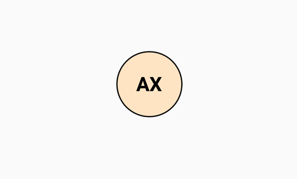
Custom image
You can add a custom user image by setting the ImageSource property. Refer to the Getting Started Documentation in SfAvatarView.
Avatar characters
The preset vector images in Avatar View can be utilized by setting the AvatarCharacter property.
<sfavatar:SfAvatarView VerticalOptions="Center"
                       HorizontalOptions="Center"
                       ContentType="AvatarCharacter"
                       AvatarCharacter="Avatar8"
                       Background="DeepSkyBlue"
                       WidthRequest="50"
                       HeightRequest="50"
                       CornerRadius="25"
                       Stroke="Black"
                       StrokeThickness="1">
</sfavatar:SfAvatarView>
Grid mainGrid = new Grid();
SfAvatarView avatarview = new SfAvatarView();
avatarview.VerticalOptions = LayoutOptions.Center;
avatarview.HorizontalOptions = LayoutOptions.Center;
avatarview.WidthRequest = 50;
avatarview.HeightRequest = 50;
avatarview.CornerRadius = 25;
avatarview.ContentType = ContentType.AvatarCharacter;
avatarview.AvatarCharacter = AvatarCharacter.Avatar8;
avatarview.Background = Colors.DeepSkyBlue;
avatarview.Stroke = Colors.Black;
avatarview.StrokeThickness = 1;
mainGrid.Children.Add(avatarview);
this.Content = mainGrid;
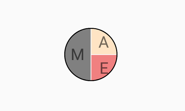
Group view
Add up to three images or initials in the same view using the group view type.
Use InitialsMemberPath for initials and ImageSourceMemberPath for images. The following code sample demonstrates how to add images using the GroupSource property.
public class Employee
    {

        private string name;
        public string Name
        {
            get { return name; }
            set { name = value; }
        }

        private string imagesource;

        public string ImageSource
        {
            get { return imagesource; }
            set { imagesource = value; }
        }

        private Color colors;

        public Color Colors
        {
            get { return colors; }
            set { colors = value; }
        }

    }

    public class EmployeeViewModel : INotifyPropertyChanged
    {

        public event PropertyChangedEventHandler PropertyChanged;
        private void OnPropertyRaised(string propertyname)
        {
            if (PropertyChanged != null)
            {
                PropertyChanged(this, new PropertyChangedEventArgs(propertyname));
            }
        }
        private ObservableCollection<Employee> collectionimage;

        public ObservableCollection<Employee> CollectionImage
        {
            get { return collectionimage; }
            set
            {
                collectionimage = value;
                OnPropertyRaised("CollectionImage");
            }
        }

        public EmployeeViewModel()
        {
            CollectionImage = new ObservableCollection<Employee>();
            CollectionImage.Add(new Employee { Name="Mike" , ImageSource = "mike.png",Colors=Colors.Gray });
            CollectionImage.Add(new Employee { Name="Alex",ImageSource= "alex.png", Colors = Colors.Bisque });
            CollectionImage.Add(new Employee { Name="Ellanaa", ImageSource= "ellanaa.png",Colors=Colors.LightCoral });
        }

}<ContentPage.BindingContext>
<local:EmployeeViewModel/>
</ContentPage.BindingContext>
<sfavatar:SfAvatarView ContentType="Group"
VerticalOptions="Center"
HorizontalOptions="Center"
GroupSource="{Binding CollectionImage}"
BackgroundColorMemberPath="Colors"
ImageSourceMemberPath="ImageSource"
WidthRequest="50"
HeightRequest="50"
CornerRadius="25"
Stroke="Black"
StrokeThickness="1">
</sfavatar:SfAvatarView>public partial class MainPage : ContentPage, INotifyPropertyChanged
{
EmployeeViewModel emp;
public MainPage()
{
InitializeComponent();
Grid mainGrid = new Grid();
emp = new EmployeeViewModel();
SfAvatarView avatarview = new SfAvatarView();
avatarview.VerticalOptions = LayoutOptions.Center;
avatarview.HorizontalOptions = LayoutOptions.Center;
avatarview.WidthRequest = 50;
avatarview.HeightRequest = 50;
avatarview.CornerRadius = 25;
avatarview.ContentType = ContentType.Group;
avatarview.GroupSource = emp.CollectionImage;
avatarview.ImageSourceMemberPath = "ImageSource";
avatarview.BackgroundColorMemberPath = "Colors";
avatarview.Stroke = Colors.Black;
avatarview.StrokeThickness = 1;
this.BindingContext = emp;
mainGrid.Children.Add(avatarview);
this.Content = mainGrid;
}
}
Add initials only in group view
Set the initials only in the group view by using the InitialsMemberPath alone. The following example shows how this is done.
<ContentPage.BindingContext>
    <local:EmployeeViewModel/>
</ContentPage.BindingContext>

<sfavatar:SfAvatarView ContentType="Group"
                       VerticalOptions="Center"
                       HorizontalOptions="Center"
                       GroupSource="{Binding CollectionImage}"
                       BackgroundColorMemberPath="Colors"
                       InitialsMemberPath="Name"
                       WidthRequest="50"
                       HeightRequest="50"
                       CornerRadius="25"
                       Stroke="Black"
                       StrokeThickness="1">
</sfavatar:SfAvatarView>
public partial class MainPage : ContentPage, INotifyPropertyChanged
{
EmployeeViewModel emp;
public MainPage()
{
Grid mainGrid = new Grid();
emp = new EmployeeViewModel();
SfAvatarView avatarview = new SfAvatarView();
avatarview.VerticalOptions = LayoutOptions.Center;
avatarview.HorizontalOptions = LayoutOptions.Center;
avatarview.WidthRequest = 50;
avatarview.HeightRequest = 50;
avatarview.CornerRadius = 25;
avatarview.ContentType = ContentType.Group;
avatarview.GroupSource = emp.CollectionImage;
avatarview.InitialsMemberPath = "Name";
avatarview.BackgroundColorMemberPath = "Colors";
avatarview.Stroke = Colors.Black;
avatarview.StrokeThickness = 1;
this.BindingContext = emp;
mainGrid.Children.Add(avatarview);
this.Content = mainGrid;
}
}
Add both image and initials in a group view
Set both the image and initials as necessary for the collection. If the image needs to be displayed, set ImageSourceMemberPath; if initials need to be displayed, set InitialsMemberPath. This is illustrated in the following code:
public class EmployeeViewModel : INotifyPropertyChanged
{
    public EmployeeViewModel()
    {
        CollectionImage = new ObservableCollection<Employee>();
        CollectionImage.Add(new Employee { ImageSource="mike.png" });
        CollectionImage.Add(new Employee { Name= "alex", Colors=Colors.White });
        CollectionImage.Add(new Employee { ImageSource= "ellanaa.png" });
    }
}