How can I help you?
CircularGauge
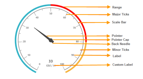
The CircularGauge control visualizes the numerical values of scales in a circular manner. It is also a feature-rich control that provides extensive appearance customization options with support for the animation of a pointer element. The CircularGauge control comprises the following basic elements:
- Scales
- Pointers
- Ticks
- Labels
- Ranges
- Indicators

Circular Gauge Control Structure
The gauge display can also be customized either as a full circle or a half circle based on individual requirements. Among other helpful features, the CircularGauge control also includes advanced user interactivity.
Key Features
- Sub-Gauge: Supports for rendering of multiple sub-gauges within the main Circular Gauge.
- User Interaction: Allows you to directly interact with the pointers of the gauge.
- Indicators: Supports for the indicator feature that shows the active or inactive state of the gauge.
- Ranges: Supports for highlighting the range of values in the gauge scale.
- Pointers: Supports for adding multiple pointers to the gauge.
- Frame types: Supports two types of gauge displays, full circle and half circle.
- Animation: Supports the animation of a pointer.
- CustomLabel: Supports the addition of custom label text in the required location of the gauge.