How can I help you?
Chart types in ASP.NET WebForms PivotChart
Essential PivotChart ASP.NET supports 18 different types of chart as follows:
- Column
- Stacking column
- Bar
- Stacking bar
- Pie
- Pyramid
- Funnel
- Line
- Step line
- Spline
- Area
- Step area
- Spline area
- Stacking area
- Doughnut
- Scatter
- Bubble
- WaterFall
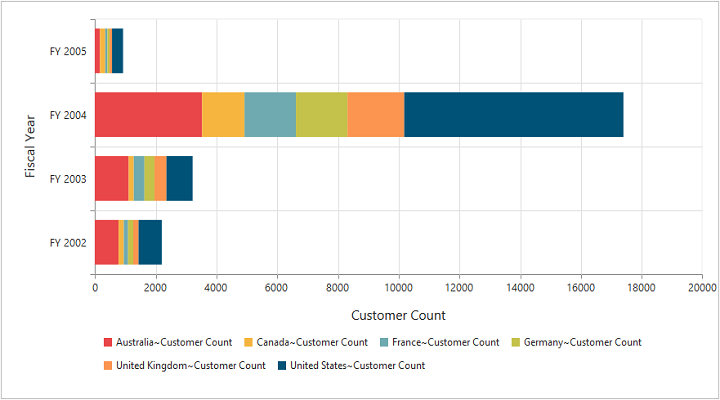
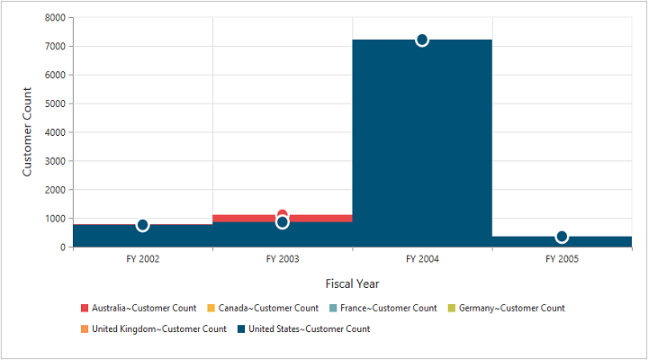
Column chart
The column chart is the most commonly used chart type. This uses vertical bars (called columns) to display different values of one or more items. Points from adjacent series are drawn as bars to compare the frequency, count, total, or average of data in different categories. The column chart is ideal to show the variations in the value of an item over a period of time.
<ej:PivotChart ID="MyPivotChart1" runat="server" Url="/RelationalChartService.svc" >
    <CommonSeriesOptions Type="Column" />
    <Size Width="950px" Height="460px"></Size>
</ej:PivotChart>
The following screenshot displays column chart:
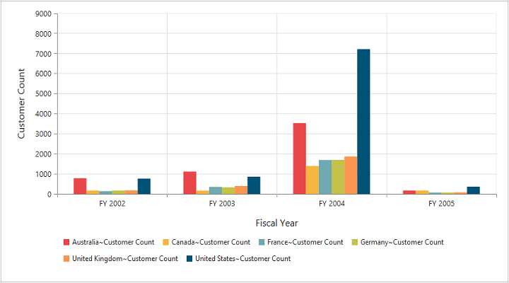
Column chart
Stacking column chart
The stacking column chart is similar to column charts except the Y-values. These Y-values stack on top of each other in a specified series order. This helps to visualize the relationship of parts to the whole chart across various categories.
<ej:PivotChart ID="MyPivotChart1" runat="server" Url="/RelationalChartService.svc" >
    <CommonSeriesOptions type="StackingColumn" />
    <Size Width="950px" Height="460px"></Size>
</ej:PivotChart>
The following screenshot displays stacking column chart:
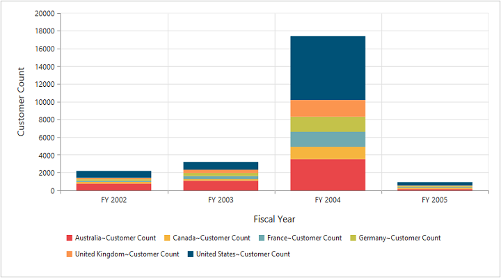
Stacking Column Chart
Bar chart
The bar chart displays horizontal bars for each point in the adjacent series. Bar charts are used to compare values across various categories for displaying the variations in the value of an item over a period of time or comparing the values of several items at a single point of time.
<ej:PivotChart ID="MyPivotChart1" runat="server" Url="/RelationalChartService.svc" >
    <CommonSeriesOptions type="Bar"/>
    <Size Width="950px" Height="460px"></Size>
</ej:PivotChart>
The following screenshot displays bar chart:
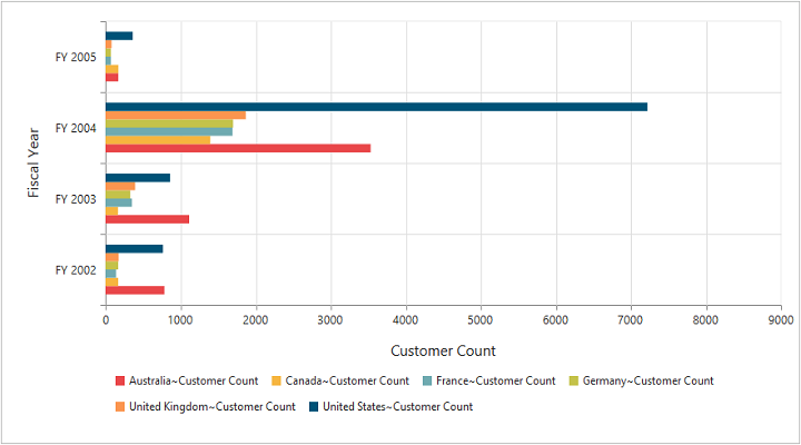
Bar Chart
Stacking bar chart
The stacking bar chart is a regular bar chart with the X-values stacked on top of each other in the specified series order.
<ej:PivotChart ID="MyPivotChart1" runat="server" Url="/RelationalChartService.svc" >
    <CommonSeriesOptions type="StackingBar"/>
    <Size Width="950px" Height="460px"></Size>
</ej:PivotChart>
The following screenshot displays stacking bar chart:
Stacking Bar Chart
Pie chart
The pie chart is used to summarize a set of categorical data or display different values of a given variable (e.g., percentage distribution). This type of chart is in a circular form that is divided into several segments. Each segment represents a particular category.
<ej:PivotChart ID="MyPivotChart1" runat="server" Url="/RelationalChartService.svc" >
    <CommonSeriesOptions type="Pie"/>
    <Size Width="950px" Height="460px"></Size>
</ej:PivotChart>
The following screenshot displays pie chart:
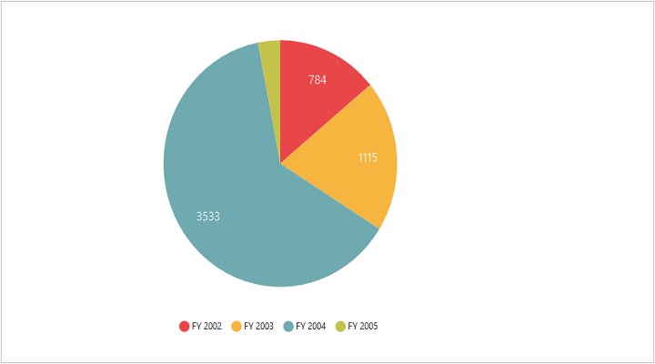
Pie Chart
Pyramid chart
The pyramid chart type displays the data in the form of a triangle. It helps you to visualize the data in a hierarchical structure without any axes.
<ej:PivotChart ID="MyPivotChart1" runat="server" Url="/RelationalChartService.svc" >
    <CommonSeriesOptions type="Pyramid"/>
    <Size Width="950px" Height="460px"></Size>
</ej:PivotChart>
The following screen shot displays pyramid chart:
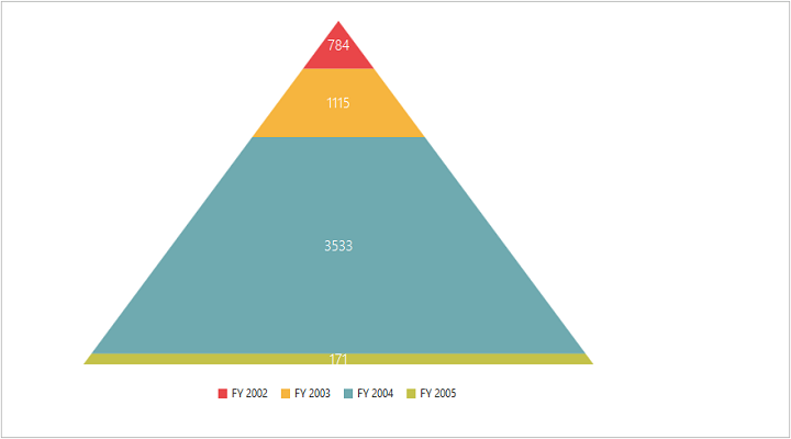
Pyramid Chart
Funnel chart
The funnel chart type displays the data in the form of an inverted triangle. It helps you to visualize the data in a hierarchical structure without any axes.
<ej:PivotChart ID="MyPivotChart1" runat="server" Url="/RelationalChartService.svc" >
    <CommonSeriesOptions type="Funnel"/>
    <Size Width="950px" Height="460px"></Size>
</ej:PivotChart>
The following screenshot displays funnel chart:
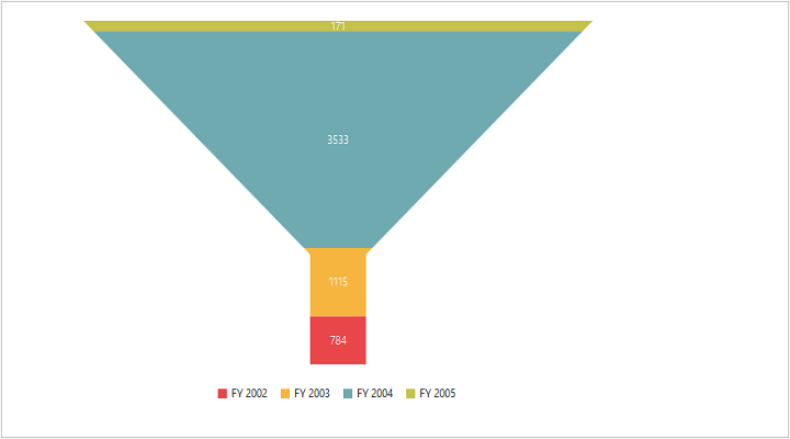
Funnel Chart
Line chart
The line chart joins the data points on a plot by using straight lines that show trends in the data at equal intervals.
<ej:PivotChart ID="MyPivotChart1" runat="server" Url="/RelationalChartService.svc" >
    <CommonSeriesOptions type="Line"/>
    <Size Width="950px" Height="460px"></Size>
</ej:PivotChart>
The following screenshot displays line hart:
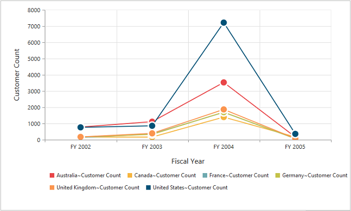
Line Chart
Step line chart
The step line chart uses horizontal and vertical lines to connect the data points resulting in a step like progression.
<ej:PivotChart ID="MyPivotChart1" runat="server" Url="/RelationalChartService.svc" >
    <CommonSeriesOptions type="StepLine"/>
    <Size Width="950px" Height="460px"></Size>
</ej:PivotChart>
The following screenshot displays step line chart:
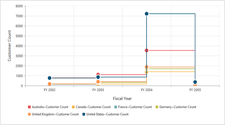
Step Line Chart
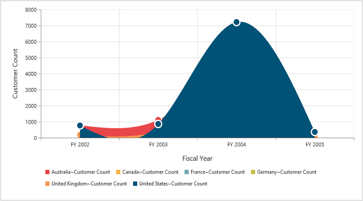
Spline chart
The spline chart is similar to the line chart except that it connects different data points with curve lines instead of straight lines.
<ej:PivotChart ID="MyPivotChart1" runat="server" Url="/RelationalChartService.svc" >
    <CommonSeriesOptions type="Spline"/>
    <Size Width="950px" Height="460px"></Size>
</ej:PivotChart>
The following screenshot displays spline chart:
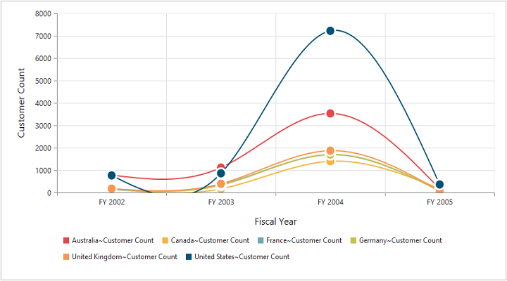
Spline Chart
Area chart
The area chart emphasizes the degree of change of values over a period of time. Instead of rendering data as discrete bars or columns, the area chart renders the continuous ebb-and-flow pattern as defined against the Y-axis.
<ej:PivotChart ID="MyPivotChart1" runat="server" Url="/RelationalChartService.svc" >
    <CommonSeriesOptions type="Area"/>
    <Size Width="950px" Height="460px"></Size>
</ej:PivotChart>
The following screenshot displays area chart:
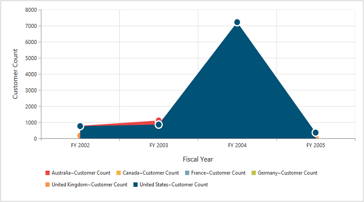
Area Chart
Step area chart
The step area chart is similar to the regular area chart except for a straight line tracing the shortest path between the data points. The values are connected by continuous vertical and horizontal lines forming a step like progression.
<ej:PivotChart ID="MyPivotChart1" runat="server" Url="/RelationalChartService.svc" >
    <CommonSeriesOptions type="StepArea"/>
    <Size Width="950px" Height="460px"></Size>
</ej:PivotChart>
The following screenshot displays step area chart:
Step Area Chart
Spline area chart
The spline area chart is similar to the area chart, but differs by connecting data points in a series. This connects each series of points by a smooth spline curve.
<ej:PivotChart ID="MyPivotChart1" runat="server" Url="/RelationalChartService.svc" >
    <CommonSeriesOptions type="SplineArea"/>
    <Size Width="950px" Height="460px"></Size>
</ej:PivotChart>
The following screenshot displays spline area chart:
Spline Area Chart
Stacking area chart
The stacking area chart is similar to the regular area chart except for the Y-values. These Y-values stack on top of each other in the specified series order. This helps to visualize the relationship of parts to the whole chart across various categories.
<ej:PivotChart ID="MyPivotChart1" runat="server" Url="/RelationalChartService.svc" >
    <CommonSeriesOptions type="StackingArea"/>
    <Size Width="950px" Height="460px"></Size>
</ej:PivotChart>
The following screenshot displays stacking area chart:
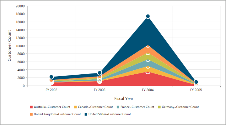
Stacking Area Chart
Doughnut chart
The doughnut chart is a doughnut like structure used to summarize a set of categorical data that is divided into several segments. Each segment represents a particular category.
<ej:PivotChart ID="MyPivotChart1" runat="server" Url="/RelationalChartService.svc" >
    <CommonSeriesOptions type="Doughnut"/>
    <Size Width="950px" Height="460px"></Size>
</ej:PivotChart>
The following screenshot displays doughnut chart:
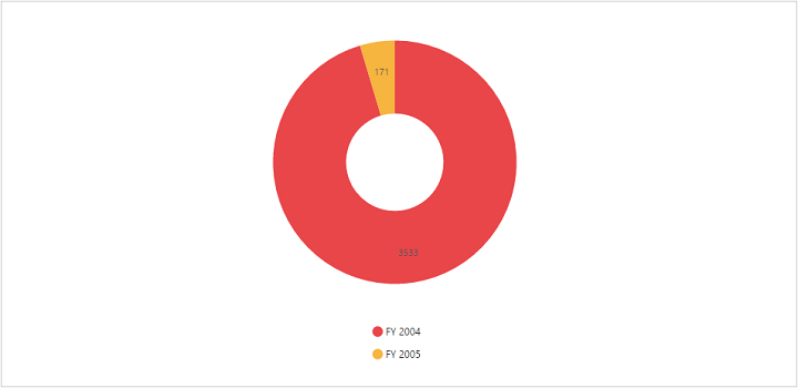
Doughnut Chart
Scatter chart
The scatter chart displays data as a collection of points corresponding to the associated values.
<ej:PivotChart ID="MyPivotChart1" runat="server" Url="/RelationalChartService.svc" >
    <CommonSeriesOptions type="Scatter"/>
    <Size Width="950px" Height="460px"></Size>
</ej:PivotChart>
The following screenshot displays scatter chart:
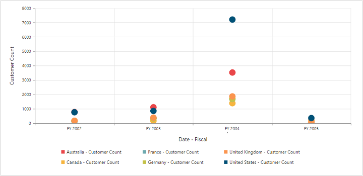
Scatter Chart
Bubble chart
The bubble chart displays data as a collection of bubbles.
<ej:PivotChart ID="MyPivotChart1" runat="server" Url="/RelationalChartService.svc" >
    <CommonSeriesOptions type="Bubble"/>
    <Size Width="950px" Height="460px"></Size>
</ej:PivotChart>
The following screenshot displays bubble chart:
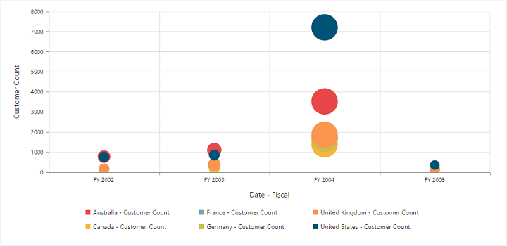
Bubble Chart
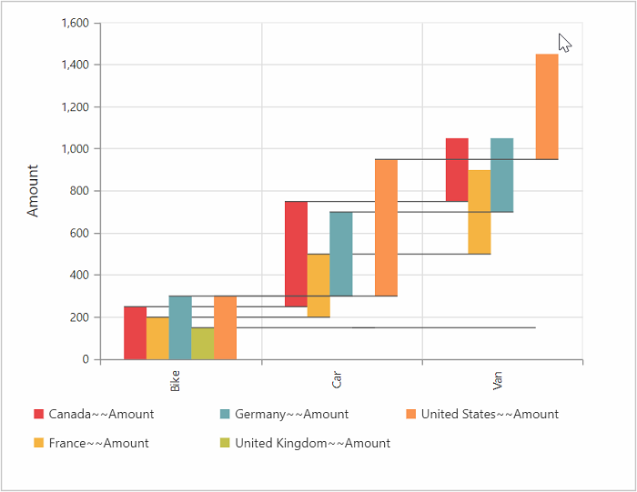
WaterFall chart
The waterfall chart type is used to show how an initial value is increased and decreased by a series of intermediate values, leading to a final value.
<ej:PivotChart ID="MyPivotChart1" runat="server" Url="/RelationalChartService.svc" >
    <CommonSeriesOptions type="WaterFall"/>
    <Size Width="950px" Height="460px"></Size>
</ej:PivotChart>
The following screenshot displays the waterfall chart:
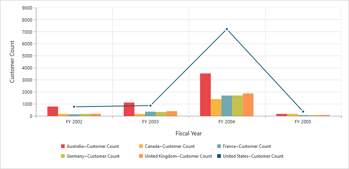
Combination chart
The combination chart combines two or more series types in a single chart, but there are some limitations in the combination chart. They are:
- The combination chart cannot combine column and bar series.
- The pie chart cannot be used with other series types.
<ej:PivotChart ID="MyPivotChart1" runat="server" Url="/RelationalChartService.svc" >
    <CommonSeriesOptions Type="Column" />
    <ClientSideEvents Load="loadTheme" SeriesRendering="onSeriesRenders" />
    <Size Width="950px" Height="460px"></Size>
</ej:PivotChart>

<script>
function onSeriesRenders(args) {
    this.model.series[5].type = ej.PivotChart.ChartTypes.Line;
    this.model.series[5].marker.visible = true;
}
</script>
The following screenshot displays combination chart: