Contents
- HTML Tooltip
Having trouble getting help?
Contact Support
Contact Support
Screen Tips
14 Dec 201724 minutes to read
ScreenTip/Tooltip is used to reduce the controls related Help that are needed to the end user to do control related actions.
HTML Tooltip
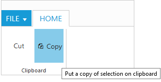
Standard html tooltip can be set using tooltip property of each group item.
<ej-ribbon id="resize" width="20%" applicationTab.type="menu" applicationTab.menuItemID="menu" allowResizing="true">
        <e-tabs>
            <e-tab id="home" text="HOME" [groups]="groups1">
            </e-tab>
        </e-tabs>
   </ej-ribbon>
<ul id="menu">
    <li>
        <a>FILE</a>
        <ul>
            <li><a>New</a></li>
            <li><a>Open</a></li>
        </ul>
    </li>
</ul>import { Component } from '@angular/core';
import { NorthwindService } from '../../services/northwind.service';
@Component({
selector: 'ej-app',
templateUrl: 'app/components/ribbon/resize.component.html',
styleUrls: ['app/components/ribbon/ribbon.component.css'],
providers: [NorthwindService]
})
export class ResizeComponent {
constructor(public northwindService: NorthwindService) { }
groups1 = [{
text: "Clipboard",
content: [{
groups: [{
id: "cut",
text: "Cut",
toolTip: "Remove the selection and put it on clipboard"
},
{
id: "copy",
text: "Copy",
toolTip: "Put a copy of selection on clipboard",
buttonSettings: {
contentType: ej.ContentType.TextAndImage,
prefixIcon: "e-ribbon e-icon e-ribboncopy"
}
}],
defaults: {
height: 70,
width: 60
}
}]
}]
}
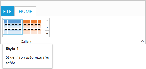
For Gallery
Custom tooltip for each gallery and custom gallery items button control can be specified.
NOTE
Custom gallery item
menuis not supported to Custom tooltip.
<ej-ribbon id="resize" width="500" applicationTab.type="menu" applicationTab.menuItemID="menu">
        <e-tabs>
            <e-tab id="home" text="HOME" [groups]="groups1">
            </e-tab>
       </e-tabs>
    </ej-ribbon>
<ul id="menu">
    <li><a>FILE</a> </li>
</ul>
<ul id="custom">
    <li>
        <a>New Quick Step</a>
        <ul>
            <li><a>Flag and Move</a></li>
        </ul>
    </li>
</ul>import { Component } from '@angular/core';
import { NorthwindService } from '../../services/northwind.service';
@Component({
selector: 'ej-app',
templateUrl: 'app/components/ribbon/resize.component.html',
styleUrls: ['app/components/ribbon/ribbon.component.css'],
providers: [NorthwindService]
})
export class ResizeComponent {
constructor(public northwindService: NorthwindService) { }
groups1 = [{
type: "gallery",
text: "Gallery",
content: [{
groups: [{
id: "Gallery",
columns: 2,
itemHeight: 54,
itemWidth: 73,
expandedColumns: 3,
type: ej.Ribbon.type.gallery,
galleryItems: [{
text: "Style 1",
customToolTip: {
title: "Style 1",
content: "<I>Style 1 to customize the table</I>"
},
buttonSettings: {
contentType: ej.ContentType.ImageOnly,
prefixIcon: "e-gallerycontent1 e-gbtnimg",
cssClass: "e-gbtnposition"
}
}, {
text: "Style 2",
customToolTip: {
title: "Style 2",
content: "<I>Style 2 to customize the table</I>"
},
buttonSettings: {
contentType: ej.ContentType.ImageOnly,
prefixIcon: "e-gallerycontent2 e-gbtnimg",
cssClass: "e-gbtnposition"
}
}, {
text: "Style 3",
customToolTip: {
title: "Style 3",
content: "<I>Style 3 to customize the table</I>"
},
buttonSettings: {
contentType: ej.ContentType.ImageOnly,
prefixIcon: "e-gallerycontent3 e-gbtnimg",
cssClass: "e-gbtnposition"
}
}, {
text: "Style 4",
customToolTip: {
title: "Style 4",
content: "<I>Style 4 to customize the table</I>"
},
buttonSettings: {
contentType: ej.ContentType.ImageOnly,
prefixIcon: "e-gallerycontent4 e-gbtnimg",
cssClass: "e-gbtnposition"
}
}],
customGalleryItems: [{
text: "Clear Formatting",
toolTip: "Clear Formatting",
customItemType: ej.Ribbon.customItemType.button,
customToolTip: {
title: "Clear Format",
content: "<I>To clear formatting</I>"
},
buttonSettings: {
cssClass: "e-extrabtnstyle"
}
}, {
customItemType: ej.Ribbon.customItemType.menu,
menuId: "custom",
menuSettings: {
openOnClick: false
}
}]
}]
}]
}]
}
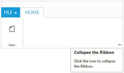
For Expand Pin
Specifies the custom tooltip for expand pin in the Ribbon.
<ej-ribbon id="resize" width="300" applicationTab.type="menu" applicationTab.menuItemID="menu"
   [expandPinSettings.customToolTip]="tooltip" applicationTab.menuSettings.openOnClick="false">
        <e-tabs>
            <e-tab id="home" text="HOME" [groups]="groups1">
            </e-tab>
       </e-tabs>
   </ej-ribbon>
<ul id="menu">
   <li>
        <a>FILE</a>
        <ul>
            <li><a>New</a></li>
            <li><a>Open</a></li>
        </ul>
   </li>
</ul>import { Component } from '@angular/core';
import { NorthwindService } from '../../services/northwind.service';
@Component({
selector: 'ej-app',
templateUrl: 'app/components/ribbon/resize.component.html',
styleUrls: ['app/components/ribbon/ribbon.component.css'],
providers: [NorthwindService]
})
export class ResizeComponent {
constructor(public northwindService: NorthwindService) { }
groups1 = [{
text: "New",
alignType: ej.Ribbon.alignType.rows,
content: [{
groups: [{
id: "new",
text: "New",
toolTip: "New",
buttonSettings: {
contentType: ej.ContentType.ImageOnly,
imagePosition: ej.ImagePosition.ImageTop,
prefixIcon: "e-ribbon e-icon e-new",
click: "executeAction"
}
}],
defaults: {
type: ej.Ribbon.type.button,
width: 60,
height: 70
}
}],
}]
tooltip = {
title: "Collapse the Ribbon",
content: "<h6>Click the icon to collapse the Ribbon.</h6>"
}
}
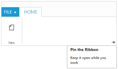
For Collapse Pin
Specifies the custom tooltip for collapse pin in the Ribbon.
<ej-ribbon id="resize" width="300" applicationTab.type="menu"
       applicationTab.menuItemID="menu" [collapsePinSettings.customToolTip]="tooltip"
       applicationTab.menuSettings.openOnClick="false">
        <e-tabs>
            <e-tab id="home" text="HOME" [groups]="groups1">
            </e-tab>
       </e-tabs>
    </ej-ribbon>
<ul id="menu">
    <li>
        <a>FILE</a>
        <ul>
            <li><a>New</a></li>
            <li><a>Open</a></li>
        </ul>
    </li>
</ul>import { Component } from '@angular/core';
import { NorthwindService } from '../../services/northwind.service';
@Component({
selector: 'ej-app',
templateUrl: 'app/components/ribbon/resize.component.html',
styleUrls: ['app/components/ribbon/ribbon.component.css'],
providers: [NorthwindService]
})
export class ResizeComponent {
constructor(public northwindService: NorthwindService) { }
groups1 = [{
text: "New",
alignType: ej.Ribbon.alignType.rows,
content: [{
groups: [{
id: "new",
text: "New",
toolTip: "New",
buttonSettings: {
contentType: ej.ContentType.ImageOnly,
imagePosition: ej.ImagePosition.ImageTop,
prefixIcon: "e-ribbon e-icon e-new",
click: "executeAction"
}
}],
defaults: {
type: ej.Ribbon.type.button,
width: 60,
height: 70
}
}],
}]
tooltip = {
title: "Pin the Ribbon",
content: "<h6>Keep it open while you work</h6>"
}
}
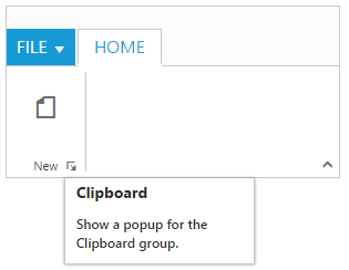
For GroupExpander
Custom tooltip for each group expander can be specified.
<ej-ribbon id="resize" width="300" applicationTab.type="menu"
       applicationTab.menuItemID="menu" [collapsePinSettings.customToolTip]="tooltip"
       applicationTab.menuSettings.openOnClick="false">
        <e-tabs>
            <e-tab id="home" text="HOME" [groups]="groups1">
            </e-tab>
       </e-tabs>
    </ej-ribbon>
<ul id="menu">
    <li>
        <a>FILE</a>
        <ul>
            <li><a>New</a></li>
            <li><a>Open</a></li>
        </ul>
    </li>
</ul>import { Component } from '@angular/core';
import { NorthwindService } from '../../services/northwind.service';
@Component({
selector: 'ej-app',
templateUrl: 'app/components/ribbon/resize.component.html',
styleUrls: ['app/components/ribbon/ribbon.component.css'],
providers: [NorthwindService]
})
export class ResizeComponent {
constructor(public northwindService: NorthwindService) { }
groups1 = [{
text: "New",
alignType: ej.Ribbon.AlignType.Columns,
enableGroupExpander: true,
groupExpanderSettings: {
customToolTip: {
title: "Clipboard",
content: "<h6>Show a popup for the Clipboard group.</h6>"
}
},
alignType: ej.Ribbon.alignType.rows,
content: [{
groups: [{
id: "new",
text: "New",
toolTip: "New",
buttonSettings: {
contentType: ej.ContentType.ImageOnly,
imagePosition: ej.ImagePosition.ImageTop,
prefixIcon: "e-ribbon e-icon e-new",
click: "executeAction"
}
}],
defaults: {
type: ej.Ribbon.type.button,
width: 60,
height: 70
}
}],
}]
}