Controls Support
3 Dec 201722 minutes to read
Button, Split Button, DropdownList, Toggle button, Gallery and Custom controls can be added to each groups. You can set type property in group to define the controls. Default type is button.
Built in Controls
The following table describes about the built in controls type and their corresponding control settings.
| Type | Control Settings | Example |
|---|---|---|
| Button | ejButton - buttonSettings | buttonSettings: { width: 70, contentType: ej.ContentType.ImageOnly, prefixIcon: "e-ribbon e-new" } |
| SplitButton | ejSplitButton - splitButtonSettings | splitButtonSettings: { contentType: ej.ContentType.ImageOnly, targetID: "pasteSplit", buttonMode: "dropdown", arrowPosition: ej.ArrowPosition.Bottom } |
| ToggleButton | ejToggleButton - toggleButtonSettings | toggleButtonSettings: { contentType: ej.ContentType.ImageOnly, defaultText: "Italic", activeText: "Italic", } |
| DropDownList | ejDropDownList - dropdownSettings | dropdownSettings: { dataSource: size, text: "1pt", width: 65 } |
NOTE
- You can specify type either to
group’s collectionor to eachgroup.- For
typeproperty you can assign either string value (“splitbutton”) or enum value (ej.Ribbon.type.splitButton).
<ej-ribbon id="Default" width="100%" applicationTab.type="menu"
applicationTab.menuItemID="menu" applicationTab.menuSettings.openOnClick="false">
    <e-tabs>
        <e-tab id="home" text="HOME" [groups]="groups1">
        </e-tab>
    </e-tabs>
</ej-ribbon>
<ul id="menu">
    <li>
        <a>FILE</a>
        <ul>
            <li><a>New</a></li>
        </ul>
    </li>
</ul>
<ul id="pasteSplit">
    <li><a>Paste</a></li>
</ul>import {Component} from '@angular/core';
import {NorthwindService} from '../../services/northwind.service';
@Component({
selector: 'ej-app',
templateUrl: 'app/components/ribbon/ribbon.component.html',
providers: [NorthwindService]
})
export class RibbonComponent {
constructor(public northwindService: NorthwindService) {}
groups1= [
{
text: "New",
alignType: "rows",
content: [
{
groups: [
{
id: "new",
text: "New",
toolTip: "New",
buttonSettings: {
contentType: ej.ContentType.ImageOnly,
imagePosition: ej.ImagePosition.ImageTop,
prefixIcon: "e-ribbon e-icon e-new"
}
}
],
defaults: {
type: "button",
width: 60,
height: 70
}
}
]
},
{
text: "Clipboard",
alignType: ej.Ribbon.alignType.columns,
content: [
{
groups: [
{
id: "paste",
text: "paste",
toolTip: "Paste",
splitButtonSettings: {
contentType: ej.ContentType.ImageOnly,
prefixIcon: "e-ribbon e-icon e-ribbonpaste",
targetID: "pasteSplit",
buttonMode: "dropdown",
arrowPosition: ej.ArrowPosition.Bottom
}
}
],
defaults: {
type: ej.Ribbon.type.splitButton,
width: 50,
height: 70
}
}
]
},
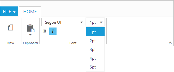
{
text: "Font",
alignType: "rows",
content: [
{
groups: [
{
id: "font",
toolTip: "Font",
dropdownSettings: {
dataSource: font,
text: "Segoe UI",
width: 150
}
},
{
id: "size",
toolTip: "FontSize",
dropdownSettings: {
dataSource: size,
text: "1pt",
width: 65
}
}
],
defaults: {
type: ej.Ribbon.type.dropDownList,
height: 28
}
}, {
groups: [
{
id: "bold",
toolTip: "Bold",
type: ej.Ribbon.type.toggleButton,
toggleButtonSettings: {
contentType: ej.ContentType.ImageOnly,
defaultText: "Bold",
activeText: "Bold",
defaultPrefixIcon: "e-ribbon e-icon bold",
activePrefixIcon: "e-ribbon e-icon bold"
}
},
{
id: "italic",
toolTip: "Italic",
type: ej.Ribbon.type.toggleButton,
toggleButtonSettings: {
contentType: ej.ContentType.ImageOnly,
defaultText: "Italic",
activeText: "Italic",
defaultPrefixIcon: "e-ribbon e-icon e-ribbonitalic",
activePrefixIcon: "e-ribbon e-icon e-ribbonitalic"
}
}
],
defaults: {
isBig: false,
}
}]
}]
var font = ["Segoe UI", "Arial", "Times New Roman", "Tahoma", "Helvetica"],
var size = ["1pt", "2pt", "3pt", "4pt", "5pt"], action1 = ["New", "Clear"],
action2 = ["Bold", "Italic", "Underline", "strikethrough", "superscript",
"subscript", "JustifyLeft", "JustifyCenter", "JustifyRight", "JustifyFull",
"Undo", "Redo"]
}
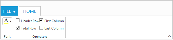
Custom
You can set type as custom to render custom controls and Custom element id has to be specified as contentID.You can change the element defined in the custom template to appropriate Syncfusion control in the event of Ribbon create.
<ej-ribbon id="Default" width="600" applicationTab.type="menu"
applicationTab.menuItemID="menu" (create)="createControl($event)">
   <e-tabs>
        <e-tab id="home" text="HOME" [groups]="groups1">
        </e-tab>
   </e-tabs>
</ej-ribbon>

<ul id="menu">
    <li>
        <a>FILE </a>
        <ul>
            <li><a>New</a></li>
            <li><a>Print</a></li>
        </ul>
    </li>
</ul>
<input id="color" />
<table id="design" class="e-designtablestyle">
    <tr>
        <td>
            <input type="checkbox" id="check1" /><label for="check1">Header Row</label>
        </td>
        <td>
            <input type="checkbox" id="Check2" checked="checked" />
            <label for="Check2">First Column</label>
        </td>
    </tr>
    <tr>
        <td>
            <input type="checkbox" id="check4" checked="checked" />
            <label for="check4">Total Row</label>
        </td>
        <td>
            <input type="checkbox" id="Check5" /><label for="Check5">Last Column</label>
        </td>
    </tr>
</table>import {Component} from '@angular/core';
import {NorthwindService} from '../../services/northwind.service';
@Component({
selector: 'ej-app',
templateUrl: 'app/components/ribbon/ribbon.component.html',
providers: [NorthwindService]
})
export class RibbonComponent {
constructor(public northwindService: NorthwindService) {}
groups1 = [{
text: "Font",
content: [{
groups: [{
id: "color",
toolTip: "Font Color",
contentID: "color"
}],
defaults: {
height: 30,
type: ej.Ribbon.type.custom
}
}]
}, {
text: "Operators",
content: [{
groups: [{
id: "design",
type: ej.Ribbon.type.custom,
contentID: "design"
}]
}]
}]
createControl(args) {
var ribbon = $("#Ribbon").data("ejRibbon");
$("#color").ejColorPicker({ value: "#FFFF00", modelType: "palette",
cssClass: "e-ribbon", toolIcon: "e-fontcoloricon" });
}
}