How can I help you?
Contextual Tabs
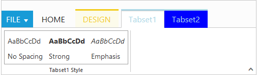
Contextual Tabs are collection of Tabs that extended styling and can be shown based on some criteria. Contextual Tabs can be added like tabs including groups and content section. You can set backgroundColor and borderColor to highlight them as Tab set. Contextual tabs can be added or set dynamically in ribbon control using addContextualTabs with it’s object and index position.
<ej-ribbon id="Default" width="500px" applicationTab.type="menu" applicationTab.menuItemID="menu"
[contextualTabs]="tab">
   <e-tabs>
        <e-tab id="home" text="HOME" [groups]="groups1">
        </e-tab>
   </e-tabs>
</ej-ribbon>
<ul id="menu">
    <li>
        <a>FILE</a>
        <ul>
            <li><a>New</a></li>
        </ul>
    </li>
</ul>
<div id="Contents">Custom Control</div>
<div id="headings" class="e-headings">
    <div>
        <p>Article</p>
        <p>No Spacing</p>
    </div>
    <div>
        <p class="e-strong">Article</p>
        <p>Strong</p>
    </div>
    <div>
        <p class="e-emphasis">Article</p>
        <p>Emphasis</p>
    </div>
</div>
<table id="design" class="e-designtablestyle">
    <tr>
        <td>
            <input type="checkbox" id="Check2" />
            <label for="Check2">First Column</label>
        </td>
        <td>
            <input type="checkbox" id="check4" checked="checked" />
            <label for="check4">Total Row</label>
        </td>
    </tr>
</table>import {Component} from '@angular/core';
import {NorthwindService} from '../../services/northwind.service';
@Component({
selector: 'ej-app',
templateUrl: 'app/components/ribbon/ribbon.component.html',
providers: [NorthwindService]
})
export class RibbonComponent {
constructor(public northwindService: NorthwindService) {}
groups1 = [{
text: "CustomControls",
type: "custom",
contentID: "Contents"
}]
tab = [{
backgroundColor: "#FCFBEB",
borderColor: "#F2CC1C",
tabs: [{
id: "Design",
text: "DESIGN",
groups: [{
text: "Table Style Options",
type: "custom",
contentID: "design"
}]
}]
},
{
backgroundColor: "blue",
borderColor: "gray",
tabs: [{
id: "tabset1",
text: "Tabset1",
groups: [{
text: "Tabset1 Style",
type: "custom",
contentID: "headings"
}]
}, {
id: "tabset2",
text: "Tabset2",
groups: [{
text: "TabSet2 Style",
content: [{
groups: [{
id: "uppercase",
text: "Upper Case",
buttonSettings: {
contentType: ej.ContentType.ImageOnly,
prefixIcon: "e-ribbon e-uppercase"
}
}, {
id: "lowercase",
text: "Lower Case",
buttonSettings: {
contentType: ej.ContentType.ImageOnly,
prefixIcon: "e-ribbon e-lowercase"
}
}],
defaults: {
isBig: true
}
}]
}]
}]
}]
}