How can I help you?
Legend in Xamarin Sunburst Chart (SfSunburstChart)
8 Jan 20258 minutes to read
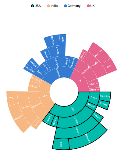
Legends are used to represent the first level (i.e root level) of categories in the sunburst chart.
The following code explains how to initialize the legends.
<sunburst:SfSunburstChart.Legend>
      <sunburst:SunburstChartLegend>
      </sunburst:SunburstChartLegend>
  </sunburst:SfSunburstChart.Legend>
SunburstChartLegend legend = new SunburstChartLegend();
sunburstChart.Legend = legend;Visibility
The visibility of legends can be controlled using the IsVisible property.
The following code shows how to control the visibility of legend.
<sunburst:SfSunburstChart.Legend>
       <sunburst:SunburstChartLegend IsVisible="True" >
       </sunburst:SunburstChartLegend>
  </sunburst:SfSunburstChart.Legend>
SunburstChartLegend legend = new SunburstChartLegend();
legend.IsVisible = true;
sunburstChart.Legend = legend;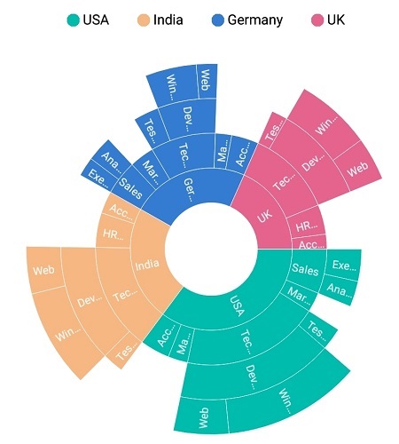
Position
Legends can be docked at the top, right, left, or bottom position using the LegendPosition property.
The following code shows customizing the legend position.
<sunburst:SfSunburstChart.Legend>
       <sunburst:SunburstChartLegend x:Name="legend" IsVisible="True"
                      LegendPosition="Left" >
       </sunburst:SunburstChartLegend>
  </sunburst:SfSunburstChart.Legend>
SunburstChartLegend legend = new SunburstChartLegend();
legend.IsVisible = true;
legend.LegendPosition = SunburstDockPosition.Left;
sunburstChart.Legend = legend;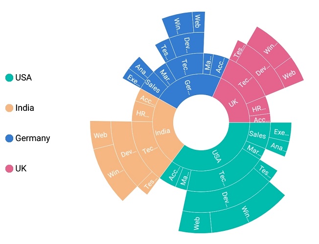
Legend icon types
Legend icon shapes can be customized using the IconType property. The IconType property provides several predefined shapes. The default legend icon type is circle.
The following predefined shapes are available in the IconType property:
- Circle
- Cross
- Diamond
- Pentagon
- Rectangle
- Triangle.
<sunburst:SfSunburstChart.Legend>
    <sunburst:SunburstChartLegend x:Name="legend" IsVisible="True"
                         IconType="Diamond" >
    </sunburst:SunburstChartLegend>
  </sunburst:SfSunburstChart.Legend>
SunburstChartLegend legend = new SunburstChartLegend();
legend.IsVisible = true;
legend.IconType = SunburstLegendIcon.Diamond;
sunburstChart.Legend = legend;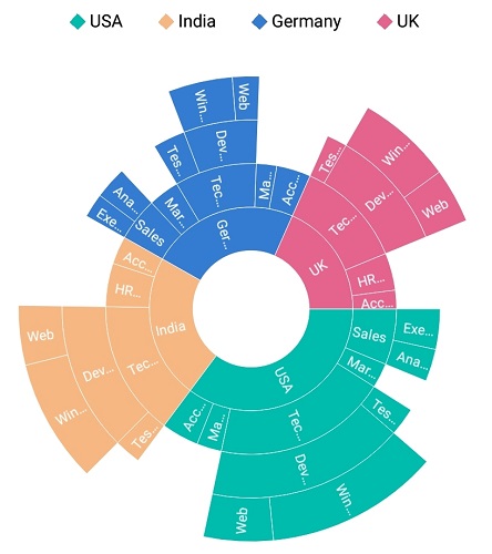
Icon size customization
The size of the legend icon can be customized using the IconHeight and IconWidth properties.
<sunburst:SfSunburstChart.Legend>
     <sunburst:SunburstChartLegend x:Name="legend" IsVisible="True" IconHeight="15"
                   IconWidth="15" IconType="Diamond">
     </sunburst:SunburstChartLegend>
  </sunburst:SfSunburstChart.Legend>
SunburstChartLegend legend = new SunburstChartLegend();
legend.IsVisible = true;
legend.IconType = SunburstLegendIcon.Diamond;
legend.IconHeight = 15;
legend.IconWidth = 15;
sunburstChart.Legend = legend;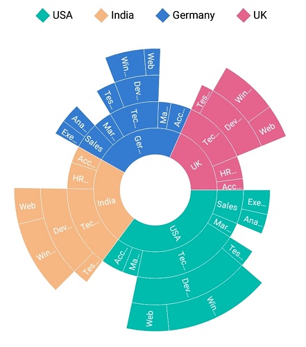
Label style
Legend label can be customized using the following properties available in LabelStyle:
-
TextColor: Customizes the text color of the label. -
FontSize: Customizes the font size of the label. -
FontAttributes: Customizes the font attributes such as Bold or Italic. -
Margin: Sets the specified margin for legend labels. -
FontFamily: Sets the specified font family for labels.
<sunburst:SfSunburstChart.Legend>
     <sunburst:SunburstChartLegend x:Name="legend" IsVisible="True" >

       <sunburst:SunburstChartLegend.LabelStyle>
            <sunburst:SunburstLegendLabelStyle x:Name="legendStyle"
                         FontAttributes="Italic" FontSize="14" Margin="5"
                         TextColor="Red" ></sunburst:SunburstLegendLabelStyle>
       </sunburst:SunburstChartLegend.LabelStyle>

   </sunburst:SunburstChartLegend>
</sunburst:SfSunburstChart.Legend>sunburstChart.Legend = new SunburstChartLegend();
sunburstChart.Legend.IsVisible = true;
SunburstLegendLabelStyle labelStyle = new SunburstLegendLabelStyle();
labelStyle.FontAttributes = FontAttributes.Italic;
labelStyle.FontSize = 14;
labelStyle.TextColor = Color.Red;
labelStyle.Margin = new Thickness(5);
sunburstChart.Legend.LabelStyle = labelStyle;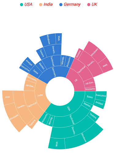
Item margin
Margin can be set to individual legend items using the ItemMargin property.
<sunburst:SfSunburstChart.Legend>
         <sunburst:SunburstChartLegend x:Name="legend" IsVisible="True" ItemMargin="3" >
         </sunburst:SunburstChartLegend>
  </sunburst:SfSunburstChart.Legend>
SunburstChartLegend legend = new SunburstChartLegend();
legend.IsVisible = true;
legend.ItemMargin = new Thickness(3, 3, 3, 3);
sunburstChart.Legend = legend;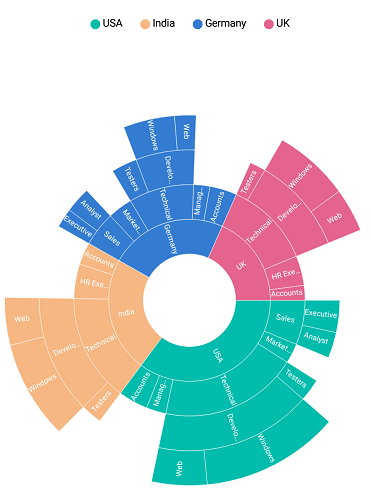
Toggle selection
Sunburst segments can also be selected via legends.
<sunburst:SfSunburstChart.Legend>
       <sunburst:SunburstChartLegend x:Name="legend" IsVisible="True"  >
       </sunburst:SunburstChartLegend>
  </sunburst:SfSunburstChart.Legend>

  <sunburst:SfSunburstChart.SelectionSettings>
       <sunburst:SelectionSettings   EnableSelection="True" SelectionDisplayMode="HighlightByStrokeColor">
       </sunburst:SelectionSettings>
  </sunburst:SfSunburstChart.SelectionSettings>
SunburstChartLegend legend = new SunburstChartLegend();
legend.IsVisible = true;
sunburstChart.Legend = legend;
SelectionSettings selection = new SelectionSettings();
selection.EnableSelection = true;
selection.SelectionDisplayMode = SelectionDisplayMode.HighlightByStrokeColor;
sunburstChart.SelectionSettings = selection;