How can I help you?
Populating Data in Xamarin Rotator (SfRotator)
11 Aug 202212 minutes to read
SfRotator control supports binding to different data sources such as IList Data Source, Observable Collection Data Source.
Through Binding
This section explains about setting Item Source and applying custom template to the data.
Create a Model with Data
SfRotator items can be populated with a collection of image data. You can assign a collection to it. Collections include arrays, Lists and DataTables. For example you may wants to create a Rotator model with Image as follows.
// Model Class for Rotator.

public RotatorModel(string imageString)
{
    Image = imageString;
}
private String _image;
public String Image
{
    get { return _image; }
    set { _image = value; }
}
Create and populate SfRotator collection as follows
// ViewModel class for Rotator.

public RotatorViewModel()
{
    ImageCollection.Add(new RotatorModel("movie1.png"));
    ImageCollection.Add(new RotatorModel("movie2.png"));
    ImageCollection.Add(new RotatorModel("movie3.png"));
    ImageCollection.Add(new RotatorModel("movie4.png"));
    ImageCollection.Add(new RotatorModel("movie5.png"));
}
private List<RotatorModel> imageCollection = new List<RotatorModel>();
public List<RotatorModel> ImageCollection
{
    get { return imageCollection; }
    set { imageCollection = value; }
}
Assigning collection to ItemSource ,
<ContentPage.BindingContext>
        <local:RotatorViewModel/>
</ContentPage.BindingContext>rotator.BindingContext = new RotatorViewModel();Binding the Data with Custom Template
SfRotator provides support to add a custom view as RotatorItems by designing a view inside its ItemTemplate. This template will be applied for all its items and its data will be binded.
<ContentPage xmlns="http://xamarin.com/schemas/2014/forms"
             xmlns:x="http://schemas.microsoft.com/winfx/2009/xaml"
             xmlns:local="clr-namespace:Rotator"
             xmlns:syncfusion="clr-namespace:Syncfusion.SfRotator.XForms;assembly=Syncfusion.SfRotator.XForms"
             x:Class="Rotator.Rotator">
    <ContentPage.BindingContext>
        <local:RotatorViewModel/>
    </ContentPage.BindingContext>
    <ContentPage.Content>
        <syncfusion:SfRotator x:Name="rotator"
                        NavigationDelay="2000"
                        ItemsSource="{Binding ImageCollection}"
                        SelectedIndex="2"
                        NavigationDirection="Horizontal"
                        NavigationStripMode="Dots"
                        BackgroundColor="#ececec">
            <syncfusion:SfRotator.ItemTemplate>
                <DataTemplate>
                    <Image  Source="{Binding Image}"/>
                </DataTemplate>
            </syncfusion:SfRotator.ItemTemplate>
        </syncfusion:SfRotator>
    </ContentPage.Content>
</ContentPage>
using Syncfusion.SfRotator.XForms;
using System;
using System.Collections.Generic;
using System.Linq;
using System.Text;
using System.Threading.Tasks;
using Xamarin.Forms;
using Xamarin.Forms.Xaml;
namespace Rotator
{
[XamlCompilation(XamlCompilationOptions.Compile)]
public partial class Rotator : ContentPage
{
public Rotator()
{
InitializeComponent ();
SfRotator rotator = new SfRotator();
var ImageCollection = new List<RotatorModel> {
new RotatorModel ("movie1.png"),
new RotatorModel ("movie2.png"),
new RotatorModel ("movie3.png"),
new RotatorModel ("movie4.png"),
new RotatorModel ("movie5.png")
};
var itemTemplate = new DataTemplate(() =>
{
var grid = new Grid();
var nameLabel = new Image();
nameLabel.SetBinding(Image.SourceProperty, "Image");
grid.Children.Add(nameLabel);
return grid;
});
rotator.ItemTemplate = itemTemplate;
rotator.ItemsSource = ImageCollection;
this.Content = rotator;
}
}
public class RotatorModel
{
public RotatorModel(string imageString)
{
Image = imageString;
}
private String _image;
public String Image
{
get { return _image; }
set { _image = value; }
}
}
}Through Rotator Item
The ItemTemplate provides common template with different data, whereas if different views for every items is needed, it can also be provided using ItemContent property in SfRotatorItem class.
using Syncfusion.SfRotator.XForms;
using System;
using System.Collections.Generic;
using System.Linq;
using System.Text;
using System.Threading.Tasks;
using Xamarin.Forms;
using Xamarin.Forms.Xaml;
namespace RangeSlider
{
[XamlCompilation(XamlCompilationOptions.Compile)]
public partial class Rotator : ContentPage
{
public Rotator()
{
InitializeComponent ();
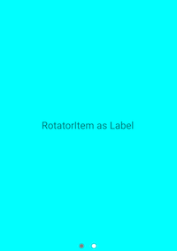
// Rotator Item as Label
SfRotator rotator = new SfRotator();
SfRotatorItem itemLabel = new SfRotatorItem();
List<SfRotatorItem> rotatorItem = new List<SfRotatorItem>();
Label label = new Label();
label.Text = "RotatorItem as Label";
label.BackgroundColor = Color.Aqua;
label.FontSize = 20;
label.VerticalTextAlignment = TextAlignment.Center;
label.HorizontalTextAlignment = TextAlignment.Center;
label.VerticalOptions = LayoutOptions.Center;
itemLabel.ItemContent = label;
rotatorItem.Add(itemLabel);
// Rotator Item as Image
SfRotatorItem itemImage = new SfRotatorItem();
Image image = new Image();
image.Source = ImageSource.FromFile("movie1.png");
image.Aspect = Aspect.AspectFit;
image.VerticalOptions = LayoutOptions.Center;
image.HeightRequest = 400;
image.WidthRequest = 400;
itemImage.ItemContent = image;
rotatorItem.Add(itemImage);
rotator.ItemsSource = rotatorItem;
this.Content = rotator;
}
}
}
And also rotator provides a support to display only the Image data with Image property in SfRotatorItem class.
public partial class RotatorControlPage : ContentPage
{
	public RotatorControlPage()
	{
		InitializeComponent();
		SfRotator rotator = new SfRotator();
        StackLayout stackLayout = new StackLayout();
		public Rotator()
		{
			InitializeComponent ();
            stackLayout.HeightRequest = 300;
            List<SfRotatorItem> collectionOfItems = new List<SfRotatorItem>();
            collectionOfItems.Add(new SfRotatorItem() { Image = "movie1.png" });
            collectionOfItems.Add(new SfRotatorItem() { Image = "movie2.png" });
            collectionOfItems.Add(new SfRotatorItem() { Image = "movie3.png" });
            collectionOfItems.Add(new SfRotatorItem() { Image = "movie4.png" });
            collectionOfItems.Add(new SfRotatorItem() { Image = "movie5.png" });
            rotator.DataSource = collectionOfItems;
            stackLayout.Children.Add(rotator);
            this.Content = stackLayout;
        }
	}
}
Similarly every item can be created and customized in case of different Rotator item view is needed.