How can I help you?
Display mode in Xamarin.Android Segmented control (SfSegmentedControl)
17 Jan 20253 minutes to read
Depending on the application, different scenarios may require icons, text, or a combination of both for effective communication. The segmented control supports these three options.
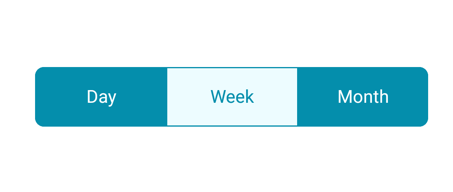
Text
Items populated in the segmented control will be displayed as text by default.
[C#]

SfSegmentedControl segmentedControl = new SfSegmentedControl(this);
segmentedControl.SelectionTextColor = Color.ParseColor("#FFFFFF");
segmentedControl.VisibleSegmentsCount = 3;
segmentedControl.BackColor = Color.ParseColor("#048EAC");
segmentedControl.CornerRadius = 15;
segmentedControl.DisplayMode = SegmentDisplayMode.Text;
segmentedControl.BorderColor = Color.ParseColor("#929292");
segmentedControl.SelectedIndex = 0;
segmentedControl.FontColor = Color.Black;
segmentedControl.SegmentBackgroundColor = Color.Transparent;
segmentedControl.ItemsSource = new ObservableCollection<SfSegmentItem>
{
    new SfSegmentItem(){ Text = "Day"},
    new SfSegmentItem(){Text = "Week"},
    new SfSegmentItem(){ Text = "Month"},
};

SelectionIndicatorSettings selectionIndicator = new SelectionIndicatorSettings()
{
    Color = Color.White
};
Image
Items populated in the segmented control can be displayed as icons.
[C#]

SfSegmentedControl segmentedControl = new SfSegmentedControl(this);
...
segmentedControl.DisplayMode = SegmentDisplayMode.Image;
segmentedControl.ItemsSource = new ObservableCollection<SfSegmentItem>
{
    new SfSegmentItem(){IconFont = "6", FontIconFontColor=Color.ParseColor("#FFFFFF"), FontColor=Color.ParseColor("#FFFFFF")},
    new SfSegmentItem(){IconFont = "6", FontIconFontColor=Color.ParseColor("#FFFFFF"), FontColor=Color.ParseColor("#FFFFFF")},
    new SfSegmentItem(){IconFont = "6", FontIconFontColor=Color.ParseColor("#FFFFFF"), FontColor=Color.ParseColor("#FFFFFF")}
};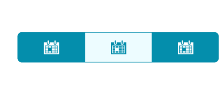
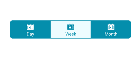
Image with text
Items populated in the segmented control can be displayed as icons with accompanying text.
[C#]

SfSegmentedControl segmentedControl = new SfSegmentedControl(this);
...
segmentedControl.DisplayMode = SegmentDisplayMode.ImageWithText;
segmentedControl.ItemsSource = new ObservableCollection<SfSegmentItem>
{
    new SfSegmentItem(){IconFont = "6", FontIconFontColor=Color.ParseColor("#FFFFFF"), FontColor=Color.ParseColor("#FFFFFF"), Text = "Day"},
    new SfSegmentItem(){IconFont = "6", FontIconFontColor=Color.ParseColor("#FFFFFF"), FontColor=Color.ParseColor("#FFFFFF"), Text = "Week"}
    new SfSegmentItem(){IconFont = "6", FontIconFontColor=Color.ParseColor("#FFFFFF"), FontColor=Color.ParseColor("#FFFFFF"), Text = "Month"}
};
How to generate font icons
The segmented control enables the user to use font icons for the items in the data source collection. For this we have to first give the desired font icon and its font family using IconFont and FontIconTypeface property.
NOTE
Font family must be added to the respective folders based on the platforms
Android -> Add the font family inside Resource-> drawable
[C#]

segmentedControl.FontIconTypeface = "segment.ttf";