How can I help you?
Customization of Xamarin.Android Segmented Control
17 Jan 20254 minutes to read
The segmented control supports customizing segment color, text color, icon size, selection color, and more. This control also supports enabling the segments to fit your application’s theme. It can be customized in the following areas.
Text appearance
The text inside the segmented control can be customized by its font size, color, and its font family.
Font family
You can customize the font family of the segmented item using the FontIconStyle property.
segmentedControl.FontIconStyle = Typeface.Create("sans-serif-light", TypefaceStyle.Normal);Font color
You can customize the text color of the segmented item using the FontColor property.
segmentedControl.FontColor = Color.Red;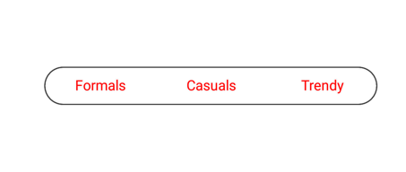
Font size
You can change the text size of the segmented item using the FontSize property.
segmentedControl.FontSize = 20;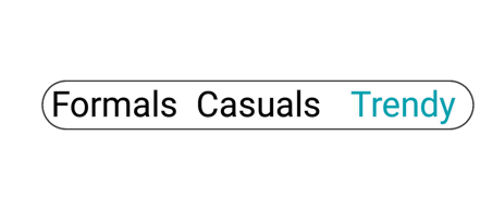
Border
You can customize the border by their color and thickness.
Border color
You can customize the BorderColor of all the items in the segmented control.
segmentedControl.BorderColor = Color.Red;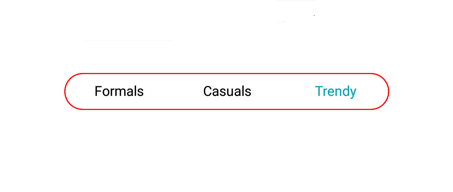
Border thickness
You can customize the width of the border using the BorderThickness property.
segmentedControl.BorderThickness = 5;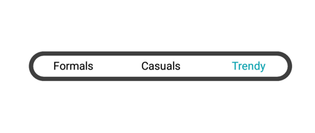
Padding
The segmented control handles padding between the items.
Segment padding
Spacing between the segmented items in the control can be customized using the SegmentPadding.
segmentedControl.SegmentPadding = 15;
Corner radius
The segmented control provides corner radius support for the segmented items and strip.
Item radius
The segmented control customizes the corner radius for each segmented item.
segmentedControl.SegmentCornerRadius = 15;
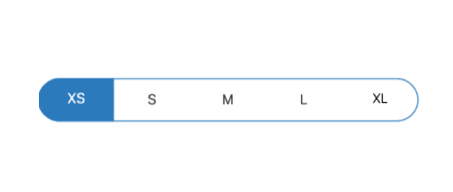
Selection strip radius
The segmented control customizes corner radius for selection strip using the CornerRadius property of SelectionIndicatorSetting.
segmentedControl.SelectionIndicatorSettings = new SelectionIndicatorSettings()
{
    CornerRadius = 15
};
Control radius
The segmented control also handles corner radius for border line of the whole control.
segmentedControl.CornerRadius = 15;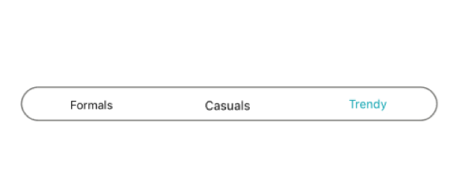
Color
The segmented control allows users to customize the background color of the segmented items and background color of the control.
Item color
You can customize the background color of each segmented item using the Color property of SelectionIndicatorSettings.
segmentedControl.SelectionIndicatorSettings = new SelectionIndicatorSettings()
{
    Color = Color.ParseColor("#FF355088")
};
Control color
You can customize the background color of the control by setting value for the BackColor property.
segmentedControl.BackColor = Color.ParseColor("#02A0AE");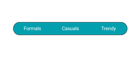
Scrolling in segmented control programmatically
The SegmentedControl allows programmatic scrolling based on index and item using the ScrollTo methods mentioned as follows.
ScrollTo(index, scrollToPosition)
This method is used to scroll the segment item based on given index and ScrollToPosition value.
segmentedControl.ScrollTo(5, Syncfusion.Android.Buttons.ScrollToPosition.Start);ScrollTo(item, scrollToPosition)
This method is used to scroll the segment item based on the given data or SfSegmentItem and ScrollToPosition value.
segmentedControl.ScrollTo(viewModel.Items[5], Syncfusion.Android.Buttons.ScrollToPosition.Start);