How can I help you?
Appearance and Styling in WPF Domain Updown (SfDomainUpDown)
25 Apr 202511 minutes to read
Spin animation
Items will spin up or down with smooth transition. The transition can be disabled using the EnableSpinAnimation property.
<syncfusion:SfDomainUpDown x:Name="domain"
                         HorizontalAlignment="Center"
                         VerticalAlignment="Center"
                         Width="200" EnableSpinAnimation="True"/>
Accent brush
The AccentBrush property is used to decorate the hot spots of a control with a solid color.
<Page xmlns:editors="clr-namespace:Syncfusion.Windows.Controls.Input;assembly=Syncfusion.SfInput.Wpf">
<Grid>
<editors:SfDomainUpDown x:Name="domainUpDown"
                       HorizontalAlignment="Center"
                       VerticalAlignment="Center"
                       Width="200"
                      AccentBrush="Black"
                      Value="James">
</editors:SfDomainUpDown >
</Grid>
</Page>
Customize Up,Down button Style
We can customize the appearance of the up/down buttons in the SfDomainUpDown control by using the UpDownStyle property.
This property allows you to apply a custom style and template to the internal SfUpDown control, which hosts the up/down buttons.
<Window xmlns:editors="clr-namespace:Syncfusion.Windows.Controls;assembly=Syncfusion.SfInput.WPF">
<Window.Resources>

    <!-- Style for Up/Down Buttons-->
    <Style x:Key="CustomUpDownButtonStyle" TargetType="editors:SfUpDown">
        <Setter Property="BorderBrush" Value="Black"/>
        <Setter Property="FontWeight" Value="Bold"/>
        <Setter Property="Template">
            <Setter.Value>
                <ControlTemplate TargetType="editors:SfUpDown">
                    <Border
                            BorderBrush="{TemplateBinding BorderBrush}"
                            BorderThickness="1"
                            CornerRadius="2">
                        <Grid x:Name="PART_OuterGrid">
                            <Grid.ColumnDefinitions>
                                <ColumnDefinition Width="*" />
                                <ColumnDefinition Width="Auto" />
                                <ColumnDefinition Width="Auto" />
                            </Grid.ColumnDefinitions>
                            <ContentControl x:Name="PART_Content" IsTabStop="False" Focusable="False" Content="{TemplateBinding UpDownContent}"
                                        />
                            <Button
                            x:Name="PART_DownButton"
                            Grid.Column="1"
                            HorizontalAlignment="Stretch"
                            VerticalAlignment="Stretch"
                            Background="{TemplateBinding AccentBrush}"
                            BorderBrush="{TemplateBinding BorderBrush}"
                            Foreground="{TemplateBinding Foreground}"
                            BorderThickness="1"
                            Padding="5"
                            FontSize="20"
                            Command="{TemplateBinding DownCommand}"
                            IsTabStop="False"
                            Content="-"
                            />
                            <Button
                            x:Name="PART_UpButton"
                            Grid.Column="2"
                            HorizontalAlignment="Stretch"
                            VerticalAlignment="Stretch"
                            Background="{TemplateBinding AccentBrush}"
                            BorderBrush="{TemplateBinding BorderBrush}"
                            Foreground="{TemplateBinding Foreground}"
                            BorderThickness="1"
                            Padding="5"
                            FontSize="20"
                            Command="{TemplateBinding UpCommand}"
                            Content="+"
                            IsTabStop="False"
                            />
                        </Grid>
                    </Border>
                </ControlTemplate>
            </Setter.Value>
        </Setter>
    </Style>

    <!-- Customized SfDomainUpDown Style -->
    <Style  TargetType="syncfusion:SfDomainUpDown">
        <Setter Property="AccentBrush" Value="LightBlue" />
        <Setter Property="Foreground" Value="Black" />
        <Setter Property="Background" Value="Lavender" />
        <Setter Property="BorderBrush" Value="Black" />
        <Setter Property="BorderThickness" Value="1" />
        <Setter Property="FontSize" Value="15" />
        <Setter Property="VerticalContentAlignment" Value="Center" />
        <Setter Property="HorizontalAlignment" Value="Center" />
        <Setter Property="Padding" Value="3" />
        <Setter Property="UpDownStyle" Value="{StaticResource CustomUpDownButtonStyle}"/>
    </Style>
</Window.Resources>
<Grid>
<syncfusion:SfDomainUpDown x:Name="DomainUpDown" Height="44" Width="231" ItemsSource="{Binding Employees}">
    <syncfusion:SfDomainUpDown.ContentTemplate>
        <DataTemplate>
            <StackPanel Orientation="Horizontal" HorizontalAlignment="Center" VerticalAlignment="Center">
                <TextBlock Text="{Binding Name}" VerticalAlignment="Center" Margin="5"/>
            </StackPanel>
        </DataTemplate>
    </syncfusion:SfDomainUpDown.ContentTemplate>
</syncfusion:SfDomainUpDown>
</Grid>
</Window>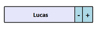
Theme
SfDomainUpDown supports various built-in themes. Refer to the below links to apply themes for the SfDomainUpDown,