Getting Started with WPF Button (ButtonAdv)
18 Nov 201823 minutes to read
This section provides an overview of how to work with the WPF Button control. It describes the control structure, initialization, and image settings. The WPF Button is implemented through the ButtonAdv class.
Control structure
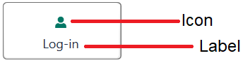
Assembly deployment
Refer to the WPF Button control dependencies section for the list of assemblies or the NuGet package that needs to be added as a reference to use the ButtonAdv control in an application.
Creating a simple application with WPF Button
In this walkthrough, you will create a WPF application that contains the WPF Button control. You can add the control in the following ways:
Adding control via designer
You can add the WPF Button control to the application by dragging ButtonAdv from the toolbox and dropping it in the designer view. After you drop the control in the designer view, the Syncfusion.Shared.WPF assembly is added to the project automatically. The following code snippets are also added to the XAML.
<syncfusion:ButtonAdv x:Name="buttonAdv" Label="ButtonAdv"/>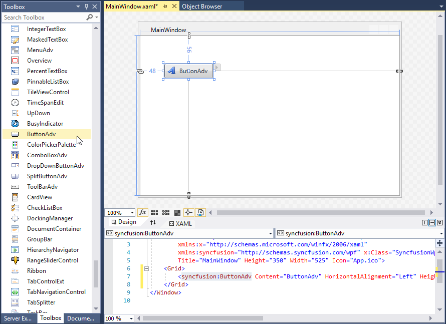
syncfusion in XAML is an auto generated namespace.
Adding control manually in XAML
To add the control manually in XAML, follow these steps.
-
Add the following required assembly reference to the project.
- Syncfusion.Shared.WPF
-
Import Syncfusion WPF schema
http://schemas.syncfusion.com/wpfor the control namespaceSyncfusion.Windows.Tools.Controlsin XAML page. -
Declare ButtonAdv control in XAML page.
<Window xmlns="http://schemas.microsoft.com/winfx/2006/xaml/presentation"
        xmlns:x="http://schemas.microsoft.com/winfx/2006/xaml"
        xmlns:local="clr-namespace:Buttonadv_GetStart_Sample"
        xmlns:syncfusion="http://schemas.syncfusion.com/wpf"
        xmlns:Syncfusion="http://schemas.microsoft.com/netfx/2009/xaml/presentation"
        mc:Ignorable="d"
        Title="MainWindow" Height="450" Width="800">
    <Grid>
        <syncfusion:ButtonAdv Height="44"  VerticalAlignment="Center" HorizontalAlignment="Center" Width="162"/>
    </Grid>
</Window>
Adding control manually in C#
To add the control manually in C#, follow these steps.
-
Add the following required assembly reference to the project.
- Syncfusion.Shared.WPF
-
Import the Syncfusion.Windows.Tools.Controls namespace.
-
Create ButtonAdv control instance and add it to the window.
<Window xmlns="http://schemas.microsoft.com/winfx/2006/xaml/presentation"
        xmlns:x="http://schemas.microsoft.com/winfx/2006/xaml"
        xmlns:local="clr-namespace:Button_Getting_Started"
        xmlns:syncfusion="http://schemas.syncfusion.com/wpf"
        xmlns:Syncfusion="http://schemas.microsoft.com/netfx/2009/xaml/presentation"
        mc:Ignorable="d"
        Title="MainWindow" Height="450" Width="800">
    <Grid x:Name="Root">

    </Grid>
</Window>
using Syncfusion.Windows.Tools.Controls; namespace Button_Getting_Started { public partial class MainWindow : Window { public MainWindow() { InitializeComponent(); ButtonAdv button = new ButtonAdv(); button.Height = 44; button.Width = 31; Root.Children.Add(button); } } }
Setting label
The label on the WPF Button is text that explains its action to the end user. Set the text by using the Label property.
<syncfusion:ButtonAdv SmallIcon="image/usersmall.png" Label="Log-in"/>ButtonAdv button = new ButtonAdv();
button.Label = "Log-in";
button.SmallIcon = new BitmapImage(new Uri("image/usersmall.png" , UriKind.RelativeOrAbsolute));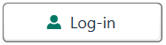
Setting size mode
Size mode renders the WPF Button control in different predefined sizes based on application requirements. Set the size mode by using the SizeMode property.
The SizeMode is an enumeration which contains the following values:
- Small
- Normal
- Large
The default value of the SizeMode property is Normal.
Small mode
When the mode is set to Small, the control is displayed without the label. Only icon will be present in it.
<syncfusion:ButtonAdv SizeMode="Small" Label="Log-in" SmallIcon ="image/usersmall.png"/>ButtonAdv button = new ButtonAdv();
button.Label = "Log-in";
button.SizeMode = SizeMode.Small;
button.SmallIcon = new BitmapImage(new Uri("image/usersmall.png", UriKind.RelativeOrAbsolute));
Normal mode
In a normal-size WPF Button, a small image is displayed beside the text.
<syncfusion:ButtonAdv SizeMode="Normal" Label="Log-in" SmallIcon ="image/usersmall.png"/>ButtonAdv button = new ButtonAdv();
button.Label = "Log-in";
button.SizeMode = SizeMode.Normal;
button.SmallIcon = new BitmapImage(new Uri("image/usersmall.png", UriKind.RelativeOrAbsolute));
Large mode
In a large-size WPF Button, a large image is displayed above the text.
<syncfusion:ButtonAdv SizeMode="Large" Label="Log-in" LargeIcon ="image/userlarge.png"/>ButtonAdv button = new ButtonAdv();
button.Label = "Log-in";
button.SizeMode = SizeMode.Large;
button.LargeIcon = new BitmapImage(new Uri("image/userlarge.png", UriKind.RelativeOrAbsolute));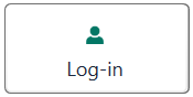
Setting icon template
The IconTemplate property supports image content such as path data and font icons in the ButtonAdv control. The icon automatically resizes the template content according to the size provided in the data template.
<Window x:Class="ButtonAdv_IconTemplate.MainWindow"
        xmlns="http://schemas.microsoft.com/winfx/2006/xaml/presentation"
        xmlns:x="http://schemas.microsoft.com/winfx/2006/xaml"
        xmlns:d="http://schemas.microsoft.com/expression/blend/2008"
        xmlns:mc="http://schemas.openxmlformats.org/markup-compatibility/2006"
        xmlns:local="clr-namespace:ButtonAdv_IconTemplate"
        xmlns:syncfusion="http://schemas.syncfusion.com/wpf"
        mc:Ignorable="d"
        Title="MainWindow" Height="450" Width="800">
    <Window.Resources>
        <DataTemplate x:Key="smallIconTemplate">
            <Grid Width="12" Height="16">
                <Path
                        Data="M21.576999,13.473151C26.414003,15.496185 30.259996,20.071221 31.999999,25.86432 15.448002,32.143386 0,25.86432 0,25.86432 1.7140042,20.158227 5.4690005,15.632174 10.202001,13.564156 11.338002,15.514191 13.444005,16.827195 15.862003,16.827195 18.317996,16.827195 20.455997,15.474182 21.576999,13.473151z M16.000003,0C19.617999,1.5323894E-07 22.550998,2.9330488 22.550998,6.5510722 22.550998,10.170134 19.617999,13.102144 16.000003,13.102144 12.381993,13.102144 9.4489957,10.170134 9.4489957,6.5510722 9.4489957,2.9330488 12.381993,1.5323894E-07 16.000003,0z"
                        Fill="#FF3A3A38"
                        Stretch="Fill" />
            </Grid>
        </DataTemplate>

        <DataTemplate x:Key="normalIconTemplate">
            <Grid Width="16" Height="16">
                <Path
                        Data="M21.576999,13.473151C26.414003,15.496185 30.259996,20.071221 31.999999,25.86432 15.448002,32.143386 0,25.86432 0,25.86432 1.7140042,20.158227 5.4690005,15.632174 10.202001,13.564156 11.338002,15.514191 13.444005,16.827195 15.862003,16.827195 18.317996,16.827195 20.455997,15.474182 21.576999,13.473151z M16.000003,0C19.617999,1.5323894E-07 22.550998,2.9330488 22.550998,6.5510722 22.550998,10.170134 19.617999,13.102144 16.000003,13.102144 12.381993,13.102144 9.4489957,10.170134 9.4489957,6.5510722 9.4489957,2.9330488 12.381993,1.5323894E-07 16.000003,0z"
                        Fill="#FF3A3A38"
                        Stretch="Fill" />
            </Grid>
        </DataTemplate>

        <DataTemplate x:Key="largeIconTemplate">
            <Grid  Width="16" Height="16">
                <Path
                        Width="16"
                        Height="16"
                        Data="M21.576999,13.473151C26.414003,15.496185 30.259996,20.071221 31.999999,25.86432 15.448002,32.143386 0,25.86432 0,25.86432 1.7140042,20.158227 5.4690005,15.632174 10.202001,13.564156 11.338002,15.514191 13.444005,16.827195 15.862003,16.827195 18.317996,16.827195 20.455997,15.474182 21.576999,13.473151z M16.000003,0C19.617999,1.5323894E-07 22.550998,2.9330488 22.550998,6.5510722 22.550998,10.170134 19.617999,13.102144 16.000003,13.102144 12.381993,13.102144 9.4489957,10.170134 9.4489957,6.5510722 9.4489957,2.9330488 12.381993,1.5323894E-07 16.000003,0z"
                        Fill="#FF3A3A38"
                        Stretch="Fill" />
            </Grid>
        </DataTemplate>
    </Window.Resources>
    <StackPanel>
        <syncfusion:ButtonAdv x:Name="smallIcon" SizeMode="Small" Label="Login" HorizontalAlignment="Center" VerticalAlignment="Center" Margin="10" IconTemplate="{StaticResource smallIconTemplate}">
        </syncfusion:ButtonAdv>
        <syncfusion:ButtonAdv x:Name="normalIcon"  SizeMode="Normal" Label="Login" HorizontalAlignment="Center" VerticalAlignment="Center" Margin="10" IconTemplate="{StaticResource normalIconTemplate}">
        </syncfusion:ButtonAdv>
        <syncfusion:ButtonAdv x:Name="largeIcon" SizeMode="Large" Label="Login" HorizontalAlignment="Center" VerticalAlignment="Center" Margin="10" IconTemplate="{StaticResource largeIconTemplate}">
        </syncfusion:ButtonAdv>
    </StackPanel>
</Window>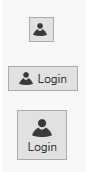
The ButtonAdv loads the icon in the following priority order.
Setting icon template selector
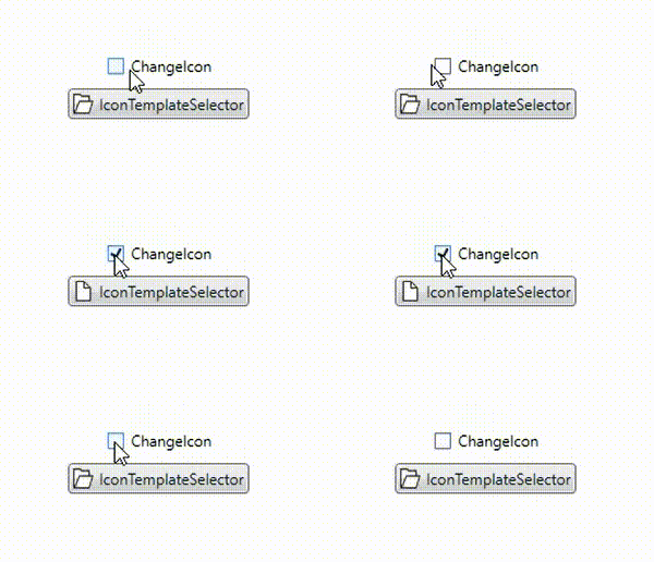
The IconTemplateSelector property allows you to specify a different data template based on the value given in the data templates.
<Window x:Class="TemplateSelector_ButtonAdv.MainWindow"
        xmlns="http://schemas.microsoft.com/winfx/2006/xaml/presentation"
        xmlns:x="http://schemas.microsoft.com/winfx/2006/xaml"
        xmlns:d="http://schemas.microsoft.com/expression/blend/2008"
        xmlns:mc="http://schemas.openxmlformats.org/markup-compatibility/2006"
        xmlns:local="clr-namespace:TemplateSelector_ButtonAdv"
        xmlns:syncfusion="http://schemas.syncfusion.com/wpf"
        mc:Ignorable="d"
        Title="MainWindow" Height="450" Width="800">

     <Window.DataContext>
      <local:ViewModel/>
     </Window.DataContext>

    <Window.Resources>
        <DataTemplate x:Key="checkedIcon">
            <Grid Width="12" Height="16">
                <Path
                      Margin="0.5"
                      Data="M0,0 L5.9999999,0 11,5 11,15 0,15 z"
                      Fill="White"
                      Stretch="Fill" />
                <Path
                     Data="M7,1.7070007 L7,5 10.292999,5 z M1,1 L1,15 11,15 11,6 6,6 6,1 z M0,0 L6.7070007,0 12,5.2929993 12,16 0,16 z"
                     Fill="#FF3A3A38"
                     Stretch="Fill" />
            </Grid>
        </DataTemplate>
        <DataTemplate x:Key="unCheckedIcon">
            <Grid Width="16" Height="16">
                <Path
                     Margin="0.5,0.5,0.738,0.502"
                     Data="M0,0 L5,0 6,1 12,1 12,3.4999998 11.499065,3.9999996 14.716998,3.9999996 11.92699,10.999 4.1853847,10.984859 0,10.982999 z"
                     Fill="White"
                     Stretch="Fill" />
                <Path
                     Data="M5.162991,5.0009986 L1.7839907,10.979999 4.3081884,10.984653 5.0009999,10.984999 5.0009999,10.98593 12.088991,10.999 14.480014,5.0009986 z M0,0 L5.7069998,0 6.7069998,1 13,1 13,3.9999998 12,3.9999998 12,1.9999998 6.2930002,1.9999998 5.2930002,1 0.99999994,1 0.99999994,10.335325 4.5790062,4.0009986 15.954991,4.0009986 12.765994,12.000998 4.552258,11.98482 0,11.982999 z"
                     Fill="#FF3A3A38"
                     Stretch="Fill" />
            </Grid>
        </DataTemplate>
        <local:IconTemplateSelector x:Key="IconTemplateSelector" CheckedIcon="{StaticResource checkedIcon}" UnCheckedIcon="{StaticResource unCheckedIcon}"/>
    </Window.Resources>

    <Grid>
        <StackPanel VerticalAlignment="Center">
            <CheckBox Name="Check" IsChecked="{Binding IsChecked, Mode=TwoWay}" HorizontalAlignment="Center" Content="ChangeIcon"/>
            <syncfusion:ButtonAdv x:Name="button" HorizontalAlignment="Center" Margin="10" Label="IconTemplateSelector" IconTemplateSelector="{StaticResource IconTemplateSelector}" DataContext="{Binding IsChecked}"/>
        </StackPanel>
    </Grid>
 </Window>
public class ViewModel : INotifyPropertyChanged
{
private bool _isChecked;
public bool IsChecked
{
get { return _isChecked; }
set
{
if (_isChecked != value)
{
_isChecked = value;
OnPropertyChanged(nameof(IsChecked));
}
}
}
public event PropertyChangedEventHandler PropertyChanged;
protected void OnPropertyChanged(string propertyName) =>
PropertyChanged?.Invoke(this, new PropertyChangedEventArgs(propertyName));
}
public class IconTemplateSelector : DataTemplateSelector
{
public DataTemplate CheckedIcon { get; set; }
public DataTemplate UnCheckedIcon { get; set; }
public override DataTemplate SelectTemplate(object item, DependencyObject container)
{
if (item is bool isChecked)
{
return isChecked ? CheckedIcon : UnCheckedIcon;
}
return base.SelectTemplate(item, container);
}
}
The ButtonAdv loads the icon in the following priority order.
Setting image
The image option provides a pictorial representation of the WPF Button. You can add an image by using either the SmallIcon property or the LargeIcon property.
SmallIcon — This property will be used to set the image when size mode is Normal or Small.
LargeIcon — This property will be used to set the image when size mode is Large.
You can set the SmallIcon property as follows:
<syncfusion:ButtonAdv SizeMode="Small" SmallIcon ="image/syncfusion.png"/>ButtonAdv button = new ButtonAdv();
button.SizeMode = SizeMode.Small;
button.SmallIcon = new BitmapImage(new Uri("image/syncfusion.png", UriKind.RelativeOrAbsolute));
The SmallIcon property can be set even when the SizeMode is Normal.
<syncfusion:ButtonAdv SizeMode="Normal" SmallIcon="image/syncfusion.png" Label="Syncfusion"/>ButtonAdv button = new ButtonAdv();
button.Label = "Syncfusion";
button.SizeMode = SizeMode.Normal;
button.SmallIcon = new BitmapImage(new Uri("image/syncfusion.png", UriKind.RelativeOrAbsolute));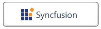
You can set the LargeIcon property as follows:
<syncfusion:ButtonAdv SizeMode="Large" LargeIcon="image/syncfusion.png" Label="Syncfusion"/>ButtonAdv button = new ButtonAdv();
button.Label = "Syncfusion";
button.SizeMode = SizeMode.Large;
button.SmallIcon = new BitmapImage(new Uri("image/syncfusion.png", UriKind.RelativeOrAbsolute));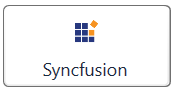
Setting icon width and height
Icon width and icon height can be set using IconWidth and IconHeight properties respectively.
<syncfusion:ButtonAdv x:Name="button1" SizeMode="Normal" IconHeight="20" IconWidth="20" Label="Syncfusion" SmallIcon ="image/syncfusion.png"/>ButtonAdv button1 = new ButtonAdv();
button1.Label = "Syncfusion";
button1.IconWidth = 20;
button1.IconHeight = 20;
button1.SmallIcon = new BitmapImage(new Uri("image/syncfusion.png", UriKind.RelativeOrAbsolute));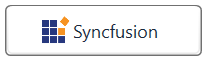
<syncfusion:ButtonAdv x:Name="button2" SizeMode="Normal" IconHeight="30" IconWidth="30" Label="Syncfusion" SmallIcon ="image/syncfusion.png" />ButtonAdv button2 = new ButtonAdv();
button2.Label = "Syncfusion";
button2.IconWidth = 30;
button2.IconHeight = 30;
button2.SmallIcon = new BitmapImage(new Uri("image/syncfusion.png", UriKind.RelativeOrAbsolute));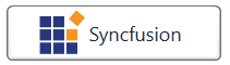
View sample in GitHub. This sample showcases how to add button control and its basic features like image sizing options and size modes.
Setting corner radius
The CornerRadius property allows users to customize the appearance of buttons with rounded corners. The default value of the CornerRadius property is 3.
<syncfusion:ButtonAdv Label="Syncfusion" SmallIcon="image/syncfusion.png" CornerRadius="15" SizeMode="Normal" IconHeight="25" IconWidth="30"/>ButtonAdv button = new ButtonAdv();
button.Label = "Syncfusion";
button.CornerRadius = new CornerRadius(15);
button.IconWidth = 30;
button.IconHeight = 25;
button.SmallIcon = new BitmapImage(new Uri("image/syncfusion.png", UriKind.RelativeOrAbsolute));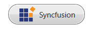
IsDefault mode
The IsDefault property indicates whether the WPF Button is a default button that can be activated by pressing the Enter key. When you set the IsDefault property to true, the user can invoke the button by pressing the Enter key.
<syncfusion:ButtonAdv x:Name="defaultButton" Label="Default" Grid.Column="1" Grid.Row="1" VerticalAlignment="Top" HorizontalAlignment="Center" Click="ButtonAdv_Click" IsDefault="True" />IsCancel mode
The IsCancel property indicates whether the WPF Button is a cancel button that can be activated by pressing the Escape key. When you set the IsCancel property to true, the user can invoke the button by pressing the Escape key.
<syncfusion:ButtonAdv x:Name="cancelButton" Label="Cancel" Grid.Column="1" Grid.Row="1" VerticalAlignment="Top" HorizontalAlignment="Center" Click="ButtonAdv_Click" IsCancel="True" />Theme
The WPF Button supports various built-in themes. Refer to the following links to apply themes to the button: