Alignment and positioning in WPF Badge (SfBadge)
18 Feb 20259 minutes to read
This section explains the alignment and positioning functionalities available in the WPF Badge control.
Alignment of Badge
you can align the Badge either horizontally or vertically by using the HorizontalAlignment or VerticalAlignment properties. The default value of HorizontalAlignment property is Right and VerticalAlignment property is Top.
| HorizontalAlignment | ||||
|---|---|---|---|---|
| VerticalAlignment | Left | Center | Right | Stretch |
| Top | 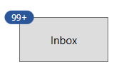 |
 |
 |
 |
| Center | 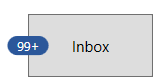 |
 |
 |
 |
| Bottom | 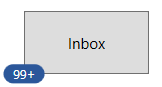 |
 |
 |
 |
| Stretch | 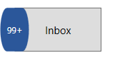 |
 |
 |
 |
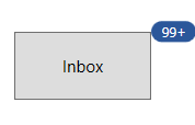
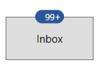
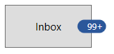
<Button Width="100"
        Height="50"
        Content="Inbox">
    <notification:SfBadge.Badge>
        <notification:SfBadge HorizontalAlignment="Left"
                              VerticalAlignment="Center"
                              Content="99+"
                              x:Name="badge"/>
    </notification:SfBadge.Badge>
</Button>badge.HorizontalAlignment = HorizontalAlignment.Left;
badge.VerticalAlignment = VerticalAlignment.Center;
badge.Content = "99+";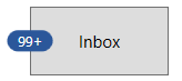
NOTE
Download demo application from GitHub
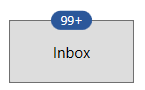
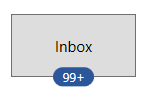
Positioning of Badge
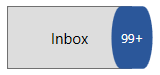
You can change the horizontal or vertical position of the Badge either inside, outside or in the middle by using the HorizontalAnchor and VerticalAnchor properties. It will be placed based on the value of HorizontalAlignment and VerticalAlignment properties. The default value of HorizontalAnchor and VerticalAnchor properties is Center.
For example, you will change the HorizontalAnchor and VerticalAnchor property values on when the value of HorizontalAlignment properties is Right and VerticalAlignment property is Top. Badge will be positioned as follows,
| HorizontalAnchor | ||||
|---|---|---|---|---|
| VerticalAnchor | Inside | Center | OutSide | |
| Inside | 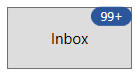 |
 |
 |
|
| Center | 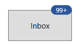 |
 |
 |
|
| Outside | 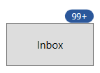 |
 |
 |
|
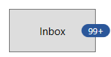
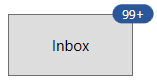
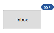
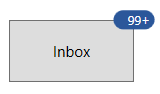
<Button Width="100"
        Height="50"
        Content="Inbox">
    <notification:SfBadge.Badge>
        <notification:SfBadge HorizontalAnchor="Outside"
                              VerticalAnchor="Center"
                            Content="10"
                            x:Name="badge"/>
    </notification:SfBadge.Badge>
</Button>badge.HorizontalAnchor = BadgeAnchor.Outside;
badge.VerticalAnchor = BadgeAnchor.Center;
badge.Content = "10";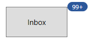
NOTE
Download demo application from GitHub
Place the Badge any where on the container
If you want to place the Badge anywhere on any shaped container, use the HorizontalPosition or VerticalPosition properties. The value range for HorizontalPosition and VerticalPosition properties is 0 to1. The default value of HorizontalPosition property is 1 and VerticalPosition property is 0.
For example, if you use any circular containers, you can easily place the Badge anywhere by using the HorizontalPosition and VerticalPosition properties.
<Image Source="/Images/avatar.png"
       Width="100"
       Height="100" >
    <notification:SfBadge.Badge>
        <notification:SfBadge Shape="None"
                              HorizontalPosition="0.9"
                              VerticalPosition="0.8"
                              x:Name="badge">
            <notification:SfBadge.Content>
                <Ellipse Width="20"
                         Height="20"
                         Fill="LimeGreen"/>
            </notification:SfBadge.Content>
        </notification:SfBadge>
    </notification:SfBadge.Badge>
</Image>badge.HorizontalPosition = 0.9;
badge.VerticalPosition = 0.8;
NOTE
Download demo application from GitHub
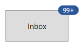
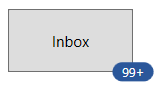
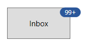
Custom alignment and positioning of Badge
You can customize the horizontal or vertical position of the Badge either inside, outside or in the middle with any point by using the HorizontalPosition & VerticalPosition properties and HorizontalAnchorPosition & VerticalAnchorPosition properties. This will effective only on by setting the HorizontalAnchor and VerticalAnchor properties value as Custom. The value range for HorizontalAnchorPosition and VerticalAnchorPosition properties is 0 to1. The default value of HorizontalAnchorPositionand VerticalAnchorPosition properties is 0.
| HorizontalPosition & HorizontalAnchorPosition | |||
|---|---|---|---|
| VerticalPosition & VerticalAnchorPosition | 0 | 0.5 | 1 |
| 0 | 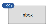 |
 |
 |
| 0.5 | 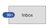 |
 |
 |
| 1 | 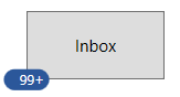 |
 |
 |
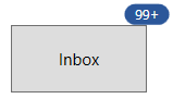
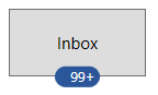
<Button Width="100"
        Height="50"
        Content="Inbox">
    <notification:SfBadge.Badge>
        <notification:SfBadge HorizontalAnchor="Custom"
                              VerticalAnchor="Custom"
                              HorizontalAnchorPosition="0.2"
                              VerticalAnchorPosition="0.4"
                              Content="99+"
                              x:Name="badge2"/>
    </notification:SfBadge.Badge>
</Button>badge.HorizontalAnchor = BadgeAnchor.Custom;
badge.VerticalAnchor = BadgeAnchor.Custom;
badge.HorizontalAnchorPosition = 0.2;
badge.VerticalAnchorPosition = 0.4;
badge.Content = "99+";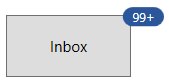
NOTE
Download demo application from GitHub
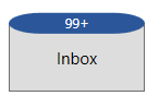
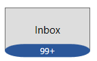
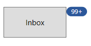
Badge content alignment
you can place the Badge content either horizontally or vertically by using the HorizontalContentAlignment or VerticalContentAlignment properties. The default value of HorizontalContentAlignment and VerticalContentAlignment properties is Center.
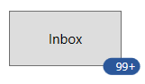
<Button Width="100"
        Height="50"
        Content="Inbox">
    <notification:SfBadge.Badge>
        <notification:SfBadge HorizontalContentAlignment="Right"
                              VerticalContentAlignment="Center"
                              Content="10"
                              x:Name="badge"/>
    </notification:SfBadge.Badge>
</Button>badge.HorizontalContentAlignment = HorizontalAlignment.Right;
badge.VerticalContentAlignment = VerticalAlignment.Center;
badge.Content = "99+";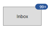
NOTE
Download demo application from GitHub