Customization in WPF Badge (SfBadge)
18 Feb 202524 minutes to read
This section explains the customization features available in the WPF Badge control.
Adding badge for a Button
If you want to assign Badge for any objects, create the Badge and assign the badge to the SfBadge.Badge property. Before that you need to create a SfBadge.Badge object and add that object to the parent control.
Here, Badge control added for the Button control.
<Button Width="100"
        Height="50"
        Content="Inbox">
    <notification:SfBadge.Badge>
        <notification:SfBadge Content="10"
                              x:Name="badge"/>
    </notification:SfBadge.Badge>
</Button>/Creating Badge control
SfBadge sfBadge = new SfBadge();
sfBadge.Name = "badge";
sfBadge.Content = 10;
//Create button control as container for badge
Button button = new Button();
button.Width = 100;
button.Height = 50;
button.Content = "Primary";
//Assigning Badge control to button
SfBadge.SetBadge(button, sfBadge);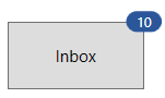
NOTE
Download demo application from GitHub
Adding badge without BadgeContainer
You can directly add the Badge to any objects without using the SfBadge.Badge container.
public class MailItem
{
   public string ItemName { get; set; }
   public int? UnreadMessageount { get; set; }
}

public class ViewModel {
    public List<MailItem> MailItems { get; set; }
    public ViewModel(){
        MailItems = new List<MailItem>();
        MailItems.Add(new MailItem()
        {
            ItemName = "Inbox",
            UnreadMessageount = 20
        });
        MailItems.Add(new MailItem()
        {
            ItemName = "Drafts",
            UnreadMessageount = null
        });
        MailItems.Add(new MailItem()
        {
            ItemName = "Sent Items",
            UnreadMessageount = 5
        });
        MailItems.Add(new MailItem()
        {
            ItemName = "Deleted Items",
            UnreadMessageount = null
        });
        MailItems.Add(new MailItem()
        {
            ItemName = "Junk Email",
            UnreadMessageount = null
        });
    }
}<Window.DataContext>
<local:ViewModel/>
</Window.DataContext>
<Grid>
<ListView BorderThickness="1"
BorderBrush="LightGray"
ItemsSource="{Binding MailItems}"
SelectedIndex="0"
VerticalAlignment="Center"
HorizontalAlignment="Center">
<ListView.ItemTemplate>
<DataTemplate>
<Grid>
<Grid.ColumnDefinitions>
<ColumnDefinition Width="150"/>
<ColumnDefinition Width="100"/>
</Grid.ColumnDefinitions>
<ContentPresenter Grid.Column="0"
Content="{Binding ItemName}"
VerticalAlignment="Center"/>
<notification:SfBadge x:Name="badge4"
Grid.Column="1"
Height="20"
Width="40"
Background="Orange"
Content="{Binding UnreadMessageount}"
Shape="Oval"/>
</Grid>
</DataTemplate>
</ListView.ItemTemplate>
</ListView>
</Grid>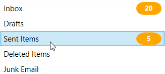
NOTE
Download demo application from GitHub
Setting Badge display content
If you want to set or change the display content of the Badge, use the Content property. The default value of Content property is null.
<Button Width="100"
        Height="50"
        Content="Inbox">
    <notification:SfBadge.Badge>
        <notification:SfBadge Content="99+"
                              x:Name="badge"/>
    </notification:SfBadge.Badge>
</Button>badge.Content = "99+";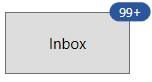
NOTE
Download demo application from GitHub
Custom UI for Badge content
You can change the appearance of Badge content by using ContentTemplate property. The DataContext of ContentTemplate property is Content.
<Button Width="100"
        Height="50"
        Content="Inbox">
    <notification:SfBadge.Badge>
        <notification:SfBadge Content="99+"
                            x:Name="badge">
            <notification:SfBadge.ContentTemplate>
                <DataTemplate>
                    <Grid>
                        <TextBlock Text="{Binding}"
                                   Foreground="Yellow"/>
                    </Grid>
                </DataTemplate>
            </notification:SfBadge.ContentTemplate>
        </notification:SfBadge>
    </notification:SfBadge.Badge>
</Button>
NOTE
Download demo application from GitHub
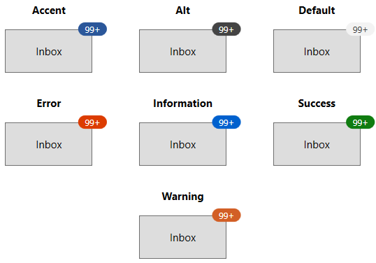
Predefined colors for displaying the badges
You can change background color of the Badge by using the Fill property. Based on the value of Fill property, respective background color will be applied to the Badge. The default value of Fill property is Accent.
The Badge supports the following different essential states :
-
Accent - DarkSlateBlue background will be applied
-
Alt - DarkSlateGray background will be applied
-
Default - WhiteSmoke background will be applied
-
Error - OrangeRed background will be applied
-
Information - RoyalBlue background will be applied
-
Success - Green background will be applied
-
Warning - Chocolate background will be applied
<Button Width="100"
        Height="50"
        Content="Inbox">
    <notification:SfBadge.Badge>
        <notification:SfBadge Fill="Success"
                              Content="99+"
                              x:Name="badge"/>
    </notification:SfBadge.Badge>
</Button>badge.Fill = BadgeFill.Success;
badge.Content = "99+";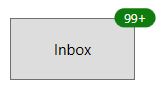
NOTE
Download demo application from GitHub
Custom colors for displaying the badges
If you want to change the background color of the Badge other than the default Fill colors, use the Background property. You can also change foreground of the Badge by using the Foreground property. The default value of Background and Foreground properties is null.
<Button Width="100"
        Height="50"
        Content="Inbox">
    <notification:SfBadge.Badge>
        <notification:SfBadge Background="Black"
                              Foreground="Yellow"
                              Content="99+"
                              x:Name="badge"/>
    </notification:SfBadge.Badge>
</Button>badge.Background = Brushes.Black;
badge.Foreground = Brushes.Yellow;
badge.Content = "99+";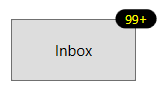
NOTE
Download demo application from GitHub
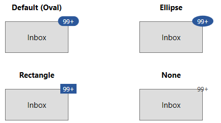
Predefined shapes for displaying the Badge
You can change the default shape to either Rectangle, Oval or Ellipse by using Shape property. If you want to display the Badge content without any default shapes , use the Shape property value as None. The default value of Shape property is Ellipse.
<Button Width="100"
        Height="50"
        Content="Inbox">
    <notification:SfBadge.Badge>
        <notification:SfBadge Shape="Oval"
                              Content="99+"
                              x:Name="badge"/>
    </notification:SfBadge.Badge>
</Button>badge.Shape = BadgeShape.Oval;
badge.Content = "99+";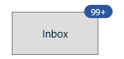
NOTE
Download demo application from GitHub
Custom shape for displaying the Badge
If you want to change the shape of the Badge other than the default shapes, use the CustomShape property. You can enable the custom shapes by setting the Shape property value as Custom.
<Button Width="100"
        Height="50"
        Content="Inbox">
    <notification:SfBadge.Badge>
        <notification:SfBadge Shape="Custom"
                              CustomShape="M16,0C17.300003,0.49999999 18.399994,1.6000063 19.199997,3.3000189 19.300003,3.3000189 19.5,3.1999823 19.600006,3.1999823 19.800003,3.3999945 20,3.4999703 20.199997,3.8000194 21.5,2.9999701 22.800003,2.6000067 24,2.8000189 24.600006,3.6000069 25,4.6000072 25,5.8000194 25.5,5.8000194 25.899994,5.899995 26.300003,6.1000076 26.399994,6.3999954 26.5,6.6000076 26.600006,6.8999954 28.199997,6.8000198 29.600006,7.1999832 30.5,7.8999959 30.699997,9.1999837 30.199997,10.699984 29.100006,12.199985L29.399994,12.499972C29.399994,12.800021 29.300003,12.999972 29.199997,13.300021 30.600006,13.999972 31.600006,14.999973 32,15.999973 31.600006,16.899998 30.899994,17.699986 29.800003,18.399998 30,18.800022 30.100006,19.199986 30.199997,19.60001 30,19.800022 29.800003,19.999973 29.600006,20.199986 30.399994,21.499975 30.800003,22.800024 30.600006,23.999975 29.5,24.800024 27.899994,25.199988 26,24.999975 26,25.100012 25.899994,25.300024 25.899994,25.4 25.600006,25.499975 25.399994,25.600012 25.100006,25.600012 25.199997,26.999975 24.800003,28.300024 24.100006,29.199989 23.100006,29.400002 22,29.100014 20.800003,28.499975 20.5,28.900002 20.199997,29.199989 19.899994,29.400002 19.600006,29.400002 19.300003,29.300026 19,29.199989 18.300003,30.499977 17.199997,31.499977 16.100006,31.900002 14.800003,31.400002 13.699997,30.199989 12.899994,28.600012 12.800003,28.600012 12.600006,28.699988 12.5,28.699988 12.300003,28.499975 12.100006,28.4 11.899994,28.100012 10.5,28.999977 9.1999969,29.400002 8,29.199989 7.3999939,28.4 7,27.4 7,26.199988 6.5,26.199988 6.1000061,26.100012 5.6999969,25.9 5.6000061,25.600012 5.5,25.4 5.3999939,25.100012 3.8000031,25.199988 2.3999939,24.800024 1.5,24.100012 1.3000031,22.800024 1.8000031,21.300024 2.8999939,19.800022L2.6000061,19.499973C2.6000061,19.199986 2.6999969,18.999973 2.8000031,18.699986 1.3999939,17.999973 0.3999939,16.999973 0,15.999973 0.3999939,15.10001 1.1000061,14.300021 2.1999969,13.600009 2,13.199985 1.8999939,12.800021 1.8000031,12.399997 2,12.199985 2.1999969,11.999972 2.5,11.800021 1.6999969,10.499971 1.3000031,9.1999837 1.5,7.9999715 2.5,7.1999832 4.1000061,6.8000198 6,6.999971 6,6.8999954 6.1000061,6.6999832 6.1000061,6.6000076 6.3999939,6.499971 6.6999969,6.3999954 7,6.3999954 6.8999939,4.899995 7.3000031,3.6999825 8,2.8000189 9,2.6000067 10.100006,2.8999945 11.300003,3.4999705 11.600006,3.1000067 11.899994,2.8000189 12.199997,2.6000067 12.5,2.6000067 12.800003,2.6999823 13.100006,2.8000189 13.800003,1.3999941 14.800003,0.39999388 16,0z"
                              Content="10"
                              x:Name="badge"/>
    </notification:SfBadge.Badge>
</Button>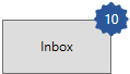
NOTE
Download demo application from GitHub
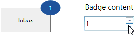
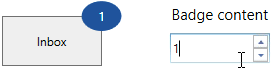
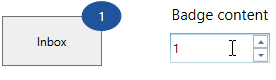
Animate when content changes
You can enable the Scale or Opacity based animation for displaying the Badge text by using AnimationType property. You can only see the animation when you change the text of the Badge. The default value of AnimationType property is None.
<Button Width="100"
        Height="50"
        Content="Inbox">
    <notification:SfBadge.Badge>
        <notification:SfBadge AnimationType="Scale"
                              x:Name="badge"/>
    </notification:SfBadge.Badge>
</Button>

<StackPanel Orientation="Vertical">
    <TextBlock Text="Badge content"
               TextAlignment="Center" />
    <notification:UpDown MinValue="1"
                         MaxValue="10"
                         Step="1"
                         NumberDecimalDigits="0"
                         Value="1"
                         x:Name="badgeContent"
ValueChanged="BadgeContent_ValueChanged"/>badge.AnimationType = BadgeAnimationType.Scale;
badgeContent.ValueChanged += BadgeContent_ValueChanged;private void BadgeContent_ValueChanged(DependencyObject d, DependencyPropertyChangedEventArgs e)
{
this.badge.Content = Convert.ToInt32(e.NewValue).ToString();
}Scaling based animation
Opacity based animation
NOTE
Download demo application from GitHub
Stroke customization
You can change stroke color and its thickness by using the Stroke and StrokeThickness properties. The default value of Stroke property is null and StrokeThickness property is 0.
<Button Width="100"
        Height="50"
        Content="Inbox">
    <notification:SfBadge.Badge>
        <notification:SfBadge Stroke="Red"
                              StrokeThickness="3"
                              Content="99+"
                              x:Name="badge"/>
    </notification:SfBadge.Badge>
</Button>badge.Stroke = Brushes.Red;
badge.StrokeThickness = 3;
badge.Content = "99+";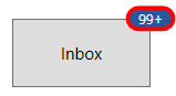
NOTE
Download demo application from GitHub
Display number formatting
You can format the numbers which are displayed in the Badge content by using the converters. For example, you can display the number as 99+ which is greater than or equal to 100.
<Button Width="100"
        Height="50"
        Content="Inbox">
    <notification:SfBadge.Badge>
        <notification:SfBadge x:Name="badge"
                              Shape="Ellipse"
                              AnimationType="None"/>
    </notification:SfBadge.Badge>
</Button>

<StackPanel Orientation="Vertical">
    <TextBlock Text="Badge content"
               TextAlignment="Center" />
    <notification:UpDown MinValue="1"
                         MaxValue="10000000"
                         Step="1"
                         NumberDecimalDigits="0"
                         Value="1"
                         x:Name="badgeContent"
ValueChanged="BadgeContent_ValueChanged"/>badge.AnimationType = BadgeAnimationType.None;
badge.Shape = BadgeShape.Ellipse;
badgeContent.ValueChanged += BadgeContent_ValueChanged;private void BadgeContent_ValueChanged(DependencyObject d, DependencyPropertyChangedEventArgs e)
{
int content_Value =Convert.ToInt32(e.NewValue);
if (content_Value <= 99)
{
this.badge.Content = content_Value.ToString();
}
else if (content_Value <= 999)
{
this.badge.Content = "99+";
}
else if (content_Value < 99999)
{
this.badge.Content = (content_Value / 1000).ToString("0.#") + "K";
}
else if (content_Value < 999999)
{
this.badge.Content = (content_Value / 1000).ToString("#,0K");
}
else if (content_Value < 9999999)
{
this.badge.Content = (content_Value / 1000000).ToString("0.#") + "M";
}
else
{
this.badge.Content = (content_Value / 1000000).ToString("#,0M");
}
}
NOTE
Download demo application from GitHub
Change Badge size
You can change the size of Badge by using the Width and Height properties. The default value of Width property is 40 and Height property is 30.
<Button Width="100"
        Height="50"
        Content="Inbox">
    <notification:SfBadge.Badge>
        <notification:SfBadge Width="50"
                              Height="30"
                              Content="99+"
                              x:Name="badge"/>
    </notification:SfBadge.Badge>
</Button>badge.Width = 50;
badge.Height = 30;
badge.Content = "99+";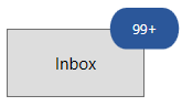
NOTE
Download demo application from GitHub
Text formatting
You can change the style, size and font family of the Badge display content by using the FontFamily, FontStyle and FontSize properties. The default value of FontFamily property is Segoe UI, FontStyle property is Normal and FontSize property is 14.
<Button Width="100"
        Height="50"
        Content="Inbox">
    <notification:SfBadge.Badge>
        <notification:SfBadge FontFamily="Perpetua"
                              FontStyle="Oblique"
                              Shape="Ellipse"
                              FontSize="20"
                              Content="99+"
                              x:Name="badge"/>
    </notification:SfBadge.Badge>
</Button>badge.FontFamily = new FontFamily("Perpetua");
badge.FontSize = 20;
badge.Shape = BadgeShape.Ellipse;
badge.Content = "99+";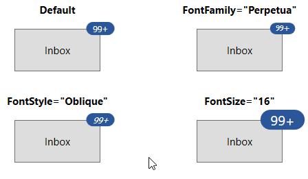
NOTE
Download demo application from GitHub
Change opacity of Badge
You can change opacity of the Badge by using the Opacity property. Value range of Opacity property is 0 to 1. The default value of Opacity property is 1.
<Button Width="100"
        Height="50"
        Content="Inbox">
    <notification:SfBadge.Badge>
        <notification:SfBadge Opacity="0.6"
                              Content="99+"
                              x:Name="badge"/>
    </notification:SfBadge.Badge>
</Button>badge.Opacity = 0.6;
badge.Content = "99+";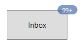
NOTE
Download demo application from GitHub
Hide the Badge
You can hide the Badge by setting the Visibility property value as Collapsed. Badge will be hidden when its content is null. The default value of Visibility property is Visible.
<Button Width="100"
        Height="50"
        Content="Inbox">
    <notification:SfBadge.Badge>
        <notification:SfBadge Visibility="Collapsed"
                              Content="99+"
                              x:Name="badge"/>
    </notification:SfBadge.Badge>
</Button>badge.Visibility = Visibility.Collapsed;
badge.Content = "99+";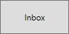