Getting Started with WPF Badge (SfBadge)
18 Feb 202524 minutes to read
This section explains the steps required to add the Badge control and its elements such as shapes, alignment and predefined colors. This section covers only basic features needed to get started with Syncfusion Badge control.
Structure of SfBadge control
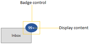
Assembly deployment
Refer to the Control Dependencies section to get the list of assemblies or NuGet package that needs to be added as a reference to use the control in any application.
Refer to this documentation to find more details about installing nuget packages in a WPF application.
Adding WPF SfBadge via XAML
To add the SfBadge manually in XAML, follow these steps:
-
Create a new WPF project in Visual Studio.
-
Add the following required assembly references to the project:
- Syncfusion.Shared.WPF
- Syncfusion.Tools.WPF
-
Import Syncfusion® WPF schema http://schemas.syncfusion.com/wpf, and declare the
SfBadgein XAML page.<Window x:Class="GettingStarted.MainWindow" xmlns="http://schemas.microsoft.com/winfx/2006/xaml/presentation" xmlns:x="http://schemas.microsoft.com/winfx/2006/xaml" xmlns:d="http://schemas.microsoft.com/expression/blend/2008" xmlns:mc="http://schemas.openxmlformats.org/markup-compatibility/2006" xmlns:notification="http://schemas.syncfusion.com/wpf" mc:Ignorable="d"> <Grid> <notification:SfBadge Name="badge"/> </Grid> </Window>
Adding WPF SfBadge via C#
To add the SfBadge control manually in C#, follow these steps:
-
Create a new WPF application via Visual Studio.
-
Add the following assembly references to the project,
- Syncfusion.Shared.WPF
- Syncfusion.Tools.WPF
-
Include the required namespace and create an instance of
SfBadgeand add it to the window. -
Declare the
SfBadgecontrol using C#.using Syncfusion.Windows.Controls.Notification; namespace GettingStarted { /// <summary> /// Interaction logic for MainWindow.xaml /// </summary> public partial class MainWindow : Window { public MainWindow() { this.InitializeComponent(); // Creating an instance of the Badge control SfBadge badge = new SfBadge(); grid.Children.Add(badge); } } }
Adding badge for a Button
If you want to assign Badge for any objects, create the Badge and assign the badge to the SfBadge.Badge property. Before that you need to create a SfBadge.Badge object and add that object to the parent control.
Here, Badge control added for the Button control.
<Button Width="100"
        Height="50"
        Content="Inbox">
    <notification:SfBadge.Badge>
        <notification:SfBadge Content="10"
                              x:Name="badge"/>
    </notification:SfBadge.Badge>
</Button>
//Creating Badge control
SfBadge sfBadge = new SfBadge();
sfBadge.Name = "badge";
sfBadge.Content = 10;
//Create button control as container for badge
Button button = new Button();
button.Width = 100;
button.Height = 50;
button.Content = "Primary";
//Assigning Badge control to button
SfBadge.SetBadge(button, sfBadge);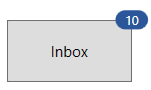
NOTE
Download demo application from GitHub
Setting Badge display content
If you want to set or change the display content of the Badge, use the Content property. The default value of Content property is null.
<Button Width="100"
        Height="50"
        Content="Inbox">
    <notification:SfBadge.Badge>
        <notification:SfBadge Content="99+"
                              x:Name="badge"/>
    </notification:SfBadge.Badge>
</Button>badge.Content = "99+";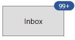
NOTE
Download demo application from GitHub
Alignment of Badge
you can align the Badge either horizontally or vertically by using the HorizontalAlignment or VerticalAlignment properties. The default value of HorizontalAlignment property is Right and VerticalAlignment property is Top.
<Button Width="100"
        Height="50"
        Content="Inbox">
    <notification:SfBadge.Badge>
        <notification:SfBadge HorizontalAlignment="Left"
                              VerticalAlignment="Center"
                              Content="99+"
                              x:Name="badge"/>
    </notification:SfBadge.Badge>
</Button>badge.HorizontalAlignment = HorizontalAlignment.Left;
badge.VerticalAlignment = VerticalAlignment.Center;
badge.Content = "99+";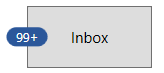
NOTE
Download demo application from GitHub
Positioning of Badge
You can change the horizontal or vertical position of the Badge either inside, outside or in the middle by using the HorizontalAnchor and VerticalAnchor properties. The default value of HorizontalAnchor and VerticalAnchor properties is Center.
<Button Width="100"
        Height="50"
        Content="Inbox">
    <notification:SfBadge.Badge>
        <notification:SfBadge HorizontalAnchor="Outside"
                              VerticalAnchor="Center"
                              Content="10"
                              x:Name="badge"/>
    </notification:SfBadge.Badge>
</Button>badge.HorizontalAnchor = BadgeAnchor.Outside;
badge.VerticalAnchor = BadgeAnchor.Center;
badge.Content = "10";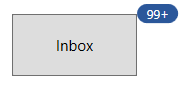
NOTE
Download demo application from GitHub
Place the Badge any where on the container
If you want to place the Badge anywhere on any shaped container, use the HorizontalPosition or VerticalPosition properties. The value range for HorizontalPosition and VerticalPosition properties is 0 to1. The default value of HorizontalPosition property is 1 and VerticalPosition property is 0.
For example, if you use any circular containers, you can easily place the Badge anywhere by using the HorizontalPosition and VerticalPosition properties.
<Image Source="/Images/avatar.png"
       Width="100"
       Height="100" >
    <notification:SfBadge.Badge>
        <notification:SfBadge Shape="None"
                              HorizontalPosition="0.9"
                              VerticalPosition="0.8"
                              x:Name="badge">
            <notification:SfBadge.Content>
                <Ellipse Width="20"
                         Height="20"
                         Fill="LimeGreen"/>
            </notification:SfBadge.Content>
        </notification:SfBadge>
    </notification:SfBadge.Badge>
</Image>badge.HorizontalPosition = 0.9;
badge.VerticalPosition = 0.8;
NOTE
Download demo application from GitHub
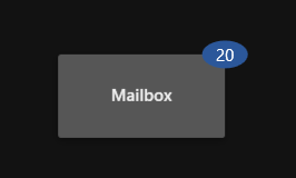
Adding badge without BadgeContainer
You can directly add the Badge to any objects without using the SfBadge.Badge container.
public class ViewModel {
 public string ItemName { get; set; }
 public int? UnreadMessageount { get; set; }
}

public class ViewModel {
    public List<Model> MailItems { get; set; }
    public ViewModel(){
        MailItems = new List<Model>();
        MailItems.Add(new Model()
        {
            ItemName = "Inbox",
            UnreadMessageount = 20
        });
        MailItems.Add(new Model()
        {
            ItemName = "Drafts",
            UnreadMessageount = null
        });
        MailItems.Add(new Model()
        {
            ItemName = "Sent Items",
            UnreadMessageount = 5
        });
        MailItems.Add(new Model()
        {
            ItemName = "Deleted Items",
            UnreadMessageount = null
        });
        MailItems.Add(new Model()
        {
            ItemName = "Junk Email",
            UnreadMessageount = null
        });
    }
}<Window.DataContext>
<local:ViewModel></local:ViewModel>
</Window.DataContext>
<Grid>
<ListView BorderThickness="1"
BorderBrush="LightGray"
ItemsSource="{Binding MailItems}"
SelectedIndex="0"
VerticalAlignment="Center"
HorizontalAlignment="Center">
<ListView.ItemTemplate>
<DataTemplate>
<Grid>
<Grid.ColumnDefinitions>
<ColumnDefinition Width="150"/>
<ColumnDefinition Width="100"/>
</Grid.ColumnDefinitions>
<ContentPresenter Grid.Column="0"
Content="{Binding ItemName}"
VerticalAlignment="Center"/>
<notification:SfBadge x:Name="badge4"
Grid.Column="1"
Height="20"
Width="40"
Background="Orange"
Content="{Binding UnreadMessageount}"
Shape="Oval"/>
</Grid>
</DataTemplate>
</ListView.ItemTemplate>
</ListView>
</Grid>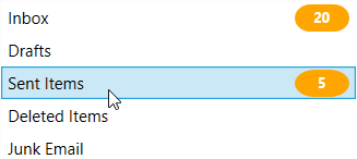
NOTE
Download demo application from GitHub
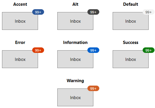
Predefined colors for displaying the badges
You can change background color of the Badge by using the Fill property. Based on the value of Fill property, respective background color will be applied to the Badge. The default value of Fill property is Accent.
The Badge supports the following different essential states :
-
Accent - DarkSlateBlue background will be applied
-
Alt - DarkSlateGray background will be applied
-
Default - WhiteSmoke background will be applied
-
Error - OrangeRed background will be applied
-
Information - RoyalBlue background will be applied
-
Success - Green background will be applied
-
Warning - Chocolate background will be applied
<Button Width="100"
        Height="50"
        Content="Inbox">
    <notification:SfBadge.Badge>
        <notification:SfBadge Fill="Success"
                              Content="99+"
                              x:Name="badge"/>
    </notification:SfBadge.Badge>
</Button>badge.Fill = BadgeFill.Success;
badge.Content = "99+";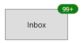
NOTE
Download demo application from GitHub
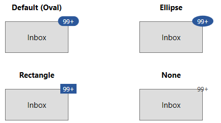
Predefined shapes for displaying the Badge
You can change the default shape to either Rectangle, Oval or Ellipse by using Shape property. If you want to display the Badge content without any default shapes , use the Shape property value as None. The default value of Shape property is Oval.
<Button Width="100"
        Height="50"
        Content="Inbox">
    <notification:SfBadge.Badge>
        <notification:SfBadge Shape="Oval"
                              Content="99+"
                              x:Name="badge"/>
    </notification:SfBadge.Badge>
</Button>badge.Shape = BadgeShape.Oval;
badge.Content = "99+";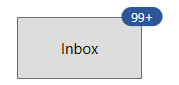
NOTE
Download demo application from GitHub
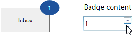
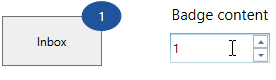
Animate when content changes
You can enable the Scale or Opacity based animation for displaying the Badge text by using AnimationType property. You can only see the animation when you change the text of the Badge. The default value of AnimationType property is None.
<Button Width="100"
        Height="50"
        Content="Inbox">
    <notification:SfBadge.Badge>
        <notification:SfBadge AnimationType="Scale"
                              Shape="Ellipse"
                              x:Name="badge"/>
    </notification:SfBadge.Badge>
</Button>

<StackPanel Orientation="Vertical">
    <TextBlock Text="Badge content"
               TextAlignment="Center" />
    <notification:UpDown MinValue="1"
                         MaxValue="10"
                         Step="1"
                         NumberDecimalDigits="0"
                         Value="1"
                         x:Name="badgeContent"
ValueChanged="BadgeContent_ValueChanged"/>badge.AnimationType = BadgeAnimationType.Scale;
badge.Shape = BadgeShape.Ellipse;
badgeContent.ValueChanged += BadgeContent_ValueChanged;private void BadgeContent_ValueChanged(DependencyObject d, DependencyPropertyChangedEventArgs e)
{
this.badge.Content = Convert.ToInt32(e.NewValue).ToString();
}Scaling based animation
Opacity based animation
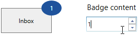
NOTE
Download demo application from GitHub
Custom Content Formats
You can format the numbers which are displayed in the Badge content by using the converters. For example, you can display the number as 99+ which is greater than or equal to 100.
<Button Width="100"
        Height="50"
        Content="Inbox">
    <notification:SfBadge.Badge>
        <notification:SfBadge x:Name="badge"
                              Shape="Ellipse"
                              AnimationType="None"/>
    </notification:SfBadge.Badge>
</Button>

<StackPanel Orientation="Vertical">
    <TextBlock Text="Badge content"
               TextAlignment="Center" />
    <syncfusion1:UpDown MinValue="1"
                        MaxValue="10000000"
                        Step="1"
                        NumberDecimalDigits="0"
                        Value="1"
                        x:Name="badgeContent"
                        ValueChanged="BadgeContent_ValueChanged"/>
</StackPanel>badge.AnimationType = BadgeAnimationType.None;
badge.Shape = BadgeShape.Ellipse;
badgeContent.ValueChanged += BadgeContent_ValueChanged;private void BadgeContent_ValueChanged(DependencyObject d, DependencyPropertyChangedEventArgs e)
{
int content_Value =Convert.ToInt32(e.NewValue);
if (content_Value <= 99)
{
this.badge.Content = content_Value.ToString();
}
else if (content_Value <= 999)
{
this.badge.Content = "99+";
}
else if (content_Value < 99999)
{
this.badge.Content = (content_Value / 1000).ToString("0.#") + "K";
}
else if (content_Value < 999999)
{
this.badge.Content = (content_Value / 1000).ToString("#,0K");
}
else if (content_Value < 9999999)
{
this.badge.Content = (content_Value / 1000000).ToString("0.#") + "M";
}
else
{
this.badge.Content = (content_Value / 1000000).ToString("#,0M");
}
}
NOTE
Download demo application from GitHub
Theme
Badge supports various built-in themes. Refer to the below links to apply themes for the Badge,