Localization and Formatting in WinUI Date Picker
19 Apr 20229 minutes to read
This section describes how to localize and format the WinUI Date Picker control using CalendarIdentifier and Language properties and to change the display formats.
Change the type of calendar
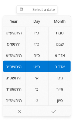
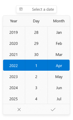
The Date Picker control supports different type of calendar such as Gregorian, Julian, Hebrew, etc. You can change the calendar type by using CalendarIdentifier property. The default value of CalendarIdentifier property is GregorianCalendar.
You can select the required CalendarIdentifier value from below types.
- JulianCalendar
- GregorianCalendar
- HebrewCalendar
- HijriCalendar
- KoreanCalendar
- TaiwanCalendar
- ThaiCalendar
- UmAlQuraCalendar
- PersianCalendar
<editors:SfDatePicker
                      x:Name="sfDatePicker"
                      CalendarIdentifier="HebrewCalendar"/>
SfDatePicker sfDatePicker = new SfDatePicker();
sfDatePicker.CalendarIdentifier = "HebrewCalendar";
NOTE
Date Pickercontrol updates the flow direction visually based on theCalendarIdentifierproperty value.
NOTE
When
CalendarIdentifierandFlowDirectionproperties are set,FlowDirectionproperty have higher precedence.
NOTE
Download demo application from GitHub
Change flow direction
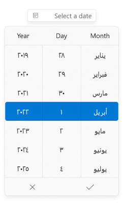
You can change the flow direction of the Date Picker layout from right to left by setting the FlowDirection property value as RightToLeft. The default value of FlowDirection property is LeftToRight.
<editors:SfDatePicker
                      x:Name="sfDatePicker"
                      FlowDirection="RightToLeft" />
SfDatePicker sfDatePicker = new SfDatePicker();
sfDatePicker.FlowDirection = FlowDirection.RightToLeft;
NOTE
Download demo application from GitHub
Change the language
You can localize the Date Picker using the Language property. The default value of Language property is en-US.
<editors:SfDatePicker
                      x:Name="sfDatePicker"
                      Language="ar-SA"/>
SfDatePicker sfDatePicker = new SfDatePicker();
sfDatePicker.Language = "ar-SA";
NOTE
Date Pickercontrol updates the flow direction visually based on theLanguageproperty value.
NOTE
When
LanguageandFlowDirectionproperties are set,FlowDirectionproperty have higher precedence.
NOTE
Download demo application from GitHub
Change editor display format
You can edit and display the selected date with various formatting like date, month and year formats by using the DisplayDateFormat property. The default value of DisplayDateFormat property is d.
<editors:SfDatePicker x:Name="sfDatePicker"
                      DisplayDateFormat="MM/dd" />
SfDatePicker sfDatePicker = new SfDatePicker();
sfDatePicker.DisplayDateFormat= "MM/dd";
NOTE
Download demo application from GitHub
Change the field value format in Spinner
You can customize the format of the date, month and year fields in the spinner of the DatePicker control by using the DayFormat, MonthFormat and YearFormat properties. By default, the value of DayFormat property is {}{day.integer}, the value MonthFormat property is {}{month.abbreviated} and the value of YearFormat property is {}{year.full}.
<editor:SfDatePicker HorizontalAlignment="Center"
                    VerticalAlignment="Center"
                    DayFormat="{}{day.integer}"
                    MonthFormat="{}{month.full}"
                    YearFormat="{}{year.abbreviated}"
                    />
SfDatePicker sfDatePicker = new SfDatePicker();
sfDatePicker.DayFormat = "{day.integer}";
sfDatePicker.MonthFormat = "{month.full}";
sfDatePicker.YearFormat = "{year.abbreviated}";
sfDatePicker.HorizontalAlignment = HorizontalAlignment.Center;
sfDatePicker.VerticalAlignment = VerticalAlignment.Center;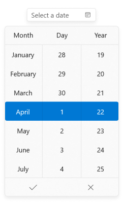
Edit date using mask mode
By default ‘Mask’ editing is enabled, which ensure that it contains only valid value. As soon as in input is given, the value is validated and correction is done immediately. Once input is completed for a field, cursor moves to next field automatically.
Based on the DisplayDateFormat and your input values, date, month and year field values are automatically corrected.
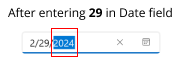
For example,
| Default Masking | Input | Output |
|---|---|---|
If you enter 29 into the date field and 2(Feb) in the month field, the year field value automatically changed to the upcoming leap year. |
29 (in date field) |
|
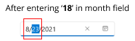
If you try to enter values between 13-19 the month field, it will add last input digit(3-9) in the month field and move the cursor to the next field. |
18 (in month field) |
|
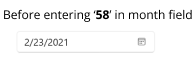
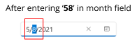
If you try to enter input in month field that is greater than 19, it will add first digit in month field and last digit added into next field. |
58 (in month field) |
|
<editors:SfDatePicker
                      x:Name="sfDatePicker"
                      EditMode="Mask" />
SfDatePicker sfDatePicker = new SfDatePicker();
sfDatePicker.EditMode = DateTimeEditMode.Mask;

NOTE
Download demo application from GitHub
Edit date using free form editing
If you want to perform the validation after the user completely entering their date inputs, use the EditMode property value as Normal. Then the entered date value is validated with the DisplayDateFormat property value by pressing the Enter key or lost focus. If entered value is not suit with DisplayDateFormat property, the previously selected date value sets to SelectedDate property.
<editors:SfDatePicker
                      x:Name="sfDatePicker"
                      EditMode="Normal" />
SfDatePicker sfDatePicker = new SfDatePicker();
sfDatePicker.EditMode = DateTimeEditMode.Normal;

NOTE
Download demo application from GitHub
Hide clear button in the editor
By default, the clear button X will be displayed in the editor of the Date Picker control, which can be used to clear the entered input. You can hide the clear button in Date Picker control using the ShowClearButton property. The default value of ShowClearButton property value is true.
<editors:SfDatePicker
                      Name="sfDatePicker"
                      ShowClearButton="False"/>
SfDatePicker sfDatePicker = new SfDatePicker();
sfDatePicker.ShowClearButton = false;