Getting Started with WinUI Date Picker
18 Nov 201812 minutes to read
This section explains the steps required to add the WinUI Date Picker control and its date selection options. This section covers only the basic features needed to get started with the Syncfusion Date Picker control.
Structure of Date Picker control
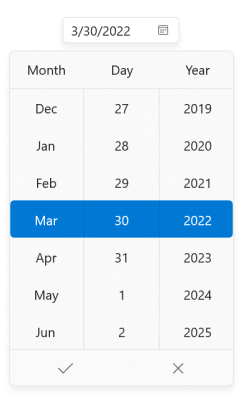
Creating an application with WinUI Date Picker
In this walkthrough, you will create a WinUI application that contains the Date Picker control.
Adding control manually in XAML
To add the Date Picker control manually in XAML, follow the below steps.
- Create a WinUI 3 desktop app for C# and .NET 5.
- Download and refer to the following NuGet in the project.
- Import the control namespace
Syncfusion.UI.Xaml.Editorsin XAML or C# code. -
Initialize the
SfDatePickercontrol.<Window x:Class="GettingStarted.MainWindow" xmlns="http://schemas.microsoft.com/winfx/2006/xaml/presentation" xmlns:x="http://schemas.microsoft.com/winfx/2006/xaml" xmlns:local="using:GettingStarted" xmlns:d="http://schemas.microsoft.com/expression/blend/2008" xmlns:mc="http://schemas.openxmlformats.org/markup-compatibility/2006" xmlns:editors="using:Syncfusion.UI.Xaml.Editors" mc:Ignorable="d"> <Grid Name="grid"> <!--Adding Date Picker control --> <editors:SfDatePicker Name="sfDatePicker"/> </Grid> </Window>
Adding control manually in C#
To add the Date Picker control manually in C#, follow the below steps.
- Create a WinUI 3 desktop app for C# and .NET 5 or WinUI 3 app in UWP for C#.
- Download and refer to the following NuGet in the project.
- Import the
Date PickernamespaceSyncfusion.UI.Xaml.Editorsin the C# page. -
Initialize the
Date Pickercontrol.using Syncfusion.UI.Xaml.Editors; namespace GettingStarted { /// <summary> /// An empty window that can be used on its own or navigated to within a Frame. /// </summary> public sealed partial class MainWindow : Window { public MainWindow() { this.InitializeComponent(); // Creating an instance of the Date Picker control SfDatePicker sfDatePicker = new SfDatePicker(); this.Content = sfDatePicker; } } }
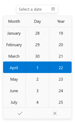
Download demo application from GitHub
Select date programmatically
You can set or change the selected date programmatically by using the SelectedDate property. If you do not assign any value to the SelectedDate property, the Date Picker will automatically assign the current system date as SelectedDate.
using Syncfusion.UI.Xaml.Editors;

SfDatePicker sfDatePicker= new SfDatePicker();
sfDatePicker.SelectedDate = new DateTimeOffset(new DateTime(2021, 10, 29));

Download demo application from GitHub
Select date interactively
You can change the selected date interactively by entering the date value using the keyboard or selecting from the drop-down date spinner. You can get the selected date from the SelectedDate property.
<Window
    ...
     xmlns:editors="using:Syncfusion.UI.Xaml.Editors">
    <editors:SfDatePicker Name="sfDatePicker" />
</Window>
using Syncfusion.UI.Xaml.Editors;
SfDatePicker sfDatePicker= new SfDatePicker();
Download demo application from GitHub
Restrict selection
You can restrict users from:
- Selecting a date within a specific minimum and maximum range using the
MinDateandMaxDateproperties. - Selecting a date from blocked dates using the
BlackoutDatesproperty. - Selecting a date from a specifically blocked set of dates (example: blocking weekend dates) using the
DateFieldItemPreparedevent.
For further reference click_here.
Setting null value
If you want to set a null value for the Date Picker, set the AllowNull property to true and set the SelectedDate property to null. If the AllowNull property is false, then the current system date is updated in the SelectedDate property and displayed instead of null.
<Window
    ...
     xmlns:editors="using:Syncfusion.UI.Xaml.Editors">
    <editors:SfDatePicker Name="sfDatePicker"
                          SelectedDate="{x:Null}"
                          AllowNull="True"
                           />
</Window>
using Syncfusion.UI.Xaml.Editors;
SfDatePicker sfDatePicker= new SfDatePicker();
sfDatePicker.SelectedDate = null;
sfDatePicker.AllowNull = true;

Download demo application from GitHub
Header and description
This section explains the Header and Description properties of the WinUI Date Picker.
Header
The Header property is used to display the title for the WinUI Date Picker control.
<Window
    ...
     xmlns:editors="using:Syncfusion.UI.Xaml.Editors">
    <editors:SfDatePicker x:Name="datePicker"
                          Height="75"
                          Width="200"
                          Header="Enter your interview date" />
</Window>
using Syncfusion.UI.Xaml.Editors;
SfDatePicker datePicker = new SfDatePicker();
datePicker.Header = "Enter your interview date";
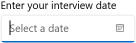
Header customization
By using the control’s HeaderTemplate property, you can customize the appearance of the control’s header. The following code sample shows how to use a header template to customize the header.
<Window
...
xmlns:editors="using:Syncfusion.UI.Xaml.Editors">
<editors:SfDatePicker Width="250" Height="75">
<editors:SfDatePicker.HeaderTemplate>
<DataTemplate>
<StackPanel Orientation="Horizontal">
<FontIcon FontFamily="Segoe MDL2 Assets" Glyph=""/>
<TextBlock Text="Interview Date" FontSize="14" Margin="5"/>
</StackPanel>
</DataTemplate>
</editors:SfDatePicker.HeaderTemplate>
</editors:SfDatePicker>
</Window>
Description
The Description support is used to display the content beneath the control as well as to provide guidance on the input that the control expects.
<Window
    ...
     xmlns:editors="using:Syncfusion.UI.Xaml.Editors">
    <editors:SfDatePicker x:Name="DatePicker"
                          Height="75"
                          Width="300"
                          Header="Enter your interview date"
                          Description="The chosen date must be within the next 5 days."/>
</Window>
using Syncfusion.UI.Xaml.Editors;
SfDatePicker datePicker = new SfDatePicker();
datePicker.Description = "The chosen date must be within the next 5 days.";

Setting watermark text
You can prompt the user with some information by using the PlaceholderText property. This will be displayed only when the WinUI Date Picker contains the SelectedDate property as null and the AllowNull property as true. If the AllowNull property is false, then the current system date is updated in the SelectedDate property and displayed instead of PlaceholderText.
<Window
    ...
     xmlns:editors="using:Syncfusion.UI.Xaml.Editors">
    <editors:SfDatePicker Name="sfDatePicker"
                          PlaceholderText="select a journey date"
                          SelectedDate="{x:Null}"
                          AllowNull="True"
                           />
</Window>
using Syncfusion.UI.Xaml.Editors;
SfDatePicker sfDatePicker= new SfDatePicker();
sfDatePicker.PlaceholderText = "select a journey date";
sfDatePicker.SelectedDate = null;
sfDatePicker.AllowNull = true;

Download demo application from GitHub
Date changed notification
You will be notified when the selected date changes in the WinUI Date Picker by using the SelectedDateChanged event. The SelectedDateChanged event contains the old and newly selected date in the OldDateTime and NewDateTime properties.
-
OldDateTime- Gets the date that was previously selected. -
NewDateTime- Gets the date that is currently selected.
<Window
    ...
     xmlns:editors="using:Syncfusion.UI.Xaml.Editors">
    <editors:SfDatePicker
                          Name="sfDatePicker"
                          SelectedDateChanged="SfDatePicker_DateChanged" />
</Window>
using Syncfusion.UI.Xaml.Editors;
SfDatePicker sfDatePicker = new SfDatePicker();
sfDatePicker.SelectedDateChanged += SfDatePicker_DateChanged;
You can handle the event as follows:
private void SfDatePicker_DateChanged(DependencyObject d, DependencyPropertyChangedEventArgs e) {
    Console.WriteLine("The previously selected Date: " + e.OldDateTime.ToString());
    Console.WriteLine("The newly selected Date: " + e.NewDateTime.ToString());
}