How can I help you?
Themes for Syncfusion® WinUI Controls
21 Jan 20255 minutes to read
Themes provide a sense of visual continuity for the Windows apps.
It allows you to customize the appearance of the application.
The theme affects the colors of the Controls’ background, foreground, border brush, font, etc.
Supported themes
Syncfusion® WinUI controls support Light and Dark themes.
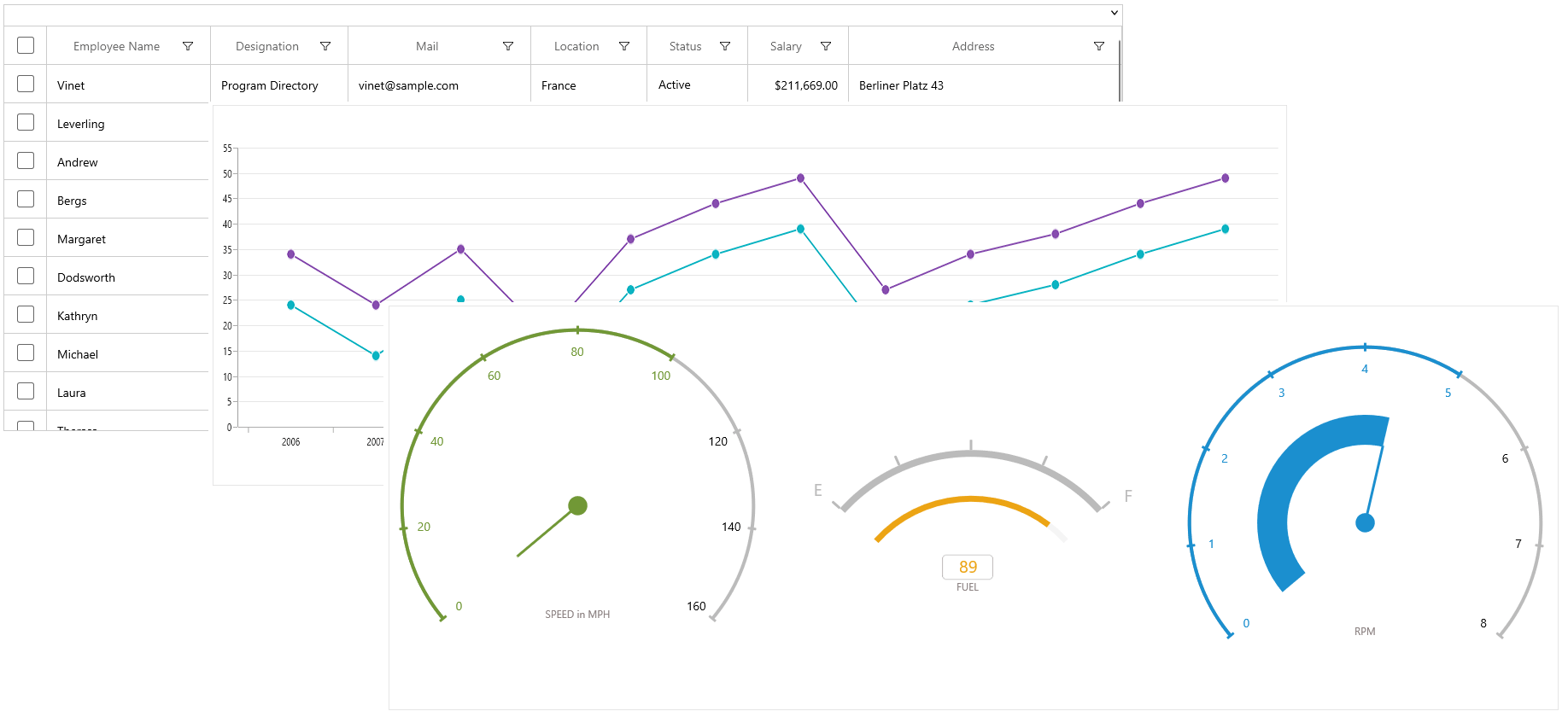
Light theme

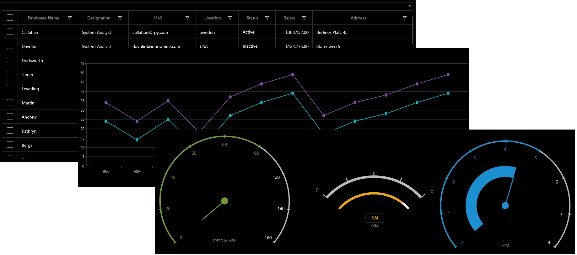
Dark theme

Applying themes at the application level
The theme for the whole application can be changed using the RequestedTheme property available in App.xaml.
Syncfusion® control adopts to Theme settings, when it is applied using the RequestedTheme property.
<Application
        x:Class="DemoApp.App"
        xmlns="http://schemas.microsoft.com/winfx/2006/xaml/presentation"
        xmlns:x="http://schemas.microsoft.com/winfx/2006/xaml"
        xmlns:local="using:WinUIDemoApp" RequestedTheme="Dark">
    </Application>
sealed partial class App : Application
{
public App()
{
this.RequestedTheme = ApplicationTheme.Dark;
this.InitializeComponent();
}
}NOTE
When the
RequestedThemeproperty is not set, the application will use the users’ system settings.
Applying themes for controls
Themes can also be applied for each framework element individually irrespective of the application level themes.
It can be set using the RequestedTheme property available in UI Elements.
When the RequestedTheme property is set to Default, it uses the Application.RequestedTheme value for the elements.
<syncfusion:SfDataGrid x:Name="datagrid" RequestedTheme="Dark"/>public MainPage()
{
this.datagrid.RequestedTheme = ElementTheme.Dark;
this.InitializeComponent();
}NOTE
When the RequestedTheme value is set on a FrameworkElement, it is inherited by any elements nested within the element.
Theme resource
Syncfusion® provides a theme resource file for all Syncfusion® WinUI Project Reunion controls. By referring to this file, the appearance of the controls can be customized at the application level.
Theme resource files for Syncfusion® WinUI controls can be referred from this link.
Modify theme resource at application level
Refer to the above-mentioned theme resources to obtain the required keys for customizing the control as desired, and then define the same keys with custom colors at the application level.
The following example shows how to customize the ribbon control at the application level by using a ribbon theme resource file.
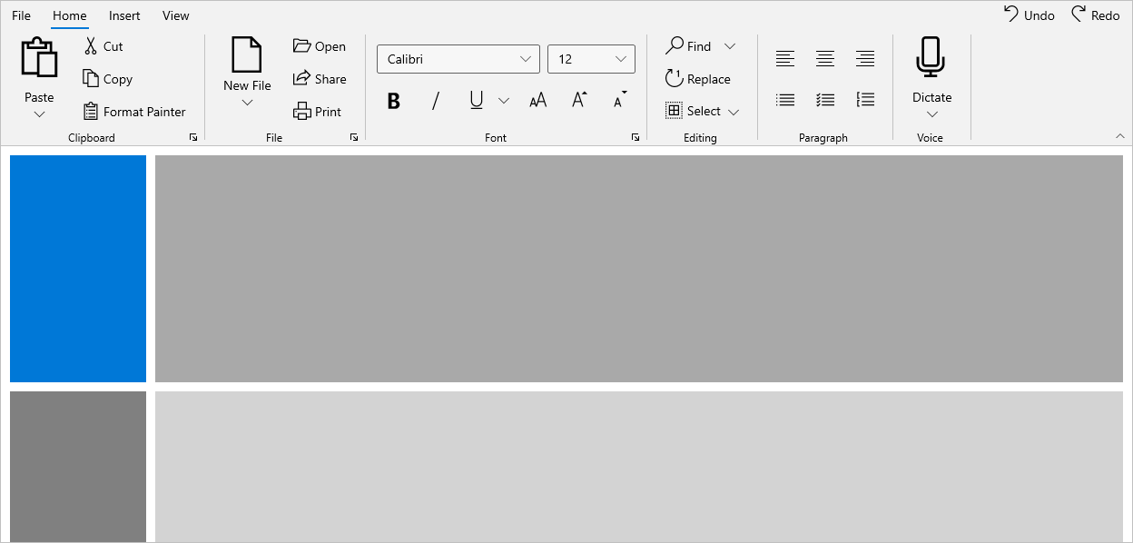
Default theme resource values
| Key | Value |
| SyncfusionRibbonTabMenuButtonBackground | SystemChromeLowColor |
| SyncfusionRibbonTabMenuButtonForeground | SystemBaseHighColor |
| SyncfusionRibbonTabBorderBrushSelected | SystemAccentColor |
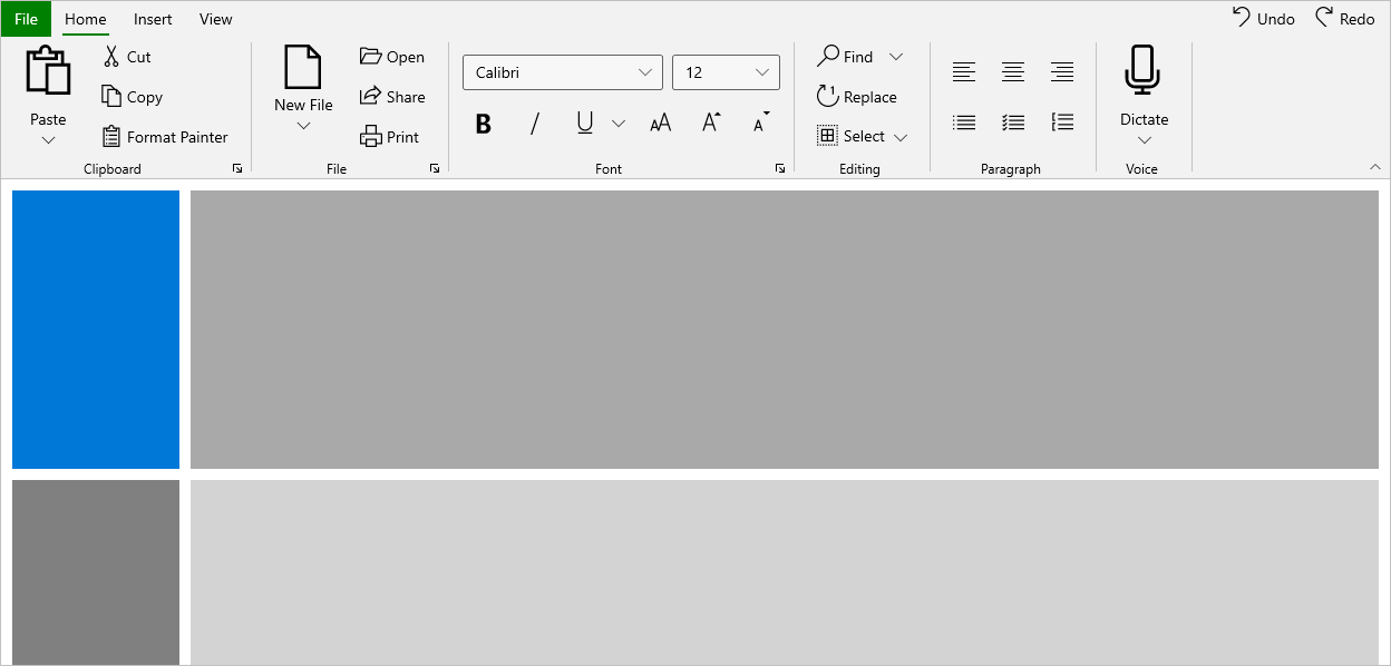
Customized value
| Key | Value |
| SyncfusionRibbonTabMenuButtonBackground | Green |
| SyncfusionRibbonTabMenuButtonForeground | White |
| SyncfusionRibbonTabBorderBrushSelected | Green |
Now, add the customized value in application root elements’ resources.
<Page>
        <Page.Resources>
            <SolidColorBrush x:Key="SyncfusionRibbonTabMenuButtonBackground"
                                    Color="Green" />
            <SolidColorBrush x:Key="SyncfusionRibbonTabMenuButtonForeground"
                                    Color="White" />
            <SolidColorBrush x:Key="SyncfusionRibbonTabBorderBrushSelected"
                                    Color="Green" />
        </Page.Resources>

        <ribbon:SfRibbon>
        ...
        </ribbon:SfRibbon>
    </Page>
Control with default theme resource

Control with customized theme resource
