How can I help you?
Label Support in UWP Range Slider (SfRangeSlider)
10 May 202113 minutes to read
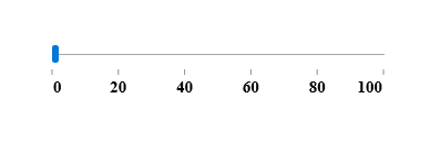
This feature allows users to display labels for custom values given in the CustomLabels collection when the ShowCustomLabels property is set to true. It also displays labels for all of the tick values when ShowValueLabels is set to true.
| Property | Description |
|---|---|
| CustomLabels | It describes an observable collection of items that contains the custom labels and the values for which the labels should be displayed. |
| ShowCustomLabels | This property allows us to display custom labels for particular values based on CustomLabels collection. |
| ShowValueLabels | This property allows us to display labels for the ticks. |
| LabelPlacement | This property specifies the position of the custom label placement. |
| ValuePlacement | This property specifies the position of the label for all of the ticks. |
| LabelOrientation | LabelOrientation specifies the orientation of the labels as either horizontal or vertical. |
CustomLabels
CustomLabels is an observable collection of items which contains the Label and Value properties. We have to create an observable collection of items by specifying the custom labels for corresponding values as shown in the following code sample:
this.customCollection.Add(new Items(){label = "Min", value= 100});

this.customCollection.Add(new Items() { label = "Max", value = 200 });

private ObservableCollection<Items> customCollection = new ObservableCollection<Items>();


public ObservableCollection<Items> CustomCollection

{

get { return customCollection; }

set { customCollection = value; }

}Me.customCollection_Renamed.Add(New Items() With {
.label = "Min",
.value= 100
})
Me.customCollection_Renamed.Add(New Items() With {
.label = "Max",
.value = 200
})
private ObservableCollection(Of Items) customCollection_Renamed = New ObservableCollection(Of Items)()
public ObservableCollection(Of Items) CustomCollection
If True Then
Get
Return customCollection_Renamed
End Get
Set
customCollection_Renamed = value
End Set
End IfIn the following sample, we have bound the CustomCollection property to CustomLabels property in the RangeSlider control, which populates the custom labels collection:
<editors:SfRangeSlider x:Name="rangeSlider" Width="200" Minimum="100" Maximum="200" TickFrequency="20" TickPlacement="Outside" ShowCustomLabels="True" CustomLabels="{Binding CustomCollection}" />
ShowCustomLabels
The default value of ShowCustomLabels is false. When set to true, it will display the custom labels for particular values based on the CustomLabels collection.
<editors:SfRangeSlider x:Name="rangeSlider" Width="200" Minimum="100" Maximum="200" TickFrequency="20" TickPlacement="Outside" ShowCustomLabels="True" CustomLabels="{Binding CustomCollection}" />rangeSlider.ShowCustomLabels = true;rangeSlider.ShowCustomLabels = True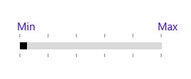
LabelPlacement
LabelPlacement property describes the position of the custom labels for particular values mentioned in the CustomLabels collection. Available options for this property are:
- BottomRight
- TopLeft
The following code sample shows the usage of the LabelPlacement property. The output is displayed in the corresponding images.
<editors:SfRangeSlider x:Name="rangeSlider" Width="200" Minimum="100" Maximum="200" TickFrequency="20" TickPlacement="Outside" ShowCustomLabels="True" CustomLabels="{Binding CustomCollection}" LabelPlacement="BottomRight"/>rangeSlider.LabelPlacement = Syncfusion.UI.Xaml.Controls.Input.LabelPlacement.BottomRight;rangeSlider.LabelPlacement = Syncfusion.UI.Xaml.Controls.Input.LabelPlacement.BottomRight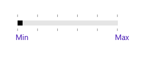
<editors:SfRangeSlider x:Name="rangeSlider" Width="200" Minimum="100" Maximum="200" TickFrequency="20" TickPlacement="Outside" ShowCustomLabels="True"

CustomLabels="{Binding CustomCollection}" LabelPlacement="TopLeft"/>rangeSlider.LabelPlacement = Syncfusion.UI.Xaml.Controls.Input.LabelPlacement.TopLeft;rangeSlider.LabelPlacement = Syncfusion.UI.Xaml.Controls.Input.LabelPlacement.TopLeft
ShowValueLabels
The default value of the ShowValueLabels property is false. When set to true, it will display the label for all the ticks based on the ValuePlacement property.
<editors:SfRangeSlider x:Name="rangeSlider" Width="200" Minimum="100" Maximum="200" TickFrequency="20" TickPlacement="BottomRight" ShowValueLabels="True"/>rangeSlider.ShowValueLabels = true;rangeSlider.ShowValueLabels = True
ValuePlacement
The ValuePlacement property describes the position of the labels for all the ticks. Available options for this property are:
- BottomRight
- TopLeft
The following code sample shows the usage of ValuePlacement property. The output is displayed in the corresponding images.
<editors:SfRangeSlider x:Name="rangeSlider" Width="200" Minimum="100" Maximum="200" TickFrequency="20" TickPlacement="Outside" ShowValueLabels="True" ValuePlacement="TopLeft"/>rangeSlider.ValuePlacement = Syncfusion.UI.Xaml.Controls.Input.ValuePlacement.TopLeft;rangeSlider.ValuePlacement = Syncfusion.UI.Xaml.Controls.Input.ValuePlacement.TopLeft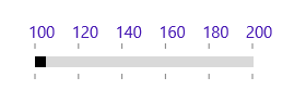
<editors:SfRangeSlider x:Name="rangeSlider" Width="200" Minimum="100" Maximum="200" TickFrequency="20" TickPlacement="Outside" ShowValueLabels="True" ValuePlacement="BottomRight"/>rangeSlider.ValuePlacement = Syncfusion.UI.Xaml.Controls.Input.ValuePlacement.BottomRight;rangeSlider.ValuePlacement = Syncfusion.UI.Xaml.Controls.Input.ValuePlacement.BottomRight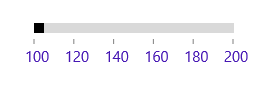
LabelOrientation
The LabelOrientation property describes the orientation of the labels for both ticks and custom labels. Available options for this property are:
- Horizontal
- Vertical
The following code sample shows the usage of LabelOrientation property. The output is displayed in the corresponding images.
<editors:SfRangeSlider x:Name="rangeSlider" Width="200" Minimum="100" Maximum="200" TickFrequency="20" TickPlacement="Outside" ShowValueLabels="True" LabelOrientation="Horizontal"/>rangeSlider.LabelOrientation = Orientation.Horizontal;rangeSlider.LabelOrientation = Orientation.Horizontal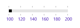
<editors:SfRangeSlider x:Name="rangeSlider" Width="200" Minimum="100" Maximum="200" TickFrequency="20" TickPlacement="Outside" ShowValueLabels="True" LabelOrientation="Vertical"/>rangeSlider.LabelOrientation = Orientation.Vertical;rangeSlider.LabelOrientation = Orientation.Vertical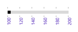
Customizing label font
The range slider control provides the FontFamily, FontWeight , FontStyle and FontSize properties to customize the value text and custom label text.
<Page
    x:Class="RangeSlider_Sample.MainPage"
    xmlns="http://schemas.microsoft.com/winfx/2006/xaml/presentation"
    xmlns:x="http://schemas.microsoft.com/winfx/2006/xaml"
    xmlns:local="using:RangeSlider_Sample"
    xmlns:d="http://schemas.microsoft.com/expression/blend/2008"
    xmlns:mc="http://schemas.openxmlformats.org/markup-compatibility/2006"
    xmlns:input="using:Syncfusion.UI.Xaml.Controls.Input"
    mc:Ignorable="d">

    <Grid Background="{ThemeResource ApplicationPageBackgroundThemeBrush}">
        <input:SfRangeSlider x:Name="rangeSlider"  Width="300" HorizontalAlignment="Center"  VerticalAlignment="Center" TickFrequency="20" TickPlacement="BottomRight"  LabelPlacement="BottomRight" Orientation="Horizontal"
         FontFamily="Times New Roman" FontSize="15" FontStyle="Normal" FontWeight="Bold" ShowValueLabels="True" ValuePlacement="BottomRight"/>
    </Grid>
</Page>using Syncfusion.UI.Xaml.Controls.Input;
using Windows.UI.Xaml;
using Windows.UI.Xaml.Controls;
using Windows.UI.Xaml.Media;
namespace RangeSlider_Sample
{
/// <summary>
/// An empty page that can be used on its own or navigated to within a Frame.
/// </summary>
public sealed partial class MainPage : Page
{
public MainPage()
{
this.InitializeComponent();
SfRangeSlider rangeSlider = new SfRangeSlider()
{
Width = 300,
HorizontalAlignment = HorizontalAlignment.Center,
VerticalAlignment = VerticalAlignment.Center,
TickFrequency = 20,
TickPlacement = Syncfusion.UI.Xaml.Controls.Input.TickPlacement.BottomRight,
LabelPlacement = LabelPlacement.BottomRight,
Orientation = Orientation.Horizontal,
FontFamily = new FontFamily("Times New Roman"),
FontSize = 15,
FontStyle = Windows.UI.Text.FontStyle.Normal,
FontWeight = Windows.UI.Text.FontWeights.Bold,
ShowValueLabels = true,
ValuePlacement = ValuePlacement.BottomRight
};
this.Content = rangeSlider;
}
}
}Imports Syncfusion.UI.Xaml.Controls.Input
''' <summary>
''' An empty page that can be used on its own or navigated to within a Frame.
''' </summary>
Public NotInheritable Class MainPage
Inherits Page
Public Sub New()
InitializeComponent()
Dim rangeSlider As New SfRangeSlider()
rangeSlider.Width = 300
rangeSlider.HorizontalAlignment = HorizontalAlignment.Center
rangeSlider.VerticalAlignment = VerticalAlignment.Center
rangeSlider.TickFrequency = 20
rangeSlider.TickPlacement = Syncfusion.UI.Xaml.Controls.Input.TickPlacement.BottomRight
rangeSlider.LabelPlacement = LabelPlacement.BottomRight
rangeSlider.Orientation = Orientation.Horizontal
rangeSlider.ShowValueLabels = True
rangeSlider.ValuePlacement = ValuePlacement.BottomRight
rangeSlider.FontSize = 15
rangeSlider.FontStyle = Windows.UI.Text.FontStyle.Normal
rangeSlider.FontWeight = Windows.UI.Text.FontWeights.Bold
rangeSlider.FontFamily = New FontFamily("Times New Roman")
Me.Content = rangeSlider
End Sub
End Class