How can I help you?
Dealing with Ticks in UWP Range Slider (SfRangeSlider)
10 May 202110 minutes to read
It is possible to place tick marks along the track in a uniform manner. The position of tick marks can be customized.
Tick Frequency
The Tick Frequency property is used to define the number of ticks along the track, based on Minimum and Maximum values.
<editors:SfRangeSlider x:Name="rangeSlider" Width="200" Minimum="0" Maximum="100" TickFrequency="20" Value="40" />rangeSlider.TickFrequency = 20;rangeSlider.TickFrequency = 20
NOTE
When the SnapsTo property is set to Ticks, the TickFrequency is used to specify the interval between snap points.
Step Frequency
When the SnapsTo property is set to StepValues, the StepFrequency property is used to specify the interval between snap points.
<editors:SfRangeSlider x:Name="rangeSlider" Width="200" VerticalAlignment="Center" Minimum="0" Maximum="100" StepFrequency="20" Value="40"/>rangeSlider.StepFrequency = 20;rangeSlider.StepFrequency = 20Snaps To
The SnapsTo property determines whether the RangeSlider snaps to steps or ticks. Available options for this property are
- StepValues
- Ticks
Default option is StepValues and StepFrequency property is used to specify the interval between snap points in this case. If the SnapsTo property is set to Ticks, the TickFrequency property is used to specify the interval between snap points.
Tick Placement
The TickPlacement property used to determine where to draw tick marks in relation to the track. Available options for this property are
- BottomRight
- Inline
- None
- Outside
- TopLeft
The default option is Inline.
BottomRight
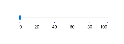
Tick marks placed either below the track in horizontal orientation or right of the track in vertical orientation.
<editors:SfRangeSlider Width="200" Minimum="0"   Maximum="100"   x:Name="rangeSlider"

TickFrequency="20" TickPlacement="BottomRight" Value="40" />rangeSlider.TickPlacement = Syncfusion.UI.Xaml.Controls.Input.TickPlacement.BottomRight;rangeSlider.TickPlacement = Syncfusion.UI.Xaml.Controls.Input.TickPlacement.BottomRight
NOTE
In Vertical Orientation, this option will place the ticks to right side.
TopLeft
Tick marks placed either above the track in horizontal orientation or left of the track in vertical orientation.
<editors:SfRangeSlider x:Name="rangeSlider" Width="200" Minimum="0" Maximum="100" TickFrequency="20" TickPlacement="TopLeft" Value="40" />rangeSlider.TickPlacement = Syncfusion.UI.Xaml.Controls.Input.TickPlacement.TopLeft;rangeSlider.TickPlacement = Syncfusion.UI.Xaml.Controls.Input.TickPlacement.TopLeft
NOTE
In Vertical Orientation, this option will place the ticks to left side.
Outside
Tick marks placed on both sides of the track either in horizontal or vertical orientation.
<editors:SfRangeSlider x:Name="rangeSlider" Width="200" Minimum="0" Maximum="100" TickFrequency="20" TickPlacement="Outside" Value="40"/>rangeSlider.TickPlacement = Syncfusion.UI.Xaml.Controls.Input.TickPlacement.Outside;rangeSlider.TickPlacement = Syncfusion.UI.Xaml.Controls.Input.TickPlacement.Outside
Inline
Ticks are placed inside the track.
<editors:SfRangeSlider x:Name="rangeSlider" Width="200" Minimum="0" Maximum="100" TickFrequency="20" TickPlacement="Inline" Value="40" />rangeSlider.TickPlacement = Syncfusion.UI.Xaml.Controls.Input.TickPlacement.Inline;rangeSlider.TickPlacement = Syncfusion.UI.Xaml.Controls.Input.TickPlacement.Inline
None
Tick marks not appear.
<editors:SfRangeSlider x:Name="rangeSlider" Width="200" Minimum="0" Maximum="100" TickFrequency="20" TickPlacement="None" Value="40" />rangeSlider.TickPlacement = Syncfusion.UI.Xaml.Controls.Input.TickPlacement.None;rangeSlider.TickPlacement = Syncfusion.UI.Xaml.Controls.Input.TickPlacement.None
Customizing tick color
The range slider control provides the TickBarFill property to customize the color of ticks in tick bar.
<Page
    x:Class="RangeSlider_Sample.MainPage"
    xmlns="http://schemas.microsoft.com/winfx/2006/xaml/presentation"
    xmlns:x="http://schemas.microsoft.com/winfx/2006/xaml"
    xmlns:local="using:RangeSlider_Sample"
    xmlns:d="http://schemas.microsoft.com/expression/blend/2008"
    xmlns:mc="http://schemas.openxmlformats.org/markup-compatibility/2006"
    xmlns:input="using:Syncfusion.UI.Xaml.Controls.Input"
    mc:Ignorable="d">

    <Grid Background="{ThemeResource ApplicationPageBackgroundThemeBrush}">
        <input:SfRangeSlider x:Name="rangeSlider"  Width="300" HorizontalAlignment="Center"  VerticalAlignment="Center" TickFrequency="20" TickPlacement="BottomRight"  LabelPlacement="BottomRight" Orientation="Horizontal"
         TickBarFill="Blue" ShowValueLabels="True" ValuePlacement="BottomRight"/>
    </Grid>
</Page>using Syncfusion.UI.Xaml.Controls.Input;
using Windows.UI;
using Windows.UI.Xaml;
using Windows.UI.Xaml.Controls;
using Windows.UI.Xaml.Media;
namespace RangeSlider_Sample
{
/// <summary>
/// An empty page that can be used on its own or navigated to within a Frame.
/// </summary>
public sealed partial class MainPage : Page
{
public MainPage()
{
this.InitializeComponent();
SfRangeSlider rangeSlider = new SfRangeSlider()
{
Width = 300,
HorizontalAlignment = HorizontalAlignment.Center,
VerticalAlignment = VerticalAlignment.Center,
TickFrequency = 20,
TickPlacement = Syncfusion.UI.Xaml.Controls.Input.TickPlacement.BottomRight,
LabelPlacement = LabelPlacement.BottomRight,
Orientation = Orientation.Horizontal,
TickBarFill = new SolidColorBrush(Color.FromArgb(255, (byte)0, (byte)0, (byte)255)),
ShowValueLabels = true,
ValuePlacement = ValuePlacement.BottomRight
};
this.Content = rangeSlider;
}
}
}Imports Syncfusion.UI.Xaml.Controls.Input
Imports Windows.UI
''' <summary>
''' An empty page that can be used on its own or navigated to within a Frame.
''' </summary>
Public NotInheritable Class MainPage
Inherits Page
Public Sub New()
InitializeComponent()
Dim rangeSlider As New SfRangeSlider()
rangeSlider.Width = 300
rangeSlider.HorizontalAlignment = HorizontalAlignment.Center
rangeSlider.VerticalAlignment = VerticalAlignment.Center
rangeSlider.TickFrequency = 20
rangeSlider.TickPlacement = Syncfusion.UI.Xaml.Controls.Input.TickPlacement.BottomRight
rangeSlider.LabelPlacement = LabelPlacement.BottomRight
rangeSlider.Orientation = Orientation.Horizontal
rangeSlider.ShowValueLabels = True
rangeSlider.ValuePlacement = ValuePlacement.BottomRight
rangeSlider.TickBarFill = New SolidColorBrush(Color.FromArgb(255, 0, 0, 255))
Me.Content = rangeSlider
End Sub
End Class